
The adage that weddings are about the couple, not the guests, holds true. While your personal style is important, the unwritten etiquette of wedding attire often hinges on a nuanced understanding of color. This isn’t about dictating your wardrobe; it’s about ensuring your sartorial choices contribute positively to the celebratory atmosphere, rather than unintentionally detracting from it. Just as a poorly chosen font can undermine a brand’s message, or a flawed investment strategy can jeopardize financial security, misinterpreting the visual language of wedding colors can lead to awkward moments and a subtle disruption of the intended aesthetic. This guide delves into the colors that are generally best avoided at weddings, exploring the reasons behind these conventions and offering alternatives to ensure you look and feel your best while respecting the occasion.
H2: The Unspoken Rules of Wedding Color Etiquette
When selecting your wedding guest attire, consider the visual harmony of the event. The primary purpose of these guidelines is to prevent any guest’s outfit from inadvertently competing with the bridal party or causing unintended visual discord. It’s a subtle form of social engineering through color, much like a brand uses specific hues to evoke particular emotions or establish a distinct identity.
H3: White and Off-White: Reserved for the Stars
The most universally recognized color to avoid at a wedding is white or any shade close to it, such as ivory, cream, or champagne. This is a deeply ingrained tradition, and for good reason. In Western cultures, white is historically and symbolically associated with the bride. Wearing white can be perceived as an attempt to upstage the bride on her special day, a faux pas that can create significant social awkwardness.
Think of it like this: if a brand launches a new product with a bold, attention-grabbing color, the expectation is that this color will be associated with that specific product. Similarly, at a wedding, the color white is pre-assigned to the bride. Deviating from this can be interpreted as a lack of awareness or respect for the occasion’s central figures. While not every wedding will have a bride in a white dress (some opt for colored gowns), it remains the safest and most respectful default to avoid white unless explicitly stated otherwise by the couple.
H3: Black: A Matter of Interpretation and Context
Black is a more complex color to navigate when it comes to wedding guest attire, and its appropriateness often depends on the formality of the wedding and cultural norms. In many Western societies, black was historically considered a color of mourning and therefore not suitable for joyous occasions like weddings. However, this perception has evolved significantly, especially in recent decades.
For formal evening weddings, a chic black dress or suit can be perfectly acceptable and even stylish. It conveys sophistication and elegance. However, if the wedding is a more casual daytime affair, or if the couple has expressed a preference for a vibrant and celebratory atmosphere, black might feel too somber. It’s important to gauge the overall mood and dress code.
Consider the psychological impact of colors. Black often signifies authority, power, and seriousness. While these can be positive attributes, at a wedding, the focus should be on lightness and celebration. If you choose black, consider accessorizing with pops of color to inject a more festive feel. Alternatively, if the wedding is in a very warm climate or has a relaxed, beachy vibe, black might feel out of place and uncomfortably hot.
H3: Red: The Bold Statement (and Potential Pitfall)
Red is a powerful and attention-grabbing color, evoking passion, love, and vibrancy. While these are all positive associations, wearing red to a wedding can be a double-edged sword. In some cultures, red is traditionally associated with good luck and is even a popular color for bridal attire. However, in Western wedding contexts, a bright red dress can sometimes be perceived as drawing too much attention, potentially competing with the bride’s attire or the overall visual scheme.
The intensity of the shade also matters. A deep, muted burgundy might be perfectly acceptable, while a vibrant, fire-engine red could be considered too attention-seeking. If you love red, consider opting for a less saturated shade or incorporating it through accessories rather than a full ensemble. It’s about finding a balance between expressing your personal style and respecting the visual narrative of the day. Think of it as a marketing campaign: you want your brand to be noticed, but not at the expense of the client’s message.
H2: Understanding the Nuances of Other Potentially Problematic Colors
Beyond the most commonly cited colors, there are other hues that warrant consideration, depending on the specific wedding and its cultural context. These are often less about strict rules and more about achieving a harmonious and respectful aesthetic.

H3: Metallics and Sparkles: Use with Discretion
While sequins and metallic fabrics can be incredibly glamorous, they can also be highly reflective and eye-catching. At a wedding, especially during key moments like the ceremony or first dance, excessive sparkle can distract from the couple and the proceedings. If you choose to wear metallic or heavily embellished attire, opt for subtler details or ensure the overall effect is sophisticated rather than ostentatious. A metallic accessory or a dress with a subtle shimmer is generally a safer bet than a fully sequined gown that might steal the spotlight.
Imagine a brand using a glittery logo on every piece of marketing material. While it might grab initial attention, it could quickly become overwhelming and detract from the core message. The same principle applies here: a little sparkle goes a long way in enhancing your look without becoming a distraction.
H3: Overly Casual or Revealing Colors and Styles
While not strictly a color issue, the type of fabric and the style of the garment can also be influenced by color. Bright neon colors, for instance, are generally perceived as too casual and loud for most wedding settings. Similarly, colors that are part of extremely casual attire, like athletic wear or brightly colored t-shirts, are obviously inappropriate.
The goal is to complement, not contrast, the celebratory nature of the event. A pale blue dress in a light, airy fabric is perfect for a summer wedding. A bright turquoise in a casual jersey might not be. The color itself might be lovely, but its association with a more relaxed context can make it unsuitable.
H2: The Power of Color in Personal Expression and Event Harmony
Ultimately, the “rules” surrounding wedding attire colors are not arbitrary. They are rooted in a desire to create a cohesive and respectful atmosphere where the focus remains squarely on the couple and their union. Understanding these nuances allows you to make informed choices that enhance your personal style while contributing positively to the overall visual tapestry of the wedding.
H3: Respecting the Couple’s Vision
Every couple has a vision for their wedding day, often reflected in their invitations, venue decor, and even their requested dress code. Your attire is an extension of your respect for that vision. By understanding which colors might detract or distract, you demonstrate your thoughtfulness and consideration for their special occasion. This is akin to how a company meticulously crafts its brand guidelines to ensure consistency across all its communications. A wedding is a personal brand event for the couple, and guests play a supporting role in its visual narrative.
H3: Making Informed Color Choices: Alternatives and Strategies
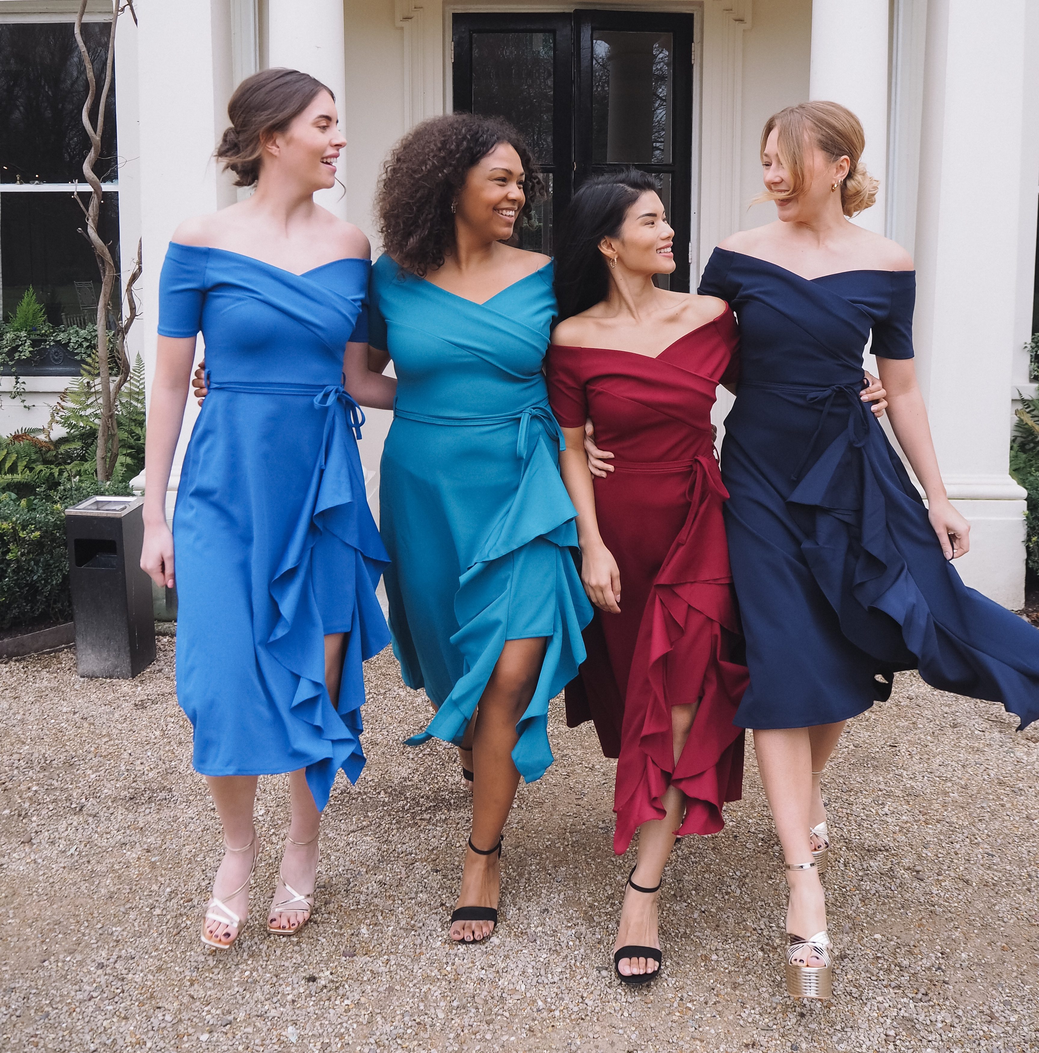
When in doubt, err on the side of caution and choose colors that are universally flattering and appropriate for formal or semi-formal events. Muted tones, pastels (outside of white), jewel tones, and sophisticated earth tones are often safe and stylish choices.
- Pastels: Soft blues, pinks, lavenders, and mint greens are beautiful and celebratory.
- Jewel Tones: Emerald green, sapphire blue, amethyst purple, and ruby red (in a more muted shade) offer depth and richness.
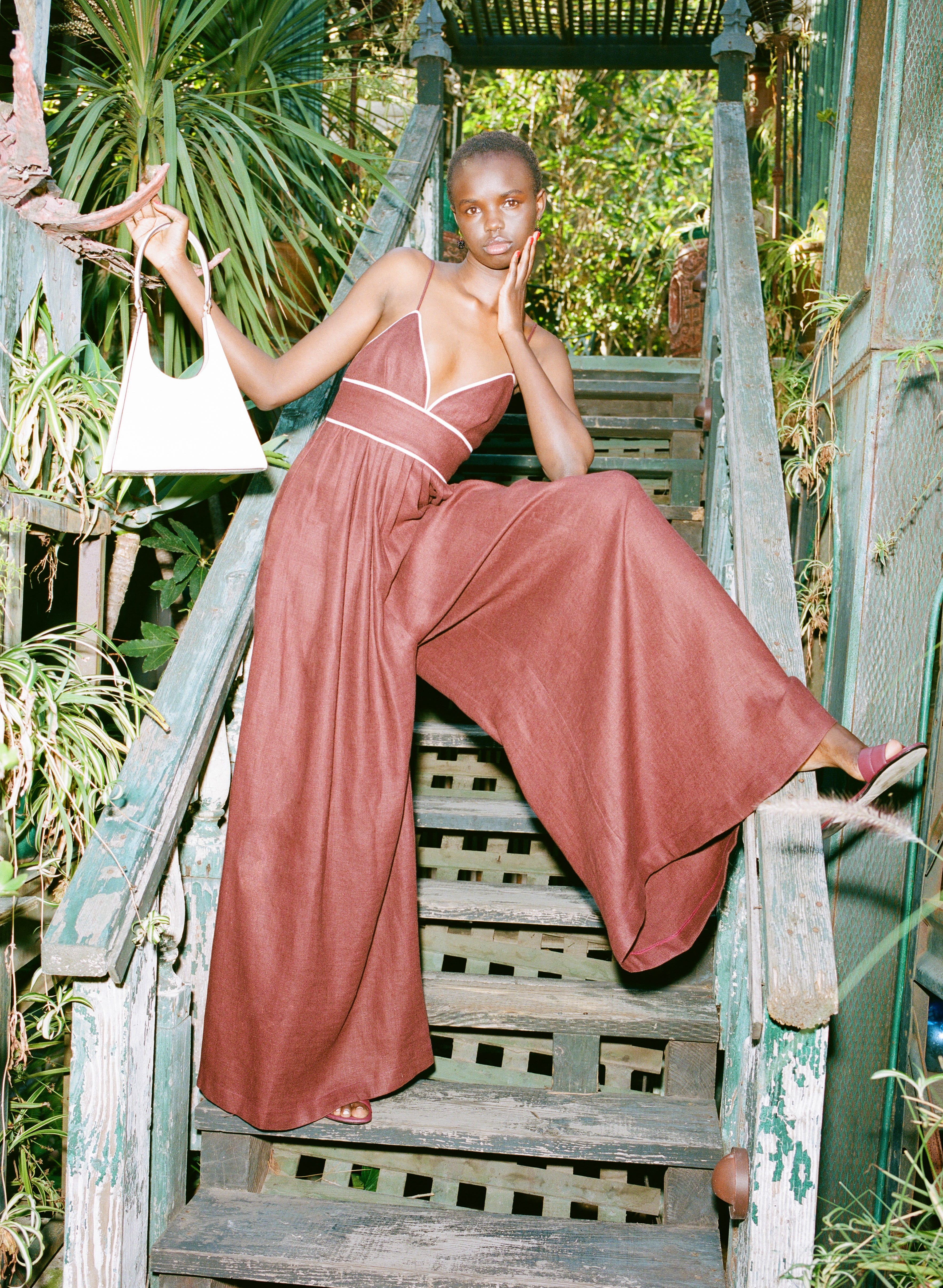
- Earth Tones: Burgundy, deep greens, warm browns, and terracotta can be elegant and sophisticated, particularly for autumn or winter weddings.
- Monochromatic or Neutral Palettes: Well-executed outfits in shades of grey, navy, or beige can be incredibly chic.
If you are unsure about the formality of the wedding or the couple’s preferences, a quick look at their wedding website or a polite inquiry to the couple or their wedding party can provide clarity. It’s always better to ask than to risk an unintended misstep.
H3: The Role of Personal Branding in Wedding Attire
While this article focuses on wedding etiquette, it’s worth noting the parallels to personal branding. The colors you choose to wear, much like the colors you use in your personal branding, communicate something about you. At a wedding, you want your “personal brand” as a thoughtful and respectful guest to shine through. This means selecting attire that is stylish and reflects your personality, but also demonstrates an awareness of the occasion’s significance. Your outfit is a form of non-verbal communication, and at a wedding, the message should be one of celebration, joy, and support for the couple. By avoiding colors that might inadvertently cause distraction or discomfort, you ensure your personal brand on this day is one of grace and good taste.
aViewFromTheCave is a participant in the Amazon Services LLC Associates Program, an affiliate advertising program designed to provide a means for sites to earn advertising fees by advertising and linking to Amazon.com. Amazon, the Amazon logo, AmazonSupply, and the AmazonSupply logo are trademarks of Amazon.com, Inc. or its affiliates. As an Amazon Associate we earn affiliate commissions from qualifying purchases.