
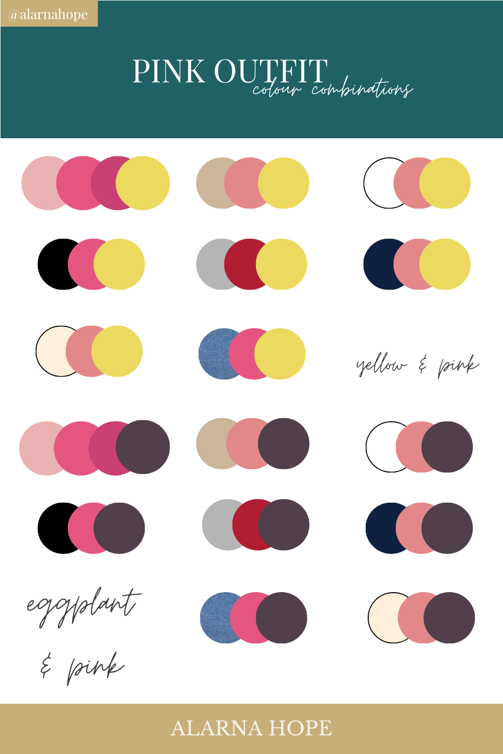
Pink, often associated with sweetness, femininity, and romance, is a surprisingly versatile color that can evoke a range of emotions and aesthetics. Far from being a one-dimensional hue, the right color pairings can elevate pink from saccharine to sophisticated, playful to powerful. Understanding how to effectively combine pink with other colors is a fundamental skill in design, branding, and visual communication. This article delves into the nuanced world of color theory as it applies to pink, exploring harmonious and impactful color palettes that leverage its inherent charm and adaptability. We will examine how different shades of pink interact with various color families, offering insights that are directly applicable to creating compelling brand identities, engaging marketing campaigns, and visually appealing digital assets.
The Psychology and Spectrum of Pink
Before exploring specific color pairings, it’s crucial to understand the diverse nature of pink itself and the psychological impact it carries. Pink is not a single color, but a spectrum that ranges from the palest, almost ethereal blush to the vibrant, attention-grabbing fuchsia. Each shade possesses its own unique personality and demands different complementary or analogous colors to achieve its full potential.
Understanding the Shades of Pink
The perception and application of pink are heavily influenced by its specific hue and saturation.
Pastel Pinks: Softness and Serenity
Pastel pinks, such as baby pink, rose quartz, and blush, exude gentleness, tranquility, and a touch of innocence. These lighter, desaturated versions of pink are often associated with calmness, nurturing, and approachability. In branding, they can create a sense of softness and approachability, ideal for brands targeting younger demographics or those emphasizing a gentle, caring image. Think of the subtle elegance of a well-designed skincare product packaging or the inviting feel of a wellness app interface.
Vibrant Pinks: Energy and Excitement
Brighter, more saturated pinks, like hot pink, fuchsia, and magenta, convey energy, playfulness, passion, and confidence. These shades are bolder and demand attention, making them excellent choices for brands aiming to make a statement, evoke excitement, or inject a sense of youthful exuberance. They are frequently seen in fashion, entertainment, and brands that want to stand out in a crowded market. In digital design, these colors can be used strategically to highlight calls to action or to create visually dynamic interfaces.
Muted and Dusty Pinks: Sophistication and Maturity
Deeper, desaturated, or “dusty” pinks, such as dusty rose, salmon pink, and mauve, offer a more sophisticated and mature interpretation of the color. These shades often carry an air of vintage charm, understated elegance, and groundedness. They are particularly effective in brands that aim for a refined, artisanal, or timeless appeal. These pinks can also lend a sense of warmth and comfort, making them suitable for brands in the home décor or lifestyle sectors.
The Emotional Resonance of Pink
The psychological impact of pink is widely recognized. It’s often linked to feelings of love, compassion, and empathy. In a branding context, this can be leveraged to build emotional connections with an audience. However, depending on the shade and its application, pink can also symbolize confidence, power, and even rebellion. For instance, a strong, vibrant pink can be empowering, challenging traditional gender stereotypes. Understanding these emotional nuances allows for more strategic and effective color choices in brand development.
Harmonious Color Pairings for Pink
The art of color matching lies in understanding relationships between colors. Complementary colors create high contrast and visual excitement, while analogous colors offer a sense of harmony and unity. When pairing colors with pink, we can explore these relationships to achieve desired brand aesthetics and communication goals.
Complementary and Near-Complementary Palettes: Creating Contrast and Vibrancy
Complementary colors sit opposite each other on the color wheel, creating a strong visual contrast when placed side-by-side. For pink, its most direct complementary color is green. However, the specific shade of green will significantly influence the outcome.
Pink and Green: A Classic Pairing with Nuance
-
Vibrant Pink with Emerald or Forest Green: This pairing offers a bold and sophisticated contrast. Emerald green can bring out the richness of deeper pinks like magenta, while forest green provides a grounding, natural element. This combination is excellent for brands that want to convey a sense of luxury, nature, or a fusion of vitality and stability. Think of high-end fashion brands or eco-conscious businesses that want to appear both energetic and responsible.
-
Pastel Pink with Mint or Sage Green: This creates a softer, more refreshing, and harmonious contrast. Mint green offers a cool, airy feel that complements the sweetness of pastel pink, while sage green adds a touch of organic, earthy sophistication. This palette is ideal for brands in the beauty, wellness, or home goods sectors that aim for a calming, natural, and aesthetically pleasing presentation.
-
Dusty Pink with Olive or Moss Green: This combination leans towards a vintage, earthy, and refined aesthetic. Olive green provides a subtle, natural undertone that harmonizes beautifully with the muted tones of dusty pink, creating an atmosphere of understated elegance and timelessness. This pairing is well-suited for artisanal brands, handcrafted products, or businesses with a focus on heritage and quality.
Pink and Yellow/Orange: Warmth and Energy
While not direct complements, certain shades of yellow and orange can create vibrant and cheerful pairings with pink.
-
Hot Pink with Bright Yellow or Gold: This is a high-energy, celebratory combination that exudes boldness and optimism. The warmth of yellow amplifies the intensity of hot pink, creating a dynamic and attention-grabbing palette. This can be highly effective for brands aiming for a playful, festive, or energetic brand image, such as in the event planning or children’s entertainment industries.
-
Blush Pink with Peach or Coral: This creates a softer, warmer, and more inviting feel. Peach and coral share undertones with pink, resulting in a harmonious blend that feels both friendly and sophisticated. This palette is perfect for brands in the lifestyle, fashion, or food and beverage industries that want to evoke warmth, approachability, and a sense of effortless style.
Analogous Palettes: Creating Harmony and Flow
Analogous colors are adjacent to each other on the color wheel, meaning they share a common hue and create a sense of visual unity and harmony. For pink, these often include reds and purples.
Pink and Purple: From Royal to Romantic

-
Fuchsia with Violet or Amethyst: This pairing offers a rich, luxurious, and somewhat exotic feel. The boldness of fuchsia is beautifully complemented by the depth of violet, creating a palette that suggests creativity, passion, and a touch of mystery. This combination can be powerful for brands in the arts, entertainment, or luxury goods sectors.
-
Rose Pink with Lavender or Lilac: This combination evokes a romantic, serene, and ethereal mood. Lavender and lilac share a soft, cool undertone that harmonizes perfectly with the gentle nature of rose pink. This palette is ideal for brands in the wedding industry, beauty, or those aiming for a dreamy, whimsical aesthetic.
-
Coral Pink with Red-Violet: This offers a warmer, more dynamic analogous palette. The vibrancy of coral pink is enhanced by the depth of red-violet, creating a stimulating and passionate feel. This can be effective for brands in fashion or those aiming to convey energy and allure.
Pink and Red: Passion and Power
- Any Pink with Crimson or Burgundy: Pairing pink with deeper reds creates a sophisticated and mature palette that conveys passion, confidence, and a touch of luxury. The intensity of red is softened by the presence of pink, resulting in a balanced yet impactful combination. This is particularly effective for brands that want to project strength, elegance, and a bold statement without being overly aggressive.
Neutral Pairings for Pink: Balancing and Grounding
While vibrant and analogous pairings are exciting, neutrals provide a crucial balance, allowing pink to shine without overwhelming the viewer. Neutrals also help to define the overall mood and sophistication of a color palette.
Pink and White: Purity and Sophistication
- Any Pink with Crisp White: White is the quintessential pairing for pink, creating a clean, fresh, and timeless aesthetic. It allows the specific shade of pink to stand out and be fully appreciated. Pastel pinks with white evoke innocence and purity, while vibrant pinks with white create a modern, chic, and impactful look. This combination is versatile and can be used across almost all industries, from fashion and cosmetics to technology and lifestyle brands.
Pink and Gray: Modern and Chic
-
Dusty Pink with Charcoal Gray: This pairing creates a sophisticated, modern, and understatedly elegant look. Charcoal gray provides a strong, grounding contrast that prevents dusty pink from appearing too sweet. This combination is excellent for brands aiming for a contemporary, urban, or minimalist aesthetic, particularly in fashion, architecture, or design firms.
-
Blush Pink with Light or Medium Gray: This offers a softer, more subtle contrast. Light grays can create a dreamy, ethereal feel with blush pink, while medium grays provide a gentle grounding. This palette is well-suited for brands in the interior design, home décor, or wellness sectors that seek to create a calming and stylish environment.
Pink and Beige/Cream: Warmth and Natural Elegance
- Any Pink with Beige or Cream: These warm neutrals create a soft, inviting, and natural aesthetic. Beige and cream tones complement the warmth of many pink shades, resulting in a harmonious and approachable palette. This is particularly effective for brands in the artisanal, handcrafted, or lifestyle categories, conveying a sense of comfort, quality, and understated luxury.
Pink and Black: Boldness and Drama
-
Hot Pink or Fuchsia with Black: This is a high-impact, dramatic, and undeniably chic pairing. Black provides a strong, grounding foundation that allows vibrant pinks to pop with maximum effect. This combination exudes confidence, power, and a sense of edgy sophistication, making it ideal for fashion brands, nightlife, or any brand that wants to make a bold, memorable statement.
-
Pastel Pink with Black: While less common, pastel pink with black can create an interesting juxtaposition of soft and strong elements. This can be used to subvert expectations and create a unique, contemporary feel.
Strategic Application of Pink in Branding and Design
Understanding color theory is only the first step; the strategic application of pink in branding and design is what truly unlocks its potential. The choice of pink and its accompanying colors should always be driven by the brand’s identity, target audience, and overall communication objectives.
Building Brand Identity with Pink
Pink can be a powerful tool for shaping brand perception. A brand that uses soft pastels might aim for an image of gentleness, care, and trustworthiness, appealing to consumers seeking comfort and simplicity. Conversely, a brand utilizing hot pink or magenta is likely projecting energy, innovation, and a youthful, vibrant spirit.
Conveying Specific Brand Values
- Trust and Reliability: Lighter, more muted pinks combined with blues or grays can evoke trust and a sense of calm reliability.
- Innovation and Creativity: Vibrant pinks paired with electric blues or sharp yellows can communicate a forward-thinking, creative, and dynamic brand.
- Luxury and Exclusivity: Dusty rose or deep magenta with gold, black, or deep jewel tones can create an aura of opulence and sophistication.
- Playfulness and Youthfulness: Bright pinks with cheerful yellows, oranges, or teals can convey fun, accessibility, and a youthful appeal.
Digital Design Considerations for Pink
In digital interfaces, color plays a critical role in user experience and engagement. Pink can be used strategically to guide users, enhance readability, and create a visually appealing environment.
User Interface (UI) and User Experience (UX)
- Call to Action (CTA) Buttons: Vibrant pinks can be highly effective for CTAs, drawing the user’s eye and encouraging interaction, provided they have sufficient contrast with the background.
- Highlighting Important Information: Pink can be used to subtly draw attention to key text or elements without being jarring, especially when paired with a neutral background.
- Creating Brand Consistency: Ensuring the chosen pink aligns with the overall brand palette across all digital touchpoints is essential for a cohesive brand experience.
- Accessibility: When using pink, especially in text or interactive elements, it’s vital to ensure sufficient contrast ratios with background colors to meet accessibility standards for users with visual impairments. This often means pairing pink with darker neutrals or using it in larger, more prominent elements.

Website and App Design
- Backgrounds and Accents: Soft pinks can create inviting backgrounds for websites or apps, while bolder pinks can be used for accents, icons, or decorative elements to add personality and visual interest.
- Illustrations and Graphics: Pink is a popular choice in digital illustrations and graphics for its versatility in conveying different moods, from whimsical to modern.
- Photography: Incorporating pink elements in product photography or imagery can help establish a brand’s aesthetic and attract its target audience.
By thoughtfully considering the shade of pink, its complementary and analogous partners, and its strategic placement, brands and designers can harness the power of this multifaceted color to create compelling, memorable, and effective visual communications. Pink, when used with intention and understanding, is far more than just a pretty color; it’s a strategic tool for building connections and conveying meaning.
aViewFromTheCave is a participant in the Amazon Services LLC Associates Program, an affiliate advertising program designed to provide a means for sites to earn advertising fees by advertising and linking to Amazon.com. Amazon, the Amazon logo, AmazonSupply, and the AmazonSupply logo are trademarks of Amazon.com, Inc. or its affiliates. As an Amazon Associate we earn affiliate commissions from qualifying purchases.