
In the vast and ever-evolving landscape of branding, color is not merely an aesthetic choice; it’s a powerful communicator, a silent architect of perception, and a fundamental element in establishing a distinct corporate identity. The ability to evoke specific emotions, convey certain values, and resonate with target audiences hinges significantly on the strategic selection and application of color. Among the spectrum of hues, dark blue occupies a unique and highly coveted position, exuding an aura of trust, professionalism, stability, and sophistication. But what precisely constitutes this deeply resonant shade, and more importantly, what color combinations can be artfully blended to achieve its compelling depth within the context of brand design? This exploration delves into the chromatic alchemy that defines dark blue and its crucial role in crafting a compelling brand identity.

The Psychology and Perception of Dark Blue in Branding
Dark blue is far more than a simple color on a chart; it carries a profound psychological weight that brands can leverage to their advantage. Its inherent characteristics make it a perennial favorite across diverse industries, from finance and technology to healthcare and corporate services. Understanding these underlying perceptions is the first step in wielding dark blue effectively.
Trust, Reliability, and Authority
The primary association with dark blue is one of unwavering trust and reliability. Think of the uniforms of police officers, pilots, or even the deep hues of the ocean and the night sky – all evoke a sense of dependability and order. In the branding world, this translates into a powerful message of stability and competence. Brands that utilize dark blue effectively are perceived as being steadfast, secure, and having a proven track record. This is particularly critical for financial institutions, insurance companies, and technology firms where customers place a premium on security and trustworthiness. The sheer depth of dark blue suggests a solid foundation, something that cannot be easily shaken, thus fostering a sense of confidence in the brand’s offerings.
Professionalism and Sophistication
Beyond trust, dark blue is synonymous with professionalism and a polished, sophisticated image. It’s a color that rarely feels out of place in formal settings and is often the go-to choice for businesses aiming to project an air of seriousness and expertise. This sophisticated quality makes dark blue ideal for brands that want to be perceived as leaders in their field, offering high-quality products or services. It speaks to a mature and considered approach, suggesting that the brand has invested time and thought into its operations and customer experience. The subtle elegance of dark blue can elevate a brand’s perceived value without resorting to overtly flashy or ostentatious design elements.
Calmness and Serenity
In contrast to more energetic colors, dark blue possesses a calming and serene quality. This can be incredibly beneficial for brands looking to alleviate customer anxiety or foster a sense of peace and well-being. Industries such as healthcare, wellness, and even certain aspects of travel can find dark blue to be a valuable asset in their visual identity. It promotes a sense of clarity and focus, encouraging contemplation rather than impulsive action. This subtle psychological effect can contribute to a more positive and less stressful customer journey, enhancing the overall brand experience.
The Chromatic Foundation: What Colors Constitute Dark Blue?
Understanding how to create dark blue is paramount for designers aiming for precise brand representation. It’s not a single monolithic hue but rather a sophisticated blend, a gradient of possibilities that can be achieved through various combinations. At its core, dark blue is a blue hue that has been significantly desaturated and darkened. This darkening can be achieved by either adding black or a darker, less saturated complementary color.
The Dominant Blue Base
The foundation of any dark blue is, of course, blue itself. However, the specific shade of blue used as a base will influence the final outcome. Common blue bases for dark blues include:
- Navy Blue: Often considered the archetypal dark blue, navy is a deep, rich blue that leans towards black without being entirely devoid of its blue characteristics. It’s a classic choice that embodies formality and authority.
- Midnight Blue: As the name suggests, this is an even deeper, more intense shade of blue, approaching the darkness of the night sky. It conveys a sense of mystery and profound depth.
- Prussian Blue: A historical pigment known for its intense, dark blue hue with a slight greenish undertone. In digital design, this translates to a dark blue that can have a subtle, sophisticated character.
- Indigo: A deep, vibrant blue that sits between blue and violet on the color spectrum. When darkened, indigo can yield a rich, slightly purplish dark blue, adding a touch of regality.
The selection of the base blue is critical. A vibrant, electric blue, when darkened, will produce a different kind of dark blue than a softer, more muted blue. The purity and saturation of the initial blue will significantly impact the final shade.
The Art of Darkening: Adding Depth and Shadow
The transformation from a mid-tone blue to a true dark blue is achieved through the careful addition of other colors. This process is not simply about diluting a color but about enriching its depth and complexity.
- The Role of Black: The most straightforward method of darkening a blue is by adding black. This desaturates the blue, pushing it towards a darker tone. However, an indiscriminate addition of black can result in a muddy or lifeless color. The key is moderation and understanding how black interacts with the specific blue hue. The goal is to create a deep, rich shadow rather than a dull, flat tone.
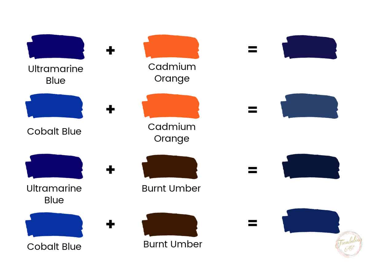
- The Power of Complementary Colors: Another highly effective, and often more nuanced, method of darkening blue is by introducing its complementary color, which is orange. When orange is added in a very desaturated and dark form, it doesn’t create a jarring contrast but rather a subtle muting and deepening of the blue. This technique can create a dark blue with a more complex undertone, preventing it from appearing too stark or artificial. The “darkness” here comes from the neutralization of the blue’s vibrancy and the introduction of a shadow-like quality.
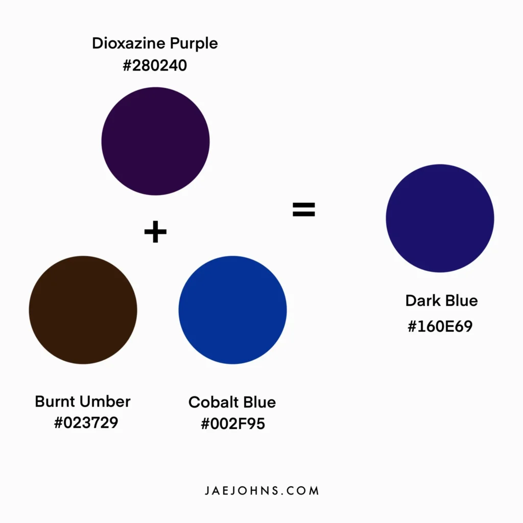
- Subtle Earth Tones: In some cases, very small amounts of desaturated browns or even deep greens can be introduced to a blue to achieve specific dark blue variations. These additions are subtle and aim to add a naturalistic depth or a slightly muted, sophisticated character, moving the dark blue away from a pure chromatic tone and towards a more grounded, earthy feel.
The precise ratio of these darkening agents to the base blue is what differentiates various shades of dark blue, from a deep navy to an almost-black indigo. This intricate interplay of hues is where the art of color mixing truly shines in brand design.
Designing with Dark Blue: Strategic Applications in Brand Identity
Once the nuanced creation of dark blue is understood, its strategic application in brand identity becomes a powerful tool. Its versatility allows it to be a primary brand color, an accent, or a foundation, each with distinct implications for brand perception.
Dark Blue as a Primary Brand Color: Establishing Authority and Trust
When dark blue serves as the primary color in a brand’s palette, it immediately communicates a message of strong authority, reliability, and inherent trustworthiness. This is a bold statement that anchors the brand in a space of stability and professionalism.
- Logo Design: A dark blue logo can command attention without being loud. It suggests a company that is established, reputable, and confident in its offerings. Think of major financial corporations or established tech giants that utilize dark blue prominently. The logo becomes an instant visual cue for these desired brand attributes.
- Website and App Interfaces: A dark blue background or primary interface color can create a sophisticated and user-friendly experience. It’s particularly effective for platforms that require focused attention, such as online banking portals or productivity software. The calming nature of dark blue reduces visual clutter and promotes a sense of order.
- Marketing Collateral: Business cards, brochures, and presentations in dark blue exude professionalism. When paired with appropriate typography and imagery, it reinforces the brand’s image as serious, competent, and dependable.
Dark Blue as an Accent Color: Adding Sophistication and Depth
Even when not the dominant hue, dark blue can significantly enhance a brand’s visual identity as an accent color. It offers a way to introduce sophistication and depth without overwhelming other elements.
- Highlighting Key Information: In designs where lighter colors dominate, a touch of dark blue can be used to draw the eye to crucial elements like calls to action, important statistics, or headings. This strategic use of accent ensures that the audience’s attention is guided effectively.
- Adding a Touch of Elegance: For brands aiming for a premium or luxurious feel, dark blue accents can provide a sophisticated counterpoint to lighter, more airy palettes. It adds a layer of depth and intrigue, suggesting hidden value and a refined aesthetic.
- Creating Contrast and Visual Interest: When used against brighter or more muted colors, dark blue can create a striking contrast that adds visual interest and dynamism to a design without compromising its overall tone.
Pairing Dark Blue: Creating Harmonious and Impactful Palettes
The effectiveness of dark blue in branding is often amplified by the colors it is paired with. The choice of complementary, analogous, or neutral colors can significantly alter the overall mood and message of the brand identity.
- With Whites and Light Grays: This classic pairing creates a crisp, clean, and highly professional look. It embodies clarity, simplicity, and a sense of order. This combination is ubiquitous in corporate branding for a reason – it’s consistently effective.
- With Golds and Silvers: To convey luxury, prestige, and exclusivity, dark blue pairs exceptionally well with metallic accents. Gold adds a touch of opulence and traditional wealth, while silver offers a more modern, sleek, and futuristic feel.
- With Brighter Blues and Greens: For brands that want to evoke trustworthiness but also a sense of innovation or nature, combining dark blue with lighter, more vibrant blues or fresh greens can strike a balance. This can communicate reliability coupled with forward-thinking or environmental consciousness.
- With Warm Tones (Used Sparingly): While dark blue itself is cool, a carefully introduced warm accent, such as a muted orange or a rich brown, can create a more approachable and grounded feel. This combination should be approached with caution to maintain the inherent stability of the dark blue.
In conclusion, the ability to “make” dark blue is not just a technical exercise in color mixing; it’s an art form that underpins successful brand identity. By understanding the psychological resonance of this powerful hue and mastering the chromatic combinations that bring it to life, brands can craft visual identities that are not only aesthetically pleasing but also deeply communicative, building trust, projecting professionalism, and ultimately, forging lasting connections with their audiences. The strategic use of dark blue, born from a nuanced understanding of its constituent colors, is an indispensable tool in the modern brand designer’s arsenal.
aViewFromTheCave is a participant in the Amazon Services LLC Associates Program, an affiliate advertising program designed to provide a means for sites to earn advertising fees by advertising and linking to Amazon.com. Amazon, the Amazon logo, AmazonSupply, and the AmazonSupply logo are trademarks of Amazon.com, Inc. or its affiliates. As an Amazon Associate we earn affiliate commissions from qualifying purchases.