In the realm of digital design and branding, the concept of “making” a color, especially a foundational one like blue, delves beyond simple mixing. It’s about strategic creation, meticulous calibration, and understanding the psychological and technical underpinnings that allow us to manifest specific shades of blue for maximum impact. While physically mixing pigments is a tangible process, in the digital world, “making blue” involves a sophisticated interplay of code, design principles, and brand objectives. This article explores the nuanced ways in which brands, through technology and design, “make” their signature blues, transforming abstract concepts into visually compelling identities.

The Algorithmic Genesis of Digital Blues
The creation of any digital color, including blue, is fundamentally rooted in the mathematical and technological frameworks that govern our screens. Unlike the additive or subtractive mixing of physical paints, digital color is constructed through the manipulation of light. This process, while seemingly straightforward, is deeply intertwined with technological advancements and the sophisticated tools that designers and developers employ. Understanding these mechanisms is key to mastering the art of digitally “making” blue.
The RGB and Hexadecimal Foundations
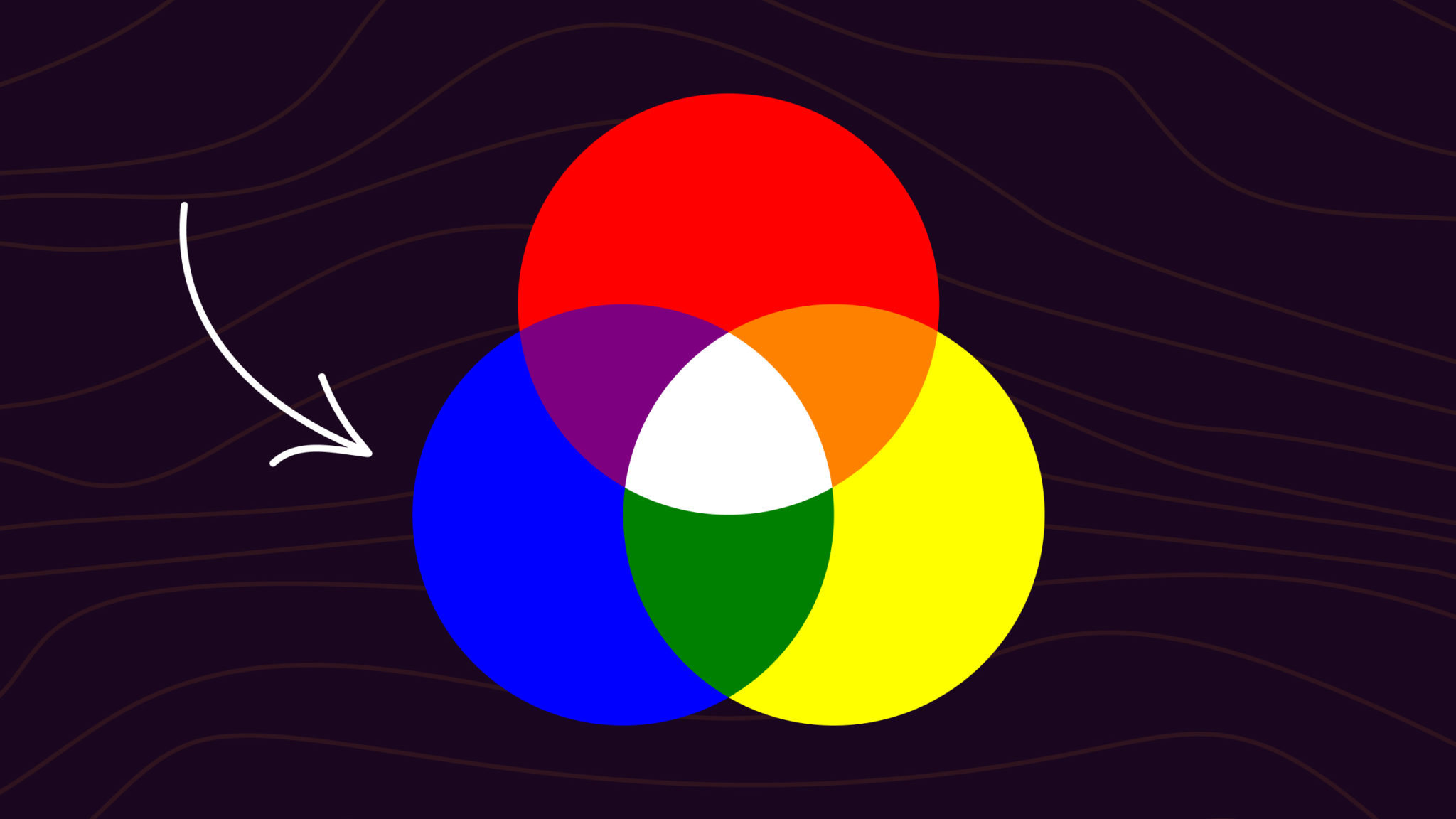
At the core of digital color representation lies the RGB (Red, Green, Blue) color model. This additive color system posits that all colors visible to the human eye can be created by combining varying intensities of red, green, and blue light. For blue, this means that the intensity of the blue channel is paramount, while the red and green channels are kept at their minimum (or zero) to achieve a pure blue.
In the hexadecimal color system, commonly used in web design and development, each color channel (Red, Green, Blue) is represented by a two-digit hexadecimal number ranging from 00 to FF (equivalent to 0 to 255 in decimal). A pure blue would theoretically be represented as #0000FF, where the first pair signifies zero red, the second pair zero green, and the third pair maximum blue intensity. However, this pure, unadulterated blue is rarely used in professional branding due to its starkness and potential for visual fatigue.
The true artistry in “making blue” digitally lies in the subtle adjustments to these values. By introducing small amounts of red or green, designers can shift the perception of the blue towards warmer or cooler tones. For instance, adding a touch of green creates a cyan-like blue, while adding a touch of red can result in a more violet-leaning blue. These minute alterations, governed by precise hexadecimal codes, are the building blocks of a brand’s unique blue.
Color Spaces and Their Impact on Perception
Beyond the fundamental RGB model, digital color also operates within various color spaces. These spaces define the range of colors that a particular device or standard can reproduce. Common color spaces include sRGB, Adobe RGB, and P3. The choice of color space significantly impacts how a brand’s blue will be perceived across different devices and platforms.
-
sRGB (Standard Red Green Blue): This is the most widely adopted color space for the web and many consumer devices. While it offers broad compatibility, its gamut (the range of colors it can display) is relatively limited. Brands aiming for broad accessibility often design their blues within the sRGB space.
-
Adobe RGB: This color space offers a wider gamut than sRGB, particularly in the cyan-green and red-orange regions. Designers working with professional photography or print often utilize Adobe RGB to ensure a richer and more nuanced representation of colors, including blues, that might be lost in the sRGB space.
-
P3: Developed by Apple, the P3 color space offers an even wider gamut than Adobe RGB, encompassing more vibrant and saturated colors. Devices supporting P3, such as modern smartphones and displays, can render blues with greater depth and brilliance.
The “making” of a brand’s blue, therefore, involves not only selecting the correct RGB or hexadecimal values but also considering which color space is most appropriate for its intended application and target audience. A brand that prioritizes vibrant visual experiences on high-end displays might design its blues with P3 in mind, understanding that these shades will be rendered with exceptional fidelity.
The Strategic Crafting of Brand Blues
In the competitive landscape of branding, a signature blue is more than just a color; it’s a strategic asset. It evokes emotions, conveys personality, and fosters recognition. The process of “making” this specific blue is a deliberate and often iterative endeavor, guided by market research, psychological principles, and a deep understanding of the brand’s core message.
Evoking Emotion and Psychology Through Hue
The psychological impact of blue is well-documented. It is often associated with trust, stability, calmness, intelligence, and professionalism. However, different shades of blue evoke subtly different emotional responses.
-
Light Blues (e.g., Sky Blue, Baby Blue): These hues often convey feelings of serenity, peace, openness, and approachability. They can be used by brands aiming for a gentle, optimistic, or youthful image.
-
Medium Blues (e.g., Royal Blue, Azure): These blues strike a balance between vibrancy and calmness. They suggest reliability, authority, and sophistication. Many corporate brands leverage these blues to project stability and trustworthiness.
-
Dark Blues (e.g., Navy Blue, Midnight Blue): These deep, rich blues are synonymous with power, authority, elegance, and luxury. They are often employed by financial institutions, luxury brands, or organizations that want to convey a sense of gravitas and exclusivity.
- Electric/Bright Blues (e.g., Cyan, Cerulean): These more vivid blues can evoke energy, innovation, and modernity. They are often used by tech companies or brands seeking to appear cutting-edge and dynamic.
When a brand “makes” its blue, it’s not just picking a shade; it’s selecting a hue that is intended to elicit a specific emotional response from its target audience. This selection is a critical part of the brand’s overall communication strategy, aiming to align the visual identity with the desired brand perception.
The Role of Digital Tools in Blue Calibration
The creation and maintenance of a consistent brand blue across all digital touchpoints are heavily reliant on sophisticated design and development tools. These tools enable precise calibration and ensure that the intended shade of blue is replicated with accuracy.
-
Color Pickers and Palettes: Software like Adobe Photoshop, Illustrator, and Figma provide advanced color pickers that allow designers to select precise RGB and hexadecimal values. They also facilitate the creation of comprehensive color palettes, ensuring that all shades within a brand’s visual system complement the primary blue.
-
Style Guides and Design Systems: For larger organizations, comprehensive style guides and design systems are indispensable. These documents meticulously define brand colors, including the exact specifications for the primary blue, along with its variations, tints, and shades. They often include hex codes, RGB values, and sometimes even CMYK and Pantone equivalents for consistency across digital and print media. Design systems further codify these elements into reusable components, ensuring that the brand blue is applied consistently across all digital products and platforms.
-
Color Management Software: For brands that require extremely precise color reproduction, color management software and hardware are employed. This ensures that the blue rendered on a designer’s monitor is as close as possible to the intended output on various devices and even in print. This meticulous approach to calibration is what allows a brand to truly “make” its blue, ensuring its integrity and impact.
Beyond the Screen: Ensuring Blue Consistency Across Platforms
The challenge in the digital age is not just in creating a perfect blue for one screen, but in ensuring that this “made” blue remains consistent and impactful across an ever-expanding ecosystem of devices, platforms, and applications. This requires a strategic understanding of how color behaves in different digital environments and a commitment to rigorous brand governance.
The Challenge of Cross-Platform Color Fidelity
Different devices have different display technologies, color calibration, and capabilities. A blue that looks vibrant on an OLED smartphone might appear dull on an older LCD monitor. This inherent variability in color fidelity poses a significant challenge for brands that rely on a specific shade of blue for recognition and trust.
-
Device Variations: Smartphones, tablets, laptops, desktop monitors, smart TVs – each can render colors differently. Factors like screen brightness, contrast settings, and ambient lighting further influence the perceived color.
-
Browser Differences: While web standards aim for consistency, subtle differences in how web browsers interpret and render color information can lead to minor variations.
-
Operating System Settings: Users can often adjust display settings on their devices, including color profiles, which can alter how colors are displayed.
To “make” blue consistently, brands must develop a deep understanding of these potential discrepancies and implement strategies to mitigate them. This often involves testing the brand blue on a range of devices and platforms to identify any significant deviations.

Implementing Robust Brand Governance for Digital Blue
Effective brand governance is paramount to maintaining the integrity of a brand’s digital blue. This involves establishing clear guidelines and implementing systems that ensure consistent application.
-
Defining Primary and Secondary Blues: Brands often define a primary brand blue, along with secondary blues that complement it. These are meticulously documented with precise hexadecimal and RGB values.
-
Creating Style Guides and Brand Manuals: Comprehensive style guides are essential for communicating the correct usage of the brand blue. These guides should include visual examples, forbidden usages, and specifications for different digital contexts (e.g., web, mobile apps, social media).
-
Leveraging Design Systems: As mentioned earlier, design systems are powerful tools for ensuring consistency. By codifying brand colors into reusable components, they eliminate the need for individual designers to manually input color values, reducing the risk of errors.
-
Regular Audits and Updates: The digital landscape is constantly evolving. Brands should conduct regular audits of their digital assets to ensure that their blue remains consistent and that any new platforms or technologies are integrated seamlessly without compromising the brand’s visual identity. This iterative process of “making” and maintaining the brand blue is an ongoing commitment to digital excellence.
In conclusion, “making blue” in the digital realm is a sophisticated process that extends far beyond simple color mixing. It involves a deep understanding of color theory, technological capabilities, and strategic brand objectives. By meticulously calibrating digital palettes, leveraging advanced tools, and implementing robust governance, brands can effectively “make” their signature blues, ensuring they resonate with audiences, evoke the desired emotions, and build lasting recognition across the complex digital ecosystem.
aViewFromTheCave is a participant in the Amazon Services LLC Associates Program, an affiliate advertising program designed to provide a means for sites to earn advertising fees by advertising and linking to Amazon.com. Amazon, the Amazon logo, AmazonSupply, and the AmazonSupply logo are trademarks of Amazon.com, Inc. or its affiliates. As an Amazon Associate we earn affiliate commissions from qualifying purchases.