The simple question, “What color is mocha?” belies a surprisingly complex and impactful reality within the realm of branding and design. Mocha, a term often associated with a rich, warm beverage, translates into a distinct visual language that brands leverage to evoke specific feelings, connect with target audiences, and forge lasting identities. This article will explore the multifaceted nature of mocha as a brand color, dissecting its visual spectrum, its psychological implications, and its strategic application across diverse industries. Far from being a singular shade, mocha is a palette of possibilities, a sophisticated descriptor that can be manipulated and interpreted to serve a brand’s unique objectives.

The Spectrum of Mocha: Beyond the Coffee Cup
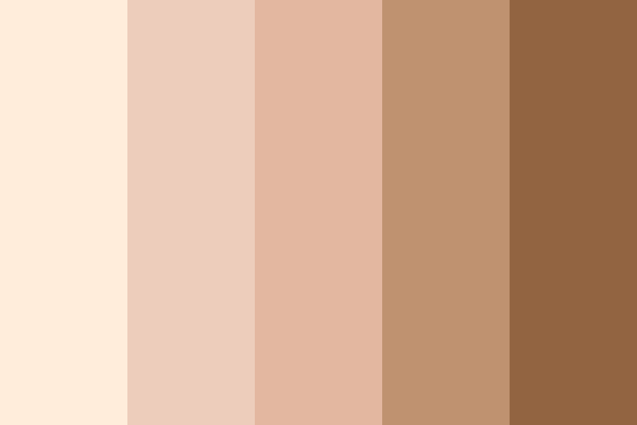
When we speak of “mocha” in a branding context, we are not referring to a single, Pantone-defined hue. Instead, it encompasses a range of warm, earthy tones that draw their inspiration from the beloved coffee and chocolate beverage. This inherent flexibility is a significant asset, allowing brands to tailor the precise shade to their desired impact.
Understanding the Core Elements: Brown and Red-Brown Dominance
At its heart, mocha as a brand color is rooted in variations of brown. However, it’s not the stark, utilitarian brown of industrial materials. Mocha possesses a warmth and depth that distinguishes it. This warmth is often achieved through undertones of red, orange, or even a subtle hint of purple, creating a more complex and inviting hue.
- The “Brown” Foundation: The dominant component of mocha is, undeniably, brown. This can range from a light, creamy taupe reminiscent of steamed milk to a deep, almost espresso-like richness. These browns evoke feelings of stability, reliability, earthiness, and naturalness. They are grounded colors, suggesting tradition and a sense of permanence.
- The “Red-Brown” Infusion: What elevates a simple brown to “mocha” is the infusion of red or reddish-brown tones. These undertones introduce a layer of sophistication, warmth, and even a touch of sensuality. Think of the subtle blush on a perfectly roasted coffee bean or the rich glaze on dark chocolate. These red-brown elements can also convey a sense of energy, passion, and a premium quality.
- Nuances and Variations: The beauty of mocha lies in its adaptability. Brands can play with:
- Lightness and Darkness: A pale, creamy mocha can feel airy, sophisticated, and minimalist, often seen in luxury skincare or high-end fashion. Conversely, a deep, dark mocha exudes opulence, strength, and a sense of indulgence, suitable for premium food and beverage brands or sophisticated interior design.
- Saturation: A highly saturated mocha will appear bold and impactful, demanding attention. A desaturated mocha, on the other hand, will offer a softer, more understated elegance.
- Undertones: A mocha with more orange undertones will feel warmer and more energetic, while a mocha with hints of purple might lean towards a more muted, chic, and potentially mysterious aesthetic.
The Influence of Context: From Beverage to Brand Essence
The original association of mocha with a comforting, indulgent beverage plays a crucial role in its branding power. This association is not accidental; it’s a deliberate choice by brands seeking to harness the positive emotions and sensory experiences linked to coffee and chocolate.
- Sensory Evocation: The color mocha directly taps into our sensory experiences. It reminds us of the aroma of freshly brewed coffee, the velvety texture of chocolate, and the comforting warmth of a favorite mug. This sensory connection can create an immediate emotional resonance with consumers.
- Indulgence and Comfort: Mocha is often perceived as a color of indulgence, pleasure, and comfort. This makes it an ideal choice for brands in the food and beverage sector, especially those offering premium treats, artisanal coffees, or gourmet chocolates. It promises a moment of escape, a treat for the senses.
- Sophistication and Luxury: When applied with a refined touch, mocha can also convey a sense of sophistication and understated luxury. It’s a color that speaks of quality without being ostentatious. This is why it finds favor in high-end fashion, premium cosmetics, and luxury lifestyle brands. It suggests a discerning taste and an appreciation for the finer things.
The Psychology of Mocha: Decoding Emotional Responses
Colors are not merely visual elements; they are powerful psychological triggers that influence our perceptions, emotions, and behaviors. The color mocha, with its inherent warmth and depth, elicits a distinct set of psychological responses that brands strategically utilize.
Evoking Trust and Stability: The Grounding Effect of Brown
The dominant brown tones within mocha provide a foundational sense of trust and stability. This is a crucial element for brands seeking to build long-term customer relationships and establish themselves as reliable entities.
- Reliability and Dependability: Brown is intrinsically linked to the earth, suggesting a grounded and dependable nature. Brands that use mocha may aim to convey that they are solid, trustworthy, and will consistently deliver on their promises. This can be particularly important for financial institutions, service providers, or businesses dealing with essential goods.
- Naturalness and Authenticity: The earthy quality of mocha can also suggest naturalness and authenticity. This resonates with consumers who are increasingly seeking brands that are transparent, ethically sourced, and in tune with nature. Think of organic food brands, eco-friendly products, or companies that emphasize natural ingredients.
- Maturity and Wisdom: Deeper shades of mocha can also impart a sense of maturity and wisdom. This can be appealing for brands targeting a more discerning audience or those that have a long-standing heritage and a reputation for expertise.
The Warmth of Connection: Red-Brown’s Emotional Resonance
The red-brown undertones in mocha inject a vital element of warmth and emotional connection, transforming the groundedness of brown into something more inviting and engaging.
- Friendliness and Approachability: The warmth associated with mocha makes it an approachable and friendly color. It can create a welcoming atmosphere and encourage interaction, making it ideal for brands that want to foster a sense of community or personal connection with their customers. Coffee shops, cafes, and restaurants often use mocha to create a cozy and inviting ambiance.
- Passion and Enthusiasm: The red-brown hues can also evoke feelings of passion and enthusiasm. This is a powerful tool for brands that want to convey excitement, creativity, or a deep commitment to their craft. It can add a spark of energy without being overly aggressive.
- Sensual and Inviting: The subtle sensuality of mocha, particularly in its richer, darker forms, can create an alluring and inviting impression. This is effective for brands in the beauty, fashion, or gourmet food industries where a touch of allure and desirability is key.
Balancing Sophistication and Approachability: The Mocha Paradox
One of the most compelling aspects of mocha as a brand color is its ability to simultaneously project sophistication and approachability. This delicate balance is a testament to its nuanced nature.
- The “Grown-Up” Appeal: While approachable, mocha rarely feels childish or overly casual. Its depth and richness lend it a certain gravitas, making it a “grown-up” color that appeals to adults seeking quality and refinement.
- Subtle Luxury: Unlike overtly luxurious colors like gold or deep purples, mocha offers a more subtle and understated form of luxury. It suggests discernment and good taste rather than ostentation, making it accessible yet aspirational.
- Versatile Emotional Range: The adaptable nature of mocha allows it to fit a surprisingly wide emotional range. Depending on the specific shade and how it’s implemented, it can convey everything from a cozy, friendly vibe to a chic, sophisticated aura. This versatility is a significant advantage for brands that wish to evolve or appeal to diverse customer segments.
Strategic Application of Mocha in Branding: From Identity to Experience
The effective use of mocha as a brand color goes far beyond simply choosing a shade. It involves a strategic integration into the entire brand experience, from visual identity to the tangible products and services offered.
Visual Identity and Logo Design: Establishing the Core Impression
The primary and most visible application of mocha is within a brand’s visual identity. Its presence in logos, color palettes, and typography sets the initial tone and communicates the brand’s essence to consumers.
- Logo Color Choices: When a brand chooses mocha for its logo, it immediately signals a certain set of attributes. For example, a coffee chain using a rich mocha hue in its logo suggests warmth, quality, and a welcoming atmosphere. A skincare brand opting for a lighter, creamier mocha might be aiming for an image of natural purity and gentle efficacy.
- Brand Color Palettes: Mocha rarely stands alone. It is typically part of a broader brand color palette. Its versatility allows it to be paired with a range of complementary colors. Whites and creams can enhance its warmth and create a sense of spaciousness. Deep greens can evoke a connection to nature and organic qualities. Metallics like rose gold or brushed copper can elevate its sense of luxury. Darker blues or grays can provide a sophisticated contrast.
- Typography and Font Choices: The choice of typography also interacts with the color mocha. Serif fonts can enhance a sense of tradition and gravitas, aligning with deeper mocha tones. Sans-serif fonts can offer a more modern and clean aesthetic, particularly when paired with lighter, more muted mochas.
Product and Packaging Design: Tangible Brand Experience
The physical manifestation of a brand through its products and packaging is a critical touchpoint for consumers. Mocha plays a significant role in shaping the perceived quality and appeal of these tangible elements.
- Food and Beverage Packaging: This is perhaps the most intuitive application of mocha. Brands in the coffee, chocolate, baked goods, and confectionery industries frequently use mocha tones to evoke the flavors and sensory experiences of their products. The color directly communicates taste and desirability.
- Cosmetics and Personal Care: In the beauty industry, mocha can be used to represent natural ingredients, warmth, and a sophisticated, earthy aesthetic. It’s often found in foundations, bronzers, lipsticks, and skincare packaging aiming for a chic, understated elegance.
- Fashion and Accessories: Brands in fashion and accessories might employ mocha to convey a sense of timeless style, natural materials, and understated luxury. It can be found in clothing lines, handbags, shoes, and jewelry, often associated with autumn collections or a bohemian-chic aesthetic.
- Home Goods and Decor: For furniture, textiles, and decorative items, mocha offers a warm, inviting, and grounding presence. It can create a sense of comfort and sophistication in living spaces, aligning with interior design trends that emphasize natural materials and cozy atmospheres.
Marketing and Advertising Campaigns: Communicating Brand Values
Beyond static visuals, mocha is strategically employed in marketing and advertising to convey specific messages and evoke desired emotional responses in consumers.
- Creating an Ambiance: In advertising, mocha can be used to create a specific mood or ambiance. A warm, inviting cafe setting bathed in mocha-toned lighting can convey comfort and community. A luxurious product shot against a mocha backdrop can highlight exclusivity and sophistication.
- Storytelling and Narrative: The color mocha can be woven into brand narratives to enhance storytelling. A brand promoting its artisanal heritage might use rich mocha tones to evoke tradition and craftsmanship. A brand focused on relaxation and self-care might use softer mochas to suggest tranquility and rejuvenation.
- Target Audience Resonance: By understanding the psychological associations with mocha, brands can use it to resonate with specific target audiences. A brand aiming for a mature, discerning demographic might lean towards richer, more complex mocha shades, while a brand targeting a younger, trend-conscious audience might opt for a more modern, desaturated interpretation.
In conclusion, the question “what color is mocha” is not about identifying a single shade but understanding a sophisticated and versatile brand hue. Mocha is a spectrum of warm, earthy tones, deeply rooted in sensory associations and psychological resonance. Brands that strategically harness its power can evoke trust, warmth, sophistication, and a unique sense of indulgent comfort, forging deeper connections with their audiences and establishing enduring visual identities. Its ability to bridge the gap between approachability and luxury makes it a perennial favorite in the ever-evolving landscape of brand design.
aViewFromTheCave is a participant in the Amazon Services LLC Associates Program, an affiliate advertising program designed to provide a means for sites to earn advertising fees by advertising and linking to Amazon.com. Amazon, the Amazon logo, AmazonSupply, and the AmazonSupply logo are trademarks of Amazon.com, Inc. or its affiliates. As an Amazon Associate we earn affiliate commissions from qualifying purchases.