The seemingly simple question of “what color does brown and yellow make?” opens a surprisingly rich avenue for exploration, particularly within the realm of digital branding and marketing. While a child might experiment with crayons to discover the resulting hue, for a brand, understanding color mixing transcends elementary art class. It delves into the psychology of perception, the nuances of digital representation, and the strategic deployment of color to evoke specific emotional responses and solidify brand identity in a crowded digital landscape. This article will navigate this fascinating intersection, demonstrating how the fundamental principles of color theory, when applied to the digital canvas, become powerful tools for brand differentiation and connection.
The Science and Art of Color Mixing: From Pigment to Pixels
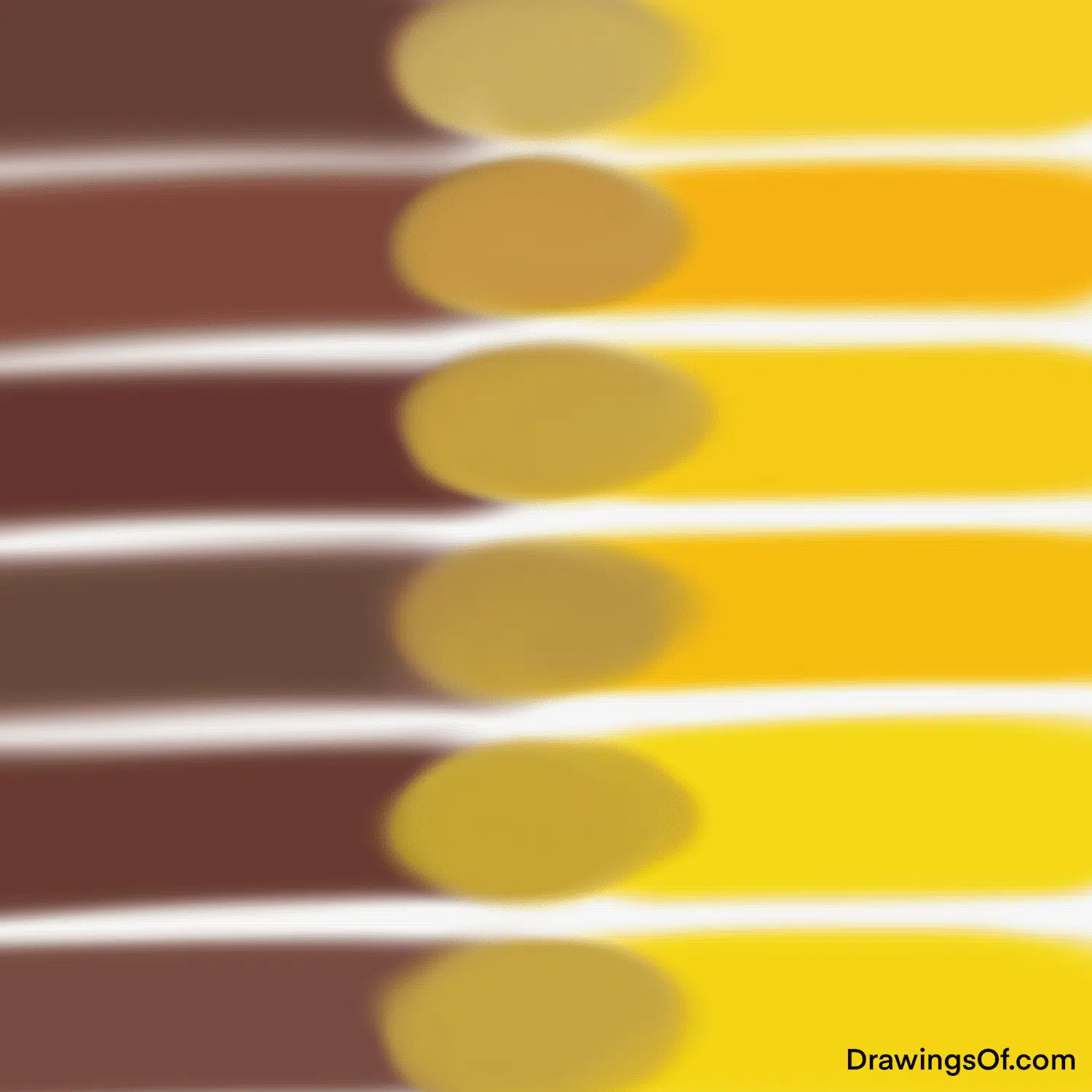
At its core, understanding how brown and yellow combine relies on foundational color theory. Historically, this has been understood through subtractive color mixing, where pigments absorb certain wavelengths of light. When mixing paints, yellow, a primary color in subtractive systems, is combined with brown, which is essentially a dark shade of orange or red. The addition of yellow to brown typically results in a lighter, more muted, or even a golden-brown hue, depending on the specific shades and proportions used.
However, in the digital world, color mixing operates differently. Digital screens, like those used for websites, apps, and social media, utilize additive color mixing. Here, light is emitted, and primary colors – red, green, and blue (RGB) – are combined to create other colors. Yellow is created by mixing red and green light. Brown, in the digital context, is often represented as a dark shade of orange, which itself is a blend of red and yellow (or red and green light). Therefore, when considering digital color, the concept of “mixing” brown and yellow becomes less about a physical combination of pigments and more about the deliberate selection and layering of RGB values to achieve a desired visual effect.
Understanding RGB and Hex Codes: The Digital Palette
For any brand operating online, understanding RGB (Red, Green, Blue) values and their hexadecimal (hex) equivalents is paramount. RGB values range from 0 to 255 for each color channel, dictating the intensity of red, green, and blue light emitted by a pixel. For instance, pure red is (255, 0, 0), pure green is (0, 255, 0), and pure blue is (0, 0, 255). White is achieved when all three are at their maximum (255, 255, 255), and black is (0, 0, 0).
Hex codes are a shorthand representation of these RGB values, using a six-digit alphanumeric code prefixed with a ‘#’. Each pair of characters represents the intensity of red, green, and blue, respectively, in hexadecimal format. For example, pure red is #FF0000.
To create a color that conceptually combines “brown” and “yellow” in a digital context, designers would select specific RGB or hex values that evoke these tones. For instance, a golden yellow might be #FFD700, while a rich chocolate brown could be #A0522D. To create a blend that leans towards a warmer, earthy tone with a hint of brightness, one might select a color like #DAA520 (Goldenrod), which sits somewhere between a deep yellow and a light brown, or explore variations by adjusting the red, green, and blue components. The key is not a literal mixing but a strategic choice of pre-defined digital colors that produce the desired visual impression.
The Psychology of Brown and Yellow in Branding
The choice of colors for a brand is never arbitrary; it’s deeply rooted in color psychology and its impact on consumer perception. Both brown and yellow carry distinct psychological associations that, when combined thoughtfully, can create powerful branding messages.
Yellow is often associated with optimism, happiness, warmth, energy, and intellect. It can evoke feelings of joy, creativity, and approachability. Brands that use yellow often aim to appear cheerful, friendly, and innovative. Think of companies like IKEA, known for its welcoming and accessible approach, or McDonald’s, with its iconic golden arches symbolizing a sense of familiarity and quick service.
Brown, on the other hand, is commonly linked to nature, earthiness, stability, reliability, and comfort. It can convey a sense of groundedness, authenticity, and tradition. Brands that lean on brown often seek to establish trust, professionalism, and a connection to natural or organic products. Examples include brands in the coffee, chocolate, or outdoor adventure industries, where brown reinforces a sense of natural quality and dependable craftsmanship.
When brown and yellow are combined, the resulting palette can be incredibly versatile, creating a spectrum of emotions and brand personas. A lighter, golden yellow paired with a rich, dark chocolate brown can evoke a sense of sophisticated warmth, appealing to a desire for both comfort and quality. Conversely, a brighter, more vibrant yellow with a lighter, sandy brown might suggest playfulness, energy, and natural exploration. The specific shades chosen and their proportions on a digital interface will dictate the dominant emotional resonance.
Strategic Application: Crafting Digital Brand Identities with Brown and Yellow
In the competitive digital arena, a brand’s visual identity is its first point of contact and a critical differentiator. The strategic use of color, including the nuanced combination of brown and yellow, plays a pivotal role in shaping this identity and influencing consumer behavior.
Evoking Trust and Warmth: A Balanced Approach

Brands seeking to build trust and cultivate a warm, approachable image can leverage the synergistic effects of brown and yellow. This palette can be particularly effective for businesses that emphasize natural products, artisanal craftsmanship, or a friendly, community-oriented ethos.
Consider a direct-to-consumer coffee brand. A rich, dark brown can be used for primary elements like the logo or background, conveying the depth and quality of the coffee beans. Paired with a warm, creamy yellow or a soft, golden hue, this combination can evoke the inviting aroma of freshly brewed coffee and the comforting ritual of enjoying a cup. The yellow acts as a highlight, adding a touch of optimism and energy, preventing the brown from feeling too heavy or somber. This balance creates a digital experience that feels both reliable and welcoming, encouraging repeat engagement.
Communicating Premium Quality and Natural Luxury
For brands positioning themselves in the premium or luxury market, the combination of brown and yellow can be sophisticated and understated, signaling quality without being ostentatious. The subtle interplay between these colors can evoke a sense of natural richness and refined elegance.
Imagine a high-end skincare brand that emphasizes natural ingredients. A muted, sophisticated brown, perhaps akin to polished wood or fine leather, could form the foundation of their digital presence. This can be complemented by a subtle, almost champagne-like yellow, used for accent elements like call-to-action buttons or subtle graphical details. This pairing suggests exclusivity, natural purity, and a gentle, nurturing approach. The brown grounds the brand in authenticity and natural origin, while the yellow adds a touch of luminosity and perceived value.
Driving Engagement with Energetic and Earthy Tones
In industries where dynamism and connection to the outdoors are key, the strategic deployment of brown and yellow can create an engaging and memorable digital experience. This palette can foster a sense of adventure, authenticity, and vibrant energy.
For instance, an outdoor gear company or an eco-tourism platform might use a spectrum of browns – from deep forest hues to sandy beiges – to represent the natural world. Paired with a bright, sun-kissed yellow, this combination can inspire a sense of excitement and the thrill of exploration. The yellow acts as a visual cue for energy and discovery, drawing users towards engaging content or product offerings. This energetic yet grounded palette can effectively communicate the brand’s passion for the outdoors and encourage users to connect with nature.
Color Palettes and Digital Design Tools: Practical Implementation
Translating the theoretical understanding of color mixing and psychology into tangible digital assets requires practical knowledge of design tools and the ability to create harmonious color palettes.
Building Cohesive Color Palettes
Creating a successful brand color palette involving brown and yellow is more than just picking two colors. It involves developing a system of complementary and analogous colors that work together harmoniously across various digital touchpoints.
A common approach is to start with a primary brown and a primary yellow and then explore variations. For instance, if the primary brown is a deep, earthy tone, complementary colors might include muted greens or blues to represent nature. Analogous colors could be oranges or muted reds to enhance warmth. The yellow can be amplified with lighter shades of itself or paired with creams and off-whites to create a softer, more luminous effect. Online color palette generators, such as Adobe Color or Coolors, can be invaluable resources for discovering harmonious combinations based on color theory principles, allowing designers to experiment with different color relationships and find palettes that resonate with the brand’s message.
Accessibility Considerations in Digital Design
As brands increasingly focus on inclusive design, ensuring that color choices are accessible to all users is paramount. This is particularly relevant when combining colors like brown and yellow, which can sometimes present contrast issues.
Web Content Accessibility Guidelines (WCAG) recommend specific contrast ratios between text and its background to ensure readability. Dark brown text on a light yellow background, or vice versa, needs to be carefully checked. Tools like the WebAIM Contrast Checker can help designers verify that their chosen color combinations meet accessibility standards. Failing to address contrast can lead to users with visual impairments being unable to read essential content, negatively impacting user experience and brand perception. A brand that prioritizes accessibility signals a commitment to inclusivity, further strengthening its connection with its audience.

Conclusion: The Enduring Power of Color in Digital Branding
The question “what color does brown and yellow make?” may start with a simple curiosity about color mixing, but in the context of digital branding, it evolves into a profound exploration of how strategic color choices can shape perception, evoke emotion, and build a compelling brand identity. By understanding the science of digital color, the psychology of hue, and the practicalities of design implementation, brands can harness the power of the brown and yellow spectrum to create memorable, engaging, and trustworthy online experiences. Whether aiming for warm approachability, natural luxury, or energetic adventure, the thoughtful application of these foundational colors, within a well-crafted digital strategy, ensures that a brand’s visual voice resonates clearly and effectively in today’s crowded digital marketplace.
aViewFromTheCave is a participant in the Amazon Services LLC Associates Program, an affiliate advertising program designed to provide a means for sites to earn advertising fees by advertising and linking to Amazon.com. Amazon, the Amazon logo, AmazonSupply, and the AmazonSupply logo are trademarks of Amazon.com, Inc. or its affiliates. As an Amazon Associate we earn affiliate commissions from qualifying purchases.