
In the dynamic and visually driven world of branding, every element is meticulously crafted to communicate a message, evoke an emotion, and forge a connection with the target audience. Among the most potent and immediate tools at a brand’s disposal is color. Color possesses an almost primal ability to influence perception, trigger psychological responses, and imbue products and services with meaning. When it comes to refining and perfecting visual brand elements, understanding color relationships is paramount. This brings us to a fundamental question that resonates deeply within design and marketing circles: “What color corrects purple?” While seemingly a simple query about color science, its implications for branding are far-reaching, touching upon everything from logo design and packaging to website aesthetics and marketing campaigns.

The concept of “correcting” a color in a branding context isn’t about fixing an error in the traditional sense, but rather about achieving a desired visual harmony, enhancing legibility, or subtly influencing the mood and perception of the brand. Purple, a color often associated with luxury, creativity, spirituality, and royalty, can be a powerful choice for a brand. However, depending on its shade and context, it can sometimes appear too muted, too aggressive, or simply not as impactful as intended. Understanding how other colors interact with purple allows brand strategists and designers to make informed decisions that elevate their visual identity.
The Complementary Relationship: Understanding Opposites in the Color Wheel
The most direct answer to “what color corrects purple” lies in understanding the concept of complementary colors. On a standard color wheel, complementary colors are those positioned directly opposite each other. When placed next to each other, they create the strongest contrast, making both colors appear more vibrant and noticeable. This principle is fundamental to how colors “correct” or enhance one another.
Identifying the Complement of Purple
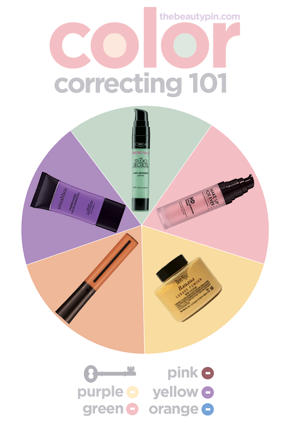
Purple, as a secondary color, is created by mixing red and blue. Therefore, its complementary color will be a primary color that balances these two components. On most color wheels, the direct complement to purple is yellow.
-
Yellow’s Role in Correcting Purple: When yellow is placed adjacent to purple, it doesn’t “cancel out” purple in a way that makes it disappear. Instead, it amplifies the vibrancy and intensity of both colors. A shade of yellow can lift a dull or muddy purple, making it appear richer and more sophisticated. Conversely, a well-chosen purple can make a yellow pop, adding depth and an element of intrigue. This interplay is crucial in branding where contrast is often desired to draw attention and improve readability.
-
Variations and Nuances: It’s important to note that “purple” is a broad term encompassing a spectrum of shades from deep amethyst and violet to lighter lilacs and lavenders. Similarly, “yellow” ranges from bright lemon to deep mustard and ochre. The specific shade of purple and yellow will dictate the precise effect. For instance, a bright, electric purple might be best complemented by a golden yellow, while a dusty lavender might pair more harmoniously with a pale, creamy yellow. This attention to nuance is what separates effective branding from merely decorative design.
-
Beyond Direct Complements: While yellow is the direct complement, other colors can also be used to “correct” or influence purple’s perception through analogous or triadic color schemes. For example, analogous colors (colors next to each other on the color wheel, like blues and reds) can create a more harmonious and unified feel, softening the impact of purple. Triadic colors, equidistant on the wheel, can create a more vibrant and dynamic palette. However, for the specific question of “correction” through contrast, the complementary relationship with yellow remains the most potent.
Strategic Applications of Purple and its Complementary Counterparts in Branding
The understanding of complementary colors is not merely an academic exercise in color theory; it forms the bedrock of strategic decisions in brand development. When a brand chooses purple as a primary or secondary color, the judicious use of its complement, yellow, or its variations, can profoundly impact how that brand is perceived.
Enhancing Visual Hierarchy and Readability
In branding, clear communication is key. Whether it’s a logo, a website, or a marketing brochure, information needs to be easily digestible. Purple, especially darker or more muted shades, can sometimes pose a readability challenge if placed on a similarly toned background or if text is rendered in a subtle shade of purple.
-
Text and Background Contrast: Using yellow or a pale yellow shade as a background for purple text, or vice-versa, can dramatically improve contrast. This ensures that key brand messaging, calls to action, or important details are easily legible. For example, a luxury cosmetics brand using deep violet for its logo might employ a subtle gold or cream-colored typography for product names or descriptions to ensure clarity and elegance.
-
Iconography and Call-to-Action Buttons: In digital branding, where user experience is paramount, complementary colors are frequently used to highlight interactive elements. A purple button on a yellow background, or a prominent yellow “buy now” button set against a predominantly purple user interface, will immediately draw the user’s eye and encourage engagement. This strategic use of contrast guides the user’s journey and improves conversion rates.
Creating Memorable and Impactful Visual Identities
The power of complementary colors lies in their ability to create visual tension and excitement. This tension, when artfully managed, can make a brand’s visual identity stand out in a crowded marketplace.
-
Logo Design: A logo that incorporates both purple and yellow (or closely related shades) can be incredibly striking and memorable. The interplay of these colors can convey a dualistic brand personality – perhaps combining innovation (often associated with purple) with optimism and accessibility (associated with yellow). Consider brands that want to communicate creativity and energy; a purple and yellow palette can be an excellent choice.
-
Packaging and Product Design: For physical products, packaging is the first point of physical contact a consumer has with a brand. Using purple and yellow strategically on packaging can create an immediate visual impact on store shelves. A purple bottle with yellow lettering, or a yellow box with purple accents, can grab attention and communicate key brand attributes. Think of brands that want to convey a sense of premium quality (purple) combined with a sense of fun or vibrant energy (yellow).
-
Marketing and Advertising: In the realm of advertising, the judicious use of complementary colors can ensure that campaigns cut through the visual noise. A striking purple advertisement featuring yellow highlights, or vice-versa, is likely to be more memorable than one relying on more subdued or analogous color schemes. This can be particularly effective for brands that want to project an image of bold creativity or distinctive flair.
Beyond Yellow: Exploring Other Interactions with Purple in Branding
While yellow is the direct complementary color that “corrects” purple by creating maximum contrast, the strategic application of color in branding is rarely about rigid adherence to rules. Instead, it’s about understanding relationships and choosing the right nuance for the desired outcome. Other color interactions can also influence and “correct” purple’s visual presence.
Analogous Colors: Harmony and Sophistication
Analogous colors are those that sit next to each other on the color wheel. For purple, these would be blues and reds, as well as shades that lean towards them, like violet-blue or red-violet.
-
Creating Serenity and Depth: Using analogous colors alongside purple can create a more harmonious, serene, and sophisticated visual experience. A brand that uses various shades of blue and purple, or red and purple, might aim to convey a sense of trust, stability, and depth. This approach is often seen in brands that want to project a feeling of calm or introspection.
-
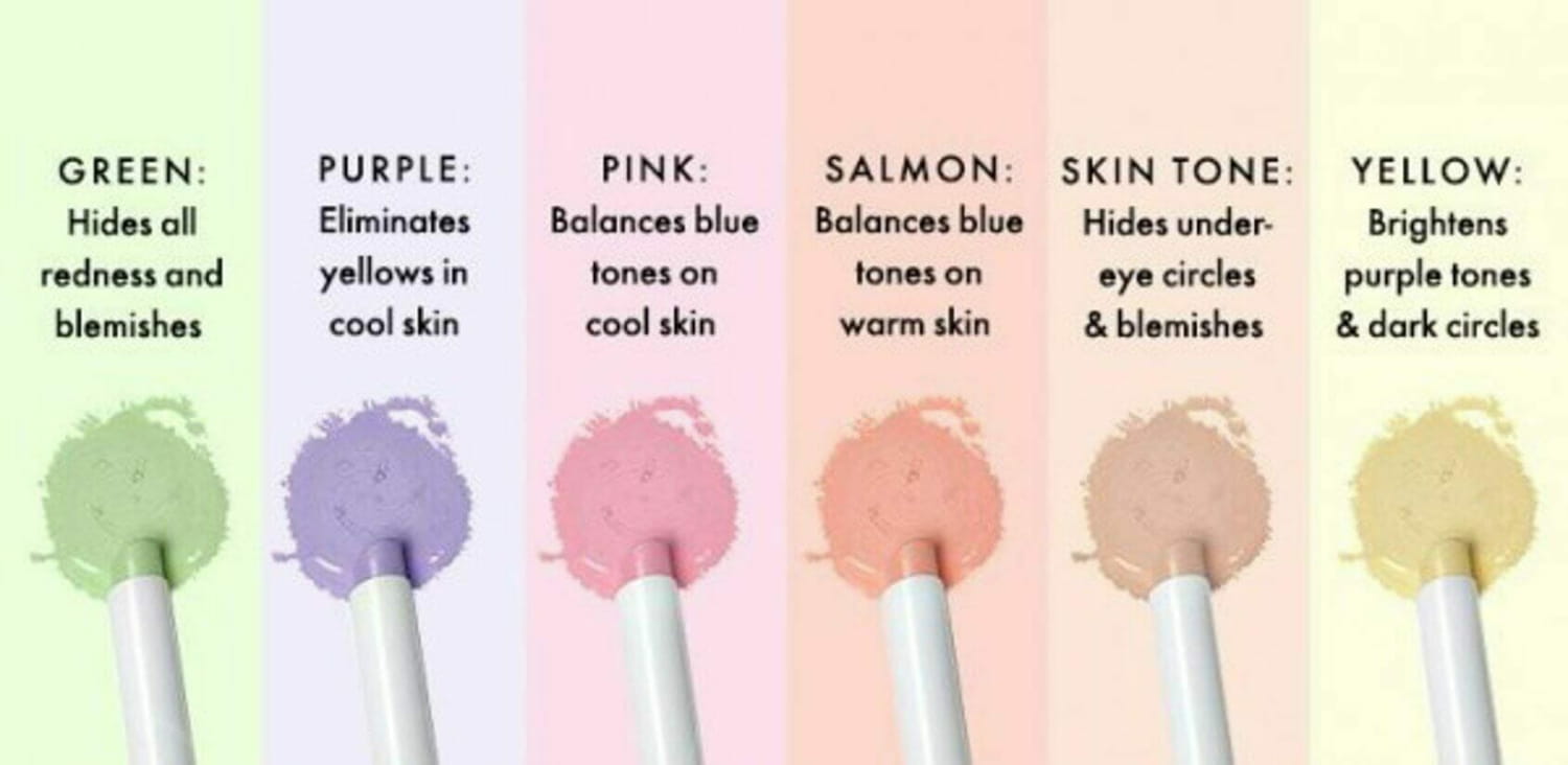
Subtlety and Gradation: When working with lighter shades of purple, like lavender or lilac, pairing them with softer blues or pinks can create a delicate and ethereal aesthetic. This is effective for brands aiming for a gentle, nurturing, or romantic image. The “correction” here is not about contrast, but about creating a flowing, pleasing visual gradient that feels cohesive and balanced.
Split-Complementary Palettes: Dynamic yet Harmonious
A split-complementary color scheme involves using a base color and the two colors adjacent to its direct complement. For purple, this would mean using shades of yellow-orange and yellow-green.
-
Balanced Vibrancy: This approach offers a more nuanced and less jarring contrast than a direct complementary scheme. A brand using purple with yellow-orange and yellow-green can achieve a lively and energetic palette without the intense visual tension of pure purple and yellow. This allows for more complex visual storytelling and can convey a sense of enthusiasm and dynamic creativity.
-
Adding Complexity and Interest: Brands that want to appear sophisticated and creative, but also approachable, might find a split-complementary scheme effective. It allows for more color within the brand’s visual language while maintaining a sense of order and visual appeal.
The Importance of Context and Brand Personality
Ultimately, the “correction” of purple in branding is less about a scientific formula and more about strategic intent. The chosen color palette must align with the brand’s core values, target audience, and the emotional response it aims to elicit.
-
Defining the Brand’s Narrative: A brand seeking to project luxury and exclusivity might use deep purple with subtle gold or cream accents, leaning into the sophistication of analogous or muted complementary palettes. A playful and energetic brand, on the other hand, might embrace the bold contrast of purple and bright yellow, or use more vibrant split-complementary schemes.
-
Audience Perception: Understanding how different color combinations are perceived by the target demographic is crucial. While color theory provides a framework, cultural associations and individual experiences can influence how colors are interpreted. Thorough market research and testing are essential to ensure that the chosen color strategy effectively communicates the intended brand message.
In conclusion, the question “what color corrects purple” leads us to the fundamental principles of color theory, particularly the power of complementary colors. However, within the realm of branding, this understanding is merely the starting point. By strategically employing yellow, or exploring analogous and split-complementary palettes, brands can refine their visual identities, enhance communication, create memorable impressions, and ultimately, forge stronger connections with their audience. The art of color correction in branding is about wielding color not just for aesthetic appeal, but as a powerful tool for strategic communication and impactful storytelling.
aViewFromTheCave is a participant in the Amazon Services LLC Associates Program, an affiliate advertising program designed to provide a means for sites to earn advertising fees by advertising and linking to Amazon.com. Amazon, the Amazon logo, AmazonSupply, and the AmazonSupply logo are trademarks of Amazon.com, Inc. or its affiliates. As an Amazon Associate we earn affiliate commissions from qualifying purchases.