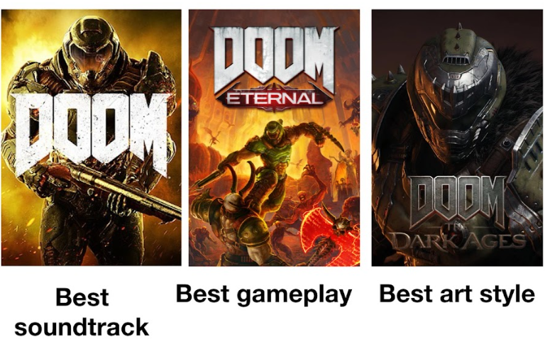
The original Doom, released in 1993 by id Software, wasn’t just a groundbreaking first-person shooter; it was a visual spectacle that fundamentally altered the landscape of video game aesthetics. Its raw, visceral presentation, characterized by its gritty, hellish environments, menacing demons, and weapon-heavy combat, felt unlike anything players had experienced before. While “Doom art style” might be a common descriptor, the specific visual characteristics that defined it are a rich subject for exploration, falling squarely within the realm of Brand and its impact on the perception and identity of a product. The art style of Doom was not merely a set of graphical choices; it was a deliberate and immensely successful branding element that contributed significantly to its iconic status and enduring legacy.
The term “art style” can be broad, encompassing everything from painterly realism to abstract expressionism. In the context of video games, and particularly Doom, it refers to the cohesive visual language that defines the game’s world, characters, and overall atmosphere. This language is crafted through a combination of technical limitations, artistic vision, and strategic design decisions. Understanding Doom’s art style involves dissecting its historical context, its technical innovations, its thematic choices, and the lasting impact it had on subsequent game development.
The Brand of Doom was built on the pillars of visceral action, intense horror, and a rebellious, over-the-top aesthetic. Its art style was the primary vehicle for conveying these brand promises to players. It wasn’t just about how characters looked, but how the environment made you feel, how the weaponry conveyed power, and how the demonic entities inspired dread. In essence, the art style was a crucial component of Doom’s brand identity, making it instantly recognizable and deeply impactful.
The Genesis of a Visual Identity: Influences and Inspirations
The art style that defined Doom was not born in a vacuum. It emerged from a confluence of artistic movements, contemporary visual culture, and the inherent constraints of the technology available at the time. The success of Doom’s visual branding can be attributed to its ability to synthesize these influences into something uniquely its own, a visual language that resonated deeply with its target audience.
Gothic Horror and the Macabre
A significant thread running through Doom’s visual tapestry is its deep engagement with Gothic horror. This literary and artistic tradition, characterized by its exploration of the dark, the supernatural, the decaying, and the grotesque, provided a rich wellspring of imagery for the game’s designers. Think of crumbling castles, shadowy catacombs, and the unsettling presence of the monstrous. Doom took these elements and translated them into a digital medium, infusing them with a kinetic energy that amplified their effect.
The demons themselves were clearly influenced by classic depictions of hell and demonic entities. Their twisted forms, sharp fangs, and glowing eyes tapped into a primal fear of the unknown and the diabolical. The environments, too, echoed this Gothic sensibility. The blood-soaked floors, the dimly lit corridors, and the oppressive architecture created a sense of claustrophobia and impending doom, classic elements of the genre that were expertly leveraged to build the game’s brand of terror.
B-Movie Sensibilities and Pulp Fiction
Beyond the more refined influences of Gothic literature, Doom’s art style also embraced the unpretentious, often sensationalistic appeal of B-movies and pulp fiction. This is evident in the game’s often over-the-top gore, its straightforward narrative of good versus evil (albeit with a sci-fi twist), and its focus on visceral action. The sheer amount of blood, the explosive deaths of enemies, and the over-sized weaponry all point to a deliberate choice to tap into a more visceral, less nuanced form of entertainment.
This approach served Doom’s brand by making it accessible and exciting. It didn’t shy away from the shocking or the sensational, and this boldness became a defining characteristic. The “shock value” inherent in its art style was a key component of its brand identity, attracting a certain demographic of players looking for an intense and unapologetic gaming experience. This embrace of the pulpy, the visceral, and the slightly excessive was a calculated move that paid dividends in building a strong, memorable brand.
Technical Constraints as Creative Catalysts
It’s crucial to remember that Doom’s visual style was also shaped by the technological limitations of the era. The game utilized a revolutionary 2.5D engine, which rendered environments and enemies using 2D sprites. This meant that detail was often conveyed through clever use of color, shading, and texture mapping rather than complex 3D models. This constraint, however, paradoxically pushed the artists to be more inventive and to develop a distinct visual shorthand.
The pixelated nature of the sprites, while rudimentary by today’s standards, contributed to Doom’s unique aesthetic. The chunky pixels of the demons and weapons gave them a distinct, almost blocky appearance that was nevertheless menacing and impactful. The limited color palettes, while restricted, were used effectively to create atmospheric lighting and distinct visual themes for different areas of the game. This forced ingenuity in overcoming technical hurdles became a cornerstone of Doom’s visual brand, proving that artistic vision could thrive even within strict limitations.
The Aesthetic Pillars: Characterizing the “Doom” Look
While the influences are important, the true essence of Doom’s art style lies in the specific aesthetic choices made by its development team. These elements, when combined, created a cohesive and instantly recognizable visual language that became synonymous with the game and its brand.
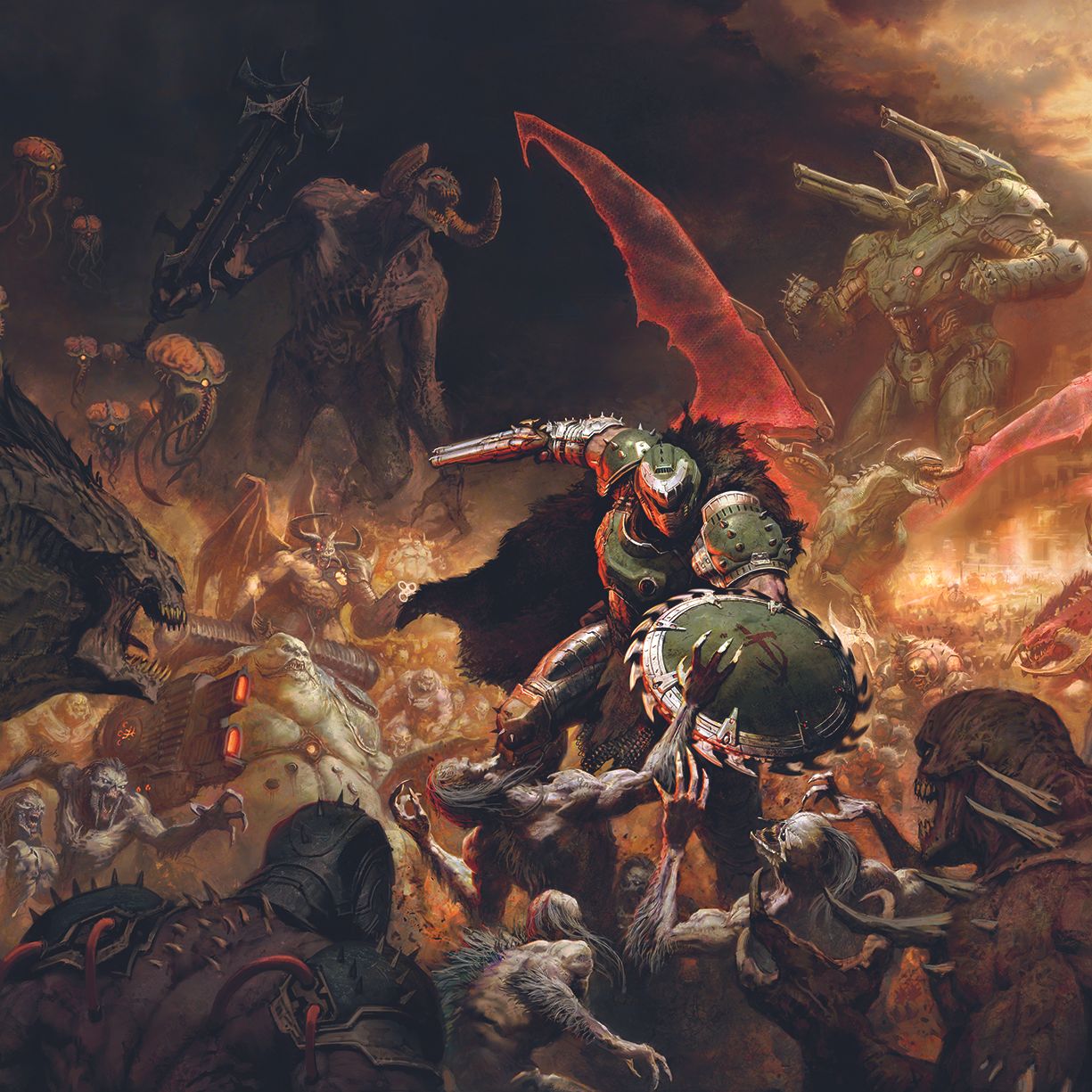
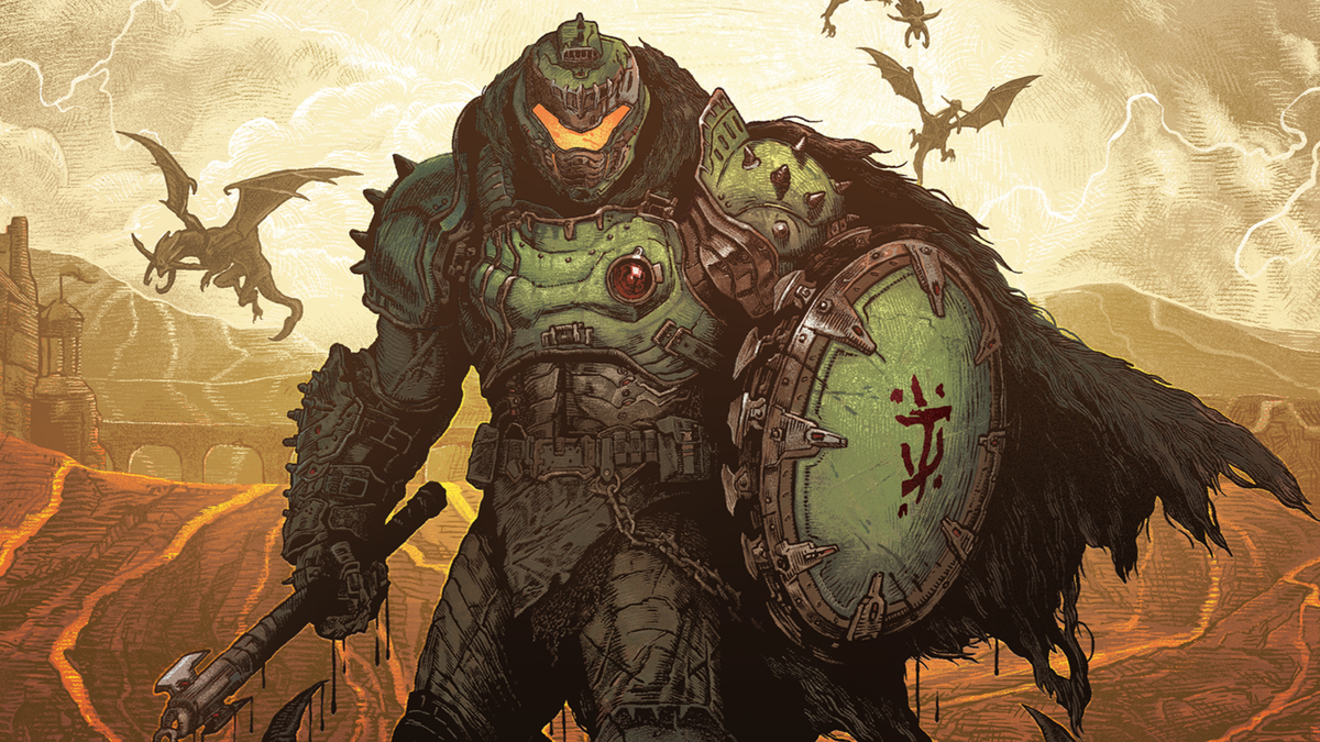
The Demonic Bestiary: A Palette of Terror
The creatures of Doom are arguably its most iconic visual element. They represent a diverse collection of hellish entities, each with its own distinct design and threat level. The Imps, with their leering faces and small stature, were the ubiquitous cannon fodder. The Cacodemons, floating eyeballs with a single horn, were a more unsettling, airborne threat. The Mancubus, with its hulking frame and arm cannons, embodied brute force. And of course, the Baron of Hell, with its imposing, horned silhouette, served as a more formidable foe.
The design of these demons was a masterclass in conveying menace through silhouette, color, and animation. Even with their pixelated forms, their menacing postures and unsettling animations made them feel alive and dangerous. The limited color palettes, often featuring reds, blacks, and sickly greens, enhanced their hellish origins. The sheer variety and distinctiveness of the demonic designs were crucial to the game’s brand of challenging and diverse combat encounters, ensuring that players always faced new and terrifying foes.
Environmental Design: Hell as a Labyrinth
The environments in Doom were as much a character as the demons themselves. They were not just backdrops; they were integral to the gameplay and the overall mood. The game eschewed natural landscapes in favor of industrial hellscapes, claustrophobic corridors, and oppressive alien structures. These environments were characterized by their dark, often grimy textures, their stark lighting, and their labyrinthine layouts.
The visual cues within these environments were essential for the player’s navigation and survival. They communicated danger, offered cover, and guided the player through the intense combat sequences. The art team masterfully used these elements to reinforce the game’s brand of relentless action and constant threat. Every corner could hide an enemy, and every open space was a potential deathtrap. The visual design of the levels created a sense of constant unease and urgency, perfectly aligning with the game’s core brand promise of high-octane thrills.
Weaponry and Violence: The Brutal Aesthetic
Doom’s weaponry and its depiction of violence were undeniably central to its art style and its brand. The weapons were not just tools; they were extensions of the player’s power, designed to be brutal and effective. The iconic shotgun, the chaingun that unleashed a torrent of bullets, the BFG (Big F***ing Gun) that obliterated anything in its path – these were all visually distinct and conveyed a sense of raw, unadulterated power.
The violence itself, while pixelated, was remarkably visceral. The blood splatters, the dismemberment of enemies, and the explosive deaths were a significant part of the game’s appeal and its brand. This unapologetic depiction of gore was a deliberate choice that helped to carve out Doom’s niche in the gaming market. It was a brand that embraced the extreme, the violent, and the satisfyingly destructive, and its art style was the primary conduit for delivering that message.
The Lasting Impression: How “Doom’s Art Style” Became a Brand Descriptor
The impact of Doom’s art style extended far beyond its initial release. It set a precedent for countless other games and became a shorthand for a particular kind of visceral, action-oriented shooter. The term “Doom-like” or “Doom-style” emerged, signifying games that shared its visual and thematic DNA. This demonstrates the power of its art style as a branding tool, capable of transcending the game itself and influencing an entire genre.
The “Doom Clone” Phenomenon
In the years following Doom’s release, a wave of first-person shooters emerged that were heavily inspired by its gameplay and, critically, its visual aesthetic. These games, often referred to as “Doom clones,” adopted similar graphical techniques, enemy designs, and environmental themes. While many of these games were successful in their own right, they often struggled to distinguish themselves from Doom’s dominant brand.
The very existence of the “Doom clone” phenomenon is a testament to the strength and recognizability of Doom’s art style as a branding element. It provided a successful template that others sought to emulate, solidifying its place in the pantheon of influential game aesthetics. The visual language of Doom had become so potent that it could be adopted and iterated upon by other developers, further cementing its status as a foundational element of the first-person shooter genre.
Legacy in Modern Game Design
While modern games have advanced exponentially in graphical fidelity, the core principles that defined Doom’s art style continue to resonate. The emphasis on clear enemy silhouettes, atmospheric environmental storytelling, and impactful visual feedback for combat remains a critical aspect of good game design. Even games that utilize hyper-realistic graphics often draw inspiration from the foundational visual language that Doom helped to establish.
The success of Doom’s art style as a branding strategy lies in its ability to be both innovative within its technical constraints and timeless in its thematic appeal. It proved that a strong, cohesive visual identity, supported by a clear brand promise, could capture the imagination of players and shape the direction of an entire industry. The “Doom art style” wasn’t just about how the game looked; it was about the feeling it evoked, the excitement it delivered, and the indelible mark it left on the world of interactive entertainment. It was, in essence, a masterclass in visual branding.
aViewFromTheCave is a participant in the Amazon Services LLC Associates Program, an affiliate advertising program designed to provide a means for sites to earn advertising fees by advertising and linking to Amazon.com. Amazon, the Amazon logo, AmazonSupply, and the AmazonSupply logo are trademarks of Amazon.com, Inc. or its affiliates. As an Amazon Associate we earn affiliate commissions from qualifying purchases.