The question of which skin color tattoos “look best on” is a nuanced one, often fraught with subjective interpretations and aesthetic preferences. However, from a technical and visual design perspective, the answer lies not in a definitive “best” but in understanding how different skin tones interact with the pigments and application techniques of tattooing. This exploration delves into the science behind ink visibility, the impact of skin undertones, and the evolving considerations for achieving optimal results across a diverse spectrum of complexions, all within the framework of Brand. Specifically, we will examine how understanding these factors contributes to the Personal Branding of an individual seeking tattoos and the Design principles that inform successful tattoo artistry, ultimately impacting how a tattoo functions as a visual Marketing tool for self-expression.
The Canvas: Understanding Skin Pigmentation and Its Impact on Tattoo Visibility
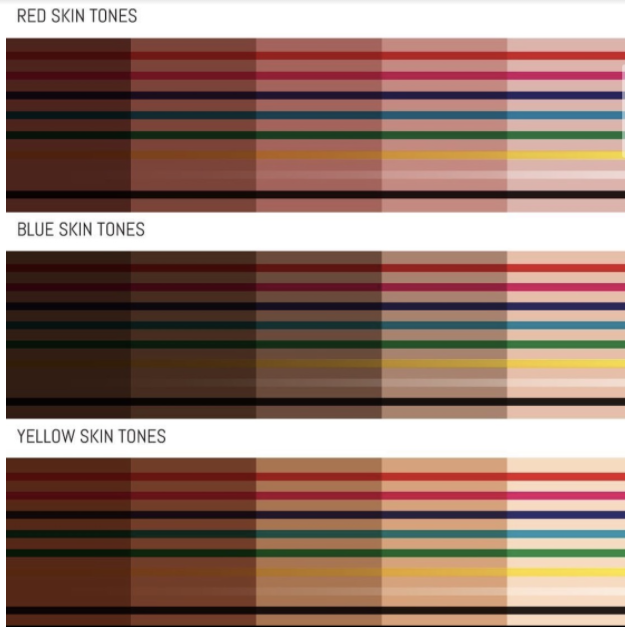
The human skin tone is a complex interplay of melanin, carotene, and hemoglobin. Melanin, the primary pigment responsible for color, exists in two forms: eumelanin (brown-black) and pheomelanin (red-yellow). The relative amounts and distribution of these pigments, along with underlying blood vessels and fat, determine an individual’s skin color. This variation is the fundamental canvas upon which a tattoo is applied, and it directly influences how colors are perceived and how lines and details hold up over time.
Melanin’s Role: The Foundation of Ink Perception
Melanin acts as a natural filter, absorbing and scattering light. In individuals with higher melanin concentrations (darker skin tones), this scattering effect can make it more challenging for lighter inks to stand out vibrantly. Conversely, darker inks can appear more muted or blend more subtly with the skin. The density of melanin also plays a role in the healing process. Skin with higher melanin content may be more prone to hyperpigmentation or hypopigmentation around the tattooed area, potentially altering the healed appearance of the tattoo.
Undertones: The Subtlety That Matters
Beyond the surface color, skin undertones are crucial. These are the subtle hues that lie beneath the visible skin tone and can be broadly categorized as cool (pink, red, blue), warm (yellow, peach, golden), or neutral (a mix of both).
- Cool Undertones: Often found in lighter skin tones, cool undertones can make certain colors appear more intense. For instance, vibrant blues and purples can pop against a cool complexion, while warmer colors like orange and yellow might appear less saturated.
- Warm Undertones: Common in medium to darker skin tones, warm undertones can enhance the richness of warm colors like reds, oranges, and yellows. Cool colors might appear more subdued on warm skin.
- Neutral Undertones: Individuals with neutral undertones have more flexibility, as both warm and cool colors can complement their skin well.
Understanding one’s undertone allows for more strategic color selection, ensuring that the tattoo’s palette harmonizes with the natural hues of the skin, thereby enhancing its aesthetic appeal as a component of personal branding.
Skin Texture and Scarring: Factors Influencing Longevity and Clarity
The texture of the skin and the presence of any pre-existing scarring can also impact how a tattoo looks and ages. Thicker, more elastic skin may hold ink more cleanly, resulting in sharper lines and more vibrant colors. Areas prone to dryness or stretching can cause ink to spread or fade more rapidly, affecting the long-term clarity of the design. Scar tissue, in particular, presents a unique challenge. The scar tissue itself has a different cellular structure and blood supply than surrounding skin, which can lead to uneven ink saturation and unpredictable color absorption. Tattoo artists often need to employ specialized techniques and consider the placement of tattoos on or around scarred areas to achieve the best possible outcome. This is a critical aspect of the Design process, where the artist must adapt their approach based on the individual’s unique skin characteristics.
The Palette: Color Theory and Its Application to Tattoo Ink on Diverse Skin Tones
The effectiveness of a tattoo’s color palette is directly linked to how those colors interact with the wearer’s skin tone. This is where the principles of color theory become paramount in achieving a visually striking and harmonious Personal Branding statement.
High Contrast vs. Subtle Integration: Achieving Desired Visual Impact
The desired visual impact of a tattoo can range from bold and eye-catching to subtle and integrated.
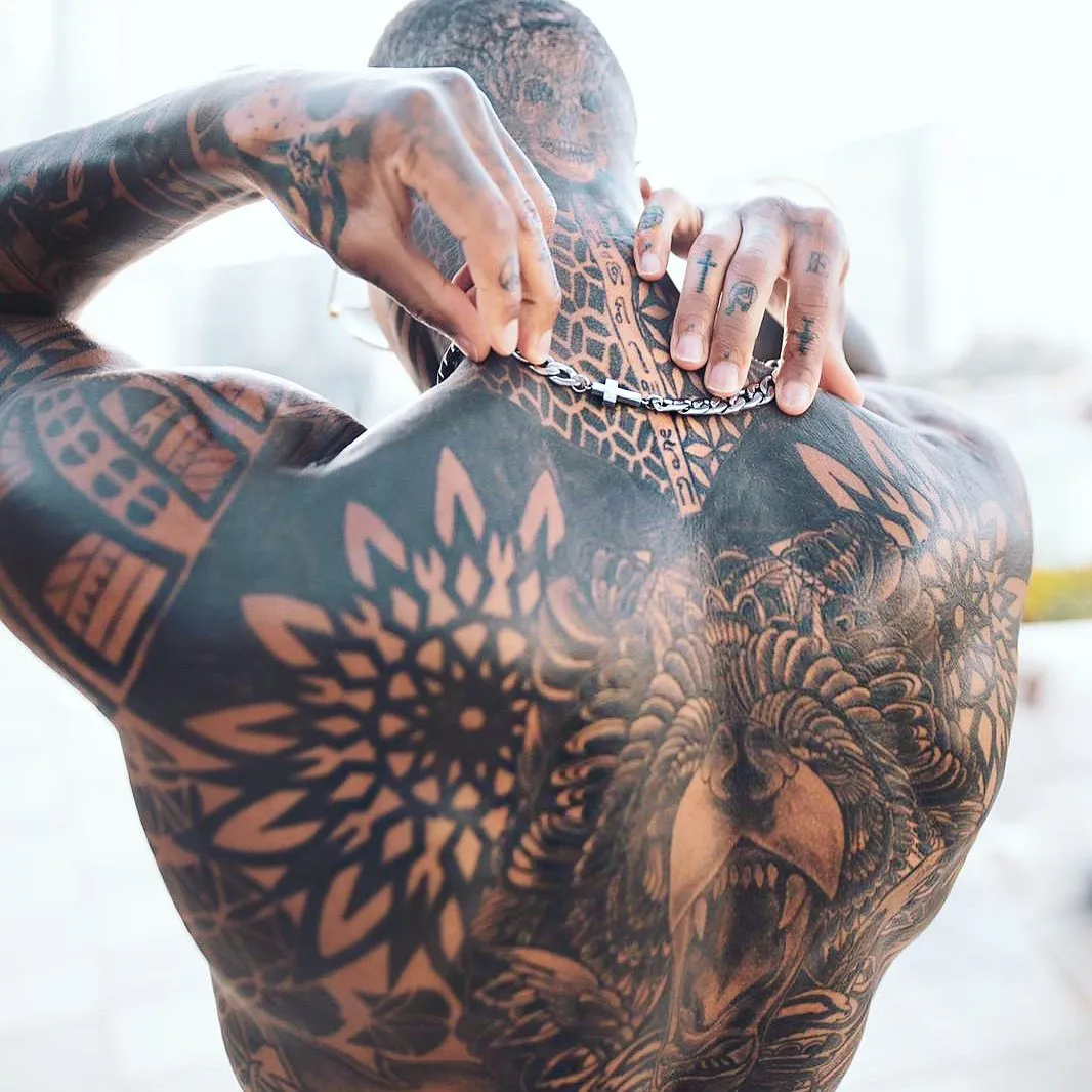
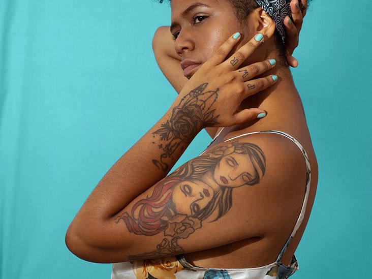
- High Contrast: For a tattoo to stand out boldly against darker skin tones, artists often opt for high-contrast colors. Bright, saturated pigments like vivid reds, electric blues, neon greens, and stark whites can create a dramatic effect. These colors push against the darker background of the skin, demanding attention. For lighter skin tones, while high contrast is also possible with darker inks like black, grey, and deep blues, achieving a truly standout effect might involve selecting colors that are significantly lighter or more saturated than the skin itself.
- Subtle Integration: Conversely, for a more understated aesthetic, artists may choose colors that complement or echo the skin’s undertones. Earthy tones, muted pastels, and shades that are close in value to the skin can create a harmonious blend. On darker skin, this might involve using deep jewel tones like emerald green, sapphire blue, or rich burgundy, which have enough depth to be visible without being jarring. On lighter skin, softer hues like rose gold, pale lavenders, or muted sepia can create a delicate and integrated look.
This strategic use of color is essentially a form of visual Marketing, communicating a specific aesthetic and personality through the chosen design and its execution.
The Power of Black and Grey: A Timeless Choice for All Complexions
Black and grey tattooing, often referred to as monochrome or grayscale, offers a unique versatility that transcends the complexities of skin tone interaction.
- Depth and Dimension: The inherent contrast of black against skin, regardless of its depth, allows for incredible detail and shading. Artists can create a remarkable sense of depth and dimension using varying shades of grey wash, from deep ebony to the lightest mist. This makes black and grey designs highly effective on all skin tones, providing a sophisticated and timeless aesthetic.
- Color Fading Considerations: One of the practical advantages of black and grey is its tendency to fade more gracefully over time compared to many colored inks. While all tattoos will eventually fade, the subtle gradations in black and grey can often age more pleasingly, maintaining their readability and impact for longer. This longevity is a key factor in the enduring Brand appeal of monochrome tattoos.
The ability of black and grey to maintain its integrity and visual appeal across the entire spectrum of human skin makes it a universally strong choice for those seeking a powerful and lasting form of self-expression.
Strategic Use of White Ink and Highlight Tones
White ink, when used strategically, can be a game-changer in tattoo artistry, especially when considering diverse skin tones.
- Creating Highlights and Dimension: On darker skin tones, white ink can be used to create brilliant highlights, adding a pop of light and dimension to a design. It can mimic the glint of light on metal, the shimmer of silk, or the brightness of stars, offering a level of contrast that is otherwise difficult to achieve.
- Subtle Effects on Lighter Skin: On lighter skin, white ink can be used for more delicate effects, such as creating soft glows, adding subtle texture, or achieving a watercolor-like ethereal quality. It can also be used to soften the edges of other colors or to create a subtle contrast that is not overtly bold.
The thoughtful application of white ink, often in conjunction with other colors, allows artists to fine-tune the visual impact and enhance the overall Design of the tattoo, ensuring it resonates effectively with the individual’s skin.
The Artist’s Expertise: Bridging Skin Tone and Ink for Optimal Personal Branding
Ultimately, the “best” skin color for a tattoo is a moot point. The true determinant of a tattoo’s success lies in the skill of the tattoo artist and their understanding of how to work with the unique characteristics of each individual’s skin. This expertise is crucial for effective Personal Branding, as a well-executed tattoo becomes a powerful visual extension of oneself.
Color Matching and Saturation Techniques
Experienced tattoo artists possess an intuitive understanding of color theory and how pigments interact with different melanin levels.
- Building Layers: For darker skin tones, layering is often key. Artists might build up darker colors first, allowing them to establish a solid base, and then introduce brighter or lighter colors on top to create vibrancy. This requires a deep understanding of how ink density and layering affect the final healed color.
- Pigment Intensity: The intensity of the pigments used also plays a role. Certain pigments are formulated to be more vibrant and opaque, which can help them stand out on darker skin. Conversely, lighter and more translucent pigments might be chosen for subtle effects on lighter skin. The choice of ink formulation is a critical element of the Design process, directly impacting the outcome.
Adjusting Linework and Shading for Different Complexions
The thickness and clarity of linework, as well as the application of shading, need to be adapted for various skin tones.
- Bold Lines on Darker Skin: On darker skin, bolder linework can help designs remain clearly defined and visible. Fine, delicate lines might become less apparent over time. Similarly, strong, well-defined shading can create impactful contrast.
- Fine Details on Lighter Skin: Lighter skin tones can often accommodate finer linework and more subtle shading techniques. This allows for greater detail and intricacy in the design, creating a softer and more nuanced visual effect.
This meticulous attention to detail in linework and shading is a testament to the artist’s mastery and their ability to execute a Design that is both aesthetically pleasing and enduring.
The Consultative Process: A Partnership in Visual Identity
The most successful tattoo outcomes stem from a collaborative and consultative process between the client and the artist. Open communication about desired aesthetics, concerns about skin tone, and expectations for the tattoo’s longevity are vital.
- Honest Assessment and Guidance: A reputable artist will provide honest guidance on what colors and styles will best suit an individual’s skin tone and lifestyle. They will explain the potential challenges and offer solutions. This educational aspect is crucial for the client to make informed decisions about their Personal Branding.
- Building Trust and Expertise: The client entrusting their vision to the artist’s expertise is fundamental. The artist, in turn, leverages their knowledge of Design principles and Marketing strategies for self-expression to create a tattoo that is not just an image, but a meaningful and visually compelling statement.
In conclusion, the question of what skin color tattoos look best on is less about inherent limitations and more about understanding the dynamic interplay between ink, skin, and artistic execution. By embracing the principles of color theory, understanding the nuances of skin pigmentation, and valuing the expertise of skilled tattoo artists, individuals can achieve stunning and meaningful tattoos that serve as powerful elements of their Personal Branding, effectively Marketing their individuality through art.
aViewFromTheCave is a participant in the Amazon Services LLC Associates Program, an affiliate advertising program designed to provide a means for sites to earn advertising fees by advertising and linking to Amazon.com. Amazon, the Amazon logo, AmazonSupply, and the AmazonSupply logo are trademarks of Amazon.com, Inc. or its affiliates. As an Amazon Associate we earn affiliate commissions from qualifying purchases.