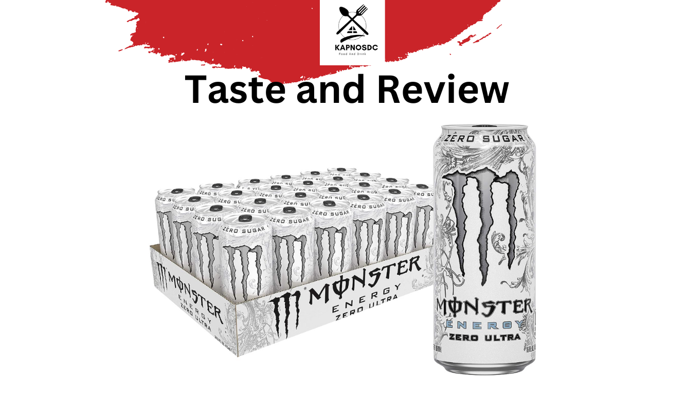
In the landscape of modern consumer packaged goods (CPG), few products have achieved the cult-like status and demographic ubiquity of Monster Energy Ultra—more commonly known by its shorthand, “The White Monster.” While the literal answer to the question “what does the white monster taste like” is a nuanced blend of citrus and light carbonation, the strategic answer is far more complex. To a brand strategist, the taste of the White Monster is the taste of a perfectly executed market pivot.
Monster Beverage Corporation didn’t just create a sugar-free alternative; they engineered a sensory experience that redefined who an energy drink consumer could be. This article explores how the taste, aesthetic, and cultural positioning of Monster Energy Ultra serve as a premier case study in brand strategy and corporate identity.
1. Sensory Engineering: Why “Taste” is a Strategic Brand Asset
In the early 2000s, the energy drink category was defined by a specific “medicinal” flavor profile—heavy on B-vitamins, taurine, and high-fructose corn syrup. When Monster launched the Ultra line, specifically the white can, they weren’t just launching a new SKU; they were launching a sensory departure from the “battery acid” reputation of the industry.
The Psychology of Crispness
The taste of the White Monster is frequently described as “light,” “crisp,” and “refreshing,” with notes of grapefruit and lime. From a brand strategy perspective, this is a calculated move toward “drinkability.” By reducing the syrupy viscosity associated with the original green Monster, the brand lowered the barrier to entry for consumers who found traditional energy drinks cloying. This “lightness” signals a healthier, more sophisticated product, even if the functional ingredients remain largely the same.
The Zero-Sugar Paradox
Monster’s ability to mask the chemical aftertaste of artificial sweeteners (Erythritol and Sucralose) is a cornerstone of its brand equity. In the world of marketing, the “flavor” of a zero-sugar product is a promise of “guilt-free performance.” By achieving a flavor profile that many consumers prefer over the original, Monster successfully transitioned the “Ultra” line from a niche diet product to a flagship preference. The taste functions as a silent brand ambassador, proving that the brand can evolve with health trends without sacrificing the “kick” its core audience demands.
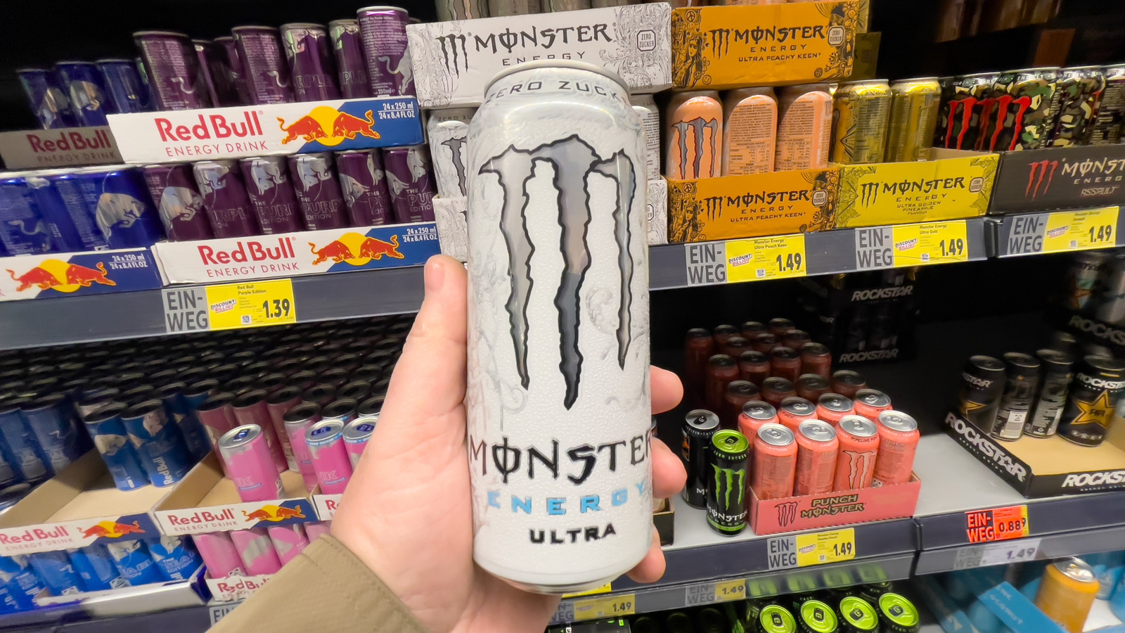
2. Visual Identity and the Power of the “White Can” Aesthetic
A product’s taste is inextricably linked to its visual presentation. In the case of the White Monster, the packaging does the heavy lifting before the first sip is even taken. The design of the Ultra White can is a masterclass in minimalist yet textured branding.
Minimalist Design in a Maximalist Market
The original Monster Energy brand was built on “M-Claw” maximalism—black cans, neon greens, and associations with extreme sports and counter-culture. The White Monster broke this mold. The silver-on-white palette suggests cleanliness, coldness, and premium quality. In brand design, white space is often synonymous with “high-end” or “medical-grade” efficacy. By stripping away the aggressive color palette, Monster appealed to a broader, more professional demographic that might feel out of place holding a neon-green can in an office or a gym.
Tactile Branding and Consumer Experience
One often-overlooked aspect of the White Monster’s brand strategy is the texture of the can itself. Unlike the smooth finish of most soda cans, the Ultra line features a raised, embossed floral pattern. This tactile experience reinforces the “premium” nature of the product. It engages the consumer’s sense of touch, making the act of holding the can as distinctive as the taste of the liquid inside. This creates a multi-sensory brand identity that is difficult for competitors to replicate through digital marketing alone.
3. Target Demographics and the “Boomer Juice” Phenomenon
The most fascinating chapter in the White Monster’s brand history is its organic adoption by various subcultures. While the “taste” is citrusy, the “flavor” of the brand in the public consciousness is defined by its memes and community ownership.
Capturing the “Lapsed” Energy Drink Consumer
Monster Energy Ultra was originally targeted at women and health-conscious professionals. However, it found an unexpected and powerful stronghold among older Millennials and Gen Xers—a demographic often referred to in internet culture as “30-year-old Boomers.” These are consumers who grew up on the original energy drinks but can no longer process 50 grams of sugar without a metabolic crash. The White Monster offered them a way to maintain their caffeine habits while aligning with their maturing lifestyle.
Viral Marketing and Community Ownership
The “Sips White Monster” meme, featuring a character who represents a content, lawn-mowing, suburbanite, did more for the brand than any million-dollar ad campaign could. Monster’s brand strategy in this instance was one of “calculated silence.” By not intervening or trying to over-corporate the meme, they allowed the community to define the brand’s identity. The “taste” of the White Monster became synonymous with a specific state of mind: reliability, nostalgia, and a “get-it-done” attitude. This is the pinnacle of personal branding within a corporate framework—where the product becomes a lifestyle shorthand.
4. Portfolio Diversification: The Role of Ultra in Monster’s Ecosystem
The success of the White Monster reflects a broader corporate strategy of market segmentation. Monster Beverage Corp has used the Ultra line to hedge against changing consumer tastes and regulatory pressures regarding sugar consumption.
Cannibalization vs. Market Expansion
A common fear in brand strategy is “cannibalization”—where a new product steals sales from the original. However, the White Monster served as a tool for market expansion. It didn’t just move current Monster drinkers from green to white; it brought in new consumers from the coffee, tea, and sparkling water categories. The “taste” was the bridge that allowed these consumers to cross over into the energy category without feeling like they were compromising their palate or their health goals.
The Future of Health-Conscious Branding
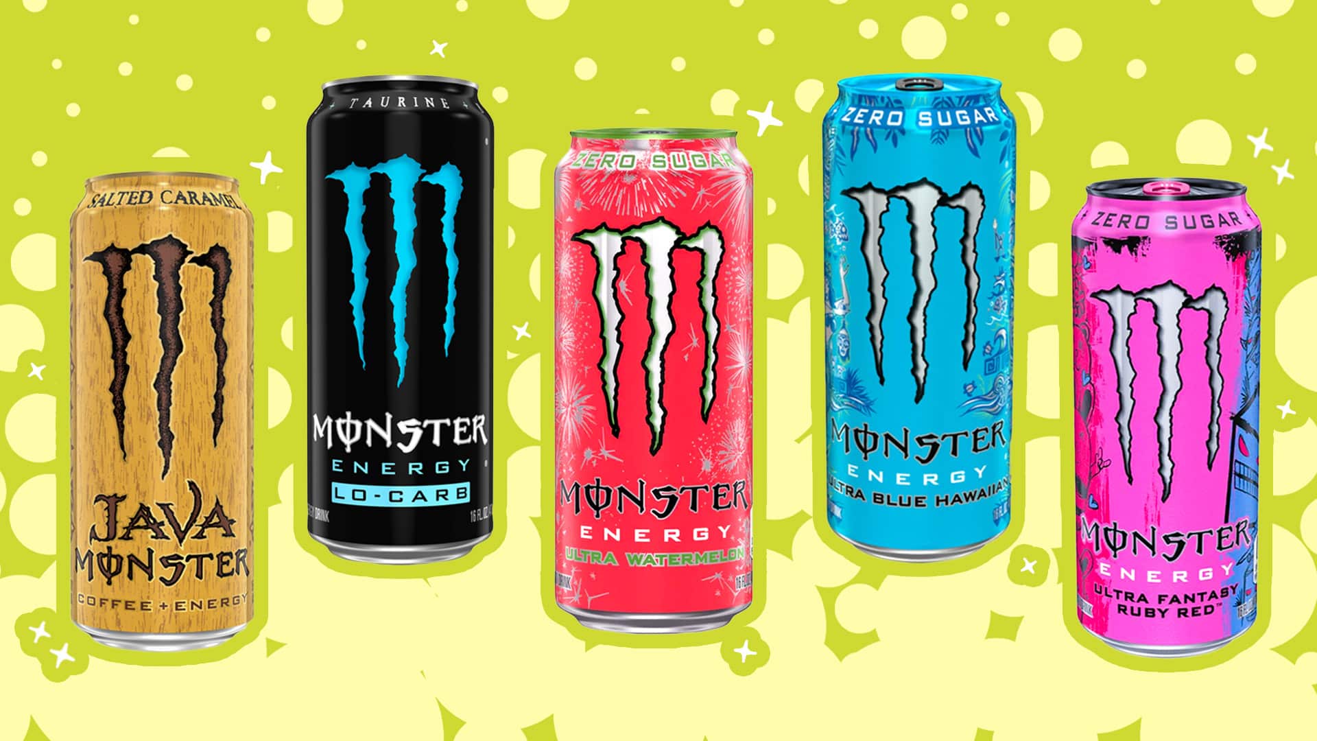
The White Monster set the blueprint for the subsequent “Ultra” flavors (Rosá, Peachy Keen, Strawberry Dreams). By establishing “Ultra White” as the gold standard, Monster created a sub-brand that carries its own weight. The corporate identity is no longer just about “Monster Energy”; it is about a tiered ecosystem where “Ultra” represents the sophisticated, sugar-free, lifestyle-oriented wing of the company. As global health trends continue to move away from high-calorie beverages, the brand equity built into the White Monster serves as a financial and reputational safety net for the parent company.
5. Conclusion: The Brand is the Flavor
So, what does the White Monster taste like? It tastes like a citrus-infused paradigm shift.
From a brand strategy perspective, the White Monster is a lesson in how to evolve a brand without losing its soul. It managed to keep the “edgy” DNA of the Monster claw while dressing it in a sophisticated, white-and-silver suit that was welcome at both the construction site and the corporate boardroom. It utilized sensory engineering to create a product that felt “lighter” and “cleaner,” and it leveraged organic cultural trends to cement its place in the zeitgeist.
The success of the White Monster proves that in the modern market, a product’s taste is only half the story. The other half is the identity the consumer adopts when they crack open the tab. Monster didn’t just sell a caffeine delivery system; they sold a “refreshing” new way for an aging demographic to stay energized, proving that sometimes, the most powerful color in a brand’s palette is white.
aViewFromTheCave is a participant in the Amazon Services LLC Associates Program, an affiliate advertising program designed to provide a means for sites to earn advertising fees by advertising and linking to Amazon.com. Amazon, the Amazon logo, AmazonSupply, and the AmazonSupply logo are trademarks of Amazon.com, Inc. or its affiliates. As an Amazon Associate we earn affiliate commissions from qualifying purchases.