In the vast and often intangible world of branding, every element plays a crucial role in shaping perception and driving consumer engagement. Among these, color stands out as a primary communicator, capable of evoking emotions, signaling intent, and even influencing purchasing decisions. When we consider the potent combination of red and green, two colors often seen as opposites, their combined impact within a brand’s visual identity is anything but simple. This article delves into the sophisticated interplay of red and green, exploring their individual psychological associations and, more importantly, how their strategic application can forge compelling brand narratives and foster powerful connections with target audiences. We will move beyond the basic color mixing and focus on the strategic implications for brand development, marketing, and design.
The Fundamental Power of Red and Green: Individual Associations and Brand Psychology
Before examining their combined effect, it’s essential to understand the distinct psychological and cultural associations of red and green. These individual meanings form the bedrock upon which their synergistic power is built.
Red: The Color of Passion, Urgency, and Attention
Red is a color that demands attention. Universally, it signifies strong emotions and primal instincts. In many cultures, red is associated with:
- Passion and Love: It’s the color of romance, desire, and deep affection, making it a powerful choice for brands aiming to evoke emotional connection and intimacy. Think of Valentine’s Day campaigns or luxury brands that leverage sensuality.
- Energy and Excitement: Red is inherently stimulating. It can increase heart rate, blood pressure, and respiration, lending itself to brands that want to convey dynamism, action, or a sense of thrill. This is why it’s frequently used in sports, fast food, and entertainment industries.
- Urgency and Warning: Its association with stop signs, emergency lights, and danger makes red a potent signal for urgency. Brands can harness this to drive immediate action, such as limited-time offers or clearance sales. However, overuse can also signal alarm or negativity.
- Power and Courage: Red can also represent strength, determination, and leadership. It can be used to establish dominance and a bold presence in the market.
From a brand perspective, red is a powerful tool for capturing immediate attention and creating a memorable impression. It can signal a brand’s confidence, boldness, and willingness to stand out. However, its intensity requires careful management; too much red can be overwhelming, aggressive, or even anxiety-inducing.
Green: The Color of Growth, Harmony, and Nature
Green, in contrast, often evokes a sense of calm, balance, and natural vitality. Its primary associations include:
- Nature and Environment: This is perhaps green’s most pervasive association. It speaks to the natural world, organic products, sustainability, and health. Brands in the eco-friendly, organic food, or wellness sectors heavily rely on green.
- Growth and Prosperity: Green is intrinsically linked to financial growth, abundance, and wealth (think of currency). It can signal a brand’s potential for success, expansion, and financial stability.
- Harmony and Balance: The color green is found in abundance in nature, creating a sense of peace, equilibrium, and relaxation. Brands aiming for a calming, trustworthy, or balanced image often gravitate towards green.
- Health and Well-being: Associated with fresh produce and natural remedies, green conveys vitality, freshness, and a commitment to health.
For brands, green offers a pathway to communicate trustworthiness, responsibility, and a connection to positive, life-affirming values. It can create a sense of reassurance and appeal to consumers seeking authenticity and well-being.
The Synergistic Power: Red and Green as Complementary Forces in Branding
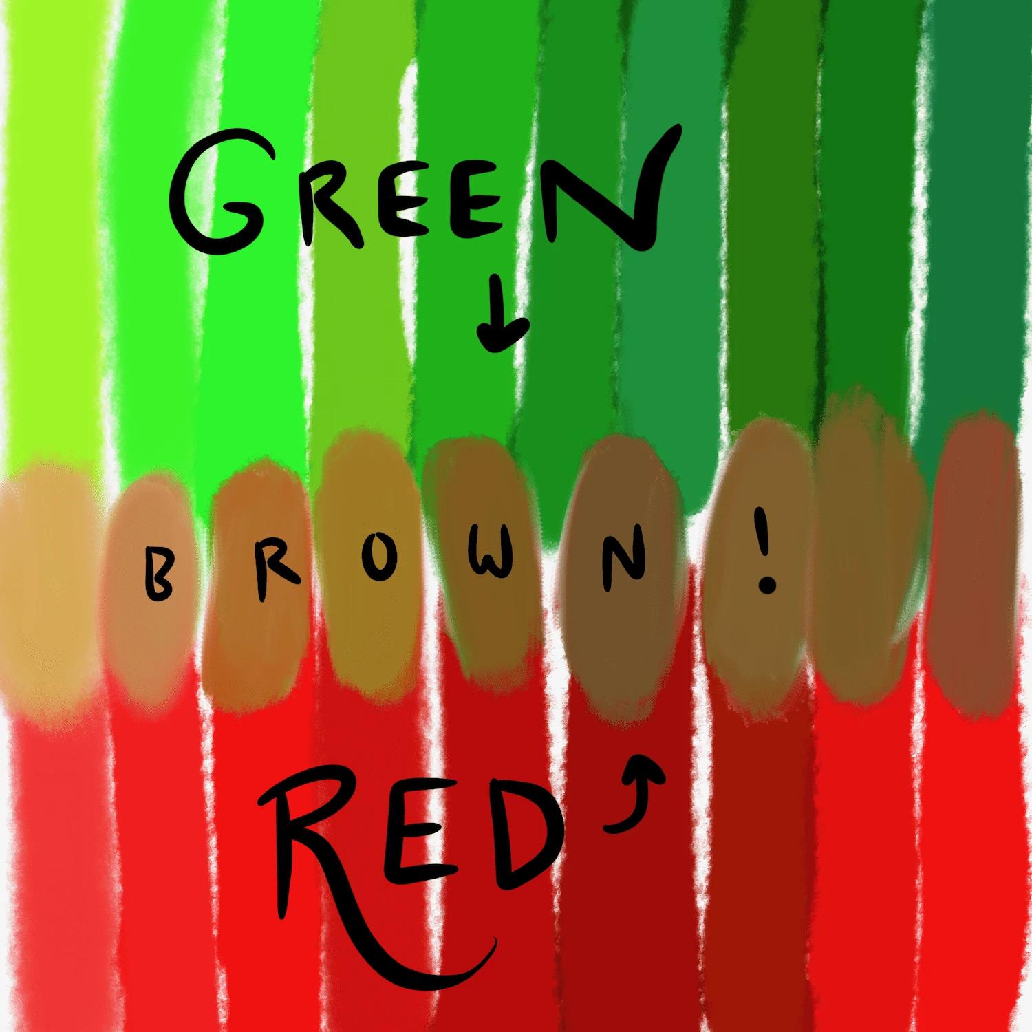
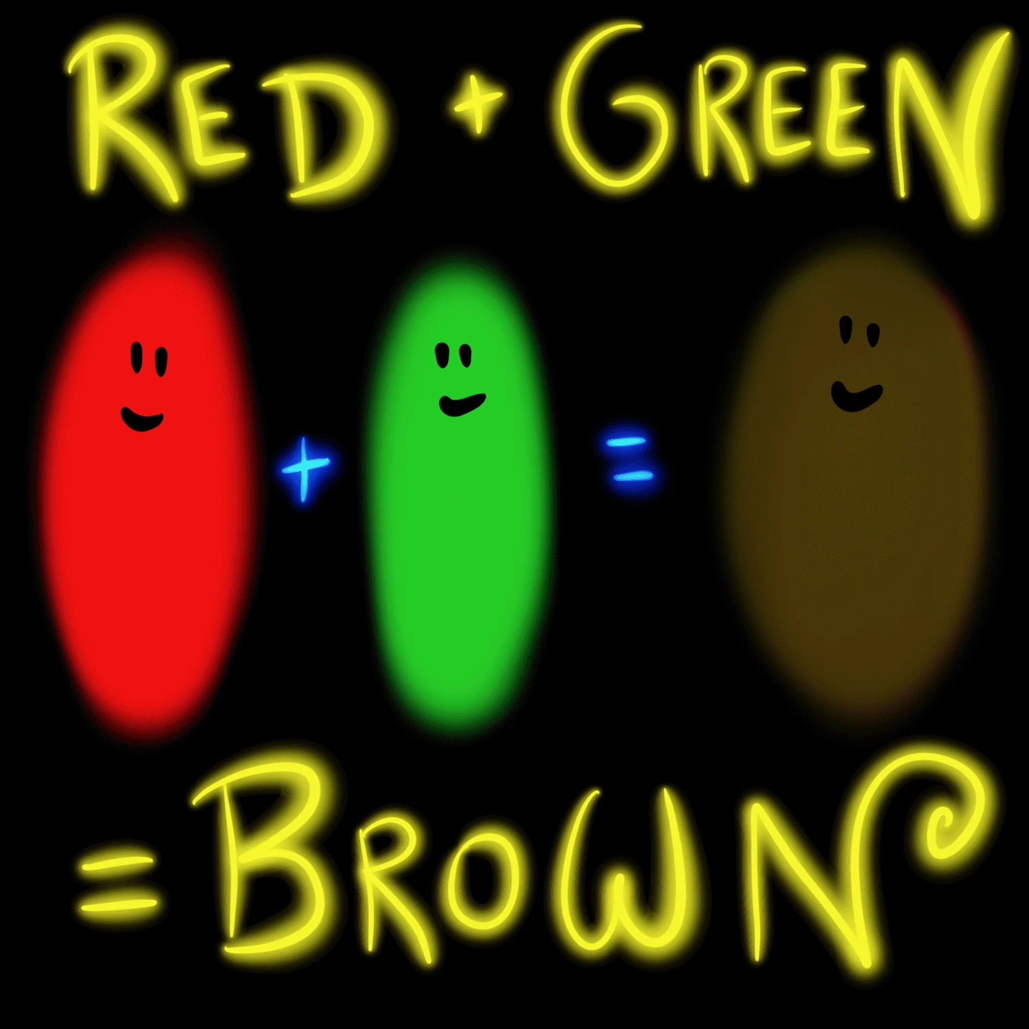
When red and green are strategically combined, their individual impacts can be amplified, contrasted, or transformed into a nuanced message. This is not about simply mixing them into a muddy brown, but about their deliberate use in conjunction, often as complementary colors on the color wheel.
Creating Contrast and Visual Excitement
On the traditional color wheel, red and green are complementary colors, meaning they sit directly opposite each other. This juxtaposition creates the strongest possible contrast, leading to a vibrant and eye-catching visual effect.
- High-Impact Visuals: Brands that want to generate immediate visual excitement and ensure their message cuts through the noise often leverage this high contrast. Think of holiday branding, where red and green are traditionally paired to evoke festive cheer. In a broader branding context, this combination can be used to draw attention to specific calls to action or key brand elements.
- Dynamic and Energetic Brands: The clash of these two potent colors can create a sense of dynamism and forward momentum. This is particularly effective for brands that want to convey innovation, energy, and a bold approach to their industry. For instance, a tech startup aiming to disrupt the market might use a bold red accent against a more grounded green background to signify both innovation (red) and stability/growth (green).
- Balancing Urgency with Reassurance: The urgent, attention-grabbing nature of red can be softened and grounded by the calming, reassuring influence of green. This creates a dynamic tension that can be very compelling. A brand might use red for a “Buy Now” button (urgency) on a page with a predominantly green color scheme (trust, growth, sustainability), effectively guiding the user toward action without causing alarm.
The Strategic Use of Red and Green in Brand Identity
The effectiveness of red and green in branding hinges on how they are used – their proportions, shades, and the context in which they appear.
- Primary vs. Accent Colors: A brand might adopt green as its primary color, signifying its core values of nature, health, or stability. Red could then be used sparingly as an accent color to highlight key offerings, promotions, or calls to action, injecting urgency and excitement without overwhelming the brand’s core identity. Conversely, a brand focused on high-energy experiences might use red as its dominant color, with green used to introduce elements of balance, ethical sourcing, or environmental responsibility.
- Target Audience and Industry: The appropriateness of red and green depends heavily on the industry and the intended audience. For example, a children’s toy brand might use bright reds and greens to create a playful and energetic feel. A financial services company, however, might opt for deeper, more muted shades of green to convey trust and stability, using red very cautiously, perhaps only for specific alerts or high-impact data points.
- Cultural Nuances: While many color associations are global, it’s crucial to consider cultural interpretations. In some Asian cultures, red is the color of luck and celebration, while green can sometimes be associated with infidelity. Brands operating in international markets must conduct thorough research to ensure their color choices resonate positively across different demographics.
Beyond the Basic Mix: Creating Sophisticated Brand Narratives with Red and Green
The true art of using red and green in branding lies in moving beyond the literal and exploring the metaphorical and emotional resonance they can create together. They can tell a story, convey a complex message, and forge a unique brand personality.
Red and Green as Symbols of Transformation and Evolution
The interplay of red and green can symbolize a journey, a process of growth, or a transformation.
- From Potential to Reality: Green can represent the raw potential, the seed of an idea, or the foundation of a business. Red can then represent the energy, passion, and action required to bring that potential to fruition, to grow and bloom. A startup might use green to represent its sustainable mission and red to highlight its innovative solutions and aggressive growth strategy.
- Balancing Risk and Reward: In business and investment, red can sometimes be associated with risk or loss, while green signifies profit and growth. A brand in the financial or investment sector could use this duality to communicate a sophisticated understanding of risk management, where calculated risks (perhaps symbolized by red elements) lead to assured growth and prosperity (represented by green).
- The Cycle of Life and Renewal: In a broader, more abstract sense, red and green can represent the dynamic cycles of life, from the blossoming of spring (green) to the vibrant energy of summer (red) or the passionate intensity of life itself. This can be powerful for lifestyle brands, wellness products, or even educational institutions aiming to convey vibrancy and continuous development.

Achieving Balance: The Art of Proportion and Shade
The success of a red and green palette often depends on the skillful management of proportions and the careful selection of specific shades.
- The 80/20 Rule (and its variations): A common design principle suggests using one color predominantly (e.g., 80%) and the other as an accent (e.g., 20%). This ensures that the dominant color establishes the overall mood and message, while the accent color provides points of interest, urgency, or emphasis. For a brand focused on sustainability, green might dominate, with red used for calls to action or limited-edition product highlights.
- Exploring Different Hues: Not all reds and greens are created equal. A deep forest green paired with a muted cranberry red will evoke a very different feeling than a vibrant lime green with a bright cherry red.
- Earth Tones: Sage green and terracotta red can create a grounded, earthy, and sophisticated feel, suitable for artisanal brands or those focusing on natural materials.
- Jewel Tones: Emerald green and ruby red exude luxury, richness, and opulence, ideal for high-end fashion, jewelry, or premium services.
- Bright and Bold: A strong primary red with a bright, almost neon green can create a highly energetic, playful, and modern aesthetic, perfect for youth-oriented brands or those aiming for maximum attention.
- Contextual Application: The surrounding elements – typography, imagery, and overall design layout – significantly influence how red and green are perceived. A minimalist design might allow the contrast of red and green to speak volumes, while a more complex design might integrate them subtly into patterns or textures.
In conclusion, the question “What does the color red and green make?” in the context of branding is not about a simple chemical reaction, but about a complex interplay of psychology, culture, and strategic design. When wielded thoughtfully, red and green are not opposing forces but powerful allies. They can create electrifying contrast, signal urgency and growth simultaneously, and tell compelling stories of transformation and balance. For brands seeking to make a lasting impact, understanding and mastering the dynamic partnership of red and green is an invaluable asset in their visual communication toolkit. The ability to orchestrate these two potent colors harmoniously can elevate a brand from merely being seen to being deeply felt and remembered.
aViewFromTheCave is a participant in the Amazon Services LLC Associates Program, an affiliate advertising program designed to provide a means for sites to earn advertising fees by advertising and linking to Amazon.com. Amazon, the Amazon logo, AmazonSupply, and the AmazonSupply logo are trademarks of Amazon.com, Inc. or its affiliates. As an Amazon Associate we earn affiliate commissions from qualifying purchases.