In the high-octane world of motorsports, few names evoke as much respect and immediate recognition as KTM. For enthusiasts, the brand is synonymous with aggressive performance, a striking orange palette, and the uncompromising “Ready to Race” mantra. However, while the logo is ubiquitous on podiums from the Dakar Rally to MotoGP, many consumers remain unfamiliar with the origins of those three letters.
To understand what KTM stands for is to delve into a masterclass in brand strategy, corporate identity, and the evolution of a niche workshop into a global dominant force. It is a story of how a specific geographic identity was transformed into a universal symbol of excellence.

The Etymology of Speed: Understanding the KTM Acronym
At its most literal level, KTM is an acronym derived from the surnames of its founders and the location of its birth. Unlike many modern brands that choose abstract or phonetic names, KTM’s identity is deeply rooted in its heritage, reflecting a classic European tradition of engineering pedigree.
Kronreif: The Business Architect
The “K” in KTM stands for Ernst Kronreif. While Hans Trunkenpolz was the technical spark behind the company, Kronreif was the catalyst for its commercial viability. Joining the venture in the early 1950s, Kronreif provided the necessary capital and business acumen to scale the operation. In the world of brand strategy, the “K” represents the foundational stability required to turn a technical passion project into a legitimate market competitor.
Trunkenpolz: The Technical Visionary
The “T” stands for Hans Trunkenpolz. In 1934, Trunkenpolz opened a repair shop in Mattighofen, Austria, named Kraftfahrzeug Trunkenpolz Mattighofen. By 1951, he had developed his first motorcycle, the R100. Trunkenpolz represented the engineering DNA of the brand—the relentless pursuit of mechanical perfection. His contribution to the name ensures that even as a multi-billion dollar entity, the brand remains tethered to its roots as a boutique precision workshop.
Mattighofen: The Geographic Soul
The “M” stands for Mattighofen, the small Austrian town where the company was founded and where its global headquarters remains today. In the context of branding, geographic markers are powerful. Just as “Modena” is inseparable from Ferrari, “Mattighofen” provides KTM with an “Old World” engineering credibility. It signals to the consumer that this is a brand with a home, a history, and a community of craftsmen dedicated to their output.
Building a “Ready to Race” Brand Identity
A brand is far more than its name; it is the emotional and psychological space it occupies in the consumer’s mind. KTM has achieved what many brands struggle with for decades: a singular, cohesive identity that is instantly recognizable across diverse markets.
The Power of Orange: Visual Consistency
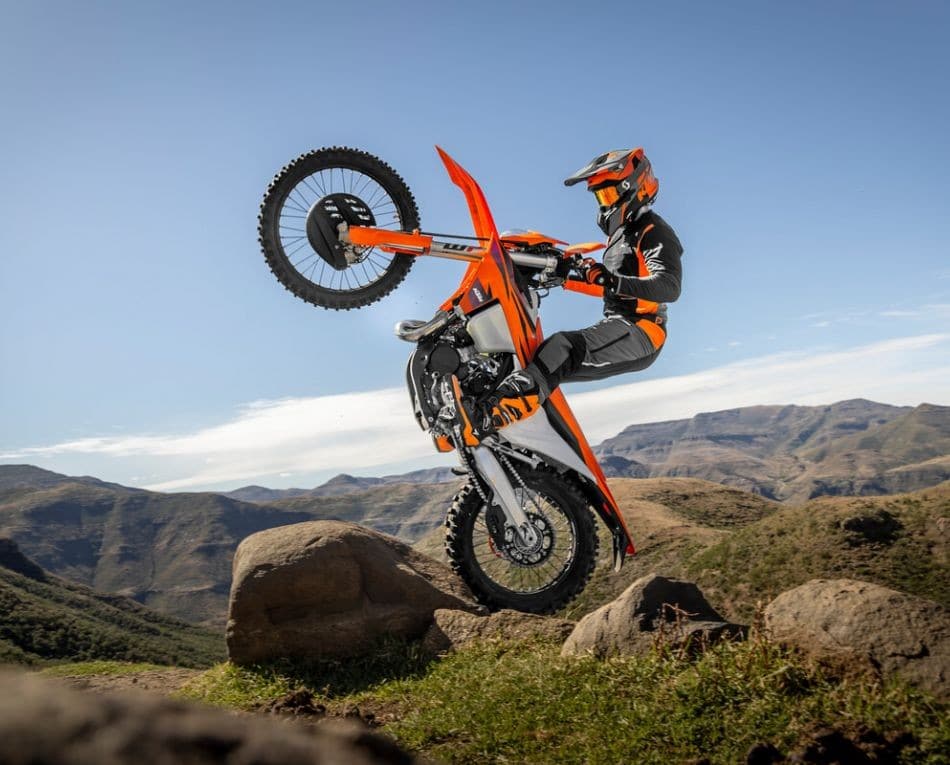
In corporate identity, color is a silent language. KTM’s adoption of bright orange is one of the most successful examples of visual branding in the automotive industry. Before the 1990s, KTM used various colors, but the strategic pivot to “KTM Orange” served two purposes. First, it offered high visibility and safety in off-road environments. Second, it provided a unique “ownable” space in the market. While Honda claimed red and Kawasaki claimed green, KTM’s orange became a badge of membership in an elite, high-performance club.
Positioning Strategy: Extreme Performance
KTM does not position itself as a “lifestyle” brand for the casual commuter. Instead, it utilizes a “top-down” brand strategy. By focusing on the most grueling races in the world—such as the Dakar Rally, where they achieved an unprecedented 18 consecutive wins—they build an aura of invincibility. This “Ready to Race” philosophy is the core of their brand promise. It tells the consumer that the technology in their showroom bike is directly descended from the machine that conquered the desert. This creates a powerful value proposition: when you buy a KTM, you are buying a piece of professional-grade equipment.
Strategic Evolution: From Local Workshop to Global Brand
The journey from a small Austrian shop to the largest motorcycle manufacturer in Europe was not a linear path. It involved a calculated evolution of brand architecture and market expansion that serves as a case study for corporate resilience.
The Turnaround of the 1990s
In the early 1990s, KTM faced a severe financial crisis that led to the company being split into several independent entities. This moment was a crossroads for the brand. Stefan Pierer, the current CEO, took the helm and initiated a radical rebranding. He realized that for KTM to survive, it couldn’t just be an engineering firm; it had to be a lifestyle and performance brand. This era saw the refinement of the logo and the solidification of the “Ready to Race” slogan, transforming a struggling manufacturer into a cult-like brand for enthusiasts.
Expanding the Product Ecosystem
KTM’s brand strategy has masterfully navigated the transition from off-road dominance to street-legal relevance. For years, KTM was pigeonholed as a “dirt bike brand.” To grow, they had to translate their core values—lightweight, powerful, and aggressive—into the street market. The “Duke” and “Super Duke” lines are perfect examples of brand extension. They retained the “Ready to Race” DNA but applied it to asphalt. This expansion allowed the brand to capture a wider demographic without diluting its premium, performance-oriented reputation.
Branding Through Partnership and Innovation
Modern brand strategy often relies on high-level alliances to reach new markets and reinforce existing perceptions. KTM has utilized strategic partnerships to cement its status as a global leader.
The Bajaj Auto Alliance: Scalability Meets Heritage
One of KTM’s most significant strategic moves was its partnership with the Indian automotive giant Bajaj Auto. From a branding perspective, this was a delicate balance. KTM needed Bajaj’s manufacturing scale to enter the Asian market and produce smaller-displacement bikes, but they could not afford to lose their “premium Austrian” status. By maintaining the design and R&D in Mattighofen while leveraging Indian production, KTM successfully expanded its global footprint while keeping the “Made in Austria” prestige intact.
Red Bull KTM: Synergetic Branding
The partnership between KTM and Red Bull is perhaps the most natural fit in the sporting world. Both are Austrian companies, both emphasize high energy, and both target a demographic that values “extreme” experiences. This synergy is so strong that the brands are often viewed as inseparable in the racing world. This co-branding strategy has allowed KTM to leverage Red Bull’s massive marketing machine, ensuring that the KTM logo is visible to millions of non-motorcyclists worldwide, further elevating the brand’s “cool factor.”
Lessons in Brand Resilience and Longevity
What KTM stands for today is a testament to the power of staying true to a core mission while remaining flexible enough to innovate. The brand has survived bankruptcies, market shifts, and intense competition from Japanese and Italian manufacturers by doubling down on its identity.
Staying True to the Core
The most dangerous thing a brand can do is “drift”—losing its original purpose in an attempt to please everyone. KTM has avoided this trap. Even as they produce electric bikes and urban commuters, every product is evaluated against the “Ready to Race” standard. If it doesn’t feel aggressive, lightweight, and performance-focused, it doesn’t get the orange paint. This discipline ensures brand loyalty; customers know exactly what they are getting when they see the KTM badge.

The Future Identity: E-Mobility and Beyond
As the automotive world shifts toward sustainability, KTM is faced with a new branding challenge: how to make electric motorcycles “Ready to Race.” Their current strategy involves positioning electric power not just as a “green” alternative, but as a performance advantage. By focusing on the instant torque and technical sophistication of their E-ride series, KTM is ensuring that the “K,” “T,” and “M” will continue to represent the cutting edge of transportation for the next generation.
In conclusion, KTM stands for far more than Kronreif & Trunkenpolz Mattighofen. It stands for a commitment to excellence that transcends borders. It is a brand that has successfully turned its heritage into a marketing asset, its engineering into a lifestyle, and its color into a global symbol of performance. For anyone looking to understand how to build a brand that resonates on both a functional and emotional level, the story of KTM provides the ultimate roadmap.
aViewFromTheCave is a participant in the Amazon Services LLC Associates Program, an affiliate advertising program designed to provide a means for sites to earn advertising fees by advertising and linking to Amazon.com. Amazon, the Amazon logo, AmazonSupply, and the AmazonSupply logo are trademarks of Amazon.com, Inc. or its affiliates. As an Amazon Associate we earn affiliate commissions from qualifying purchases.