In the world of brand strategy and corporate identity, visual elements serve as the silent ambassadors of a company’s values. When we ask the question, “What color goes with a brown leather sofa?” we are not merely discussing interior decoration; we are exploring the intersection of color psychology, tactile luxury, and the architectural foundation of a brand’s physical and visual presence. A brown leather sofa is a timeless staple that evokes feelings of heritage, stability, and rugged sophistication. However, its effectiveness in a professional or branded environment depends entirely on the secondary and tertiary colors that surround it.

Choosing the right color palette to accompany brown leather is a strategic decision. Whether you are designing a flagship office, a boutique studio, or a digital brand guide inspired by “Old Money” aesthetics, the colors you pair with this classic texture will define your brand’s personality.
1. The Psychology of Brown in Strategic Branding
Before diving into specific color pairings, it is essential to understand why brown leather is such a powerful brand asset. In the spectrum of color psychology, brown is the color of the earth—grounding, reliable, and resilient. When rendered in leather, it gains an additional layer of “premium” status, signaling quality, craftsmanship, and longevity.
The Heritage Factor: Reliability and Trust
For brands in the legal, financial, or consulting sectors, a brown leather sofa is a visual shorthand for experience. It suggests that the institution is not a “fly-by-night” operation but one with deep roots. To enhance this message of trust, the accompanying colors must remain muted and authoritative. Darker tones reflect seriousness, while lighter, warm neutrals suggest transparency.
The Rugged vs. Luxury Dichotomy
Brown leather is unique because it can represent two polar opposites in branding: the rugged outdoors (think Patagonia or Timberland) and the height of luxury (think Hermès or Louis Vuitton). The colors you choose determine which side of this dichotomy your brand lands on. Earthy greens and ochres lean into the rugged, sustainable narrative, while gold, cream, and deep blues push the brand into the realm of high-end exclusivity.
2. Complementary Palettes for Modern Corporate Identities
When building a brand around the presence of brown leather—whether in a physical lounge or as a stylistic choice for a website’s photography—the color harmony must be intentional. Here are the three primary palettes that define modern professional spaces.
The Sophisticate: Navy, Forest Green, and Charcoal
For a brand that wants to project authority and quiet confidence, dark, cool-toned saturated colors are the gold standard.
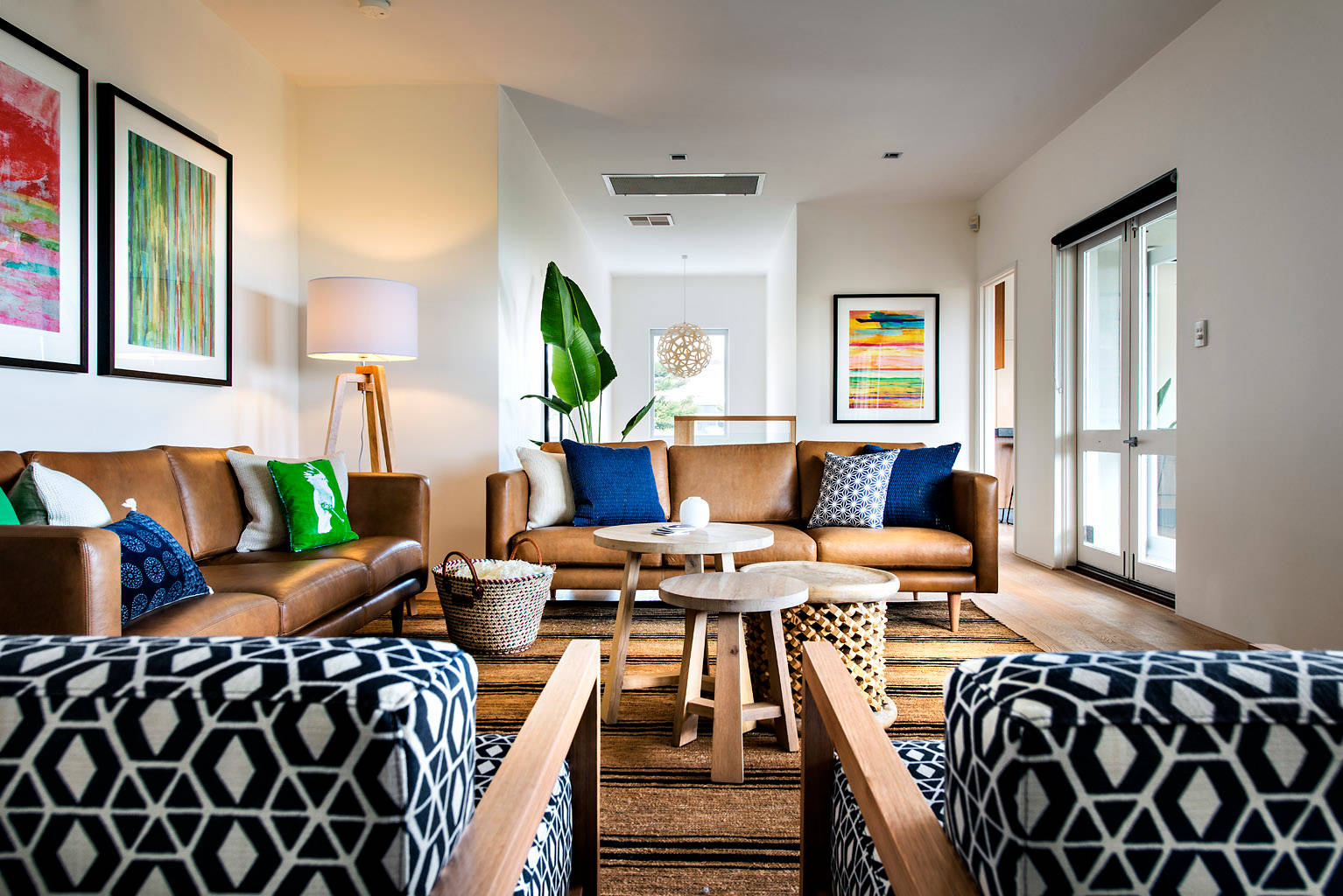
- Navy Blue: This is perhaps the most professional pairing. Blue provides a cool contrast to the warm orange and red undertones of brown leather. It creates a sense of balance and calm, making it ideal for high-stakes negotiation rooms.
- Forest Green: This pairing evokes the feeling of a prestigious library or an established social club. It communicates growth, stability, and a connection to tradition.
- Charcoal Grey: Grey provides a neutral bridge. It modernizes the brown leather, stripping away some of the “rustic” feel and replacing it with a sleek, industrial edge.
The Innovator: Burnt Orange, Teal, and Warm Neutrals
Creative agencies and tech startups often want to utilize the comfort of leather while maintaining an energetic, forward-thinking vibe.
- Teal and Cyan: These colors sit across from brown on the color wheel. This high-contrast pairing creates visual tension that feels energetic and modern. It’s a favorite for brands that want to appear “disruptive.”
- Burnt Orange: Using a monochromatic approach—pairing brown leather with shades of terracotta or burnt orange—creates a warm, inviting, and cohesive brand experience. It suggests creativity and approachability.
- Cream and Beige: These neutrals act as “white space.” They allow the texture of the leather to stand out without overwhelming the viewer, projecting a clean, minimalist, and organized brand image.
The Minimalist: Sage, Soft Grey, and Stone
In the era of “Quiet Luxury,” many brands are opting for a desaturated look. This is common in the wellness, architecture, and high-end real estate industries.
- Sage Green: A muted green brings a sense of peace and organic wellness. It softens the “heavy” look of leather, making the brand feel more breathable.
- Stone and Sand: These colors emphasize the natural origins of leather. They work perfectly for brands that value sustainability and raw materials.
3. Implementing the “Leather Aesthetic” Across Brand Touchpoints

A brand is more than just a physical office; it is a multi-sensory experience that spans digital and physical worlds. If your brand identity is anchored by the warmth of brown leather, that aesthetic must be translated into your UI/UX and marketing collateral.
Digital Design and UI/UX Integration
When translating a physical asset like a brown leather sofa into a digital interface, designers use the “Leather Aesthetic” to convey tactile quality.
- Texture and Depth: Use subtle gradients and drop shadows in your web design to mimic the richness of leather.
- Color Accents: If your primary office feature is a cognac leather sofa, use that exact hex code (e.g., #9A5B44) for your website’s call-to-action buttons or highlights. This creates a seamless transition from the physical welcome to the digital interaction.
- Typography: Pair these earthy tones with serif fonts (like Garamond or Baskerville) to lean into the heritage aspect, or clean sans-serifs (like Helvetica or Montserrat) to modernize the look.
Physical Space: Interior Branding for Client Trust
Your office is a physical manifestation of your brand’s mission statement. The colors surrounding your brown leather sofa dictate the “vibe” of the client experience.
- Wall Colors: Avoid bright whites, which can make leather look out of place or “dirty.” Instead, opt for “off-white” or light greys to provide a soft backdrop that lets the leather glow.
- Metals and Hardware: Branding isn’t just color; it’s material. Brass and gold accents heighten the luxury of brown leather, while matte black or brushed steel gives it a modern, tech-focused utility.
4. Case Studies: Brands that Master the Earthy Aesthetic
To see how these color choices manifest in the real world, we can look at several industries that use the brown leather palette to reinforce their market position.
The Modern Gentlemen’s Brand (Example: Shinola)
Shinola, the Detroit-based watch and leather goods company, uses a palette of brown leather, navy blue, and cream. This reinforces their brand pillars of American craftsmanship, industrial history, and premium quality. Their retail locations often feature brown leather seating against dark blue walls, creating an immediate sense of “sturdy luxury.”
The Sustainable Tech Firm (Example: Modern Offices in Silicon Valley)
Many tech companies are moving away from the “neon and white” aesthetic toward something more grounded. By pairing brown leather sofas with live greenery (biophilic design) and light wood tones, they project a brand identity focused on “Human-Centric Technology.” The brown leather provides the comfort, while the surrounding light greens and neutrals provide the freshness.
The Boutique Law Firm
A law firm that pairs a chesterfield brown leather sofa with dark mahogany wood and forest green accents is using a “Heritage Palette.” This is designed to make the client feel that the firm is immovable, wise, and steeped in tradition. It is a psychological play on the “Protector” brand archetype.
5. Future-Proofing Your Brand’s Visual Palette
Trends in design come and go—from the “Millennial Pink” era to the “Corporate Memphis” illustration style. However, the brown leather aesthetic remains one of the few truly “future-proof” elements in brand strategy. To ensure your brand remains relevant, you must periodically update the secondary colors that accompany your leather assets.
Adapting to the “New Professionalism”
The modern workforce values authenticity over stiff formality. If your brand feels too “stuffy,” you can refresh the look of your leather-based identity by introducing brighter, more optimistic colors like sky blue or soft ochre. This maintains the quality associated with the leather while making the brand feel more accessible to a younger demographic.
The Role of Lighting in Color Perception
Finally, never underestimate the impact of lighting on your brand’s color palette. Warm lighting will pull the red and orange tones out of a brown leather sofa, making the space feel cozy and intimate. Cool-toned LED lighting will make the leather look darker and more formal. Your brand guidelines should specify the “temperature” of your physical spaces to ensure the colors you’ve chosen are perceived correctly by clients.
In conclusion, when determining what color goes with a brown leather sofa, brand strategists must look beyond simple aesthetics. They must ask what story they want to tell. By pairing the reliability of brown leather with the authority of navy, the innovation of teal, or the serenity of sage, a brand can create a visual language that communicates excellence, history, and vision simultaneously. The sofa is not just a seat; it is the foundation of a visual narrative that defines how the world perceives your business.
aViewFromTheCave is a participant in the Amazon Services LLC Associates Program, an affiliate advertising program designed to provide a means for sites to earn advertising fees by advertising and linking to Amazon.com. Amazon, the Amazon logo, AmazonSupply, and the AmazonSupply logo are trademarks of Amazon.com, Inc. or its affiliates. As an Amazon Associate we earn affiliate commissions from qualifying purchases.