
In the hyper-competitive landscape of modern commerce, a brand’s visual identity serves as its silent ambassador. While bold primaries and neon gradients often dominate the “attention economy,” there is a rising movement toward sophisticated, grounded palettes. At the heart of this movement sits tan—a color often dismissed as “beige” or “borer” but which, in the hands of a skilled brand strategist, becomes a powerhouse of versatility and psychological resonance.
Understanding what color matches with tan is not merely a question of aesthetic preference; it is a strategic decision that influences consumer trust, perceived value, and market positioning. Whether you are building a personal brand, a corporate identity, or a niche lifestyle product, mastering the tan-based palette allows you to project an image of timelessness and reliability.
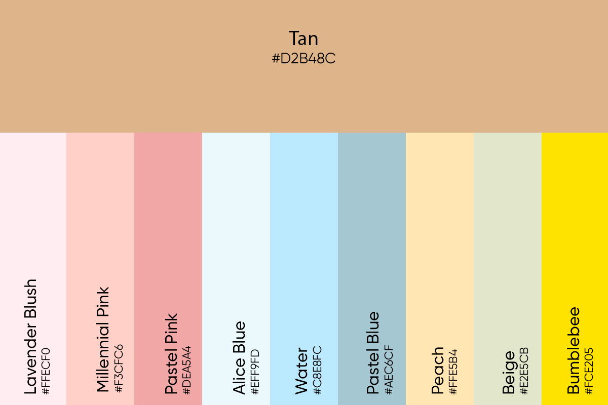
The Psychology of Tan in Modern Branding
Before exploring specific color pairings, we must understand the semiotics of tan. In branding, tan occupies a unique space between the clinical coldness of white and the heavy authority of brown. It is an “earth-tethered” neutral that suggests stability, warmth, and organic growth.
Reliability and Earthiness
In an era of digital fatigue, consumers are increasingly drawn to brands that feel “real.” Tan evokes the textures of the natural world—sand, wood, leather, and stone. For brands in the wellness, organic food, or sustainable architecture sectors, tan serves as a foundational element that signals environmental consciousness without the clichéd over-reliance on bright greens. It suggests a brand that is rooted, dependable, and unswayed by fleeting trends.
Luxury and Minimalist Sophistication
Historically, tan (often referred to as “camel” or “cognac” in high-fashion contexts) has been synonymous with luxury. From Burberry’s iconic trenches to the leather interiors of high-end automotive brands, tan suggests a “quiet luxury.” It doesn’t need to scream for attention because its quality is intrinsic. For a brand aiming for a premium price point, using tan as a primary or secondary color can instantly elevate the perceived value of the product.
Strategic Color Pairings: What Color Matches with Tan for Maximum Impact?
Choosing a complementary color for tan depends entirely on the “Brand Archetype” you wish to embody. The versatility of tan allows it to act as a “chameleon” neutral, shifting its personality based on the colors it sits alongside.
Tan and Deep Navy: The Professional Authority
If you are designing a brand identity for a consultancy, a law firm, or a fintech startup, the combination of tan and navy blue is peerless. Navy provides the “anchor” of authority and intelligence, while tan softens the rigidity of the blue, making the brand feel more approachable and “human.”
- Strategic Application: Use navy for typography and logos to ensure readability and strength, while using tan for secondary graphic elements or background textures to add warmth and depth.
Tan and Forest Green: Sustainability and Growth
For brands focused on the outdoors, sustainability, or holistic health, matching tan with forest green creates an immediate connection to the natural world. This pairing is highly effective for “Eco-Conscious” brand strategies. It avoids the “cheap” feel of neon greens by utilizing desaturated, organic tones.
- Strategic Application: This duo works exceptionally well in packaging design. A tan recycled-paper texture paired with deep green ink communicates an artisanal, hand-crafted quality that justifies a premium “eco” markup.
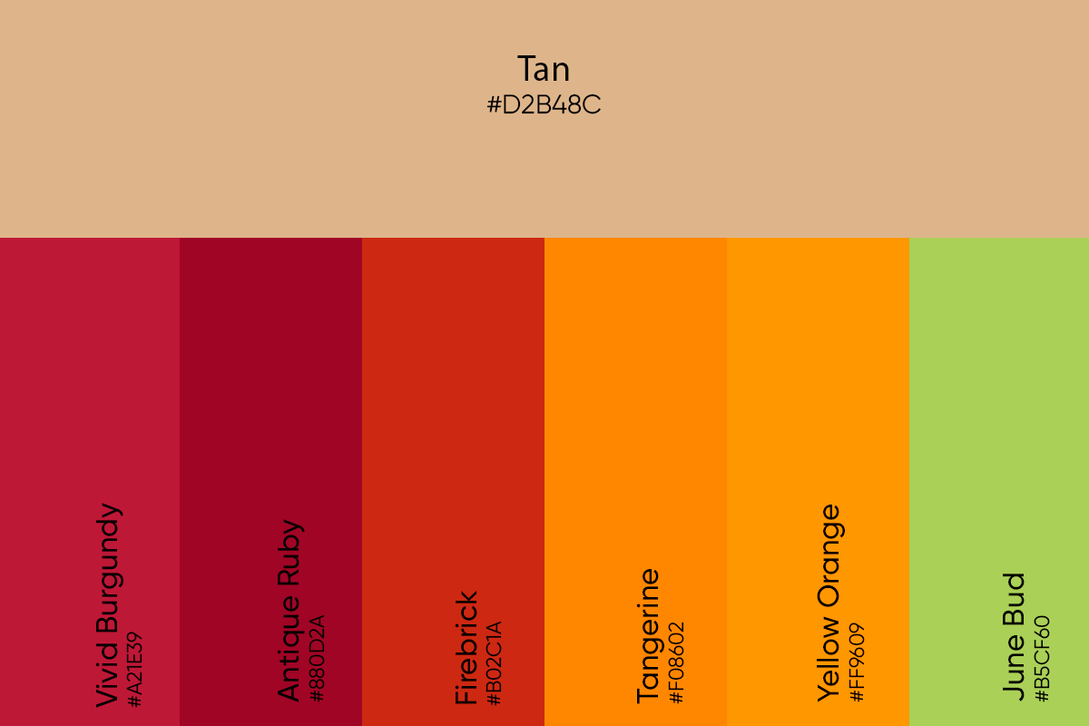
Tan and Burnt Orange or Terracotta: Energy and Creativity
When a brand needs to feel vibrant and energetic without being overwhelming, tan paired with terracotta or burnt orange is the ideal solution. This palette is currently trending in the “Direct-to-Consumer” (DTC) space, particularly for home goods and skincare. It feels “sun-drenched” and optimistic.
- Strategic Application: This is a high-performing palette for social media-first brands. The warmth of the colors performs well under mobile screen filters and creates a cohesive, “Instagrammable” brand aesthetic that encourages user-generated content.
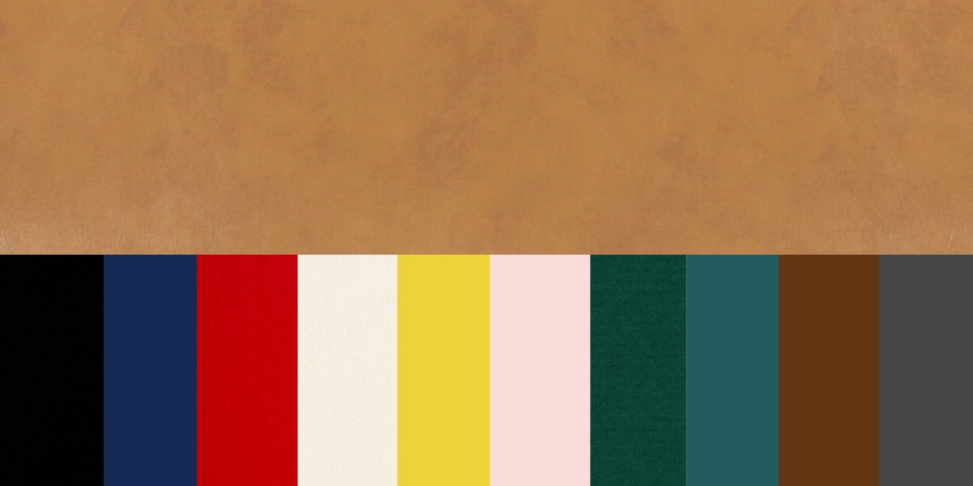
Tan and Black: The High-End Minimalist
For a brand identity that aims for “The Ruler” or “The Creator” archetype, tan and black offer a striking, high-contrast look. It is more sophisticated than the standard black-and-white pairing. The tan provides a mid-tone that prevents the black from feeling too stark or aggressive.
- Strategic Application: Think of premium lifestyle branding. Black matte finishes on packaging with tan embossed lettering or tan silk-screened logos create a tactile sense of luxury that consumers want to display on their shelves.
Implementing Tan Across Your Brand Identity Systems
A color strategy is only as good as its execution across various touchpoints. When working with tan, brand managers must be mindful of how this neutral translates from digital screens to physical materials.
Digital Accessibility and Contrast Ratios
One of the primary challenges in digital brand design is ensuring that tan-based palettes meet Web Content Accessibility Guidelines (WCAG). Because tan is a mid-to-light value color, placing white text over a tan background often results in poor legibility.
- The Strategy: When matching tan with other colors in a UI/UX context, use tan as a background “canvas” and reserve darker tones like charcoal, deep espresso, or navy for text and call-to-action buttons. This ensures that your brand remains inclusive and functional for all users while maintaining its aesthetic integrity.
Physical Collateral and Materiality
Tan truly shines in the physical world. Unlike high-saturation colors which can be difficult to replicate accurately across different printing processes, tan is forgiving and takes well to various textures.
- The Strategy: Consider the “sensory branding” aspect. A tan brand identity can be reinforced through the use of kraft paper, unbleached cotton, or raw linen. This consistency between the visual color and the physical texture creates a powerful, multi-sensory brand experience that sticks in the consumer’s memory far longer than a logo alone.
Case Studies: Brands That Own the Tan Aesthetic
To understand the power of tan in brand strategy, we can look at global leaders who have successfully utilized this neutral to build multi-billion dollar identities.
The Heritage Sector: Burberry and Hermès
Burberry has effectively trademarked a specific shade of tan (Haymarket Check). By matching tan with black, white, and a hint of red, they created a visual shorthand for British heritage and luxury. Similarly, Hermès uses a signature orange-tan (often called “Gold” in their leather goods) to signal exclusivity. For these brands, the color isn’t just an aesthetic choice; it is an asset with measurable equity.
The Modern Disruptors: Outdoor Voices and Skims
In the contemporary market, brands like Outdoor Voices and Kim Kardashian’s Skims have utilized a “nude” or “tan” palette to redefine inclusivity. By matching various shades of tan with soft greys and muted blues, they have moved away from the high-octane “neon” look of traditional athletic and undergarment brands. This strategic shift signaled a move toward “comfort” and “real bodies,” proving that tan can be a tool for radical brand repositioning.
Conclusion: Mastering the Neutral Palette
In the world of brand strategy, there are no “boring” colors—only unimaginative applications. Determining what color matches with tan is the first step in crafting a sophisticated visual language that speaks to the modern consumer’s desire for authenticity, luxury, and stability.
By pairing tan with authoritative navies, organic greens, or high-contrast blacks, you can navigate your brand away from the noise of the “fast-trend” cycle and toward a position of lasting influence. Tan is the foundation upon which trust is built. It is the canvas that allows your brand’s unique value proposition to shine. In a world of fleeting digital flashes, the brands that embrace the grounded, timeless nature of tan are the ones that will endure.
aViewFromTheCave is a participant in the Amazon Services LLC Associates Program, an affiliate advertising program designed to provide a means for sites to earn advertising fees by advertising and linking to Amazon.com. Amazon, the Amazon logo, AmazonSupply, and the AmazonSupply logo are trademarks of Amazon.com, Inc. or its affiliates. As an Amazon Associate we earn affiliate commissions from qualifying purchases.