In the realm of visual communication, the question of “what color is opposite of brown?” might seem like a simple query from a color theory textbook. However, for brand strategists, designers, and marketers, understanding complementary colors, and the strategic use of contrast, is far from a mere academic exercise. It’s a powerful tool that can define a brand’s identity, influence consumer perception, and drive engagement. This exploration delves into the essence of color opposites, not just in terms of the spectral wheel, but in the strategic application of contrast within the dynamic landscape of branding.
Brown itself is a complex color, often associated with earthiness, stability, reliability, and natural elements. Depending on its shade, it can evoke feelings of warmth, comfort, tradition, or even sophistication. To understand its “opposite” is to understand how to best complement and contrast it, thereby creating a visual language that resonates with a target audience.
The Science and Psychology of Color Opposites
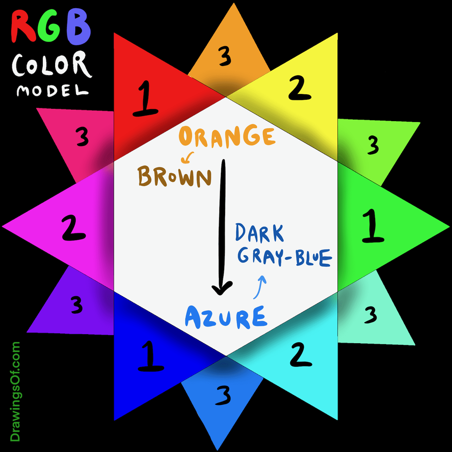
At its core, the concept of opposite colors, or complementary colors, stems from the principles of color theory. When two colors are positioned directly across from each other on a color wheel, they create the strongest possible contrast. When mixed, they tend to neutralize each other, but when placed side-by-side, they intensify one another, creating a vibrant and eye-catching effect.
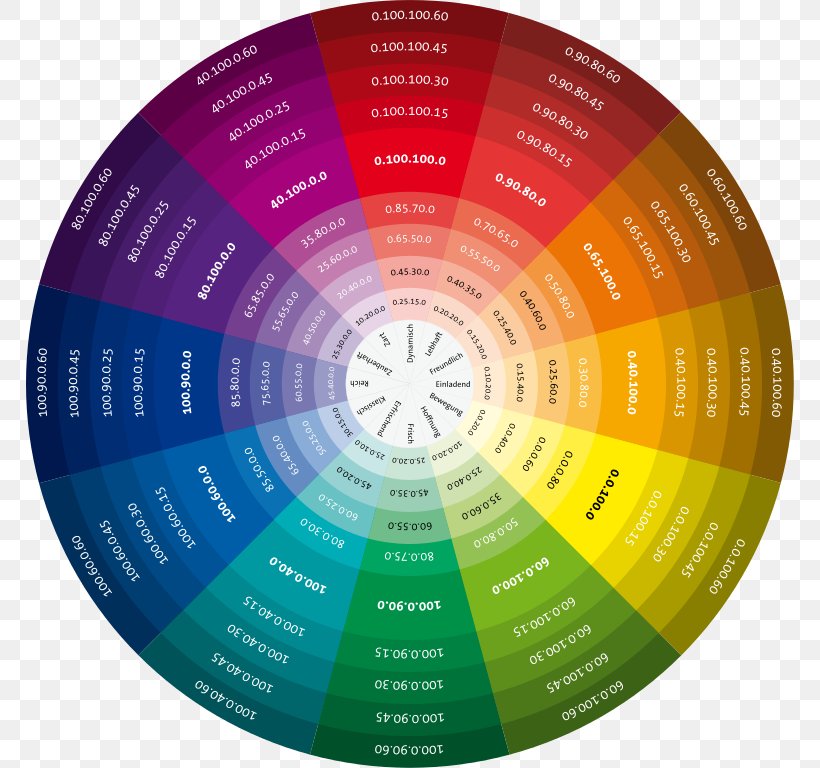
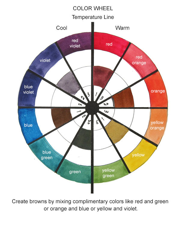
Understanding the Color Wheel and Brown’s Position
For practical branding purposes, the most commonly cited complementary color to brown is blue. This is because brown can be considered a dark shade of orange, and the complementary color to orange on a standard color wheel is blue. However, brown is a secondary color derived from mixing primary colors. The precise “opposite” can vary slightly depending on how brown is perceived or created.
- Brown as Dark Orange: If we consider brown a darkened version of orange, then its direct complement would be blue.
- Brown as a Mix of Red, Yellow, and Blue: Brown is often achieved by mixing red, yellow, and blue pigments in certain proportions. In this context, its complement is not a single color but rather the combination of colors that would create a neutral or greyish hue when mixed. However, for design and branding, this approach is less practical than considering brown’s chromatic hue.
The psychological impact of these color pairings is crucial. Blue, often seen as trustworthy, calm, and professional, can balance the grounded, organic feel of brown. This pairing can be incredibly effective for brands that want to project reliability and a connection to nature, while also conveying a sense of stability and professionalism. Think of brands in the outdoor, coffee, or artisanal food industries that often leverage this combination.
The Strategic Power of Contrast
Beyond the direct complementary pairing, the principle of “opposite” in branding extends to the broader concept of contrast. Contrast isn’t just about color; it’s about creating visual hierarchy, highlighting key elements, and ensuring legibility. In branding, contrast can be achieved through:
- Hue Contrast: Using colors that are far apart on the color wheel, such as brown and blue, green and red, or yellow and purple.
- Value Contrast: The difference between light and dark shades. A dark brown logo on a light cream background, or vice-versa, creates significant value contrast.
- Saturation Contrast: The difference between bright, vivid colors and muted, desaturated ones.
- Temperature Contrast: Pairing warm colors (reds, oranges, yellows) with cool colors (blues, greens, purples).
The strategic application of contrast is what allows a brand to stand out. A brand that is entirely monochromatic or lacks visual diversity risks blending into the background. By understanding what is “opposite” to its primary color palette, a brand can strategically introduce accent colors that create visual interest and draw the viewer’s eye to important elements like calls to action, logos, or key messaging.
Applying Color Opposites in Brand Identity Design
The journey of a brand’s visual identity begins with a deep understanding of its core values, target audience, and market positioning. Color plays an instrumental role in translating these elements into a tangible, recognizable form. When it comes to a color like brown, understanding its complementary hues and the principles of contrast can unlock a brand’s full visual potential.
Developing a Complementary Color Palette
For a brand that uses brown as its primary color, identifying its complementary or analogous colors is a vital step in building a robust brand palette.
-
The Blue Spectrum: As discussed, blues are often the go-to complementary color for brown. However, this is not a monolithic choice. Brands can choose from a wide range of blues:
- Navy Blue: Conveys seriousness, authority, and sophistication. Excellent for financial institutions or premium lifestyle brands.
- Sky Blue: Evokes openness, freedom, and tranquility. Suitable for travel or wellness brands.
- Teal or Turquoise: Offers a blend of blue’s stability with green’s natural connection, creating a sense of balance and innovation.
- Electric Blue: Can add a pop of energy and modernity.
-
Beyond Blue: Other Contrasting Hues: While blue is the traditional opposite, brands can also explore other contrasting relationships that evoke different feelings:
- Greens: Analogous to blue, greens can also provide a pleasing contrast with brown, especially when aiming for a natural, organic, or eco-friendly feel. Think forest green against a rich chocolate brown.
- Oranges and Yellows: While not direct opposites, certain brighter oranges and yellows can create a warm, inviting, and energetic contrast with darker browns, particularly in food or retail contexts.
- Reds: A deep red or crimson can offer a powerful, passionate, and luxurious contrast with brown, suitable for premium goods or brands emphasizing boldness.
The key is to select secondary and accent colors that not only contrast effectively but also align with the brand’s desired emotional resonance. A brand aiming for calm and trust might lean heavily on blues and creams to complement its brown, while a brand seeking excitement and energy might introduce pops of burnt orange or a warm yellow.
Ensuring Visual Hierarchy and Readability
One of the most practical applications of color opposites in branding is to ensure that essential elements of communication are easily digestible. This is where value contrast and hue contrast become paramount.
- Logo Design: The primary logo is the cornerstone of a brand’s visual identity. If a logo features brown, ensuring its readability against various backgrounds is crucial. This might involve a reversed version of the logo in a lighter, contrasting color for darker backgrounds, or the strategic use of a lighter accent color within the logo itself to create internal contrast.
- Website and App Design: In digital interfaces, clear calls to action (CTAs) are vital for user engagement. If a brand’s primary color is brown, CTAs in contrasting blues, greens, or even brighter oranges will naturally stand out, guiding users to desired actions like “Buy Now” or “Sign Up.” White space is also a crucial form of contrast, allowing elements to breathe and preventing visual clutter.
- Marketing Materials: Brochures, advertisements, and social media graphics all benefit from thoughtful color application. Using opposing colors to highlight headlines, key statistics, or product features can dramatically improve the effectiveness of these materials. For instance, a brown background for an article might feature headings or key takeaways in a vibrant blue to draw attention.
By consciously employing principles of color opposition, brands can move beyond mere aesthetics to create functional, intuitive, and persuasive visual experiences.
The Impact of Color Opposites on Consumer Perception and Engagement
The strategic use of color, and specifically the interplay of opposites, has a profound impact on how consumers perceive a brand and interact with its offerings. It’s not just about looking good; it’s about communicating effectively at an subconscious level.
Evoking Desired Emotions and Associations
Colors are deeply intertwined with human emotions and cultural associations. Understanding how the “opposite” of brown (like blue) or other contrasting colors affect these perceptions is a powerful branding tool.
- Trust and Reliability: Brown’s association with earth and stability is amplified when paired with blue’s inherent qualities of trust, calm, and professionalism. This combination can create a powerful message of a reliable, grounded, and trustworthy entity, ideal for industries where security and dependability are paramount.
- Natural and Organic: When brown is paired with greens, it directly reinforces associations with nature, health, and sustainability. This is a common and effective strategy for brands in the organic food, wellness, or environmental sectors.
- Energy and Excitement: While brown is typically a grounding color, pairing it with vibrant oranges or yellows can introduce an element of warmth, dynamism, and excitement, transforming the perception from static to energetic. This could be effective for brands in the food service, hospitality, or creative industries.
- Sophistication and Luxury: A deep brown can be rendered more luxurious and sophisticated when contrasted with metallic accents (like gold or copper, which can be considered warm opposites to cooler tones within brown) or with deep, rich jewel tones like emerald green or sapphire blue.
By carefully selecting the colors that oppose and complement its core brown palette, a brand can curate a specific emotional journey for its audience, guiding their feelings and expectations.
Driving Engagement and Conversion
The practical implications of contrast in driving user behavior are undeniable. In a crowded marketplace, the ability to capture attention and guide action is a significant competitive advantage.
- Highlighting Calls to Action (CTAs): As mentioned, a contrasting color for CTAs significantly increases their visibility. A “Shop Now” button in a bright blue against a brown website background is far more likely to be noticed and clicked than one in a subtle shade of beige. This direct impact on conversion rates makes understanding color opposites a critical business imperative.
- Improving Information Retention: When presenting information, using contrasting colors to highlight key data points, statistics, or important phrases can improve comprehension and retention. This makes marketing materials more persuasive and educational content more accessible.
- Creating Memorable Experiences: A well-executed color strategy, which includes the thoughtful use of contrast and complementary colors, contributes to a brand’s overall memorability. When consumers have a positive and clear visual experience with a brand, they are more likely to recall it and engage with it in the future.
Ultimately, the question “what color is opposite of brown?” is a gateway to understanding the sophisticated interplay of color in brand building. It’s about more than just hue; it’s about strategy, psychology, and the deliberate creation of visual experiences that resonate, inform, and inspire action. By mastering the art of contrast, brands can ensure their message is not only seen but deeply understood and felt by their audience.
aViewFromTheCave is a participant in the Amazon Services LLC Associates Program, an affiliate advertising program designed to provide a means for sites to earn advertising fees by advertising and linking to Amazon.com. Amazon, the Amazon logo, AmazonSupply, and the AmazonSupply logo are trademarks of Amazon.com, Inc. or its affiliates. As an Amazon Associate we earn affiliate commissions from qualifying purchases.