
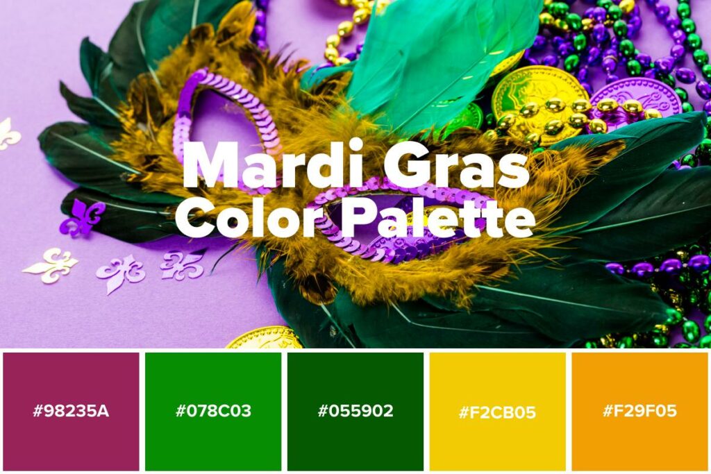
The vibrant, unmistakable hues of Mardi Gras—purple, green, and gold—are more than just a festive palette; they are a powerful branding element, deeply ingrained in the cultural fabric of this iconic celebration. While seemingly simple, these colors carry a rich history and strategic importance, particularly for businesses and organizations looking to connect with audiences, enhance their brand identity, and drive marketing success. Understanding the origins and application of Mardi Gras colors offers valuable insights into the strategic use of color in the world of branding.
The Historical Roots: From Royalty to Revolution
The traditional association of purple, green, and gold with Mardi Gras is not a modern invention. Its origins can be traced back to the late 19th century and the Rex, King of the Carnival. The choice of these specific colors was deliberate and steeped in symbolism, aiming to evoke a sense of grandeur, tradition, and collective identity.
Purple: Justice and Royalty
Purple has long been a color associated with royalty, nobility, and power. Historically, the dyeing process for purple fabric was extremely costly and labor-intensive, making it accessible only to the wealthiest and most powerful individuals. In the context of Mardi Gras, purple signifies justice and regal authority. It imbues the celebration with a sense of gravitas and importance, elevating it beyond a mere party to an event with historical and cultural weight. For brands, associating with purple can subtly communicate a sense of prestige, quality, and leadership. It can position a product or service as premium, sophisticated, and authoritative, appealing to consumers who value such attributes. Think of luxury brands that often employ purple in their logos or packaging to convey exclusivity and high status.
Green: Faith and Hope
Green, often overlooked in its symbolic depth, represents faith and hope within the Mardi Gras tradition. This connection speaks to the enduring spirit of the celebration, its ability to bring communities together year after year, and the optimistic anticipation of its return. In a broader sense, green is universally associated with nature, growth, prosperity, and renewal. For brands, the color green can be leveraged to communicate a commitment to sustainability, environmental responsibility, or the idea of growth and progress. It can evoke feelings of tranquility, health, and vitality. Consider how many natural food brands or eco-friendly companies prominently feature green in their visual identity to reinforce their core values and connect with environmentally conscious consumers.
Gold: Power and Wealth
Gold is perhaps the most universally understood symbol of wealth, prosperity, and power. In Mardi Gras, it represents the sheer opulence and celebratory extravagance of the event. It shines brightly, capturing attention and signifying abundance. For brands, gold is a potent tool for conveying luxury, success, and high value. It can be used to highlight premium products, celebrate achievements, or create an aura of exclusivity. Brands that utilize gold often aim to project an image of success, aspiration, and high quality. Think of high-end jewelry stores, luxury car manufacturers, or premium spirits brands that often incorporate gold accents to signify their elevated status and the discerning taste of their clientele.
The Strategic Deployment: Mardi Gras Colors in Branding and Marketing
The conscious and consistent use of purple, green, and gold by Mardi Gras organizations and the city of New Orleans itself has created a powerful and instantly recognizable brand. This deliberate branding strategy offers a compelling case study for how businesses can leverage color to build recognition, evoke emotion, and drive consumer engagement.
Building Brand Recognition and Identity
The distinctive trinity of purple, green, and gold has become synonymous with Mardi Gras. This consistent application across parades, costumes, decorations, and promotional materials has built an incredibly strong and memorable brand identity. When people see these colors together, they immediately associate them with the joyous, festive, and culturally rich experience of Mardi Gras.
For brands, this demonstrates the power of a consistent color palette. By selecting a core set of colors and applying them consistently across all brand touchpoints—from logos and websites to social media campaigns and product packaging—businesses can foster instant recognition and build a strong visual identity. This consistency helps consumers quickly identify a brand, recall its offerings, and differentiate it from competitors. For instance, the Coca-Cola red is instantly recognizable, as is the Tiffany blue. These colors are not just aesthetic choices; they are integral components of the brand’s identity, shaping perceptions and eliciting specific emotional responses.
Evoking Emotion and Association

Colors have a profound psychological impact, influencing our moods, emotions, and perceptions. The combination of purple, green, and gold in Mardi Gras is designed to evoke a specific emotional response: excitement, joy, anticipation, and a sense of belonging to something grand and celebratory. Purple’s regal nature, green’s hopeful vibrancy, and gold’s opulent sparkle work in concert to create an atmosphere of festive abundance and joyful revelry.
Brands can strategically employ color to tap into similar emotional connections with their target audience. Choosing colors that align with the desired brand persona and the emotional benefits of the product or service is crucial. A brand aiming to convey trust and reliability might lean towards blues, while a brand focused on energy and innovation might opt for vibrant oranges or yellows. Mardi Gras colors, when used in a marketing context, can similarly evoke feelings of festivity, generosity, and a spirit of celebration, making them ideal for seasonal promotions, event marketing, or brands that want to project an image of fun and excitement.
Driving Marketing Campaigns and Consumer Engagement
The visual appeal of Mardi Gras colors makes them highly effective for marketing campaigns. The vibrant and festive nature of the palette naturally draws attention and creates a sense of urgency and excitement, particularly during the carnival season. Businesses often capitalize on this by incorporating Mardi Gras themes and colors into their advertising, promotions, and in-store displays to align with the prevailing mood and capture consumer interest.
From a marketing perspective, the strategic use of these colors can:
- Enhance Seasonal Promotions: During the Mardi Gras season, brands can use purple, green, and gold to create themed campaigns, special offers, or limited-edition products that resonate with the celebratory spirit and tap into consumer spending habits associated with holidays and events.
- Create Thematic Packaging: For products related to food, beverages, or entertainment, incorporating Mardi Gras colors can make packaging more attractive and impulse-buy friendly, especially when the items are intended for parties or gatherings.
- Boost Social Media Engagement: Visually striking content is key on social media. Using the bold and distinctive Mardi Gras color scheme can create eye-catching posts, stories, and ads that capture attention in a crowded digital space.
- Develop Experiential Marketing: For events, festivals, or retail spaces, a well-executed Mardi Gras color theme can transform an environment, creating an immersive and memorable experience for attendees or customers, thus fostering positive brand associations.
Beyond the Celebration: Adapting Mardi Gras Colors for Modern Brands
While the immediate association of purple, green, and gold is with the annual New Orleans festival, their symbolic power and aesthetic appeal extend far beyond the parades. Savvy brands can adapt and integrate these colors, or elements thereof, into their identities and marketing strategies to achieve a variety of branding objectives.
Subtle Integration and Modern Interpretation
It’s not always about a literal replication of the full Mardi Gras palette. Brands can draw inspiration from the core symbolism and translate it into their own unique visual language. This might involve:
- Using a Dominant Color with Accents: A brand might choose purple as its primary color to convey sophistication and royalty, using touches of gold or green for highlights, calls to action, or to signify special features or products.
- Focusing on the Feeling: Instead of directly using the colors, a brand might aim to evoke the feeling of Mardi Gras—joy, abundance, and celebration—through its overall design aesthetic, which could include vibrant color combinations that are reminiscent of the festival’s spirit.
- Strategic Color Pairings: Combining one or two Mardi Gras colors with a neutral palette can create a sophisticated yet festive look. For example, a deep emerald green paired with a classic cream and subtle gold accents can feel elegant and celebratory without being overtly carnival-themed.
- Leveraging the Individual Color Symbolism: A brand focused on growth and well-being might lean heavily on green, using it as its primary brand color to communicate its values. Similarly, a luxury brand might use purple and gold to signal exclusivity and quality.
Case Studies in Color Application
While specific direct examples of brands adopting all Mardi Gras colors might be niche, the underlying principles of their strategic use are evident across various industries:
- Luxury Goods: Brands selling high-end jewelry, watches, or fashion often use gold extensively to signify wealth and craftsmanship. Purple is frequently employed by high-end cosmetic brands or in exclusive product lines to denote prestige and luxury.
- Food and Beverage: Companies in the food and beverage sector often use green to signify freshness, natural ingredients, or health. For celebratory or indulgent products, gold can be used to convey premium quality or a sense of indulgence, such as gold leaf on chocolates or gilded bottle caps on premium spirits.
- Hospitality and Events: Hotels, resorts, and event planners might use elements of the Mardi Gras palette to create an atmosphere of celebration, luxury, or festivity, particularly for themed events or during specific seasons.
- Seasonal Retail: During the holiday season, many retailers incorporate festive color palettes that often echo the vibrancy of Mardi Gras, using combinations of jewel tones and metallics to create an inviting and celebratory shopping experience.

The Enduring Power of Color in Brand Messaging
The enduring appeal and recognition of Mardi Gras colors serve as a potent reminder of the significant role color plays in building and sustaining a brand. These three hues, through their historical depth and symbolic resonance, have transcended their origins to become a globally recognized shorthand for celebration, joy, and a touch of regal splendor. For marketers and brand strategists, the lesson is clear: understand the psychological and cultural implications of color, use it consistently and strategically, and you can create an indelible mark on the hearts and minds of your audience. The vibrant, triumphant trinity of purple, green, and gold is a testament to the power of color to not only decorate but to define and to drive engagement, offering a rich tapestry of insights for any brand looking to make a lasting impression.
aViewFromTheCave is a participant in the Amazon Services LLC Associates Program, an affiliate advertising program designed to provide a means for sites to earn advertising fees by advertising and linking to Amazon.com. Amazon, the Amazon logo, AmazonSupply, and the AmazonSupply logo are trademarks of Amazon.com, Inc. or its affiliates. As an Amazon Associate we earn affiliate commissions from qualifying purchases.