
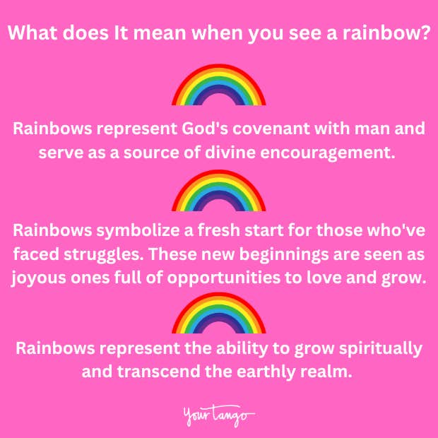
The appearance of a rainbow, a breathtaking arc of color painted across the sky, has captivated humanity for millennia. Beyond its stunning visual spectacle, the rainbow has woven itself into the fabric of our cultures, imbued with profound symbolism – hope, promise, diversity, and often, a hidden treasure. When we extend this rich tapestry of meaning into the realm of business and branding, the rainbow becomes far more than just a meteorological phenomenon; it transforms into a potent metaphor for strategic growth, innovative identity, and the aspirational journey of a brand. Understanding what it means to “see a rainbow” in a brand context is about recognizing the emergent signs of success, the foundational elements of a unique identity, and the strategic pathways that lead to a desired outcome.
In the competitive landscape of today’s market, brands are constantly seeking to differentiate themselves, connect with their audiences on a deeper level, and ultimately, achieve their own version of that coveted “pot of gold.” This pursuit often involves navigating complex challenges, fostering a distinct corporate identity, and employing sophisticated marketing strategies. The rainbow, in its multifaceted symbolism, offers a compelling framework for dissecting these elements and understanding what truly signifies a thriving and impactful brand.
The Spectrum of Brand Identity: Crafting a Unique Visual and Emotional Resonance
A brand’s identity is its essence, the sum total of how it presents itself to the world, how it is perceived, and the emotional connection it fosters with its audience. Much like a rainbow’s distinct yet harmonious band of colors, a strong brand identity is built upon a spectrum of carefully curated elements that, when combined, create a singular, memorable impression. This is not merely about a logo or a color palette; it’s about the entire sensory and emotional experience a consumer has with a brand.
Unpacking the Prismatic Components of a Brand’s Visual Language
The most immediate association with a rainbow is its visual impact. Similarly, a brand’s visual identity is its most accessible and recognizable attribute. This encompasses a range of elements, each contributing to the overall perception and memorability of the brand.
The logo is the foundational pillar, the iconic mark that represents the brand’s core. Like a single, vibrant hue in the rainbow, it needs to be distinctive, scalable, and representative of the brand’s values. Consider the iconic swoosh of Nike, the golden arches of McDonald’s, or the bitten apple of Apple – these are not just symbols but deeply ingrained visual identifiers that evoke a wealth of associations.
Beyond the logo, color psychology plays a crucial role. Each color in the rainbow, and indeed in any brand’s palette, carries specific connotations. Red might signify passion or urgency, blue trust and stability, green growth and nature, yellow optimism and energy. A brand that strategically employs a diverse yet cohesive color palette can communicate a wide array of emotions and attributes, mirroring the multifaceted nature of a rainbow. Think of the playful and energetic spectrum used by Google, or the calming and natural tones of Whole Foods. The interplay of these colors creates a visual language that resonates with the target audience.
Typography is another critical element. The choice of fonts – serif, sans-serif, script, or display – can dramatically influence how a brand is perceived. Is it modern and sleek, traditional and authoritative, or friendly and approachable? Just as the distinct shades of a rainbow create visual separation while remaining part of a unified arc, different fonts might be used for headlines, body text, and calls to action, all contributing to a consistent and readable brand voice.
Finally, imagery and design aesthetics tie everything together. High-quality photography, illustrations, and overall graphic design contribute to the brand’s look and feel. Whether it’s the aspirational lifestyle imagery of a luxury fashion brand or the practical, informative visuals of a tech company, these elements form the visual narrative that draws consumers in. A brand that masters its visual language, much like a rainbow masterfully displays its spectrum, creates an immediate and lasting impression.
The Emotional Spectrum: Connecting with the Consumer’s Psyche
While visual elements are crucial, the true power of a brand lies in its ability to connect emotionally with its audience. The rainbow, with its symbolism of hope and wonder, taps into universal human emotions. A brand that can evoke similar feelings, building a genuine emotional resonance, moves beyond mere transaction to foster loyalty and advocacy.
This emotional connection is built through storytelling. Brands that can articulate a compelling narrative about their origins, their mission, their values, and their impact can create a deeper bond with consumers. This story needs to be authentic and consistent across all touchpoints, mirroring the consistent arc of a rainbow. It’s about conveying not just what a product does, but what it represents and how it makes people feel.
The rainbow’s association with promise and good fortune also translates to how brands can position themselves. They can promise solutions to problems, aspirations for a better future, or experiences that bring joy and satisfaction. This promise needs to be delivered upon consistently. A brand that repeatedly fulfills its promises, both tangible and intangible, builds trust and reinforces its positive emotional association, much like the reliable appearance of a rainbow after a storm brings a sense of relief and renewal.
Furthermore, the rainbow is a symbol of diversity and inclusivity, representing a multitude of colors coexisting harmoniously. Brands that embrace and celebrate diversity in their messaging, their workforce, and their products are tapping into a powerful contemporary value. This inclusivity fosters a sense of belonging for a wider audience, making the brand feel more relatable and aspirational. When a brand authentically embodies inclusivity, it’s like seeing a spectrum of individuals united under a common, positive symbol, much like the diverse colors of the rainbow.
Navigating the Arc of Brand Strategy: From Potential to Promise Realized
Just as a rainbow emerges after rain, signifying a shift from challenge to beauty, brand strategy is the deliberate process of guiding a brand from its nascent potential to a realized vision. It involves understanding the market, defining objectives, and charting a course to achieve them. The metaphor of the rainbow’s arc can help us visualize this strategic journey, from the initial spark of an idea to the sustained success that represents the “pot of gold.”
Identifying the “Pot of Gold”: Defining Success and Setting Strategic Goals
The mythical pot of gold at the end of the rainbow is the ultimate symbol of reward and achievement. For a brand, this “pot of gold” is not a tangible treasure chest but a well-defined set of strategic objectives. These goals must be clear, measurable, achievable, relevant, and time-bound (SMART).

This process begins with market research. Understanding the competitive landscape, identifying unmet needs, and recognizing emerging trends are akin to observing the atmospheric conditions that precede a rainbow. A brand must know where it stands before it can chart a course. This involves analyzing competitors, understanding customer demographics and psychographics, and identifying opportunities for differentiation.
Defining the brand’s unique value proposition (UVP) is paramount. What makes this brand stand out? What unique benefit does it offer that competitors do not? This UVP is the foundation upon which all subsequent strategic decisions are built. It’s the core message that the brand will communicate, the reason why consumers should choose it over others.
Setting clear, aspirational, yet attainable goals is the next step. These might include market share targets, revenue growth, customer acquisition rates, brand awareness metrics, or customer satisfaction scores. These goals act as the “end of the rainbow,” providing a clear destination for the brand’s strategic efforts. Without a well-defined pot of gold, the journey lacks direction and purpose.
Charting the Course: Marketing, Communication, and Digital Integration
Once the destination is clear, the strategy involves charting the most effective course to get there. This is where marketing and communication efforts come into play, acting as the forces that guide the brand along its arc.
Marketing strategies encompass a wide array of tactics designed to reach and engage the target audience. This includes traditional advertising, public relations, content marketing, social media marketing, influencer collaborations, and experiential marketing. Each of these channels serves as a different segment of the rainbow’s arc, contributing to the overall reach and impact.
Digital integration is no longer optional; it’s essential. A strong online presence, robust social media engagement, and effective digital advertising campaigns are crucial for reaching today’s consumers. This involves understanding SEO, SEM, social media algorithms, and the evolving digital landscape. For instance, a targeted social media campaign can act as a prism, refracting a brand’s core message to specific, receptive audiences.
Communication is the language of the brand. It must be consistent, authentic, and tailored to each platform and audience segment. This involves developing a clear brand voice, crafting compelling messaging, and ensuring that all communications reinforce the brand’s values and UVP. Whether it’s a press release, a social media post, or a customer service interaction, every touchpoint is an opportunity to strengthen the brand’s connection with its audience, guiding them along the path towards that pot of gold.
The Enduring Rainbow: Building Brand Equity and Long-Term Success
The most impactful aspect of a brand is its enduring presence and the equity it builds over time. A true “rainbow” brand doesn’t just appear; it sustains its brilliance, becoming a reliable and cherished fixture in the consumer’s mind. This requires a commitment to consistent quality, continuous innovation, and a deep understanding of the evolving market and consumer needs.
Sustaining the Shine: Loyalty, Advocacy, and Reputation Management
A strong brand equity is built on the foundation of customer loyalty and advocacy. When customers consistently choose a brand and recommend it to others, it signifies that the brand has delivered on its promises and fostered a positive emotional connection. This is the true “pot of gold” – a self-sustaining ecosystem of satisfied customers.
Customer loyalty is nurtured through exceptional product or service quality, outstanding customer service, and a consistent brand experience. Brands that prioritize customer satisfaction and actively seek feedback are better positioned to retain their audience. Think of brands that have built cult followings; their customers are not just consumers but passionate advocates.
Brand advocacy is the ultimate testament to a brand’s success. When customers become voluntary spokespeople, sharing their positive experiences and defending the brand, it amplifies its reach and credibility far beyond what traditional marketing can achieve. This organic endorsement is invaluable.
Reputation management is also critical to sustaining a brand’s shine. In today’s hyper-connected world, negative feedback can spread rapidly. Brands must have robust strategies in place to monitor their reputation, address concerns promptly and effectively, and turn potential crises into opportunities for demonstrating their commitment to their customers and values. Maintaining a positive and trustworthy reputation is like ensuring the rainbow’s colors remain vibrant and unblemished.

The Evolving Spectrum: Innovation and Adaptability for Future Growth
The world is in constant flux, and so are consumer needs and preferences. A brand that rests on its laurels risks fading into obscurity, much like a rainbow that dissipates with changing weather. To maintain its brilliance, a brand must embrace innovation and adaptability, continually evolving its offerings and its approach.
Innovation can take many forms, from developing new products and services to improving existing ones, or finding new ways to engage with customers. It’s about staying ahead of the curve, anticipating future trends, and proactively meeting the evolving demands of the market. This might involve investing in research and development, fostering a culture of creativity within the organization, or embracing new technologies.
Adaptability is the capacity to respond to change. This could mean adjusting marketing strategies in response to new platforms, pivoting product offerings to meet shifting consumer tastes, or navigating unforeseen economic or social shifts. Brands that can be agile and resilient are better equipped to weather storms and continue to shine.
Ultimately, seeing a “rainbow” in the context of branding is about recognizing the interconnectedness of identity, strategy, and enduring success. It’s about understanding that a brand’s journey is a spectrum of development, from its foundational elements to its aspirational goals. By mastering its visual and emotional language, charting a clear strategic course, and committing to continuous innovation and customer engagement, a brand can indeed find its own radiant arc, leading to a sustained and prosperous future – its very own pot of gold.
aViewFromTheCave is a participant in the Amazon Services LLC Associates Program, an affiliate advertising program designed to provide a means for sites to earn advertising fees by advertising and linking to Amazon.com. Amazon, the Amazon logo, AmazonSupply, and the AmazonSupply logo are trademarks of Amazon.com, Inc. or its affiliates. As an Amazon Associate we earn affiliate commissions from qualifying purchases.