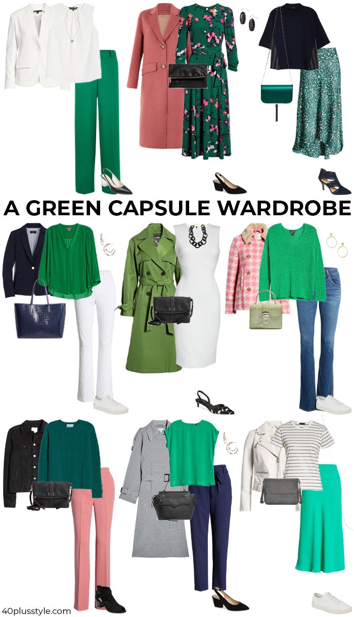
Green, a color symbolizing nature, growth, and prosperity, offers a surprisingly versatile foundation for personal and professional wardrobes. Its inherent connection to balance and harmony makes it a powerful tool for crafting a compelling brand identity. Whether you’re aiming for a sophisticated corporate look, an approachable personal brand, or a statement-making visual presence, understanding how to pair green with other colors is crucial. This guide delves into the art and science of color combinations, empowering you to leverage green effectively in your visual communication and personal presentation.
The Psychology of Green in Branding
Before exploring specific color pairings, it’s essential to understand the inherent psychological impact of green. This understanding forms the bedrock of effective brand communication. Green is a color of vitality, stability, and freshness. It can evoke feelings of calm, trust, and health, making it a popular choice for brands in the environmental, health and wellness, and financial sectors. However, the specific shade of green can dramatically alter its perception and, consequently, the message it conveys.
Decoding the Nuances of Green Shades
The vast spectrum of green offers a nuanced palette for branding. Each shade carries its own distinct personality and associated meanings:
- Emerald and Forest Green: These deep, rich greens exude luxury, sophistication, and authority. They are ideal for brands aiming to convey stability, tradition, and high quality. In a personal branding context, these shades can project confidence and professionalism.
- Olive and Khaki Green: These muted, earthy tones speak of reliability, naturalness, and groundedness. They are excellent for brands emphasizing authenticity, organic products, or a down-to-earth approach. For individuals, they can communicate a sense of calm competence and approachability.
- Mint and Sage Green: Lighter, pastel greens are associated with tranquility, serenity, and new beginnings. They evoke a sense of renewal and freshness, making them suitable for brands focused on health, self-care, or innovation. Personally, these shades can soften an image and convey a gentle, approachable demeanor.
- Lime and Neon Green: These vibrant, energetic greens are bold, modern, and attention-grabbing. They are perfect for brands wanting to project dynamism, creativity, and a forward-thinking attitude. When used judiciously, they can inject personality and memorability into a personal brand.
Harmonious Pairings: Complementing Green for Maximum Impact
The true power of green in branding lies in its ability to harmoniously integrate with a wide array of colors. These pairings are not merely aesthetic choices; they are strategic decisions that amplify the intended message and enhance brand recognition.
Classic and Timeless Combinations
Certain color pairings with green have stood the test of time, offering a sense of familiarity and trustworthiness. These combinations are often seen as safe yet sophisticated, making them excellent choices for establishing a consistent and reliable brand image.
- Green and Navy Blue: This pairing is a cornerstone of professional attire and corporate branding. Navy blue, with its connotations of stability, trust, and authority, perfectly complements green’s themes of growth and prosperity. Together, they create a balanced and dependable aesthetic, ideal for financial institutions, consulting firms, or any brand aiming to convey seriousness and competence. For individuals, this combination projects a polished and authoritative presence.
- Green and Beige/Cream: The natural synergy between green and neutral tones like beige and cream is undeniable. These pairings evoke a sense of organic harmony, earthiness, and understated elegance. They are perfect for brands in the lifestyle, home décor, or natural product sectors. This combination communicates a relaxed yet refined brand identity, promoting feelings of comfort and authenticity.
- Green and Grey: Grey offers a sophisticated and modern backdrop for green. It can tone down the vibrancy of brighter greens or enhance the depth of darker greens. This pairing suggests professionalism, innovation, and a contemporary edge. It’s a versatile choice for tech companies, creative agencies, or any brand looking to project a modern and intelligent image.
- Green and White: This classic combination is clean, fresh, and invigorating. White symbolizes purity, simplicity, and clarity, allowing green to truly shine. It’s a particularly effective pairing for brands focused on health, wellness, or any product that emphasizes a natural and unadulterated quality. The crispness of white against green creates a visually appealing and easily digestible brand message.
Bold and Contemporary Statements
For brands aiming to stand out and capture attention, bolder color combinations with green can be highly effective. These pairings often convey a sense of creativity, dynamism, and a willingness to push boundaries.
- Green and Burgundy/Deep Red: The juxtaposition of green with rich reds like burgundy creates a striking and sophisticated contrast. This pairing often evokes feelings of luxury, passion, and power. It’s a bold choice that can be used by fashion brands, upscale restaurants, or creative studios aiming for a memorable and impactful visual identity.
- Green and Mustard Yellow/Ochre: This earthy yet vibrant combination offers a retro-inspired feel and speaks of warmth, creativity, and individuality. It’s a less conventional pairing that can make a brand stand out. Brands in the artisanal, vintage, or creative arts sectors can leverage this combination to project a unique and expressive identity.
- Green and Coral/Peach: For a softer, yet still impactful, contemporary pairing, consider green with coral or peach. This combination is cheerful, optimistic, and inviting. It can be effective for brands in the beauty, lifestyle, or children’s product industries, conveying a sense of joy and approachability.
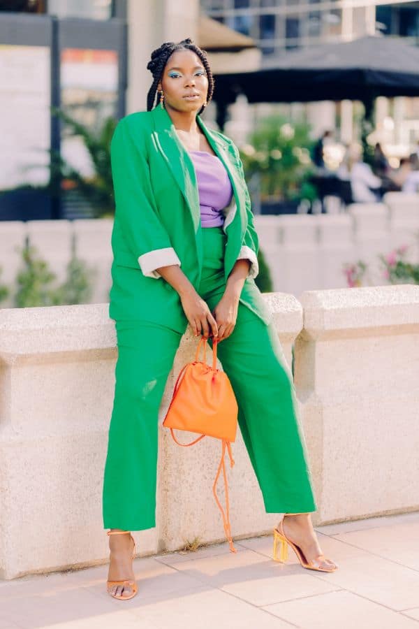
- Green and Bright Orange: This is a high-energy pairing that demands attention. It speaks of boldness, creativity, and a playful spirit. Brands that want to convey a sense of excitement, innovation, and a youthful exuberance might consider this combination. It’s a powerful choice for advertising campaigns or for brands that thrive on making a strong initial impression.

Strategic Application of Color Combinations
Understanding color theory is only the first step; the strategic application of these combinations is what truly elevates a brand. The context, target audience, and desired emotional response should all inform your color choices.
Personal Branding: Crafting Your Visual Identity
In the realm of personal branding, the colors you wear are a significant part of your non-verbal communication. When incorporating green into your professional attire or personal style, consider the impression you wish to make.
- For the Authoritative Professional: Pair a dark green blazer with a crisp white shirt and navy trousers. This combination projects competence, trustworthiness, and a strong sense of presence. Accessories in muted metallics like brushed silver or pewter can further enhance the sophisticated feel.
- For the Creative Innovator: Experiment with bolder pairings. A mint green dress with coral accessories or an olive green shirt with mustard yellow accents can convey creativity, approachability, and a unique personality. These combinations suggest a willingness to think outside the box.
- For the Approachable Leader: Blend green with softer neutrals. An emerald green scarf with a beige cardigan and cream trousers can create a look that is both professional and warm, signaling leadership that is both effective and empathetic.
Corporate Identity and Marketing Materials
For businesses, consistent and thoughtful color choices are paramount for brand recognition and recall. Green can be a powerful anchor in a brand’s visual identity.
- Logo Design: A logo featuring green can immediately communicate aspects of nature, growth, or environmental responsibility. Pairing it with a secondary color that aligns with the brand’s personality (e.g., blue for trust, yellow for optimism) creates a balanced and memorable emblem.
- Website and App Design: The use of green on digital platforms can evoke a sense of calm and ease of use. For example, a financial app might use forest green to inspire confidence, while a wellness app could opt for sage green to promote relaxation.
- Marketing Campaigns: The colors used in advertising collateral, social media graphics, and promotional materials should consistently reinforce the brand’s core message. A campaign aiming to highlight sustainability might lean on natural greens paired with earthy browns, while a campaign focused on innovation could use vibrant greens with modern greys.
The Art of Balance and Proportion
Even the most harmonious color combinations can fall flat if not applied with an understanding of balance and proportion. The dominance of each color plays a crucial role in shaping the overall perception.
Dominant vs. Accent Colors
When pairing green with another color, consider which color will take the lead and which will serve as an accent.
- Green as the Dominant Color: If you want to emphasize themes of nature, growth, or freshness, green should be the primary color. Pair it with smaller accents of complementary colors to add interest without overpowering the core message. For instance, a forest green suit could be accessorized with a burgundy tie and a subtle cream pocket square.
- Green as an Accent Color: In some cases, green can be used more sparingly to inject energy or a specific feeling into a predominantly neutral or other colored palette. A navy blue suit can be elevated with a vibrant green shirt or a bold green tie, adding a touch of personality and memorability.
Considering the Occasion and Audience
The appropriateness of a color combination is also dictated by the context. A bold green and orange pairing might be perfect for a creative startup’s launch party but less suitable for a formal corporate board meeting. Similarly, understanding your target audience’s cultural associations with colors is essential for effective communication.
In conclusion, green is a dynamic and impactful color that offers immense potential for crafting compelling brand identities. By understanding the psychological nuances of its various shades and mastering the art of harmonious color pairings, you can leverage green to communicate trustworthiness, growth, innovation, and a host of other valuable brand attributes. Whether through personal attire or corporate branding, thoughtful color choices empower you to create a visual language that resonates deeply with your intended audience, solidifying your brand’s presence and impact in the marketplace.
aViewFromTheCave is a participant in the Amazon Services LLC Associates Program, an affiliate advertising program designed to provide a means for sites to earn advertising fees by advertising and linking to Amazon.com. Amazon, the Amazon logo, AmazonSupply, and the AmazonSupply logo are trademarks of Amazon.com, Inc. or its affiliates. As an Amazon Associate we earn affiliate commissions from qualifying purchases.