Khaki. It’s a colour that evokes a sense of groundedness, a touch of utilitarian elegance, and an inherent versatility. But when it comes to building a compelling brand, simply knowing that a colour “works” isn’t enough. Understanding why certain colours complement khaki, and how to strategically deploy them within your brand’s visual identity, is paramount for creating resonance, trust, and memorability. This isn’t about fleeting fashion trends; it’s about the enduring power of colour psychology and its impact on brand perception.
In the realm of branding, colour is far more than just an aesthetic choice. It’s a potent non-verbal communicator, capable of conveying a brand’s personality, values, and aspirations before a single word is read. Khaki, with its rich history and inherent associations, presents a unique opportunity for brands to carve out a distinctive niche. But to unlock its full potential, we must delve deeper than surface-level pairings and explore the strategic implications of its complementary colours.

The Psychology and Perception of Khaki in Branding
Khaki, a light brownish-yellow or pale olive green, draws its origins from military uniforms, lending it an air of reliability, durability, and practicality. It’s a colour that doesn’t shout; it speaks with quiet confidence. This inherent characteristic makes it an excellent foundation for brands that wish to project stability, authenticity, and a down-to-earth approach.
Khaki’s Core Associations: Groundedness and Authenticity
The natural origins of khaki – think earth, sand, and muted foliage – firmly anchor it in the realm of the grounded and the authentic. This is a colour that feels real, tangible, and unpretentious. For brands, this translates into a powerful message of trustworthiness and genuine substance. Consider brands in the outdoor adventure sector, artisanal food producers, or sustainable fashion labels. Khaki can instantly communicate a connection to nature, a commitment to quality, and a rejection of superficiality. It suggests a brand that is built on solid foundations, not fleeting fads.
The Nuance of Khaki: Subtlety and Sophistication
While grounded, khaki is far from dull. Its subtle variations – from a warmer, sandy beige to a cooler, more olive tone – offer a surprising degree of sophistication. This nuance allows brands to avoid being perceived as bland or unremarkable. A well-chosen shade of khaki can lend an air of understated elegance, making it suitable for brands that aim for a more refined, yet still approachable, image. This is particularly effective for brands in the lifestyle, home décor, or even boutique hospitality sectors. The subtlety of khaki allows for richer textures and more intricate design elements to shine, creating a sophisticated visual language.
Khaki’s Versatility: A Neutral Canvas for Brand Expression
As a neutral, khaki possesses an inherent ability to play well with others. This makes it an exceptionally versatile base colour for a brand’s palette. It doesn’t compete for attention; instead, it provides a stable and sophisticated backdrop against which accent colours can truly pop. This strategic advantage allows brands to curate a dynamic visual identity that can adapt to different marketing contexts while maintaining a consistent underlying tone. The neutrality of khaki also means it can appeal to a broad demographic, avoiding alienating certain consumer groups.
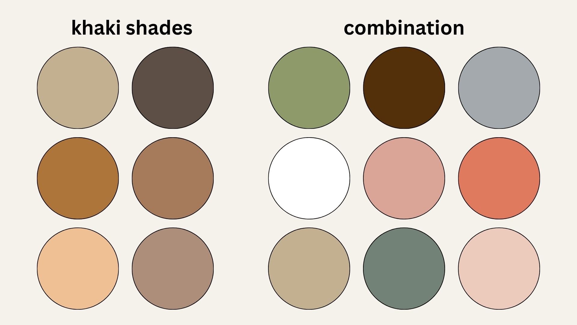
Strategic Colour Pairings for Khaki-Centric Brands
The magic of khaki lies in its ability to anchor a palette. The colours chosen to accompany it will define the overall mood, communicate specific brand values, and influence consumer perception. The key is to move beyond random associations and to select complementary colours with deliberate strategic intent.
Deep Blues and Greens: Trust, Stability, and Natural Connection
Pairing khaki with deep blues or rich greens creates an immediate sense of trust, stability, and a strong connection to nature. Navy blues, for instance, exude professionalism, authority, and reliability. When juxtaposed with khaki, they can elevate the brand’s perception, suggesting a company that is both grounded and dependable. This combination is ideal for financial institutions, consulting firms, or technology companies that want to project a sense of security and expertise.
Forest greens, emeralds, or deep teals bring an organic and sustainable feel. These colours evoke growth, health, and environmental consciousness. For brands focused on eco-friendly products, wellness, or outdoor pursuits, this pairing is a natural fit. It communicates a commitment to the planet and a celebration of the natural world, reinforcing the inherent qualities of khaki. The depth of these colours also adds a touch of sophistication, preventing the palette from feeling too rustic.

Warm Earth Tones: Richness, Comfort, and Artisanal Quality
To amplify khaki’s inherent warmth and connection to the earth, consider pairing it with other rich earth tones. Terracotta, burnt sienna, deep ochre, and warm browns can create a palette that is deeply inviting, comforting, and evokes a sense of artisanal quality. This combination is perfect for brands in the food and beverage industry, craft goods, or anything that emphasizes handmade or natural ingredients.
These colours, when used strategically, can communicate a feeling of heritage, tradition, and meticulous craftsmanship. They suggest a brand that values quality over quantity, and that takes pride in its creations. The interplay of different shades of brown and earthy reds can create a visually rich and tactile experience for the consumer, fostering a sense of familiarity and trust. Think of a coffee roaster, a pottery studio, or a natural skincare line – these palettes communicate sensory pleasure and authentic origins.
Pops of Vibrant Accent Colours: Energy, Innovation, and Boldness
While khaki excels at providing a grounded foundation, it also provides a superb canvas for bursts of vibrant accent colours. These accents can inject energy, dynamism, and a sense of innovation into a brand’s visual identity. For brands that want to convey a forward-thinking, energetic, or even playful personality, strategic use of brights is essential.
Consider a sharp coral, a vibrant teal, a sunny yellow, or even a bold magenta. These colours, used sparingly as accents within a predominantly khaki palette, can create striking visual contrast and draw immediate attention to key elements like calls to action, product highlights, or logos. This approach allows brands to remain sophisticated and grounded due to the khaki base, while simultaneously signaling boldness, creativity, and a willingness to stand out. This is particularly effective for tech startups, creative agencies, or lifestyle brands that want to appeal to a younger, more dynamic audience. The key is judicious application to avoid overwhelming the inherent calm of khaki.
Implementing Khaki in Your Brand’s Visual Strategy
Understanding the psychological impact of colour pairings is the first step. The true art of branding lies in the strategic implementation of these insights across all touchpoints of your brand’s visual identity.
Logo Design: The Cornerstone of Brand Recognition
Your logo is often the first and most enduring visual representation of your brand. When incorporating khaki, consider its prominence and the role of accent colours. A khaki logo can convey a sense of established credibility, while strategically placed accent colours can highlight key elements and convey dynamism. For instance, a khaki background with a deep blue icon can project stability and authority. Alternatively, a minimalist khaki wordmark with a vibrant accent can signal modernity and energy. The objective is to ensure the logo is memorable, easily reproducible, and effectively communicates your core brand essence.
Website and Digital Presence: Navigating the User Experience
In the digital landscape, colour plays a crucial role in user experience and navigation. A website with a khaki-centric colour palette can create a calming and inviting atmosphere, encouraging users to spend more time exploring. Use darker blues or greens for headings and call-to-action buttons to guide the user’s eye and convey important information. Warm earth tones can be used for background textures or subtle design elements to enhance a feeling of comfort and authenticity. Vibrant accent colours can be reserved for interactive elements, notifications, or special offers to create visual interest and drive engagement. The strategic use of these colours ensures that users are not only visually stimulated but also intuitively guided through the digital interface.
Marketing Collateral and Packaging: Telling Your Brand’s Story
From brochures and advertisements to product packaging, every piece of marketing collateral is an opportunity to reinforce your brand identity. Khaki, as a foundational colour, can create a cohesive and recognizable aesthetic across all materials. For product packaging, a khaki base can communicate natural ingredients, premium quality, or a rustic charm, depending on the accompanying colours and textures. Vibrant accent colours on packaging can make your product stand out on a crowded shelf, while deeper, more subdued tones can convey a sense of luxury and exclusivity. The consistent application of your chosen khaki palette across all marketing touchpoints builds brand recognition and reinforces the emotional connection with your audience.
Conclusion: Crafting a Memorable Brand with Khaki
Khaki, far from being a mere colour, is a strategic asset in the arsenal of brand builders. Its inherent qualities of groundedness, authenticity, and versatility make it a powerful foundation for creating a distinctive and resonant brand identity. By understanding the psychology of khaki and strategically selecting its complementary colours – from the steadfastness of deep blues and greens to the comforting richness of earth tones and the energetic punch of vibrant accents – brands can craft visual palettes that not only look appealing but also communicate a clear and compelling message.
The success of a khaki-centric brand identity lies not just in the colours themselves, but in their thoughtful and consistent application across all touchpoints. From the initial impression of a logo to the nuanced user experience of a website and the tangible appeal of packaging, every element contributes to the overarching narrative. By embracing the strategic power of colour, brands can harness the quiet confidence of khaki to build lasting connections, foster trust, and leave an indelible mark on the minds of their consumers.
aViewFromTheCave is a participant in the Amazon Services LLC Associates Program, an affiliate advertising program designed to provide a means for sites to earn advertising fees by advertising and linking to Amazon.com. Amazon, the Amazon logo, AmazonSupply, and the AmazonSupply logo are trademarks of Amazon.com, Inc. or its affiliates. As an Amazon Associate we earn affiliate commissions from qualifying purchases.