Color is an incredibly powerful tool, especially in the digital realm. It evokes emotions, guides user attention, and forms the very foundation of brand identity. While understanding basic color mixing is a fundamental skill, its application in professional contexts, particularly within brand strategy and digital design, goes far beyond simply knowing that purple and yellow combine to create brown or a muddy neutral. This article delves into the nuanced science and art of color, exploring how these fundamental principles translate into effective digital experiences and robust brand identities.
The Fundamental Principles of Color Mixing: Beyond the Basics
At its core, color mixing is governed by established scientific principles. When we talk about mixing colors, we’re generally referring to two primary systems: additive and subtractive color mixing. Understanding these foundational concepts is crucial before we can appreciate their application in digital design and brand strategy.
Additive Color Mixing: Light and Screens
Additive color mixing is how colors are created on digital screens. This system uses light, and the primary colors are Red, Green, and Blue (RGB). When these lights are combined in varying intensities, they produce other colors.
- Red + Green = Yellow
- Green + Blue = Cyan
- Blue + Red = Magenta
- Red + Green + Blue = White
- Absence of all colors = Black
In the context of our title, “What color does purple and yellow make?”, we need to consider how these colors are represented within the RGB model. Purple, often a mix of red and blue, and yellow, a mix of red and green, will create different results depending on their specific hues and intensities. For instance, a deep royal purple (high red, moderate blue) combined with a bright lemon yellow (high red, high green) will result in a complex interplay of light frequencies. In an RGB system, this combination, due to the presence of red in both, will lean towards a reddish-brown or a muted orange, depending on the exact RGB values. However, it’s important to remember that on a screen, we’re not physically mixing pigments but combining light emissions.
Subtractive Color Mixing: Pigments and Print
Subtractive color mixing, on the other hand, applies to pigments, inks, and dyes. The primary colors in this system are Cyan, Magenta, and Yellow (CMY), often used in printing with the addition of Black (K) to form CMYK. When these colors are combined, they absorb certain wavelengths of light and reflect others, which is what we perceive as color.
- Cyan + Magenta = Blue
- Magenta + Yellow = Red
- Yellow + Cyan = Green
- Cyan + Magenta + Yellow = Black (theoretically; in practice, a dark brown)
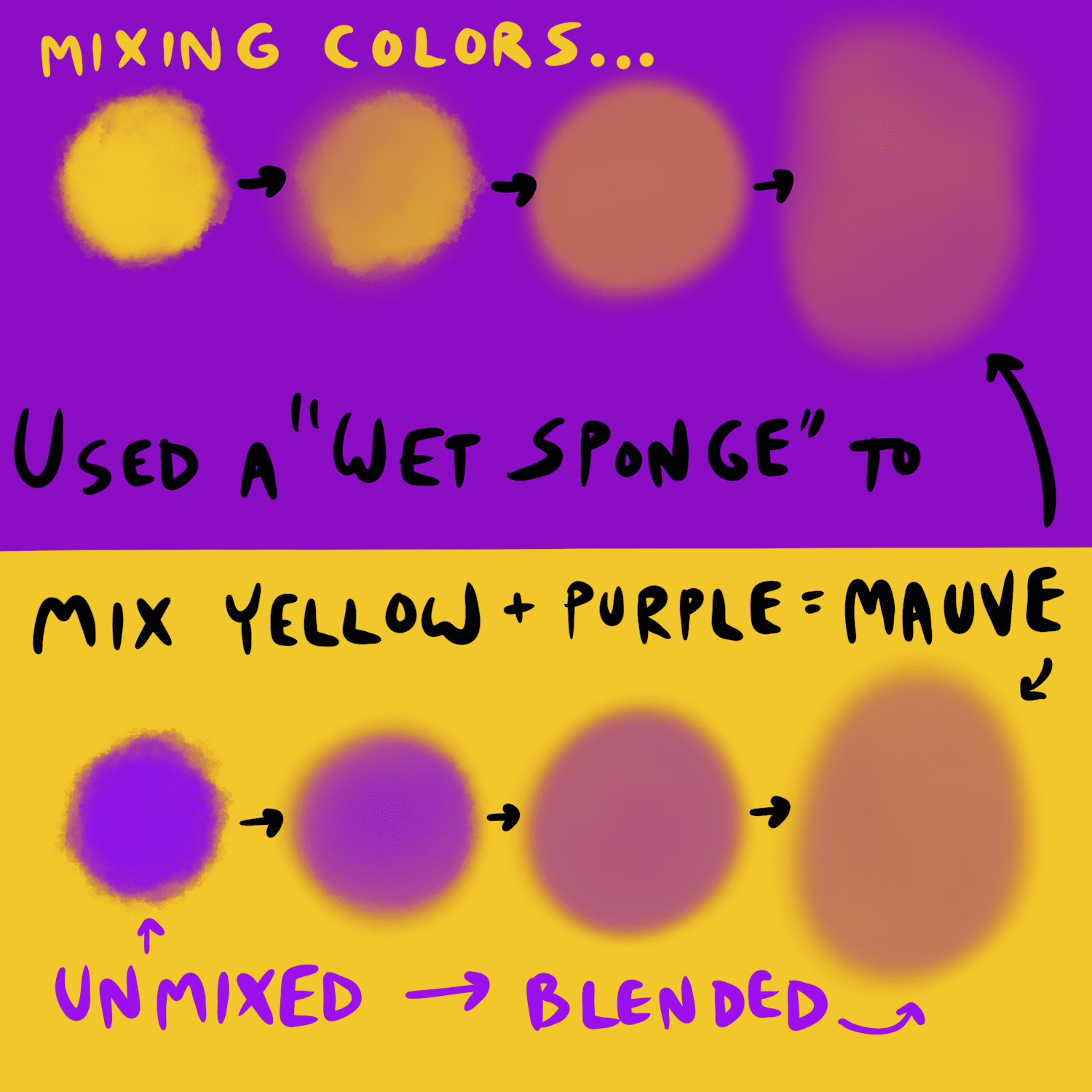
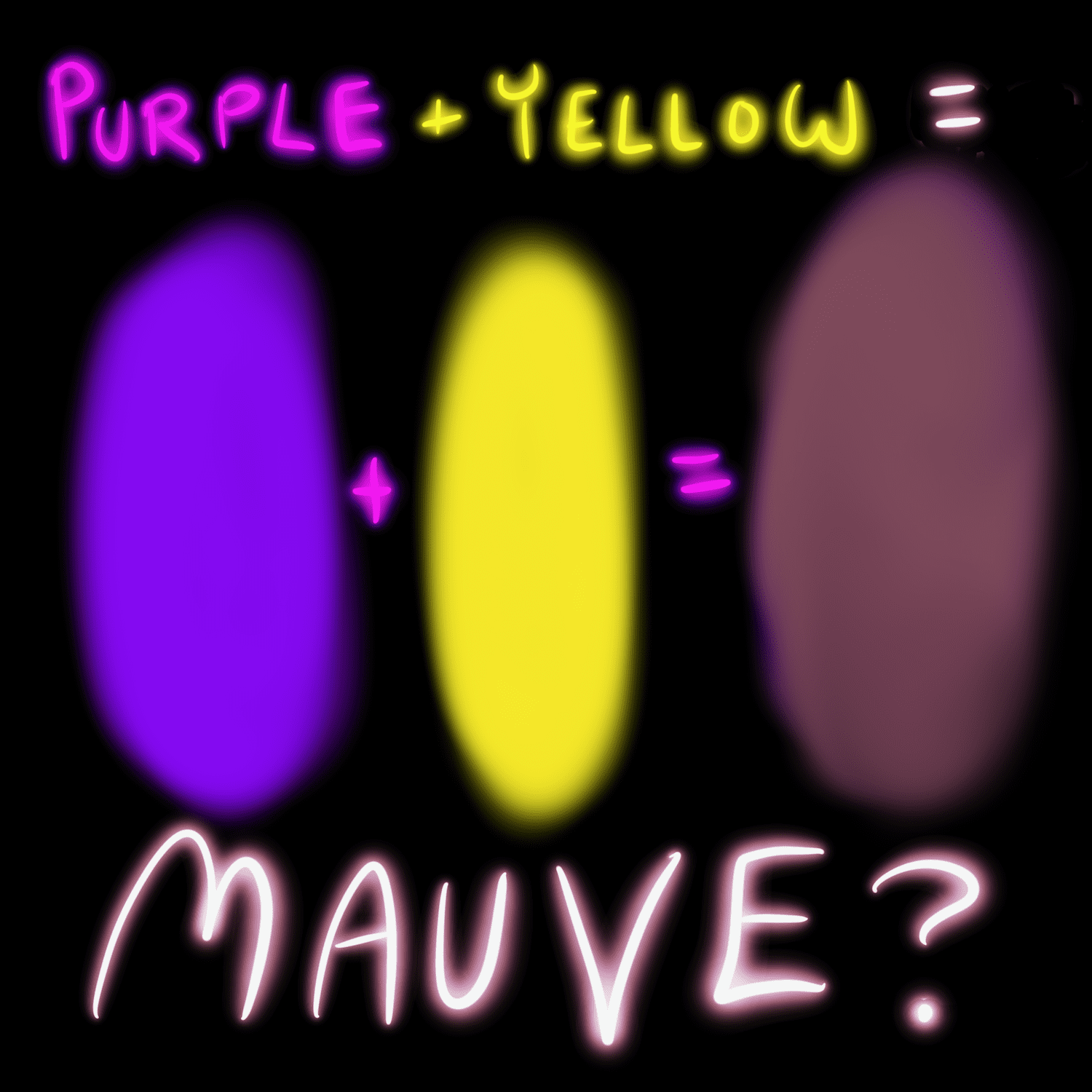
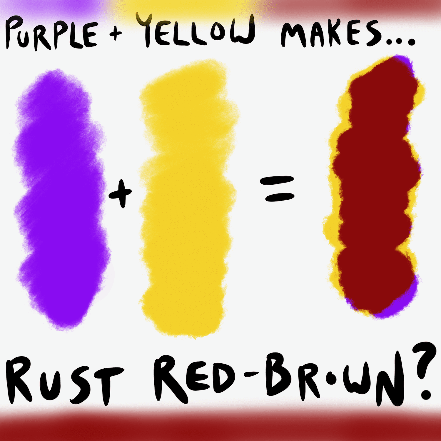
When we consider mixing purple and yellow in a subtractive model, we’re dealing with pigments. Purple is typically a mix of red and blue. Yellow is a primary color. Mixing a blue-purple pigment with a yellow pigment will, as commonly understood, result in a brown or a muddy, desaturated hue. The specific shade will depend heavily on the purity and proportions of the original pigments. A vibrant violet mixed with a bright cadmium yellow will yield a different brown than a muted lavender mixed with a pale primrose. This is because the pigments are absorbing different wavelengths of light, and when combined, they absorb even more, leading to a less saturated, darker result.
The Psychological Impact of Purple and Yellow in Branding
While the technical answer to “what color does purple and yellow make” is rooted in color mixing principles, the true power and relevance for brands lie in the psychological impact of these colors, both individually and in combination. Understanding this impact is crucial for crafting effective brand identities and marketing materials.
The Nuances of Purple: Royalty, Creativity, and Luxury
Purple has long been associated with royalty, nobility, and wealth, stemming from the historical difficulty and expense of producing purple dyes. In contemporary branding, purple can evoke a sense of creativity, imagination, mystery, and even spirituality.
- Deep Purples: Often convey luxury, sophistication, and ambition. Think of high-end cosmetic brands or premium tech products.
- Lighter Purples (Lavender, Lilac): Tend to feel more calming, spiritual, and romantic. These hues can be found in wellness brands, spas, or products targeting a more feminine audience.
- Vibrant Purples: Can signify innovation, uniqueness, and playfulness. These are often used by tech startups or brands looking to stand out.
The Vibrancy of Yellow: Optimism, Energy, and Warmth
Yellow is synonymous with sunshine, happiness, and energy. It’s a color that grabs attention and can stimulate mental activity.
- Bright Yellows: Exude joy, optimism, and a sense of urgency. Fast-food chains and brands targeting children often use bright yellow to appear friendly and energetic.
- Muted Yellows (Mustard, Ochre): Can feel more grounded, natural, and sophisticated. These are often employed in artisanal products, vintage-inspired brands, or organic food companies.
- Pale Yellows: Can offer a softer, more delicate warmth, sometimes associated with comfort and nostalgia.
The Dynamic Duo: Purple and Yellow in Brand Combinations
When purple and yellow are used together in branding, the outcome can be incredibly dynamic and impactful, provided they are used strategically. They are complementary colors on some color wheels, meaning they sit opposite each other and create a high contrast when paired. This high contrast can be very effective for drawing attention and creating a memorable visual.
- High Contrast and Energy: A bold purple paired with a bright yellow creates a vibrant, energetic, and attention-grabbing combination. This can be excellent for brands aiming to be perceived as innovative, playful, or exciting. It suggests a balance of creativity (purple) and optimism/energy (yellow).
- Sophistication with a Pop: A more muted or deep purple can be beautifully complemented by a softer or more golden yellow, creating a sense of sophisticated warmth and intrigue. This pairing can suggest luxury with a creative edge.
- Potential for Discord: However, it’s crucial to note that a poorly executed combination of purple and yellow can be jarring or even unappetizing, especially in digital interfaces where readability is paramount. The “muddy brown” result of mixing pigments can, if not handled with care in digital design, lead to visual fatigue or an unintended, unattractive aesthetic. This is where understanding color values and proportions in digital palettes becomes critical.
Translating Color Theory to Digital Design and User Experience
The practical application of color theory, including the understanding of how purple and yellow interact, is fundamental to creating effective digital experiences. Designers and brand strategists leverage these principles to influence user perception, guide navigation, and build strong brand recognition.
The Importance of Color Palettes in Digital Interfaces
A well-defined color palette is not just about aesthetics; it’s a critical component of user experience (UX) and user interface (UI) design. It dictates how users interact with a digital product and what emotions they associate with it.
- Establishing Brand Identity: Consistent use of a brand’s color palette across all digital touchpoints reinforces brand recognition and builds trust. For a brand that uses purple and yellow, the specific shades chosen and how they are balanced will communicate a distinct message. For example, a tech company might use a deep purple for its primary accent color and a bright, energetic yellow for calls-to-action, implying innovation and prompting engagement.
- Guiding User Attention: Color is a powerful tool for directing user focus. High-contrast combinations, like purple and yellow, can be strategically used to highlight important elements such as buttons, links, or notifications. However, overuse can lead to visual clutter and overwhelm the user.
- Ensuring Accessibility: Color contrast is also vital for accessibility. Ensuring sufficient contrast between text and background colors is essential for users with visual impairments. This requires careful selection and testing of color combinations, including how secondary colors like those derived from purple and yellow combinations perform.
- Evoking Emotional Responses: The colors chosen can significantly influence the user’s emotional state. A calming purple might be used for a meditation app’s background, while a vibrant yellow could be used on a gaming platform to enhance excitement.
Strategic Color Placement and Contrast Ratios
When considering the combination of purple and yellow, designers must move beyond simply asking “what color does purple and yellow make?” and instead focus on how these colors can be strategically deployed within a digital interface.
- Color Contrast for Readability: To ensure text is legible, designers use contrast ratio checkers. For example, if a brand uses a deep royal purple as a background for body text, a pale yellow might offer insufficient contrast and be difficult to read. Conversely, a bright yellow button on a dark purple background would offer high contrast and excellent visibility for calls-to-action.
- Hierarchy and Visual Flow: The interplay of colors can create a visual hierarchy, guiding the user’s eye through the interface. A brand might use a dominant purple for structural elements and a vibrant yellow for interactive components or key information, creating a clear path for the user.
- Communicating Functionality: Certain color conventions have become ingrained in digital design. For instance, red often signifies errors or warnings, while green indicates success. While purple and yellow don’t have universal functional meanings, brands can establish their own conventions. A specific shade of yellow might consistently signal a special offer, or a particular hue of purple might always denote a premium feature.
Building a Powerful Brand Identity with Color
The power of color extends beyond individual products to the overarching identity of a brand. Understanding how colors interact and what they communicate is paramount for creating a memorable and resonant brand.
The Art of Color Selection for Brand Identity
When developing a brand, the choice of colors is a deliberate and strategic decision. It’s about creating a visual language that communicates the brand’s values, personality, and promise.
- Target Audience Resonance: The chosen colors should resonate with the brand’s target audience. For instance, a brand targeting a younger, trend-conscious demographic might opt for more vibrant and contemporary color combinations, potentially including a playful interplay of purple and yellow. A more established, luxury brand might lean towards deeper, richer hues.
- Competitive Differentiation: In a crowded marketplace, distinctive color choices can help a brand stand out. Analyzing the color palettes of competitors is crucial to identify opportunities for differentiation. If competitors primarily use blues and greens, a brand incorporating purple and yellow could immediately capture attention.
- Consistency Across Touchpoints: A strong brand identity relies on consistent color usage across all platforms – websites, social media, print materials, packaging, and even physical store design. This uniformity builds recognition and reinforces the brand’s visual narrative.
Case Study Snippets: Brands Harnessing Purple and Yellow (Hypothetical)
While specific examples can be illustrative, consider the hypothetical impact of brands that might leverage purple and yellow:
- “NovaTech”: A cutting-edge software company might use a sophisticated deep purple for its primary brand color, signifying intelligence and innovation, paired with a bright, energetic yellow for its call-to-action buttons and key feature highlights, representing rapid progress and user engagement. This combination communicates reliability and forward-thinking ambition.
- “Serene & Sprout”: An organic skincare line could employ a soft lavender purple for packaging and website backgrounds, conveying tranquility and natural ingredients, complemented by a warm, golden yellow for product highlights and promotional banners, suggesting natural radiance and vitality. This pairing communicates a sense of natural wellness and gentle effectiveness.
By moving beyond the simple question of “what color does purple and yellow make?” and delving into the principles of color theory, psychology, and strategic application, brands and designers can unlock the immense potential of color to create impactful digital experiences and build lasting brand identities. The mastery of color is not just about aesthetics; it’s about creating meaning, driving engagement, and shaping perceptions in the digital landscape.
aViewFromTheCave is a participant in the Amazon Services LLC Associates Program, an affiliate advertising program designed to provide a means for sites to earn advertising fees by advertising and linking to Amazon.com. Amazon, the Amazon logo, AmazonSupply, and the AmazonSupply logo are trademarks of Amazon.com, Inc. or its affiliates. As an Amazon Associate we earn affiliate commissions from qualifying purchases.