The question of “what colors make white color” might initially seem like a simple query rooted in the physical world of paint and pigments. However, when viewed through the lens of the digital realm, it transcends elementary color theory to become a fascinating exploration of how technology constructs our visual experiences. In the domain of Tech, understanding the creation of white is fundamental to comprehending display technologies, digital design, and the very fabric of how we interact with interfaces. This article will delve into the technical underpinnings of digital white, exploring the additive color model, the role of light, and the implications for various technological applications.
The Additive Color Model: Illuminating the Digital Spectrum
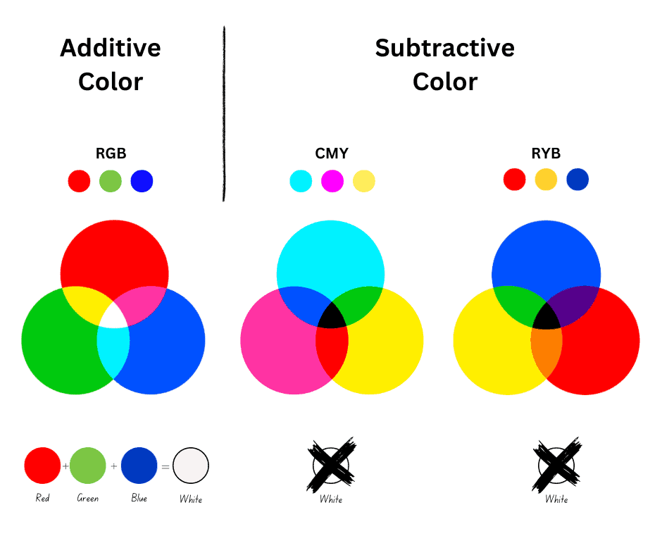
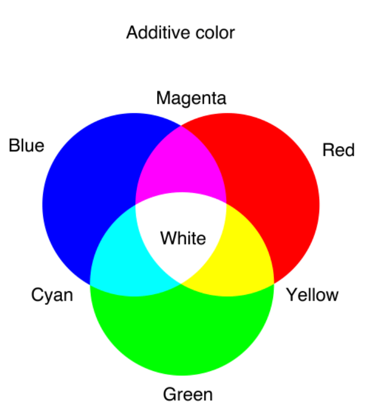
In the physical world, we often think of mixing colors by combining pigments. Red paint mixed with yellow paint creates orange. This is known as the subtractive color model, where pigments absorb certain wavelengths of light and reflect others. However, on our screens – whether it’s a smartphone, a laptop, or a television – white isn’t created by mixing pigments, but by combining light. This process is governed by the additive color model.
The Primaries of Light: Red, Green, and Blue
At the heart of the additive color model are the primary colors of light: Red, Green, and Blue (RGB). Unlike subtractive primaries (cyan, magenta, yellow), which are used in printing, the additive primaries are the wavelengths of light that, when combined in varying intensities, can reproduce almost any color visible to the human eye.
- Red Light: Emits light predominantly in the red spectrum.
- Green Light: Emits light predominantly in the green spectrum.
- Blue Light: Emits light predominantly in the blue spectrum.
These three colors are chosen because they correspond to the three types of cone cells in the human retina, which are sensitive to different wavelengths of light. By stimulating these cone cells in specific combinations and intensities, our brains perceive a vast array of colors.
The Birth of White: The Symphony of RGB
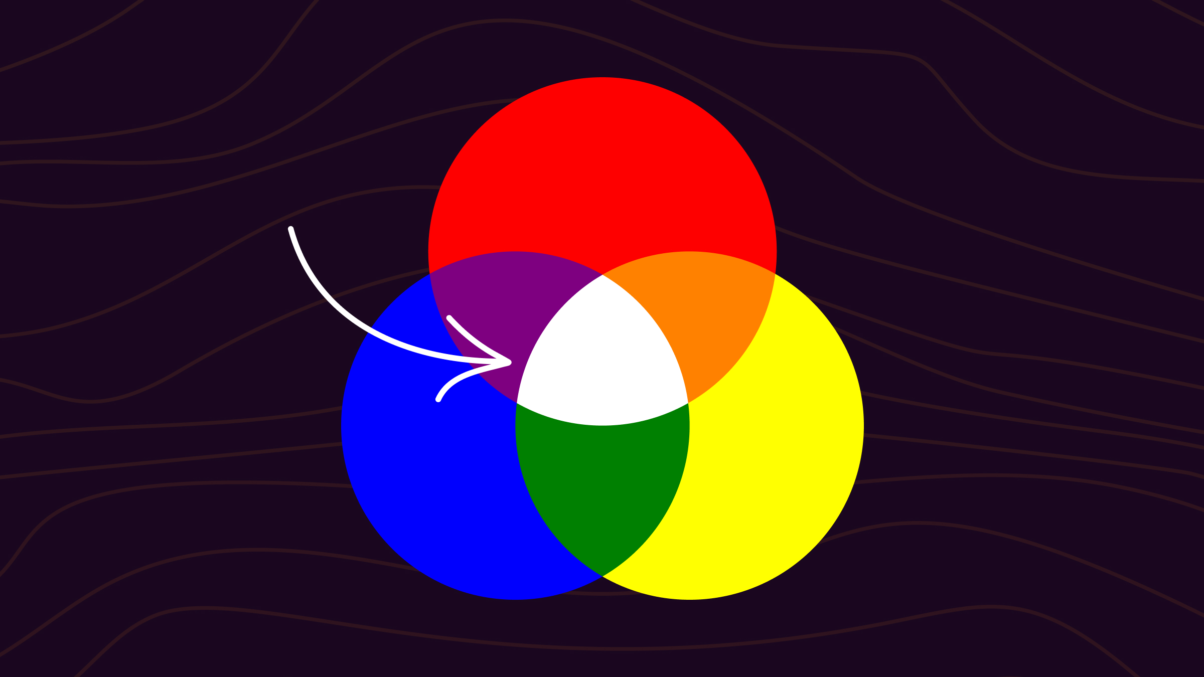
When red, green, and blue light are combined at their maximum intensity, the result is white light. This is because all three primary wavelengths are being emitted simultaneously and with equal power. Our eyes and brain interpret this full spectrum of light as white. Think of a stage spotlight: if you shine a red, a green, and a blue spotlight onto the same spot on a white surface, the area where all three overlap will appear white.
This principle is fundamental to how all digital displays function. Each pixel on your screen is, in essence, a tiny array of red, green, and blue sub-pixels. By controlling the brightness of each of these sub-pixels, the display can generate millions of different colors, including the pure white that forms the background of web pages, the highlights in images, and the overall brightness of the interface.
- Maximum Intensity: When the red, green, and blue sub-pixels within a single pixel are all illuminated at their highest possible brightness, that pixel displays white.
- Varying Intensities: By adjusting the intensity of each primary color, a wide gamut of colors can be achieved. For example, a high intensity of red with medium intensity of green and low intensity of blue might produce a reddish-orange hue.
The specific technology used to emit these colored lights varies, from the LEDs in modern LCD and OLED screens to the phosphors in older CRT monitors. Regardless of the underlying technology, the principle of additive color mixing remains the same.
Beyond RGB: Understanding Color Spaces and Digital Representation
While RGB is the foundational model for color creation on digital displays, the concept of “white” can be further nuanced by understanding different color spaces and how color is digitally represented.
Color Spaces: Defining the Boundaries of Color
A color space is a specific organization of colors, defined by a set of coordinates and boundaries. It provides a standardized way to describe and reproduce colors across different devices and applications. The RGB color model itself is a broad concept, and various specific RGB color spaces exist, each with a slightly different range and interpretation of colors.
- sRGB (Standard Red Green Blue): This is the most common color space and is widely used on the internet and by most consumer devices. It was developed by HP and Microsoft in the early 1990s. sRGB is designed to be the standard color space for web content and is the default for many cameras and displays. While it produces white when R, G, and B are at their maximum, its gamut might not encompass all colors humans can perceive.
- Adobe RGB: This color space offers a wider gamut than sRGB, particularly in the cyan-green region. It’s often used in professional photography and printing workflows where a broader range of colors is desired. In Adobe RGB, the definition of “white” is also achieved through the combination of its red, green, and blue primaries.
- ProPhoto RGB: This is an even wider color space, encompassing almost all colors visible to the human eye. It’s primarily used in high-end image editing and professional photographic applications. Like other RGB spaces, white is the sum of its full-intensity R, G, and B components.
The specific “white point” – the color temperature of the white being displayed – can also vary between these color spaces and even between different devices. A “cool” white might have a bluer cast, while a “warm” white might lean towards yellow. This is often controlled by the precise balance of RGB intensities and can be adjusted through display settings.
Digital Representation: Bits and Bytes of Color
In digital systems, colors are represented numerically. For the RGB model, each primary color (Red, Green, Blue) is typically assigned a value that indicates its intensity.
- 8-bit per channel: This is the most common representation. Each color channel (R, G, B) can have 256 different values, ranging from 0 (no intensity) to 255 (maximum intensity).
- To achieve white in an 8-bit sRGB system, the values would be (255, 255, 255).
- To achieve black, the values would be (0, 0, 0).
- A shade of gray would be represented by equal values for R, G, and B, such as (128, 128, 128).
- 10-bit or 12-bit per channel: Higher bit depths allow for a greater number of intensity levels for each color channel, resulting in smoother color gradients and a more nuanced representation of colors, including white. This is crucial in professional video editing and high-fidelity displays.
The precise numerical representation of white might subtly differ based on the specific color space and bit depth, but the fundamental principle of combining full-intensity red, green, and blue light remains the constant.
Implications for Digital Design and User Experience
Understanding how digital white is constructed has profound implications for how we design and interact with technology. The choice of white, its brightness, and its subtle hue can significantly impact usability, readability, and the overall aesthetic of an interface.
Readability and Contrast
White is often the default background color in many digital interfaces, from operating systems to web pages. This is not arbitrary; it’s a deliberate choice based on the principles of visual perception and the additive color model.
- High Contrast: White, as the combination of all primary colors of light, provides a neutral canvas. When text or other elements are rendered in dark colors against a white background, it creates a high contrast ratio. This high contrast is essential for good readability, allowing users to easily distinguish between foreground and background elements, reducing eye strain, and improving comprehension, especially for extended periods of reading.
- Color Blindness Considerations: While white offers excellent contrast for most users, designers must also consider users with color vision deficiencies. The absence of specific hues in a pure white background, combined with appropriate font choices and sufficient contrast, can mitigate some of the challenges faced by individuals with color blindness.
- The Impact of “Off-White”: Pure white (255, 255, 255) can sometimes be perceived as too stark or glaring, particularly in low-light environments. Designers often opt for slightly desaturated or tinted whites, such as very light grays or off-whites with a hint of blue or yellow. These “softer” whites still provide excellent contrast but can be more aesthetically pleasing and comfortable for prolonged use. These off-whites are still achieved through the additive model, but with slightly reduced intensities in one or more of the RGB channels, creating subtle variations from pure white.
Energy Efficiency and Display Technology
The creation of white light on digital displays also has implications for energy consumption and the underlying display technologies.
- Backlit Displays (LCD/LED): In traditional LCD displays (which are often backlit by LEDs), a constant light source (the backlight) shines through a layer of liquid crystals and color filters. To produce white, the liquid crystals are manipulated to allow the full spectrum of backlight to pass through, or the LEDs themselves are white. If the backlight is made of white LEDs, then white is simply the absence of light modulation. If the backlight is RGB, then achieving white involves illuminating all three color LEDs at maximum. In both cases, displaying white consumes a significant amount of power because the backlight is always on or all colored LEDs are at full strength.
- Self-Emissive Displays (OLED): Organic Light-Emitting Diode (OLED) displays offer a different approach. Each pixel in an OLED display is capable of emitting its own light. To display white, each sub-pixel (Red, Green, Blue, or sometimes White, depending on the panel design) is illuminated to its maximum intensity. This can be very energy-efficient for displaying black (where pixels are simply turned off), but displaying pure white can still be power-intensive as all emitting elements are at their peak. However, modern OLEDs often have a dedicated white sub-pixel (WOLED technology) which can produce white more efficiently and with greater color accuracy than by mixing R, G, and B.
The Aesthetics of White in Digital Environments
Beyond pure functionality, the perception of white in digital design contributes significantly to the overall user experience and brand identity.
- Minimalism and Cleanliness: White is often associated with minimalism, modernity, and a sense of cleanliness. Many tech companies leverage white space extensively in their user interfaces and branding to convey sophistication, simplicity, and focus on content.
- Illusion of Space: In design, ample white space can make interfaces feel more open, less cluttered, and easier to navigate. It provides visual breathing room and allows users to focus on the key elements of the page or application.
- Psychological Impact: White can evoke feelings of purity, openness, and new beginnings. In user interfaces, it can create a calming and inviting atmosphere. The subtle variations in white, from cool, sterile whites to warm, inviting whites, can subtly influence user perception and emotion.
The Future of Digital White and Color Perception
As display technologies continue to evolve, our understanding and implementation of digital white will also advance. The pursuit of more accurate color reproduction, increased energy efficiency, and enhanced user comfort will drive innovation in how we create and perceive color on screens.
High Dynamic Range (HDR) and Wider Gamuts
High Dynamic Range (HDR) technology is revolutionizing how we experience visuals on digital displays. HDR allows for a much greater range of luminance, from the deepest blacks to the brightest whites, and a broader spectrum of colors.
- Brighter Whites: In HDR, the “white” that displays can achieve significantly higher peak brightness than standard dynamic range (SDR) displays. This results in more realistic highlights and a greater sense of depth and realism in images and videos. The fundamental principle of mixing red, green, and blue light still applies, but the intensity levels can reach much higher magnitudes.
- Wider Color Gamuts: Coupled with HDR, wider color gamuts like Rec. 2020 (used for UHD television) aim to encompass an even larger portion of the colors visible to the human eye. This means that the “white” achieved through the additive mixing of primaries in these wider gamuts can potentially be more nuanced and perceptually accurate.
Advanced Display Technologies and Perceptual Engineering
The development of new display technologies, such as microLED and advancements in quantum dot technology, promises even greater control over color and brightness. Furthermore, the field of perceptual engineering is increasingly being integrated into display design, aiming to create visuals that are not only technically accurate but also psychologically appealing and comfortable for the human eye.
- Adaptive Displays: Future displays might dynamically adjust their color temperature and brightness based on ambient lighting conditions and user preferences, optimizing the perception of white and other colors for maximum comfort and visual fidelity.
- Beyond RGB: While RGB remains dominant, research continues into alternative color models and additive mixing strategies that could potentially offer even greater color reproduction capabilities and energy efficiency.
In conclusion, the seemingly simple question of “what colors make white color” opens a complex and fascinating window into the world of digital technology. From the fundamental principles of the additive color model and the RGB primaries to the nuances of color spaces, digital representation, and the ongoing evolution of display technologies, understanding the creation of digital white is key to appreciating the sophisticated engineering that underpins our daily digital interactions. The future promises even more immersive and perceptually engineered visual experiences, all built upon the foundational understanding of how light, when combined in specific ways, creates the vibrant spectrum of colors we see on our screens, including the fundamental brilliance of white.
aViewFromTheCave is a participant in the Amazon Services LLC Associates Program, an affiliate advertising program designed to provide a means for sites to earn advertising fees by advertising and linking to Amazon.com. Amazon, the Amazon logo, AmazonSupply, and the AmazonSupply logo are trademarks of Amazon.com, Inc. or its affiliates. As an Amazon Associate we earn affiliate commissions from qualifying purchases.