
When embarking on a renovation or interior design project, the selection of paint colors is often a central decision. For homeowners and designers alike, Sherwin Williams’ “Upward” has emerged as a compelling choice for wall color, lauded for its serene, airy, and versatile nature. However, the true artistry and strategic impact of this sophisticated blue-grey hue come to life when paired with the right cabinet colors. This decision transcends mere aesthetic preference; it’s a critical component of brand building, whether for a personal residence aiming to project a specific lifestyle or for a rental property designed to attract a particular demographic. Understanding the nuanced interplay between “Upward” walls and cabinet colors is paramount to creating a cohesive, desirable, and ultimately, valuable space. This article delves into the strategic considerations for selecting cabinet colors that best complement Sherwin Williams’ “Upward,” viewed through the lens of brand identity and market appeal.

The Foundation: Understanding Sherwin Williams Upward’s Brand Identity
Before we explore cabinet color pairings, it’s essential to establish the inherent brand qualities that Sherwin Williams’ “Upward” projects. This understanding forms the bedrock of our strategic decision-making. Every color carries a psychological weight and evokes specific emotions and associations. For interior design, these associations directly contribute to the perceived brand of a space.
Decoding “Upward”: Attributes and Emotional Resonance
Sherwin Williams describes “Upward” SW 6239 as a light, airy, and tranquil blue. Its undertones are subtle, leaning neither too green nor too violet, which contributes to its remarkable versatility. This ambiguity is, in fact, one of its strengths from a branding perspective.
- Serenity and Calm: The primary emotional response to “Upward” is one of peace and relaxation. It mimics the gentle hues of a clear sky, promoting a sense of spaciousness and calm. This is invaluable for any brand aiming to convey a haven, a retreat, or a place of understated elegance.
- Versatility and Adaptability: Unlike more assertive colors, “Upward” acts as a sophisticated neutral. It doesn’t dominate a space; instead, it provides a breathable backdrop that allows other elements to shine. This adaptability makes it a powerful tool for branding, as it can be molded to fit various design aesthetics and target audiences without feeling jarring or out of place.
- Modern Sophistication: The subtle grey undertones within “Upward” lend it a contemporary edge. It avoids the saccharine quality of some lighter blues, instead offering a refined and mature appeal. This positions it as a choice for brands that value understated luxury, thoughtful design, and timeless quality.
- Natural Light Enhancement: “Upward” has a remarkable ability to reflect and amplify natural light, making spaces feel larger and more open. This is a critical branding element for properties seeking to attract buyers or renters who prioritize brightness and an airy atmosphere.
From a branding perspective, “Upward” positions a space as inviting, modern, and sophisticated, offering a blank canvas upon which a desired narrative can be built through carefully chosen furnishings, finishes, and, crucially, cabinet colors.
Strategic Cabinet Color Pairings for “Upward” Walls
The choice of cabinet color is a significant design decision that anchors a room and significantly influences its overall brand perception. When “Upward” adorns the walls, the cabinet color becomes the silent narrator, whispering tales of style, purpose, and desired atmosphere. The goal is to create a harmonious partnership that enhances, rather than competes with, the serene qualities of the walls.
1. The Timeless Appeal: Whites and Off-Whites
White and off-white cabinetry are perennial favorites for a reason: they embody purity, simplicity, and an enduring sense of cleanliness and spaciousness. When paired with “Upward” walls, they create a classic, yet sophisticated, aesthetic that appeals to a broad audience, making it an excellent choice for personal branding and property marketing.
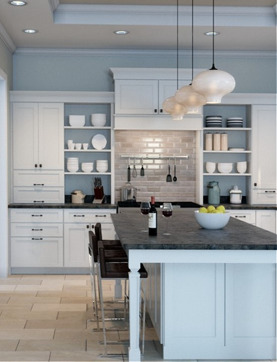
- Crisp White: A bright, clean white cabinet offers a sharp contrast to the soft blue-grey of “Upward.” This pairing evokes a sense of coastal charm, a bright farmhouse aesthetic, or a modern, minimalist retreat. The crispness of the white highlights the subtle depth of “Upward,” making the walls appear even more luminous. This combination is ideal for brands aiming to project freshness, openness, and a touch of traditional elegance with a modern twist. It’s a safe yet impactful choice for high-end rental properties or personal residences that prioritize a light-filled, airy feel.
- Soft Off-Whites and Creams: Moving away from stark white, an off-white or creamy cabinet introduces a warmer, more organic feel. Think of shades like Sherwin Williams Alabaster or Benjamin Moore Swiss Coffee. These softer whites prevent the space from feeling too sterile, adding a layer of comfort and approachability. When paired with “Upward,” this combination creates a serene, inviting atmosphere reminiscent of a tranquil spa or a cozy, well-appointed cottage. This is particularly effective for personal branding where a welcoming and nurturing environment is desired, or for vacation rentals aiming to convey relaxation and comfort.
- The Brand Narrative: Both white and off-white cabinets, against “Upward” walls, tell a story of cleanliness, order, and calm. They create a visually quiet foundation that allows for bolder accents in hardware, countertops, or decor, thereby offering flexibility in further defining the space’s brand identity. They signal a well-maintained property and a thoughtful approach to design, key components of any desirable brand.
2. The Modern Elegance: Greys and Deep Blues
For a more contemporary and sophisticated statement, consider cabinet colors within the grey and deep blue families. These choices create a layered, nuanced look that exudes refinement and intentionality.

- Charcoal or Deep Grey: A dark charcoal or deep grey cabinet against “Upward” walls creates a striking, modern contrast. This pairing offers a sense of grounding and depth, preventing the light walls from feeling monotonous. It evokes a sophisticated, urban loft aesthetic or a modern, masculine-leaning design. The contrast between the dark cabinets and the lighter walls can highlight architectural features and create a dynamic visual interest. This is a powerful choice for branding a property that targets discerning professionals or for a personal space that aims to project a strong, confident, and contemporary identity.
- Navy Blue or Deep Teal: For a bolder yet equally sophisticated choice, consider deep navy or rich teal cabinets. These colors, when paired with “Upward,” create a dramatic and luxurious effect. Navy blue offers a classic, timeless appeal, reminiscent of nautical themes or a refined library, while deep teal introduces a touch of unexpected jewel-toned richness. This combination is highly effective for creating a memorable brand experience. It speaks to confidence, personality, and a willingness to embrace color in a refined manner. It’s ideal for boutique hotels, high-end apartments, or personal homes that wish to make a distinct design statement.
- The Brand Narrative: These darker hues, when paired with “Upward,” tell a story of curated style, depth, and confidence. They signal a design that is not afraid to be bold yet remains elegant and balanced. The contrast adds a sense of drama and intrigue, making the space more memorable and impactful.
3. The Natural Sophistication: Wood Tones
Wood tones offer a timeless connection to nature and bring warmth and organic texture into a space. Their inherent character can be leveraged to create a diverse range of brand narratives when combined with “Upward” walls.
- Light Oak or Maple: Natural light wood tones, such as oak or maple, create a Scandinavian-inspired or modern organic aesthetic when paired with “Upward.” The light, airy feel of the wood complements the tranquility of the walls, resulting in a space that feels bright, natural, and inviting. This combination is excellent for brands aiming to project eco-consciousness, healthy living, or a serene, nature-inspired retreat. It’s a popular choice for modern homes, wellness centers, or rental properties seeking to appeal to those who value natural materials and a calm atmosphere.
- Walnut or Darker Woods: For a richer, more traditional, or sophisticated modern look, consider darker wood tones like walnut. The deep, warm hues of walnut create a beautiful contrast with the cool, airy tones of “Upward.” This pairing evokes a sense of established luxury, a cozy library, or a refined study. It adds depth, character, and a touch of timeless elegance to the space. This is an excellent choice for personal residences aiming to project a sense of gravitas and sophistication, or for commercial spaces like high-end boutiques or private clubs where a sense of established quality is desired.
- The Brand Narrative: Wood tones, in any shade, communicate warmth, authenticity, and a connection to the natural world. When paired with “Upward,” they create a balanced and inviting atmosphere that feels both grounded and uplifting. The specific wood chosen will dictate the precise narrative – from the minimalist and airy to the rich and traditional – allowing for precise brand positioning.
The Nuances of Finish and Hardware: Elevating the Brand
Beyond the color of the cabinets themselves, the finish and the choice of hardware play a pivotal role in refining the overall brand message. These seemingly minor details can significantly amplify or detract from the intended aesthetic.
Finish: Sheen and Texture as Brand Modifiers
The sheen of a cabinet finish dictates its light reflectivity and its perceived formality.
- Matte or Satin Finish: These finishes offer a soft, diffused light reflection, contributing to a more casual, organic, and approachable feel. A matte finish on cabinets against “Upward” walls enhances the serene and calming aspect of the walls, promoting a sense of understated luxury and comfort. This aligns well with brands that prioritize a relaxed yet sophisticated atmosphere, such as a modern farmhouse or a minimalist residential space.
- Semi-Gloss or High-Gloss Finish: These finishes offer increased durability and a more reflective surface, which can make a space feel brighter and more modern. A semi-gloss or high-gloss cabinet can provide a subtle visual pop against the matte or eggshell finish of “Upward” walls, adding a touch of polish and sophistication. This is ideal for brands aiming to convey a sleek, contemporary, and energetic feel, such as a modern urban kitchen or a boutique retail space.
Hardware: The Jewelry of Your Brand
Cabinet hardware is akin to the jewelry of your design; it can either perfectly accent or overwhelm the entire ensemble. The material, finish, and style of hardware can dramatically alter the perceived brand of the cabinetry and, by extension, the entire room.
- Brushed Nickel or Stainless Steel: These finishes offer a clean, modern, and versatile look. They pair exceptionally well with all the cabinet color suggestions, providing a subtle gleam that complements the subtle undertones of “Upward.” They are excellent for brands aiming for a universally appealing, contemporary aesthetic.
- Matte Black: For a bolder, more dramatic statement, matte black hardware provides a sharp contrast, especially against lighter cabinets. This choice injects a modern, industrial, or even a subtly dramatic flair. It can elevate a simple white or wood-toned cabinet to a more curated and intentional design feature. This is ideal for brands that want to project edginess, sophistication, and a strong design sensibility.
- Brass or Gold Tones: Warm metal finishes like brushed brass or polished gold add a touch of opulence and classic elegance. When paired with “Upward” walls and cabinets (particularly darker woods or deep blues), they create a luxurious and inviting atmosphere. This is perfect for brands aiming to convey warmth, richness, and a hint of vintage glamour or refined luxury.
The strategic selection of finishes and hardware allows for fine-tuning the brand narrative. A matte black pull on a white cabinet against “Upward” walls will project a different brand than a brushed brass knob on a walnut cabinet with the same wall color.
Conclusion: Crafting a Cohesive Brand Identity
Choosing the right cabinet color to complement Sherwin Williams’ “Upward” walls is far more than a stylistic decision; it is a strategic move that contributes significantly to the overall brand identity of a space. Whether you are enhancing the appeal of your personal residence, optimizing a rental property for a specific market, or designing a commercial interior, the interplay of color, finish, and hardware is paramount.
“Upward” provides a serene, versatile, and sophisticated foundation, allowing for a multitude of brand expressions. By understanding the emotional resonance and inherent attributes of this color, and by thoughtfully pairing it with cabinet colors that range from classic whites to deep blues and rich wood tones, you can craft a compelling narrative. The final touch, delivered through the selection of appropriate finishes and hardware, elevates this narrative, ensuring that every detail contributes to a cohesive, desirable, and impactful brand experience. Ultimately, the aim is to create a space that not only looks beautiful but also communicates a clear, intentional, and memorable brand message.
aViewFromTheCave is a participant in the Amazon Services LLC Associates Program, an affiliate advertising program designed to provide a means for sites to earn advertising fees by advertising and linking to Amazon.com. Amazon, the Amazon logo, AmazonSupply, and the AmazonSupply logo are trademarks of Amazon.com, Inc. or its affiliates. As an Amazon Associate we earn affiliate commissions from qualifying purchases.