
In the realm of fine arts, colour is often defined as the element produced when light, striking an object, is reflected back to the eye. However, when we transition from the studio of the painter to the boardroom of the brand strategist, the definition of “colour” evolves. In a commercial context, colour is not merely a visual sensation; it is a psychological trigger, a strategic tool, and the cornerstone of corporate identity.
To understand what a colour is in art is to understand the fundamental language of human emotion. For a brand, mastering this language is the difference between being a background noise and becoming an iconic household name. This article explores the intersection of artistic colour theory and professional branding, detailing how the principles used by masters like Da Vinci and Matisse have been repurposed to build the world’s most successful visual identities.
The Foundations of Colour Theory: From Canvas to Corporate Identity
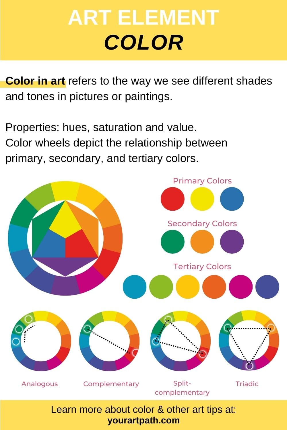
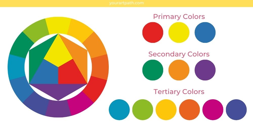
At its core, the study of colour in art begins with the colour wheel—a circular diagram representing the relationships between colours. For a brand strategist, this wheel is the primary blueprint for creating harmony, contrast, and memorability in a logo or marketing campaign.
Primary, Secondary, and Tertiary: Building the Brand DNA
In traditional art, primary colours (red, yellow, and blue) are the foundational pigments that cannot be created by mixing others. In branding, primary colours function as the “DNA” of the brand. Think of the bold red of Netflix or the vibrant blue of Intel. These choices are rarely accidental.
Secondary colours (green, orange, and purple) are created by mixing primaries. In brand strategy, these are often used to differentiate a company from competitors who occupy the “primary” space. For example, while many financial institutions use “trustworthy” blue, a brand like H&R Block utilizes green to stand out and signal growth. Tertiary colours provide the nuance necessary for sophisticated personal branding, allowing for “muted” or “earthy” palettes that suggest organic quality or high-end luxury.
The Science of the Colour Wheel in Visual Strategy
Artistic compositions rely on specific “colour schemes” to guide the viewer’s eye. Brands employ these same strategies:
- Complementary Schemes: Using colours opposite each other (like purple and yellow) to create high energy and high contrast. This is often seen in sports branding (e.g., the LA Lakers).
- Analogous Schemes: Using colours next to each other (like blue, teal, and green) to create a sense of serenity and cohesion. This is common in wellness and healthcare branding.
- Monochromatic Schemes: Using various shades of a single hue. This suggests elegance and focus, often utilized by tech brands to convey a “clean” user experience.
The Psychology of Hue: How Artistic Selection Drives Brand Perception
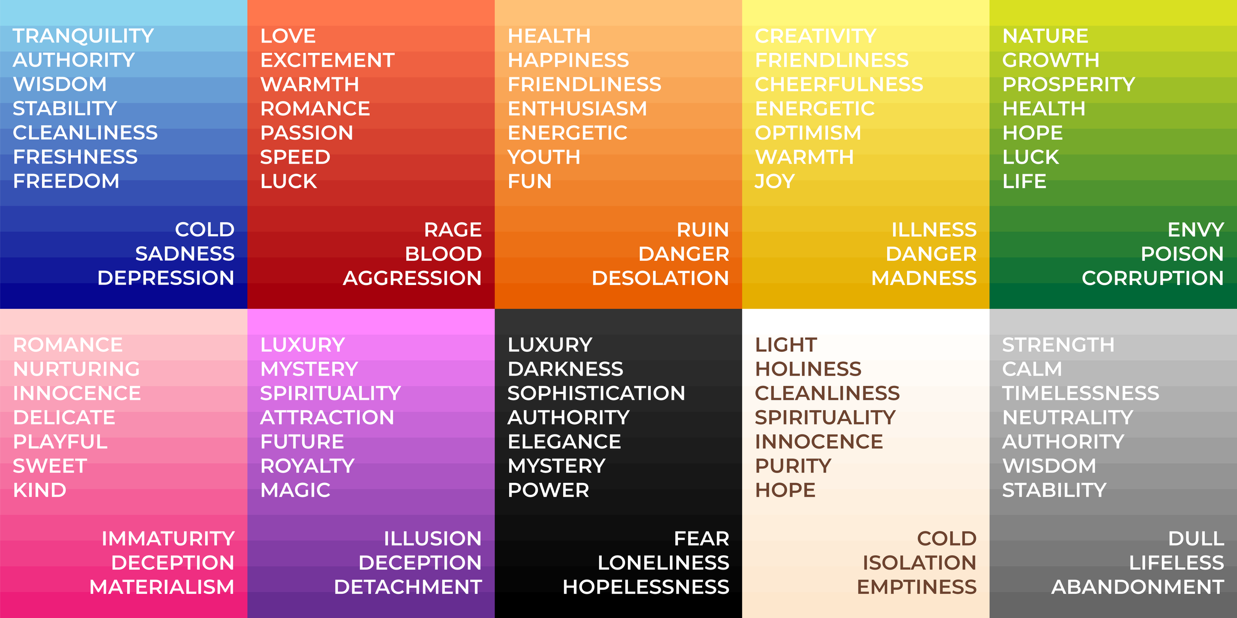
Art historians have long studied how painters use colour to evoke specific moods—the “Blue Period” of Picasso, for instance, evokes deep melancholy. In branding, this is known as Colour Psychology. Every shade chosen for a brand identity sends a subconscious message to the consumer before a single word is read.
Red and Yellow: Creating Urgency and Appetite
In the world of art, red is the colour of passion, blood, and fire. In the world of brand marketing, it is the colour of action. Red is known to increase the heart rate and create a sense of urgency, which is why it is the go-to colour for “Clearance” signs and “Order Now” buttons.
When paired with yellow—the colour of sunshine and optimism—it creates a powerful psychological “hunger” trigger. This is the “Ketchup and Mustard” theory used by giants like McDonald’s, Burger King, and Denny’s. The artistic vibrancy of these colours ensures they are visible from great distances, capturing the attention of weary drivers and hungry pedestrians alike.
Blue and Green: Establishing Trust and Sustainability
Blue is the most popular colour in corporate branding for a reason. In art, blue represents the vastness of the sea and the sky—elements that are constant and dependable. For a brand in the tech or finance sector (such as Chase or IBM), blue communicates stability, intelligence, and trust.
Green, conversely, has moved from representing “nature” in landscape art to representing “sustainability” and “wealth” in brand strategy. For a modern brand, using a specific shade of forest green or sage can instantly align the company with environmental consciousness, a crucial factor in contemporary consumer decision-making.
Neutral Palettes and the Minimalist Luxury Aesthetic
White, black, and grey are often relegated to the background in traditional painting, used for highlights and shadows. However, in the “Quiet Luxury” movement of modern branding, these neutrals are the stars. Brands like Apple, Chanel, and Tesla utilize a minimalist palette to signal sophistication, power, and timelessness. By stripping away “colour,” the brand highlights the form and function of the product, much like a minimalist sculptor focuses on the purity of the material.
Technical Precision in Modern Branding: Harmonizing Art and Digital Standards
While an artist might mix paint on a palette until it “looks right,” a brand strategist requires mathematical precision. A colour in art is subjective; a colour in branding must be universal across all mediums, from a smartphone screen to a physical billboard.
Translating Pigment to Pixel: The Importance of Consistency
One of the greatest challenges in brand design is ensuring that the “Brand Red” looks the same on a digital app (RGB) as it does on a printed business card (CMYK).
- RGB (Red, Green, Blue): This is the additive colour model used for digital screens.
- CMYK (Cyan, Magenta, Yellow, Key/Black): This is the subtractive model used for physical printing.
Professional brand guidelines will always specify the exact Hex code or Pantone Matching System (PMS) number. This ensures that the artistic vision of the brand is never diluted by technical variations, maintaining “brand equity” through visual consistency.
Contrast and Accessibility: The Ethics of Inclusivity in Design
In art, low contrast can be used to create a “dreamy” or “sfumato” effect. In brand design, low contrast is a liability. A critical part of modern brand strategy is ensuring that colour choices meet Web Content Accessibility Guidelines (WCAG).
High contrast between text and background is not just a design choice; it is an inclusive practice that ensures people with visual impairments or colour blindness can interact with the brand. What is a colour in art for “mood” becomes a colour in branding for “usability.”
Case Studies in Colour: Artistic Mastery in Global Brand Strategy
To truly understand the application of colour theory in branding, we must look at companies that have successfully “patented” their artistic choices.
Tiffany Blue and the Power of Proprietary Colour
Perhaps the most famous example of colour as brand identity is “Tiffany Blue” (Pantone 1837). This specific shade of robin’s-egg blue was chosen by founder Charles Lewis Tiffany for the cover of his “Blue Book” in 1845. Today, the colour itself is trademarked. It evokes an immediate sense of luxury and exclusivity. The artistic choice here was to pick a colour that did not exist commonly in nature or other brands, making it instantly recognizable even without a logo.
Coca-Cola: The Timelessness of Chromatic Boldness
Coca-Cola’s use of red is an exercise in “visual dominance.” By consistently using a specific, vibrant shade of red for over a century, the brand has effectively claimed that portion of the visible spectrum. In any grocery store aisle, the human eye is trained to find that specific artistic “pop” of red. This is the ultimate goal of brand strategy: to make a colour synonymous with an experience.
Conclusion: The Strategic Art of Selection
So, what is a colour in art? It is the soul of the piece. What is a colour in branding? It is the soul of the business.
For the modern professional, understanding colour is not an elective skill—it is a core competency of brand strategy. By leveraging the emotional weight of artistic hues, the structural logic of the colour wheel, and the technical precision of digital standards, a brand can transcend its product and become a visual icon. Whether you are building a personal brand or managing a corporate identity, remember that every shade carries a story. Choose your palette with the intent of an artist and the precision of a strategist.
aViewFromTheCave is a participant in the Amazon Services LLC Associates Program, an affiliate advertising program designed to provide a means for sites to earn advertising fees by advertising and linking to Amazon.com. Amazon, the Amazon logo, AmazonSupply, and the AmazonSupply logo are trademarks of Amazon.com, Inc. or its affiliates. As an Amazon Associate we earn affiliate commissions from qualifying purchases.