
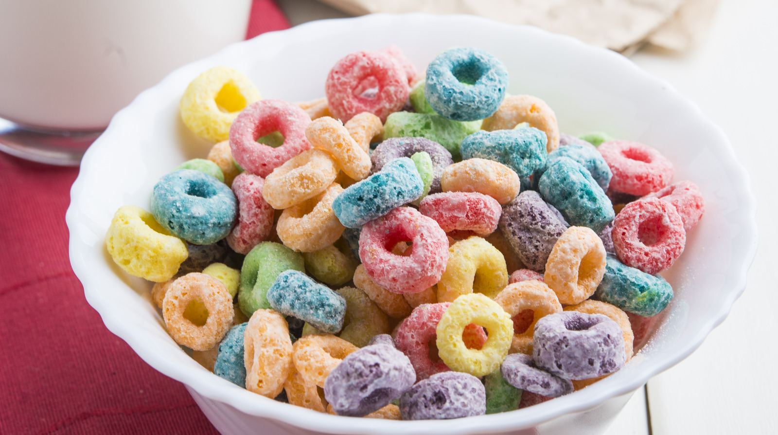
For decades, a question has lingered in the breakfast aisles of grocery stores and around kitchen tables worldwide: What flavor are Froot Loops? To the casual observer, the vibrant reds, oranges, yellows, purples, and greens suggest a cornucopia of individual fruit profiles—cherry, orange, lemon, grape, and lime. However, the reality behind Kellogg’s iconic cereal reveals a far more sophisticated strategy in brand management and sensory marketing.
In the world of corporate identity, Froot Loops serves as a seminal case study. It demonstrates how a brand can cultivate a complex, multi-sensory experience that transcends the physical attributes of the product itself. The “flavor” of Froot Loops isn’t just a culinary achievement; it is a triumph of branding, where perception, visual design, and psychological priming converge to create a singular consumer reality.

The Great Illusion: Deciphering the “Froot” Behind the Loop
To understand the branding genius of Froot Loops, one must first confront the nutritional and chemical reality: every loop, regardless of its color, is the exact same flavor. Kellogg’s has confirmed that the cereal consists of a singular “froot” blend—a proprietary mixture of fruit flavors that remains consistent across the entire box.
Uniformity Disguised as Variety
The decision to make every piece the same flavor while coloring them differently is a calculated move in brand efficiency and consumer psychology. From a manufacturing standpoint, creating a uniform flavor profile simplifies supply chains and ensures consistency. However, from a marketing standpoint, the variety of colors suggests a “wealth of choice.” Brands that offer a sense of abundance and variety often see higher engagement levels. By using color as a proxy for flavor variety, Kellogg’s provides the emotional satisfaction of diversity without the logistical nightmare of maintaining five or six distinct flavor recipes within a single production line.
The Legal and Linguistic Brilliance of “Froot”
One of the most subtle yet effective branding maneuvers in history is the spelling of the product itself. By utilizing “Froot” instead of “Fruit,” Kellogg’s navigated a complex legal landscape regarding food labeling. In the 1960s, a lawsuit (often cited in marketing lore) challenged the brand for not containing actual fruit. By pivoting to the stylized “Froot,” the brand established a unique trademark that dissociated itself from the strict regulatory requirements of fruit-based products. This move transformed a potential liability into a core component of the brand’s visual identity, creating a whimsical, “un-natural” world where the rules of reality—and traditional fruit flavors—do not apply.
Sensory Branding: How Color Influences Consumer Taste Perception
The reason most people swear they can taste a difference between the red and the yellow loops is not a flaw in their palate, but a testament to the power of sensory branding. This is the marketing practice of engaging multiple senses to build a stronger emotional connection between the consumer and the brand.
The Halo Effect of Visual Stimuli
Marketing psychology suggests that the eye “eats” before the mouth. When a consumer sees a red loop, their brain is subconsciously primed for “red flavors” like cherry or strawberry. This phenomenon, known as cross-modal perception, occurs when the brain integrates information from different senses to form a unified experience. Kellogg’s leverages this by using vibrant, artificial dyes that trigger specific flavor expectations. The brand isn’t just selling cereal; it is selling a psychological experience where the visual identity dictates the physical sensation.
Psychological Priming and the “Taste the Rainbow” Phenomenon
By presenting a rainbow of colors, the brand engages in “sensory-specific satiety” management. Research shows that consumers tend to eat more and find an experience more pleasurable when there is a perceived variety. Even if the flavor is identical, the visual variety prevents the “flavor boredom” that might occur with a monochromatic product. This is a masterstroke in brand strategy: utilizing visual design to increase product consumption and perceived value.

Brand Consistency and Longevity in the Cereal Aisle
The Froot Loops identity is anchored by more than just the cereal itself; it is supported by a robust corporate identity and iconic brand assets that have remained remarkably consistent over the decades. This consistency builds brand equity, making the product recognizable across generations.
Toucan Sam as a Brand Ambassador
No discussion of the Froot Loops brand is complete without Toucan Sam. Introduced in the 1960s, Toucan Sam serves as the ultimate brand vessel. His catchphrase, “Follow my nose! It always knows! The flavor of froot… wherever it grows!” is a brilliant piece of sensory marketing. It emphasizes the scent and flavor of the product, distracting from the lack of actual fruit content and reinforcing the “froot” identity. Characters like Toucan Sam provide a face for the brand, allowing for an emotional connection that a simple box of grain cannot achieve. Sam’s nose, with its pink, yellow, and black stripes, mirrors the cereal’s colors, creating a cohesive visual language.
Maintaining Heritage in an Era of Health-Consciousness
As consumer trends shift toward “clean labels” and natural ingredients, the Froot Loops brand has faced a significant challenge. How does a brand built on neon colors and “froot” flavors survive in a market that demands authenticity? The answer lies in brand heritage. Kellogg’s has successfully positioned Froot Loops as a “legacy brand”—a nostalgic indulgence. Rather than completely overhauling the product to be a health food, which would alienate its core base and destroy its brand identity, Kellogg’s has made incremental changes to dyes and sugar content while keeping the visual and sensory experience intact. They understand that the brand’s value lies in its identity as a fun, vibrant escape from the mundane.
The Economics of Brand Trust: Why the Flavor Doesn’t Actually Matter
From a business perspective, the specific flavor of Froot Loops is secondary to the “Brand Trust” Kellogg’s has built. In the competitive landscape of the CPG (Consumer Packaged Goods) industry, the goal is to create a “category of one.”
Emotional Connection over Product Specifications
When a consumer reaches for a box of Froot Loops, they are rarely thinking about the chemical composition of the “froot” blend. They are buying a memory, a specific crunch, and a reliable morning routine. Great brand strategy moves the consumer away from rational comparisons (e.g., “Does this have more vitamin C than the generic brand?”) and toward emotional loyalty. By focusing on the experience of the flavor mystery rather than the reality of it, Kellogg’s maintains a dominant market position.
Creating a “Category of One” Through Distinctive Assets
The combination of the unique “Froot” spelling, Toucan Sam, the “Follow your nose” slogan, and the circular shape constitutes what marketers call “Distinctive Brand Assets.” These are elements that, when seen or heard, immediately trigger the brand in the consumer’s mind. The “flavor” of Froot Loops is essentially a combination of all these assets. In a market saturated with options, having a product that is “identically diverse” (same flavor, different colors) makes it stand out as a unique entity that competitors find difficult to replicate without looking like a “knock-off.”
Conclusion: The Triumph of Perception
The answer to the question “what flavor are Froot Loops” is not a single fruit, but a complex blend of marketing brilliance and sensory psychology. The flavor is “Froot”—a proprietary, nostalgic, and visually-driven experience that has been meticulously crafted by Kellogg’s for over half a century.
Through the clever use of color to manipulate taste perception, the creation of an iconic brand ambassador, and a strategic focus on sensory branding, Froot Loops has transcended the breakfast bowl. It stands as a testament to the fact that in the world of branding, reality is often less important than the story you tell. For the brand strategist, Froot Loops is a reminder that when you successfully align visual identity with consumer psychology, you don’t just create a product—you create a cultural icon that can “follow its nose” to the top of the market for decades to come.
aViewFromTheCave is a participant in the Amazon Services LLC Associates Program, an affiliate advertising program designed to provide a means for sites to earn advertising fees by advertising and linking to Amazon.com. Amazon, the Amazon logo, AmazonSupply, and the AmazonSupply logo are trademarks of Amazon.com, Inc. or its affiliates. As an Amazon Associate we earn affiliate commissions from qualifying purchases.