In the realm of global iconography, few symbols possess the immediate recognition and emotional resonance of the five interlocking rings. For over a century, this simple geometric arrangement has transcended language barriers, political borders, and cultural divides. While many view the rings through the lens of sports or history, from a strategic perspective, they represent one of the most successful exercises in brand identity and corporate semiotics ever conceived.
Understanding what the five rings of the Olympics represent requires looking beyond the surface of a sporting event. It requires an analysis of how a visual mark can embody a complex set of values, maintain consistency over a hundred years, and adapt to a digital-first world while remaining anchored in its founding principles.
The Genesis of a Visual Identity: Designing Unity
The creation of the Olympic rings was not a historical accident but a calculated act of brand positioning. Designed in 1913 by Pierre de Coubertin, the co-founder of the modern Olympic Games, the rings were intended to serve as a visual manifesto for a movement that aimed to modernize the concept of international competition.
Pierre de Coubertin’s Visionary Concept
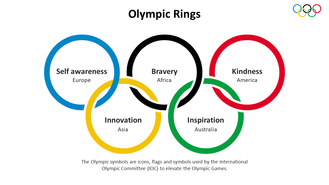
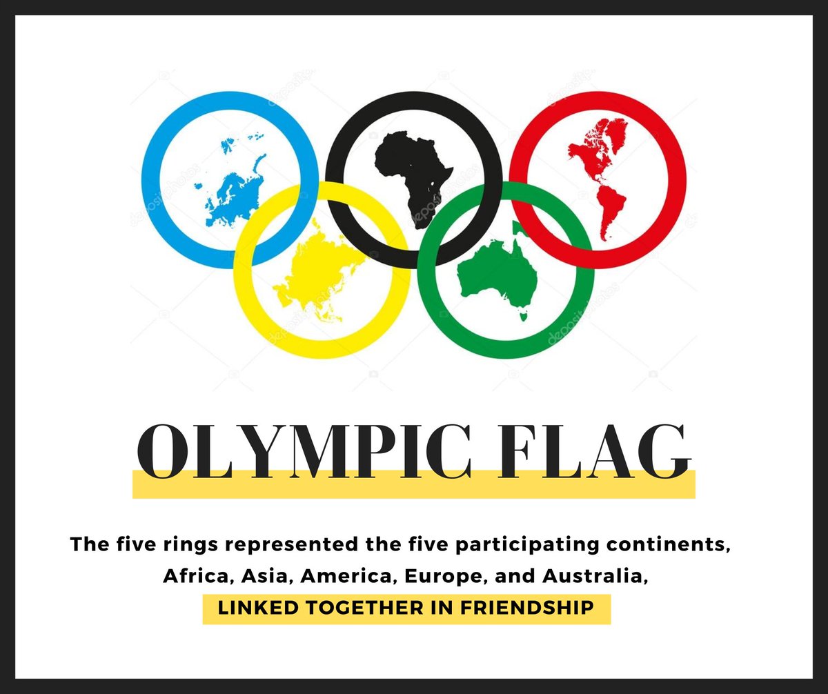
In brand strategy, a logo must communicate a “Why.” For Coubertin, the “Why” was global unity. He envisioned the rings as a representation of the five parts of the world—Africa, the Americas, Asia, Europe, and Oceania—joined together in a spirit of healthy competition. From a design standpoint, the interlocking nature of the rings is a masterstroke of symbolism. It visualizes the concept of “connection” and “interdependence” without the need for a single word of copy. This is the hallmark of effective brand design: the ability to convey a complex mission statement through a minimalist graphic.
The Color Palette: Inclusivity by Design
A common misconception is that each specific color represents a specific continent. However, the strategic intent behind the color palette (blue, yellow, black, green, and red on a white background) was far more inclusive. At the time of its creation, Coubertin noted that these six colors (including the white background) combined to reproduce the colors of every single national flag in existence without exception.
By incorporating the visual DNA of every nation, the Olympic brand achieved instant “buy-in.” This is a classic brand strategy technique: creating a sense of ownership among the target audience. By seeing their own national colors reflected in the global symbol, participants and spectators felt an immediate alignment with the Olympic brand.
Brand Equity and the Power of Global Recognition
In the world of corporate identity, brand equity refers to the value a company gains from a name or symbol that is recognizable. The Olympic rings are often cited by marketing experts alongside the likes of Apple’s bitten apple or Nike’s swoosh as the pinnacle of brand equity.
Consistency Across a Century
One of the primary reasons the Olympic rings remain so powerful is the International Olympic Committee’s (IOC) unwavering commitment to brand consistency. Since its debut at the 1920 Antwerp Games, the primary design of the rings has remained virtually unchanged. In an era where brands frequently undergo “rebrands” to chase fleeting trends, the IOC’s dedication to the original mark has built a century of trust.
This consistency allows the brand to accumulate “meaning” over time. Every victory, every heartbreak, and every moment of historical significance that occurs under the banner of the rings adds a new layer of emotional value to the mark. This is a long-term brand strategy that prioritizes legacy over novelty.
Emotional Connection and Storytelling
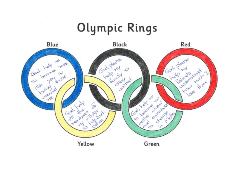
The Olympic brand does not sell a product; it sells an aspiration. The rings represent “The Olympic Values”: Excellence, Friendship, and Respect. Through decades of storytelling—leveraged via broadcast media, documentaries, and global marketing campaigns—the rings have become a shorthand for human potential.
From a marketing perspective, this is “higher-order positioning.” By associating the brand with universal human virtues rather than just athletic performance, the Olympic rings have secured a permanent place in the global psyche. This emotional tether is what makes the brand resilient even in the face of controversy or geopolitical tension.
Protecting the Intellectual Property: A Rigid Brand Framework
A brand as valuable as the Olympic rings requires an extraordinary level of protection. The IOC manages the rings not just as a logo, but as a high-stakes intellectual property (IP) asset. The strategic management of this asset is what allows the Games to generate the billions of dollars in sponsorship revenue that fund the movement.
The IOC’s Strategic Brand Guidelines
The IOC maintains one of the world’s most comprehensive brand identity manuals. These guidelines dictate everything from the exact Pantone shades of the rings to the precise amount of “clear space” required around the logo. This rigidity ensures that whether the rings appear on a digital billboard in Tokyo or a physical banner in Paris, the brand experience is identical.
This level of control prevents “brand dilution.” If the rings were allowed to be modified, recolored, or integrated haphazardly into third-party designs, they would lose their authoritative status. By maintaining a “sacred” status for the logo, the IOC ensures that any partnership or association with the rings remains a premium commodity.
Managing Sub-Brands and Local Committees
Each individual Olympic Games (e.g., London 2012, Rio 2016, Paris 2024) creates its own unique “Host City” logo. However, the brand architecture always positions the five rings at the center or the base of these designs. This “Masterbrand” strategy allows for local creativity and cultural expression while ensuring that the core identity—the five rings—remains the dominant visual anchor. It is a lesson in how global corporations can maintain a unified identity while allowing for regional adaptations.
Adapting the Brand for the Digital Age
While the rings themselves have remained constant, the brand strategy surrounding them has evolved to meet the demands of the 21st century. In an age of mobile-first consumption and social media, the IOC has had to modernize how the rings are deployed and perceived.
Minimalist Design and Mobile Optimization
In recent years, the IOC has leaned into “flat design” versions of the rings. By removing shadows, gradients, and 3D effects, the brand ensures that the rings remain legible on the smallest of smartphone screens. This shift toward minimalism is a strategic response to the way modern audiences interact with brands. A logo must be as recognizable as a 16×16 pixel favicon as it is on a stadium-sized banner.
Furthermore, the brand has expanded its digital footprint through the “Olympics” app and social media channels. Here, the rings serve as an “anchor of authenticity” amidst a sea of user-generated content. By placing the rings alongside high-quality digital content, the IOC maintains its status as the “official” voice of global sport.
The Shift Toward Values-Driven Branding
Modern consumers—particularly Millennials and Gen Z—demand that brands stand for more than just profit or performance. In response, the brand strategy behind the rings has pivoted to emphasize social impact. The representation of the five rings is now frequently linked to sustainability initiatives, gender equality in sports, and the Olympic Refugee Team.
This is a strategic move to ensure the brand remains relevant to a younger, more socially conscious demographic. By evolving what the rings “stand for” without changing what they “look like,” the Olympic movement successfully bridges the gap between tradition and progress.
Conclusion: The Ultimate Corporate Identity
The five rings of the Olympics represent far more than five continents or six colors. They represent a masterclass in brand strategy that has stood the test of time. Through purposeful design, relentless consistency, and rigorous intellectual property management, the IOC has created a visual identity that is arguably the most powerful in the world.
For brand strategists and marketing professionals, the Olympic rings offer a profound lesson: a great brand is not just a logo; it is a vessel for a set of values. When a symbol is designed with enough foresight to include its audience, and managed with enough discipline to maintain its integrity, it can transcend its original purpose to become a universal language. The five rings continue to represent the pinnacle of what a brand can achieve: the ability to unite the world under a single, unchanging vision of excellence.
aViewFromTheCave is a participant in the Amazon Services LLC Associates Program, an affiliate advertising program designed to provide a means for sites to earn advertising fees by advertising and linking to Amazon.com. Amazon, the Amazon logo, AmazonSupply, and the AmazonSupply logo are trademarks of Amazon.com, Inc. or its affiliates. As an Amazon Associate we earn affiliate commissions from qualifying purchases.