
In the world of visual communication, few symbols carry as much weight, history, and immediate recognition as a national flag. To the casual observer asking “what does a Cuban flag look like,” the answer is a description of stripes, a triangle, and a star. However, from the perspective of brand strategy and corporate identity, the Cuban flag—known as La Estrella Solitaria (The Lone Star)—is a masterclass in minimalist design, symbolic resonance, and enduring brand equity.
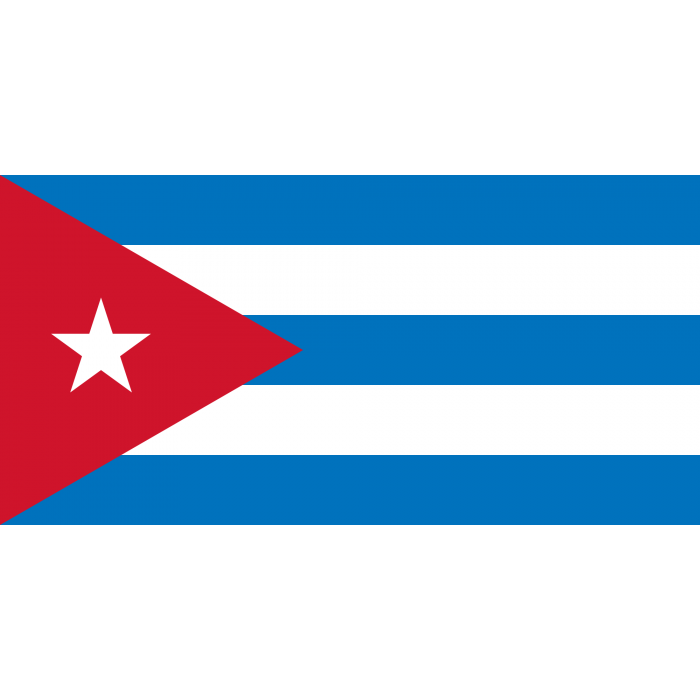
A flag is, in its purest form, the ultimate logo. It must be recognizable from a distance, reproducible across various media, and capable of evoking deep emotional loyalty. The Cuban flag achieves this through a specific arrangement of five horizontal stripes (three turquoise blue and two white), a red equilateral triangle at the hoist, and a single white five-pointed star centered within the triangle.

The Geometry of Identity: Understanding the Cuban Flag’s Visual Components
When deconstructing the “brand” of Cuba through its flag, one must first look at the foundational elements of its layout. Modern brand identity often relies on the “Rule of Three” or “Golden Ratio” to create balance; the Cuban flag utilizes geometric precision to ensure its “logo” is both bold and harmonious.
The Rule of Three: Blue Stripes and Symbolism
The flag features three blue stripes which, in the original brand narrative established in 1849 by Narciso López, represented the three administrative departments into which Cuba was divided at the time: Occidental (West), Central, and Oriental (East). From a design standpoint, these stripes provide a rhythmic “texture” to the flag. The choice of blue is not merely aesthetic; it signifies the sea surrounding the island, framing the nation’s identity within its geographical context. In corporate branding, blue is often used to convey stability, trust, and intelligence—traits that the designers sought to imbue into the fledgling national identity.
The White Balance: Purity and Purpose in Design
Interspersed between the blue are two white stripes. In the hierarchy of brand colors, white often serves as “negative space” that allows the primary colors to pop. Symbolically, these stripes represent the purity of the ideals held by those fighting for independence. Practically, the inclusion of white ensures high contrast, making the flag legible even in low-light conditions or when viewed from a great distance at sea. This focus on legibility is a cornerstone of effective corporate identity; if a brand mark cannot be identified at a glance, it fails its primary purpose.
The Power of the Triangle: Focus and Direction in National Branding
If the stripes represent the “body” of the brand, the red triangle and the white star represent the “head” or the core mission statement. In design theory, the triangle is one of the most stable and directed shapes. It points forward, suggesting progress and movement.
The Red Equilateral Triangle: Equality and Sacrifice
The use of a red equilateral triangle at the hoist (the side closest to the flagpole) is a bold stylistic choice. Red is the most high-energy color in the branding palette, associated with passion, power, and, in this context, the blood shed for freedom. The equilateral nature of the triangle is a deliberate nod to the Masonic ideals of liberty, equality, and fraternity. By using a geometric shape that symbolizes balance, the Cuban flag communicates a brand message of social equilibrium. This is a technique mirrored by modern tech and lifestyle brands that use symmetrical icons to project a sense of fairness and reliability.
The Lone Star: A Singular Brand Vision
Centered within the red triangle is La Estrella Solitaria. A star is a universal symbol of excellence, guidance, and high aspirations. In the context of the Cuban brand, the single star signifies a unified vision—a “lone” star that illuminates the path toward independence. From a brand strategy perspective, the star acts as the “icon” within the logo. It is the focal point that captures the eye. Just as the Nike “Swoosh” or the Apple “Apple” serves as a shorthand for the entire company, the white star on the red field is the shorthand for the Cuban spirit. It is simple enough for a child to draw, yet distinct enough to be unique among the myriad of world flags.
Vexillography as Brand Strategy: Lessons for Modern Corporate Identity
The study of flags, or vexillography, shares many principles with modern graphic design and brand strategy. The Cuban flag, designed long before the advent of digital marketing, adheres to several “Brand Guidelines” that modern corporations spend millions of dollars to perfect.
Simplicity and Scalability
One of the primary rules of brand design is that a logo must be scalable. It should look just as good on a business card as it does on a billboard. The Cuban flag’s design is remarkably scalable. Because it relies on basic geometric shapes—rectangles, a triangle, and a star—it retains its integrity whether it is flying atop a government building in Havana or printed as a tiny icon on a website. This “iconic” simplicity is why the design has remained virtually unchanged for over 170 years, a level of brand consistency that most corporations can only dream of.
Emotional Connection through Color Psychology
Effective branding is not just about looking good; it is about feeling right. The Cuban flag uses a primary color palette—Red, White, and Blue—which is a common “power” palette in national branding (used by the USA, UK, and France, among others). However, the specific layout and the intensity of the “Turquino” blue give it a unique Caribbean identity. By choosing colors that evoke both universal values (liberty, purity) and local realities (the sea), the flag creates a powerful emotional resonance with its “target audience”—the citizens of Cuba and the global diaspora.
Maintaining Brand Consistency: The Historical Evolution of the Cuban Insignia
A brand’s strength is often measured by its longevity and its ability to withstand “market” shifts. In the case of Cuba, the “market” has seen radical shifts in governance, from colonial rule to republic status to a socialist state. Through every era, the flag has remained the constant visual anchor of the nation.
From Narciso López to Modern Day
The design was finalized in 1849 by Narciso López and the poet Miguel Teurbe Tolón. Interestingly, they were in New York City at the time, highlighting how “brand agencies” (in this case, exiled revolutionaries) often look at a brand from an outside perspective to find its core essence. When the Republic of Cuba was officially established in 1902, the flag was adopted as the official national symbol. Unlike many other nations that change their flags following a revolution, the leaders of the 1959 Cuban Revolution chose to keep the flag. This decision was a strategic move in brand preservation; by keeping the flag, the new government claimed the “legacy” and “equity” of the independence movement of the 19th century.
Standing Out in a Competitive Global Landscape
In the “marketplace” of nations, visibility is key. The Cuban flag is often compared to the Puerto Rican flag, which features the same design with inverted colors (red stripes and a blue triangle). This creates a “brand family” feel, signifying a shared history and cultural bond between the two islands. However, the Cuban flag’s specific arrangement—the blue stripes providing the primary background—gives it a cooler, more stable visual weight. This distinction allows the Cuban “brand” to stand out while still acknowledging its regional “partners.”
Conclusion: The Enduring Legacy of the Design
To answer “what does a Cuban flag look like” is to describe a masterpiece of branding. It is a visual composition that balances the complexity of history with the simplicity of modern design. With its five stripes, its bold red triangle, and its guiding white star, the Cuban flag serves as a permanent corporate identity for the nation.
For brand strategists and designers, the Cuban flag offers a vital lesson: the most powerful identities are those built on simple geometry, high contrast, and deep symbolic meaning. It is a design that transcends language and politics, proving that a well-crafted visual brand can endure for centuries, remaining as vibrant and recognizable today as it was in the mid-19th century. Whether seen on a ship in the harbor or as a digital avatar, the Cuban flag remains a testament to the power of a singular, well-executed brand vision.
aViewFromTheCave is a participant in the Amazon Services LLC Associates Program, an affiliate advertising program designed to provide a means for sites to earn advertising fees by advertising and linking to Amazon.com. Amazon, the Amazon logo, AmazonSupply, and the AmazonSupply logo are trademarks of Amazon.com, Inc. or its affiliates. As an Amazon Associate we earn affiliate commissions from qualifying purchases.