In the dynamic world of branding and design, the seemingly simple question, “What is the standard font size?” opens a complex yet crucial dialogue. Far from a straightforward numerical answer, the concept of a “standard” font size is deeply intertwined with brand strategy, corporate identity, user experience, and marketing effectiveness. It’s not about finding a universal magic number, but rather understanding the contextual nuances that define optimal typography for a brand’s diverse touchpoints. For any brand aiming for clarity, consistency, and compelling communication, mastering the art and science of font sizing is paramount.
Effective typography is a silent brand ambassador, conveying professionalism, trustworthiness, and personality before a single word is even read. Font size, a foundational element of typography, dictates readability, visual hierarchy, and the overall aesthetic appeal of a brand’s message. Ignoring its strategic importance can lead to disjointed communication, diminished brand perception, and a frustrating user experience. This exploration delves into how brands define, implement, and evolve their font size standards to build strong, recognizable, and accessible identities.
Understanding “Standard” Font Size in Branding
The term “standard” in the context of font size for branding isn’t about a fixed global measurement; rather, it refers to a set of best practices and guidelines tailored to a brand’s specific communication channels, target audience, and overall design philosophy. A brand’s visual identity guide, often called a brand style guide or corporate identity manual, is where these standards are meticulously documented. These guidelines ensure consistency across all brand assets, from a website to a business card, and from a social media post to a billboard.
The Myth of a Universal Number
Many might expect an answer like “12pt is standard,” but this is a relic of print-centric thinking and ignores the vast landscape of digital media. A 12pt font on a printed document will appear entirely different from a 12px font on a high-resolution display, or a 12sp font on an Android device. The “standard” is fluid, adapting to the medium, the device, and the user’s viewing conditions. For brands, this means moving beyond a single point size and embracing a responsive, adaptive approach to typography.
Contextualizing “Standard” with Brand Goals
A standard font size for a luxury brand’s elegant brochure might be significantly different from that of a tech startup’s user interface, or a non-profit’s educational pamphlet. Each decision is driven by the brand’s objectives:
- Readability: Ensuring content is effortlessly consumed by the target audience.
- Brand Personality: Reflecting the brand’s tone (e.g., modern, classic, playful, serious) through typographic scale.
- Visual Hierarchy: Guiding the reader’s eye through content, emphasizing key messages.
- Accessibility: Making content usable for individuals with diverse needs.
- Consistency: Maintaining a unified look and feel across all brand touchpoints.
Ultimately, a brand’s standard font sizes are a carefully curated system designed to optimize the delivery of its message, reinforce its identity, and create a seamless experience for its audience.
The Strategic Impact of Font Size on Brand Identity and Readability
Font size is more than just a matter of legibility; it is a powerful tool in shaping brand perception and enhancing the user experience. Strategic font sizing contributes significantly to how a brand is perceived and how effectively its messages are absorbed.
Shaping Brand Perception and Personality
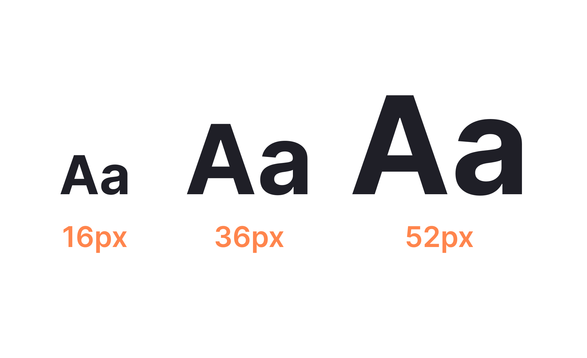
The scale of typography can dramatically alter a brand’s perceived personality. Large, bold headlines convey confidence, importance, and modernity, often favored by tech brands or news outlets. Smaller, more refined type sizes might suggest elegance, exclusivity, or understated sophistication, common in luxury branding or high-end publishing. A consistent and thoughtfully chosen font scale helps to solidify a brand’s voice and visual identity, making it instantly recognizable and memorable.
For example, a youthful, energetic brand might use larger, more varied font sizes to create dynamic layouts, while a financial institution might stick to more conservative, consistent sizes to project reliability and seriousness. The ‘standard’ for each is deeply embedded in their brand ethos and communication goals.
Enhancing Readability and User Experience
The primary goal of any textual communication is to be read and understood. Font size is a critical determinant of readability, especially in the digital age where content is consumed on screens of varying sizes and resolutions.
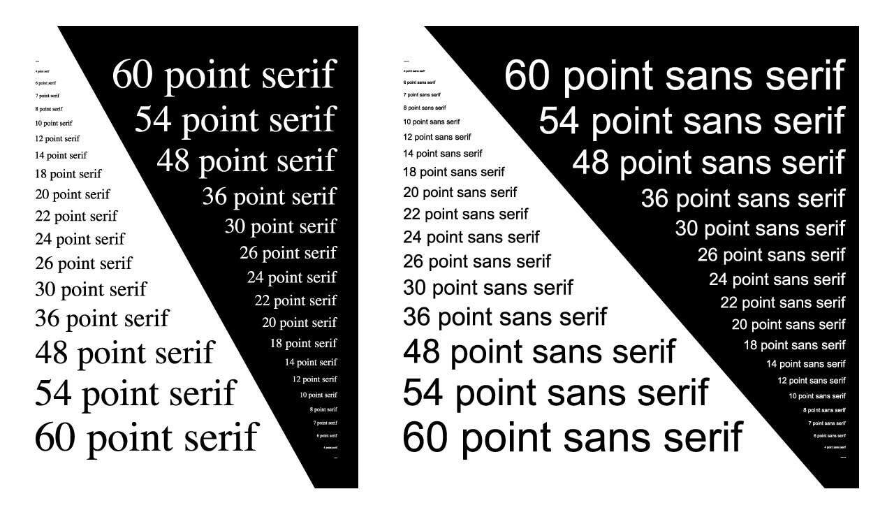
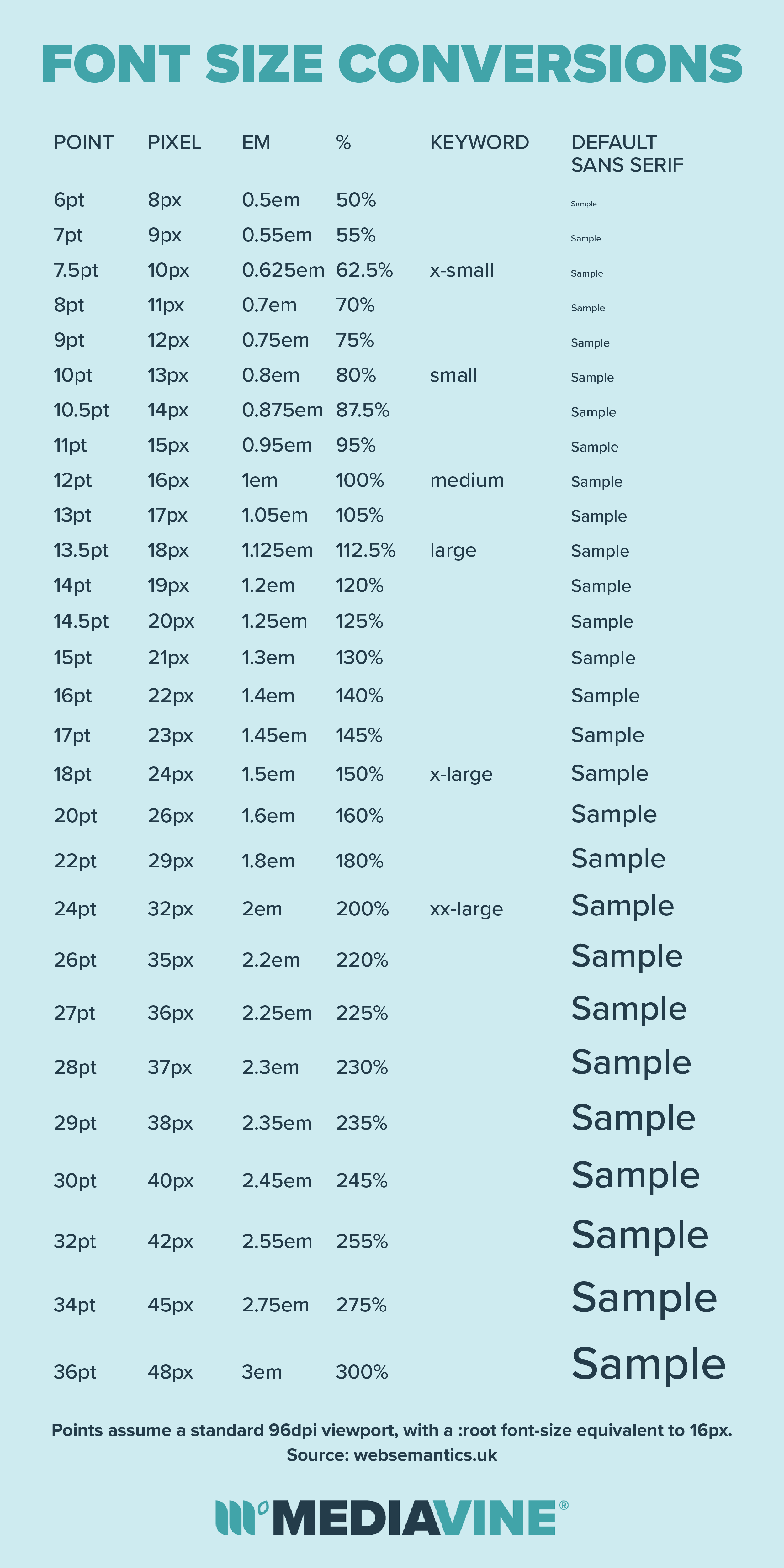
- Body Text: The bulk of any content, body text needs to be easily legible for prolonged reading. For web, a common starting point for body text on desktop is often 16px to 18px (or corresponding responsive units like
emorrem), though this can vary. Print often starts slightly higher, perhaps 10pt to 12pt depending on the font and line spacing. - Headlines and Subheadings: These require larger sizes to create visual hierarchy, break up text, and draw attention to key sections. The proportional relationship between headline sizes (H1, H2, H3, etc.) and body text is crucial for a balanced and scannable layout.
- Captions and Fine Print: These are typically smaller but must still remain legible. The lower limit is usually around 10px or 8pt, but testing on actual devices is essential.
Poor font sizing – too small, too large, or inconsistent – leads to reader fatigue, frustration, and ultimately, a breakdown in communication. A brand that prioritizes readability demonstrates respect for its audience, fostering trust and positive engagement.
Implementing Font Size Standards Across Brand Touchpoints
Once the strategic importance of font size is understood, the next step is to practically implement these standards across all channels where a brand interacts with its audience. This requires a robust brand style guide and a deep understanding of each medium’s unique requirements.
Digital Platforms: Web, Mobile, and Apps
The digital realm presents the greatest challenge and opportunity for font sizing. Responsive design is key, meaning font sizes must adapt fluidly to different screen sizes and orientations.
Responsive Typography for Web
- Relative Units: Modern web design heavily relies on relative units like
em,rem, andvw(viewport width) instead of fixedpxvalues. This allows fonts to scale proportionally based on a base font size defined in the CSS, or based on the user’s browser settings. - Base Font Size: A common practice is to set a base font size of 16px (or 100% equivalent) for the root HTML element. All other font sizes (headings, body text, etc.) are then defined in
remunits, making them proportional to this base. - Breakpoints: Designers use CSS media queries to define different font sizes (and other layout adjustments) at specific screen width breakpoints (e.g., mobile, tablet, desktop). This ensures optimal readability and visual appeal across devices.
Mobile App Considerations
Mobile app design often requires slightly larger minimum font sizes for body text than web, given that devices are held closer to the eye and screen real estate is limited. Platforms like iOS and Android provide their own Human Interface Guidelines or Material Design guidelines, which recommend specific font sizes for various UI elements to ensure a consistent and accessible user experience within their ecosystems. Brands developing apps must align their typographic standards with these platform guidelines while maintaining their unique brand identity.
Print Media: Brochures, Business Cards, and Packaging
Print still holds significant sway in many brand strategies, from marketing collateral to product packaging. Here, fixed units like points (pt) are standard, but considerations around paper type, printing technique, and viewing distance become critical.
Print Readability Guidelines
- Body Text: For most print applications (books, brochures), 10pt to 12pt is a common range for body text. However, highly legible fonts might go down to 9pt, and larger formats like posters would naturally use much larger sizes.
- Minimum Sizes: For fine print, captions, or disclaimers, a minimum of 6pt to 8pt might be used, but extreme care must be taken to ensure legibility, especially on lower-quality paper or with intricate fonts.
- Leading (Line Spacing): Equally important as font size is leading. Sufficient line spacing prevents text from appearing dense and makes it easier for the eye to track lines. A good rule of thumb is to set leading at 120-145% of the font size.
Brand Style Guides: The Typographic Bible
Every comprehensive brand style guide should dedicate a significant section to typography. This section typically covers:
- Approved Typefaces: Primary, secondary, and tertiary fonts.
- Font Size Scale: A defined hierarchy of font sizes for H1, H2, H3, body text, captions, and other elements, specified for both digital (px, rem) and print (pt) contexts.
- Line Height/Leading: Specific values for each font size.
- Tracking/Kerning: Guidelines for letter spacing.
- Color Usage: How brand colors are applied to text.
- Usage Examples: Visual examples of how type should appear across various brand assets.
This “typographic bible” is crucial for ensuring brand consistency, regardless of who is designing or developing the content.
Accessibility, Inclusivity, and Brand Reputation
In today’s global and diverse market, a brand’s commitment to accessibility is not just a regulatory requirement but a cornerstone of its reputation and an expansion of its market reach. Font size plays a pivotal role in creating accessible content for everyone, including those with visual impairments or cognitive disabilities.
Meeting WCAG Standards
The Web Content Accessibility Guidelines (WCAG) provide internationally recognized recommendations for making web content more accessible. While WCAG doesn’t dictate a single “standard” font size, it emphasizes:
- Minimum Font Size: A general consensus leans towards a minimum body text size equivalent to 16px for digital content, with larger sizes being encouraged where possible.
- Scalability: Users must be able to resize text up to 200% without loss of content or functionality. This is why using relative units (
rem,em) is highly recommended over fixedpxvalues. - Contrast Ratios: Sufficient color contrast between text and background is critical, regardless of font size.
- Clear Hierarchy: Well-defined headings (H1, H2, etc.) help users navigate content, especially those using screen readers.
Brands that adhere to these guidelines demonstrate a commitment to inclusivity, enhancing their reputation and reaching a broader audience. Failure to meet accessibility standards can result in legal challenges and significant reputational damage.
The Business Case for Accessible Font Sizing
Beyond ethics, there’s a strong business case for accessible font sizing.
- Expanded Market: A significant portion of the population has some form of visual impairment, and an even larger segment benefits from larger, clearer text (e.g., older adults). By optimizing font sizes, brands unlock access to these demographics.
- Improved SEO: Accessible websites are often better structured and more semantic, which positively impacts search engine optimization.
- Enhanced User Experience for All: What’s good for accessibility is often good for everyone. Clear, legible text benefits all users, reducing cognitive load and improving engagement.
- Positive Brand Image: Brands perceived as inclusive and user-friendly build stronger emotional connections with their audience, fostering loyalty and advocacy.
Evolving Standards: Adapting Font Size for Future Brand Communication
The “standard” font size is not static; it evolves with technological advancements, design trends, and shifting user behaviors. Brands must remain agile, regularly reviewing and adapting their typographic standards to stay relevant and effective.
High-Resolution Displays and Variable Fonts
The proliferation of high-resolution (Retina, 4K) displays means that fonts that once looked crisp can now appear small or pixelated if not properly scaled. This pushes brands towards larger baseline font sizes and more sophisticated rendering techniques. The emergence of variable fonts offers new possibilities, allowing designers to precisely control weight, width, and other typographic axes, enabling even finer adjustments to optimize readability and brand expression across various contexts without increasing file size significantly. This empowers brands to have truly responsive and adaptable typography that maintains its unique character.
Voice Interfaces and Immersive Experiences
As voice user interfaces (VUIs) and augmented/virtual reality (AR/VR) gain traction, the concept of “font size” will continue to expand. While VUIs may not display text in the traditional sense, any visual accompaniments will require careful consideration of context-aware scaling. In AR/VR, text size, depth, and spatial placement become critical for readability and user comfort, presenting new challenges and opportunities for brand typography. Brands need to think beyond flat screens and consider how their visual language, including text, translates into these immersive environments.
Personalization and User Control
The future of typography might also lean towards greater user control. While brands define their ideal standards, allowing users to adjust font sizes within certain parameters (e.g., through accessibility settings on a website or app) aligns with a user-centric approach. Brands that provide such flexibility, while maintaining core brand integrity, will likely foster deeper loyalty.
In conclusion, the quest for “the standard font size” is a journey, not a destination. For brands, it’s about establishing intelligent, flexible, and accessible typographic systems that embody their identity, communicate their message with clarity, and adapt seamlessly to an ever-changing media landscape. By strategically embracing the nuances of font sizing, brands can build stronger connections, enhance user experiences, and reinforce their position as clear, compelling communicators in a visually crowded world.
aViewFromTheCave is a participant in the Amazon Services LLC Associates Program, an affiliate advertising program designed to provide a means for sites to earn advertising fees by advertising and linking to Amazon.com. Amazon, the Amazon logo, AmazonSupply, and the AmazonSupply logo are trademarks of Amazon.com, Inc. or its affiliates. As an Amazon Associate we earn affiliate commissions from qualifying purchases.