In the vast landscape of animated television, few vehicles have achieved the same level of iconic status and immediate brand recognition as the Mystery Machine from the beloved Scooby-Doo franchise. More than just a mode of transport for Shaggy, Scooby, Fred, Daphne, and Velma, the Mystery Machine is a masterpiece of brand design—a mobile billboard, a character in its own right, and an indelible part of the Scooby-Doo corporate identity. Understanding “what kind of van” it was goes beyond mere automotive classification; it delves into the strategic choices behind its creation and its profound impact on brand building and audience engagement.
The Mystery Machine’s distinct visual appeal and narrative function have solidified its place in pop culture, making it a powerful case study in how design elements contribute to a brand’s enduring power. It demonstrates that sometimes, the most effective brand assets are not just logos or mascots, but fully realized objects that encapsulate the spirit and purpose of an entire universe. This exploration will unpack the design philosophy, strategic significance, and lasting legacy of this psychedelic chariot, viewing it through the rigorous lens of brand strategy.
The Genesis of an Icon: Crafting the Mystery Machine’s Brand Identity
Every successful brand asset begins with a vision—a creative brief, whether explicit or implicit, that guides its development. For the Mystery Machine, the goal was clearly to create something instantly recognizable, visually engaging, and perfectly aligned with the adventurous, often quirky, spirit of Scooby-Doo. Its design was not accidental but a deliberate effort to imbue a functional object with deep brand meaning.
The Creative Brief: Designing for Distinctiveness and Narrative Function
When Hanna-Barbera animators and designers set out to create the vehicle for the “meddling kids” in 1969, they faced a challenge common in brand development: how to make a seemingly ordinary object extraordinary. The choice of a panel van as the base was pragmatic; it implied space for equipment, secret compartments, and the general clutter of a mystery-solving crew. However, the transformation from a generic commercial vehicle to the Mystery Machine was where the brand magic happened.
The “kind of van” was never explicitly named within the series, which was a brilliant, perhaps unwitting, strategic move. By avoiding a specific real-world make and model, the designers created a vehicle that was universally relatable yet singularly unique. It allowed for creative freedom, preventing limitations that might come with licensing or specific design constraints of a real-world vehicle. While commonly speculated to draw inspiration from 1960s American panel vans like the Chevrolet G-Series, Ford Econoline, or Dodge A100, its ambiguous origin contributed to its mythical quality, reinforcing its fictional universe. This ambiguity served to further brand it exclusively as “The Mystery Machine,” rather than a branded version of a real vehicle.
The creative brief demanded a vehicle that could:
- Transport the protagonists: A basic functional requirement.
- Act as a mobile base: Equipped for detective work, implying compartments and adaptability.
- Reflect the show’s aesthetic: The late 1960s psychedelic, counter-culture vibe.
- Be instantly recognizable: A key element for merchandising and brand recall.
- Be memorable: An iconic visual anchor for the entire franchise.
The fulfillment of these demands through its unique visual language catapulted the Mystery Machine from mere prop to an indispensable brand icon.
Visual Language: Colors, Logos, and the Psychedelic Aesthetic
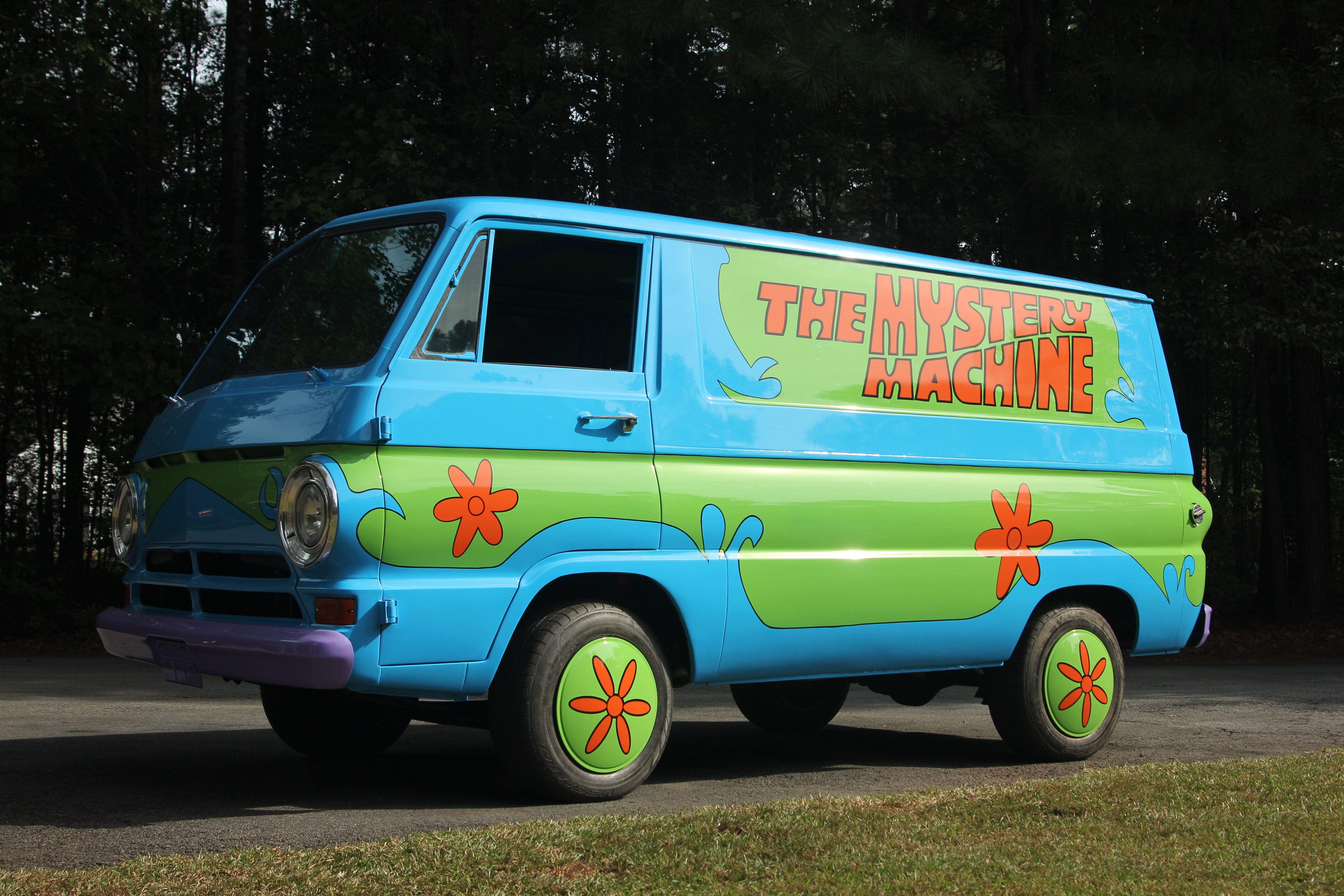
The Mystery Machine’s visual language is its strongest branding asset. Its color scheme—a vibrant mix of blue, green, and orange—was radical for its time, eschewing the subdued tones of typical vehicles. This palette was not just decorative; it was a carefully chosen set of hues that evoked adventure, playfulness, and a touch of the fantastical, perfectly aligning with the show’s blend of spooky mysteries and lighthearted humor. The bright green and sky blue base, punctuated by distinctive orange floral patterns and graphic elements, instantly communicated a youthful, optimistic, and slightly unconventional brand personality.
Central to its design, and therefore its branding, is the iconic “Mystery Machine” lettering on its sides, often rendered in a distinctive custom typeface that further enhanced its unique identity. This serves as a bold, undeniable logo, making sure no viewer could mistake its purpose or origin. The addition of subtle, yet consistent, details like the orange spare tire cover and matching floral patterns throughout its many iterations ensured visual consistency, a cornerstone of strong brand identity. This consistent visual language across decades and different animated styles demonstrates a remarkable foresight in design, allowing the brand asset to adapt while retaining its core recognizability.
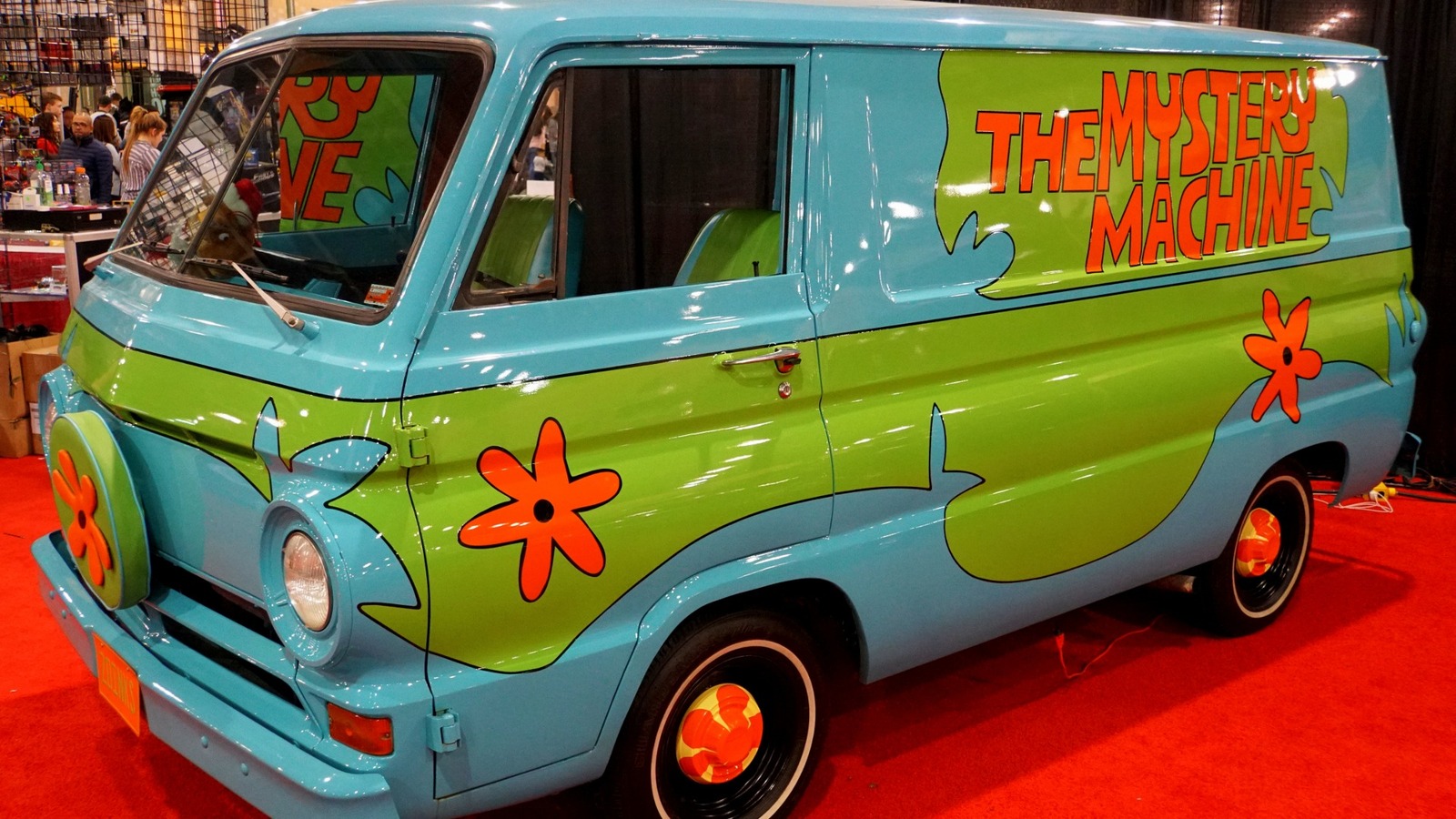
Evolution of Design: Consistency Across Eras and Adaptations
One of the most impressive feats of the Mystery Machine’s brand design is its enduring consistency across numerous animated series, films, and merchandise over five decades. From “Scooby-Doo, Where Are You!” to “Scooby-Doo! Mystery Incorporated” and live-action movies, the core elements of its design have remained remarkably stable. This consistency is vital for brand longevity and allows new generations of viewers to immediately connect with the established brand identity.
While minor stylistic tweaks have occurred—a slightly different curve here, a more modern interpretation there—the fundamental silhouette, color scheme, and graphic motifs have been preserved. This strategic decision showcases a deep understanding of brand resilience: while products or narratives might evolve, core brand assets must maintain their essence to anchor the brand’s identity and prevent dilution. The Mystery Machine is a testament to the power of a well-designed brand element to transcend fleeting trends and remain culturally relevant.
Beyond Transport: The Mystery Machine as a Core Brand Asset
The true measure of a successful brand asset is its ability to transcend its primary function and become a symbol that encapsulates the broader brand message and values. The Mystery Machine is not just a van; it is a repository of the Scooby-Doo brand’s promise: adventure, friendship, mystery, and a touch of the supernatural, always resolved with courage and teamwork.
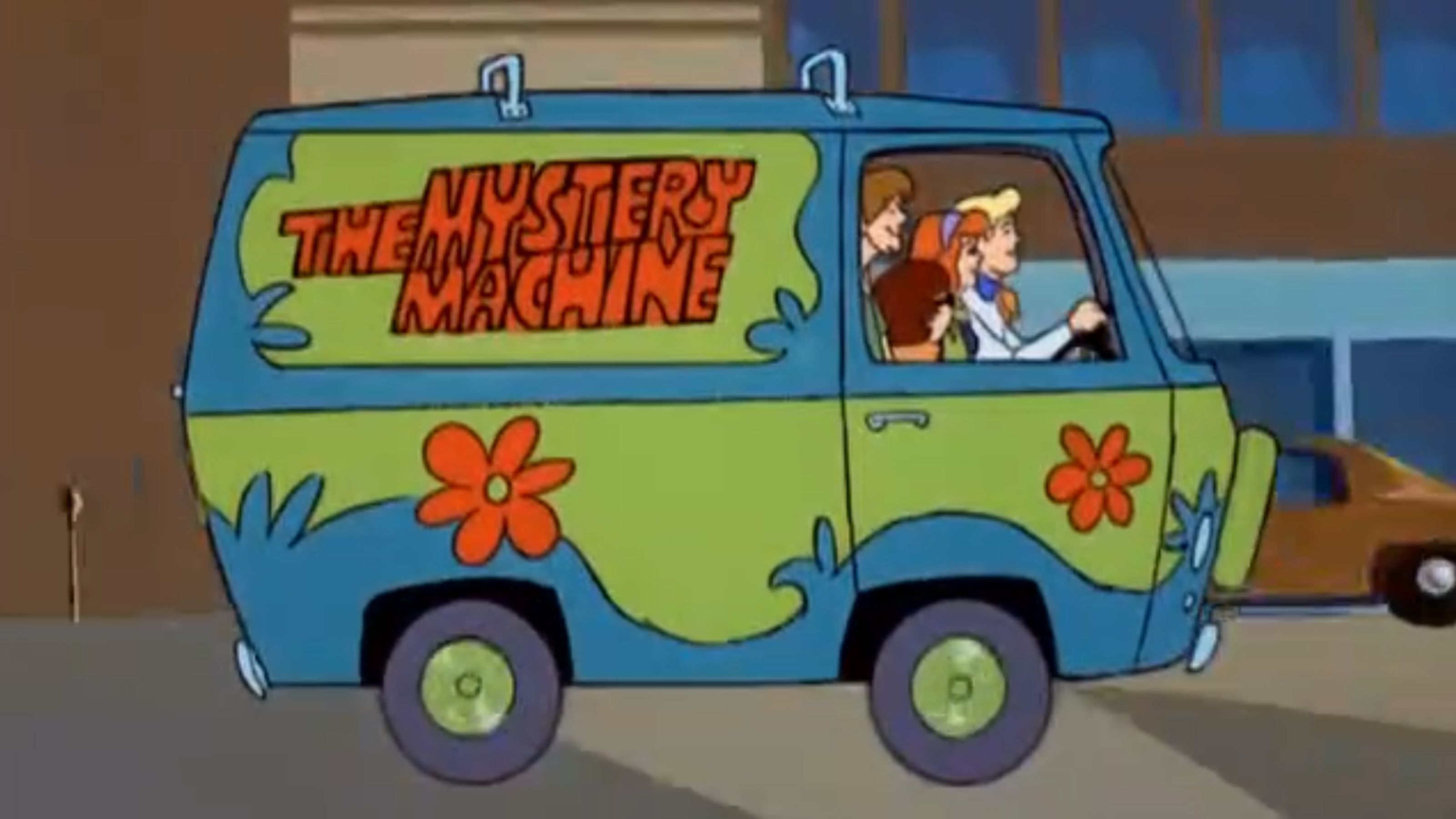
Character Extension: How the Van Embodies the Scooby-Doo Brand Personality
The Mystery Machine acts as an extension of the gang’s collective personality and the show’s ethos. It represents freedom, the open road, and the thrill of the unknown. Its worn, yet cheerful, appearance suggests a history of countless adventures, making it feel lived-in and authentic. The van embodies the notion that adventure can be found anywhere, and that a close-knit group, even with their quirks, can overcome any challenge.
Moreover, the van serves as a safe haven and a mobile base of operations, symbolizing the security and camaraderie within the group, even amidst spooky encounters. It’s where they plan, where they retreat, and where they often discover crucial clues. This intertwining of the vehicle with the narrative and character development elevates it from a mere prop to a vital supporting character, enriching the overall brand experience. The van’s distinct design signals immediately to the audience what kind of brand experience they are about to receive: one of playful mystery and youthful exploration.
Narrative Catalyst: Its Role in Driving Engagement and Plot
Beyond its symbolic value, the Mystery Machine is a powerful narrative catalyst. Its arrival often signals the beginning of an investigation, pulling viewers into the story. Its ability to navigate diverse terrains and hide secrets within its interior allows for dynamic storytelling, facilitating plot points such as chases, stakeouts, and even impromptu disguises.
From a brand perspective, this narrative integration is invaluable. It ensures the brand asset is consistently present and functionally relevant, rather than being a static logo. Every time the Mystery Machine appears, it reinforces the core narrative promise of the Scooby-Doo brand: an exciting mystery is about to unfold. This active role in the storytelling strengthens audience engagement and loyalty, as viewers develop an emotional connection not just with the characters, but with the vehicle that facilitates their beloved adventures. It’s a key visual cue that triggers anticipation and familiarity.
Merchandising Powerhouse: Leveraging the Icon for Brand Extension
The commercial success of the Mystery Machine as a brand asset is undeniable. Its instantly recognizable design makes it a merchandising dream. From toy cars and model kits to clothing, video games, and even real-life replicas, the Mystery Machine has been a consistent top-seller, extending the Scooby-Doo brand far beyond its animated origins. This ability to translate directly into tangible products is a hallmark of truly effective brand design.
The distinctiveness of the van allows it to stand alone as a product, even without the characters. It serves as a visual shorthand for the entire franchise, a powerful reminder of the brand experience. This merchandising versatility generates significant revenue and keeps the brand top-of-mind across various consumer touchpoints, demonstrating the economic value of a well-crafted brand icon. It’s a perpetual reminder of the brand’s presence in the marketplace, reaching consumers of all ages.
The Enduring Legacy: Sustaining Brand Recognition Through Iconic Design
The Mystery Machine’s status as a cultural icon is a testament to the power of thoughtful brand design and consistent execution. Its legacy is not just about nostalgia; it’s about how a well-conceived brand element can contribute to the longevity and global reach of an entire franchise.
Cultural Pervasiveness: From Animation to Live-Action and Beyond
The Mystery Machine has transcended its origins as a cartoon prop to become a genuine cultural artifact. It’s referenced in other media, recognized by people who may not even be regular viewers of Scooby-Doo, and has inspired countless fan creations. This level of cultural permeation is the ultimate goal of any brand strategist: to embed an element of the brand so deeply into the collective consciousness that it becomes a universal shorthand for a particular idea or aesthetic.
Its appearance in various adaptations—from children’s shows to blockbuster movies and even adult parodies—demonstrates its flexibility and enduring appeal. The core design remains robust enough to be reinterpreted without losing its essential identity, proving its strength as a foundational brand element. This omnipresence helps to keep the Scooby-Doo brand fresh and relevant for new generations while maintaining resonance with long-time fans.
Fan Connection: Building Loyalty Through Recognizable Elements
For fans, the Mystery Machine is more than just a vehicle; it’s a symbol of comfort, familiarity, and shared experience. Its vibrant colors and unique design evoke immediate feelings of nostalgia and adventure. This emotional connection is invaluable for building and sustaining brand loyalty. Brands that successfully create such connections foster a community around their products, ensuring a dedicated audience for future endeavors.
The consistent presence of the Mystery Machine throughout the franchise’s history has given fans a stable anchor in an ever-changing media landscape. It represents the unwavering spirit of the Scooby-Doo gang and their commitment to solving mysteries, providing a sense of continuity that reinforces brand trust and affection.
Brand Resilience: How a Consistent Icon Aids Longevity
The Mystery Machine exemplifies brand resilience. In an industry where franchises often struggle to maintain relevance across decades, Scooby-Doo has consistently reinvented itself while holding onto its core identity. A significant part of this success is attributable to iconic elements like the Mystery Machine. By providing a stable, beloved visual anchor, the van allows the brand to experiment with new storylines, animation styles, and character interpretations without losing its essence.
This consistency fosters a strong brand equity that makes the franchise recognizable and appealing across diverse demographics and cultural contexts. The Mystery Machine isn’t just a vehicle that appeared in a show; it’s a testament to how meticulous brand design, unwavering consistency, and strategic deployment of visual assets can create an enduring legacy that transcends generations and continues to drive commercial and cultural success for a brand.
Design Principles for Lasting Brand Impact: Lessons from the Mystery Machine
The enduring success of the Mystery Machine offers valuable lessons for brand designers and strategists seeking to create lasting impact. Its journey from a speculative panel van to a global icon distills several core principles of effective brand design.
Uniqueness and Memorability: The Power of Distinctive Visuals
The Mystery Machine’s strength lies in its utter distinctiveness. In a world full of generic vehicles, its vibrant colors, custom graphics, and unmistakable silhouette make it instantly memorable. For any brand, creating a visual identity that stands out from the competition is paramount. Generic designs are forgotten; unique ones become ingrained in memory, fostering instant recall and recognition. The “kind of van” was deliberately obscured to allow its branded elements to dominate and define it.
This lesson emphasizes the importance of investing in original design and not shying away from bold choices that align with the brand’s personality. The Mystery Machine didn’t try to fit in; it set its own visual standard, and in doing so, became an icon.
Emotional Resonance: Tapping into Nostalgia and Adventure
The Mystery Machine taps into deep emotional wells—nostalgia for childhood, the thrill of adventure, the comfort of friendship, and the satisfaction of solving puzzles. Successful brand design goes beyond aesthetics; it evokes feelings and connects with audiences on an emotional level. This emotional resonance builds loyalty and transforms casual viewers into passionate fans.
Brands that understand their audience’s desires and aspirations, and embed those feelings into their visual assets, are more likely to create lasting connections. The Mystery Machine, with its promise of fun and mystery, consistently delivers this emotional payoff.
Adaptability and Consistency: Balancing Evolution with Core Identity
Finally, the Mystery Machine demonstrates the delicate balance between adaptability and consistency. While the show and its characters have evolved over time, the core design of the van has remained remarkably steadfast. This strategic consistency has allowed the brand to grow and reach new audiences without alienating its original fanbase.
For brand managers, this means identifying the core, non-negotiable elements of their brand identity and safeguarding them, even as other aspects are allowed to evolve. The Mystery Machine proves that a strong, consistent visual identity is the bedrock upon which a resilient and long-lasting brand is built, irrespective of the “kind of van” it might have originally been. It is, and always will be, uniquely the Mystery Machine.
aViewFromTheCave is a participant in the Amazon Services LLC Associates Program, an affiliate advertising program designed to provide a means for sites to earn advertising fees by advertising and linking to Amazon.com. Amazon, the Amazon logo, AmazonSupply, and the AmazonSupply logo are trademarks of Amazon.com, Inc. or its affiliates. As an Amazon Associate we earn affiliate commissions from qualifying purchases.