In the vast landscape of data management and analysis tools, Microsoft Excel stands as an undisputed titan. For decades, it has served as the backbone for businesses, researchers, students, and individuals alike, offering unparalleled flexibility in organizing, calculating, and presenting data. However, for many, unlocking Excel’s full potential often feels like navigating a complex labyrinth of formulas, functions, and formatting options. This perception can deter users from diving deeper into data analysis, leaving valuable insights untapped.
Enter the Quick Analysis Tool – a game-changer designed to demystify data exploration and visualization within Excel. Introduced to streamline the process of gleaning insights, this powerful yet often overlooked feature empowers users of all skill levels to transform raw data into meaningful intelligence with unprecedented speed and simplicity. It’s a testament to Excel’s continuous evolution, aiming to make sophisticated analysis accessible at the click of a button. Far from being a niche function for advanced users, the Quick Analysis Tool is a fundamental component of efficient data handling, acting as your personal data analyst, guiding you towards relevant calculations and compelling visual representations almost instantaneously.
Unveiling Excel’s Quick Analysis Tool: Your Data’s Best Friend
The Quick Analysis Tool (QAT) is not just another button; it’s a smart, context-sensitive feature that revolutionizes how users interact with their data in Excel. It acts as a gateway to a myriad of analytical and visualization options, all presented in an intuitive, easy-to-digest format.
What it is and Why it Matters
At its core, the Quick Analysis Tool is a pop-up menu that appears when you select a range of data in your worksheet. Its primary purpose is to provide immediate suggestions for how to summarize, visualize, or format that data, bypassing the need to navigate through multiple tabs and menus. Think of it as Excel’s intelligent assistant, ready to offer relevant analytical shortcuts based on the data you’ve highlighted.
The “why it matters” is multifaceted. Firstly, it drastically cuts down the time required for initial data exploration. Instead of manually applying conditional formatting, inserting charts, or summing columns, the QAT presents these options upfront. Secondly, it democratizes data analysis. Users who might be intimidated by complex formulas or pivot tables can now generate sophisticated reports and visualizations with minimal effort. This lowers the barrier to entry for data-driven decision-making, allowing more individuals to extract value from their datasets. Thirdly, it encourages discovery. By offering a range of options, the QAT can introduce users to analytical methods they might not have considered, helping them uncover insights that would otherwise remain hidden. It’s about making data accessible, actionable, and less daunting.
How to Access and Activate It
Accessing the Quick Analysis Tool couldn’t be simpler, which is precisely why it’s so effective.
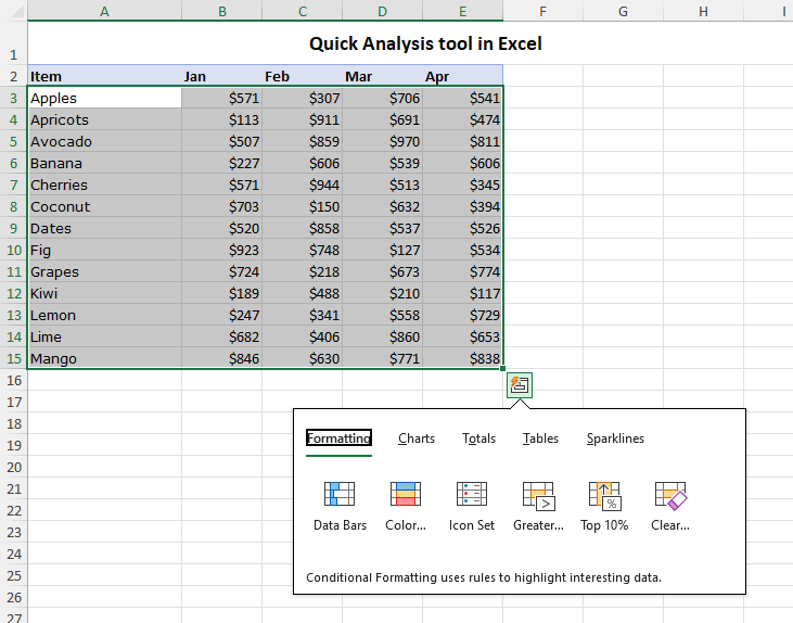
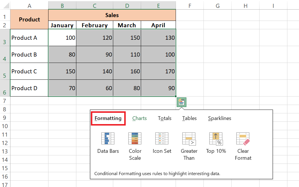
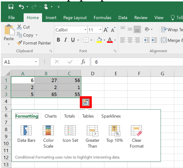
- Select Your Data: Begin by selecting any range of cells that contains the data you wish to analyze. This can be a small table, a single column, or a large dataset.
- Look for the Icon: Once your data is selected, a small, square icon with a lightning bolt symbol will appear in the bottom-right corner of your selection. This is the Quick Analysis Tool icon.
- Click to Activate: Click on this icon, and the Quick Analysis gallery will pop up, presenting you with five distinct tabs: Formatting, Charts, Totals, Tables, and Sparklines.
Alternatively, you can also activate the Quick Analysis Tool by pressing the keyboard shortcut Ctrl + Q after selecting your data. This dual access method ensures that the tool is always just a click or a keypress away, seamlessly integrating into your workflow.
The Five Pillars of Quick Analysis
The power of the Quick Analysis Tool lies in its organization. It categorizes its functionalities into five intuitive tabs, each dedicated to a different aspect of data analysis and presentation. These “pillars” collectively cover a broad spectrum of common analytical needs:
- Formatting: For visually highlighting specific data points or patterns.
- Charts: For quickly visualizing trends, distributions, and comparisons.
- Totals: For instant numerical summaries and calculations.
- Tables: For structuring and summarizing data into more manageable formats.
- Sparklines: For compact, in-cell visualizations of trends.
Understanding these five categories is key to harnessing the full potential of the Quick Analysis Tool, transforming how you interact with and interpret your data.
Beyond Raw Data: Instant Formatting and Visualizations
One of the most immediate benefits of the Quick Analysis Tool is its ability to transform raw, unformatted numbers into visually compelling insights, making patterns and anomalies instantly recognizable.
Intelligent Formatting for Clarity
Conditional formatting is a powerful Excel feature that changes the appearance of cells based on specified conditions. The QAT brings the most commonly used conditional formatting rules to the forefront, enabling rapid visual analysis.
- Data Bars: These visually represent the magnitude of values within a selected range by filling cells with color bars. Larger values have longer bars, providing an immediate visual comparison across data points. For instance, in a sales report, data bars can instantly highlight top-performing products.
- Color Scales: Color scales apply a gradient of colors to cells, where different shades correspond to different value ranges. A common use is a green-yellow-red scale, where green might indicate high values (e.g., high profit), yellow for moderate, and red for low (e.g., low profit or high cost), making outliers or trends pop out immediately.
- Icon Sets: Icon sets use graphical icons (e.g., arrows, traffic lights, flags) to categorize and represent data based on thresholds. They’re excellent for indicating performance relative to a target, status (up/down/no change), or qualitative assessments, adding a layer of visual context without relying solely on numbers.
- Greater Than/Top 10%/Clear Rules: The QAT also offers quick access to highlight cells that are “Greater Than” a specified value, “Top 10%” of the selected range, or to “Clear Rules” that have been applied. These allow for rapid identification of critical data points without diving deep into the conditional formatting manager. This instant visual feedback is invaluable for spotting trends, outliers, or areas needing attention.
Charting Your Course with Ease
Data visualization is crucial for understanding complex datasets, and the Quick Analysis Tool simplifies this process dramatically. It moves beyond simply listing chart types by offering “Recommended Charts.”
- Recommended Charts: This is where Excel’s intelligence truly shines. Based on the structure and content of your selected data, the QAT suggests a variety of appropriate chart types. If you select a column of sales figures and a column of dates, it might suggest a line chart to show trends over time. If you select categories and corresponding values, bar or column charts will likely be recommended. This feature eliminates the guesswork for users unsure which chart best represents their data, guiding them towards effective visual storytelling.
- Common Chart Types (e.g., Bar, Column, Line, Pie): Beyond recommendations, the QAT also provides direct access to common chart types that are broadly applicable. You can quickly insert bar charts for comparing discrete categories, column charts for showing changes over time or comparisons between items, line charts for illustrating trends, and pie charts for showing proportions of a whole. This instant generation of charts allows for quick visual inspection, helping to identify patterns, comparisons, and distributions that might not be evident in raw numbers.
Summarizing and Structuring Data for Deeper Insights
Beyond initial formatting and basic charts, the Quick Analysis Tool excels at helping users summarize and structure their data, transforming flat datasets into dynamic, analytical tools.
Rapid Totals and Calculations
One of the most frequent tasks in data analysis is performing calculations to summarize information. The “Totals” tab in the Quick Analysis Tool offers a range of common calculations that can be applied instantly to your selected data, eliminating the need to manually enter formulas.
- Sum, Average, Count, % Total, Running Total: These are the bedrock of data summarization.
- Sum: Quickly calculates the sum of selected numerical data, whether it’s a column of sales figures or a row of monthly expenses.
- Average: Computes the average value, providing a central tendency measure.
- Count: Counts the number of non-empty cells in the selection, useful for determining how many items or entries meet a criterion.
- % Total: Calculates each value as a percentage of the grand total, excellent for understanding contribution.
- Running Total: Displays a cumulative sum, showing how values add up over a sequence.
- Difference from Previous: This option is particularly insightful for trend analysis, showing the difference between consecutive values in a column or row. For example, it can instantly highlight month-over-month growth or decline in sales figures.
These calculations can be applied to rows or columns with a single click, appearing directly adjacent to your data. This not only saves significant time but also reduces the potential for formula errors, providing immediate, accurate summaries that are crucial for quick decision-making.
Transforming Data into Tables
While data might reside in cells arranged in rows and columns, not every range of data is an “Excel Table.” The Quick Analysis Tool provides a seamless way to convert a simple data range into an official Excel Table, unlocking a host of powerful features.
- Excel Tables Benefits: Converting your data into an Excel Table (not just visually, but structurally) offers numerous advantages:
- Structured References: Formulas automatically adjust to include new rows or columns, making them more robust.
- Automatic Filtering and Sorting: Tables automatically include filter buttons in the header row, allowing for quick data manipulation.
- Banded Rows: Default formatting with alternating row colors improves readability.
- Automatic Formula Propagation: Formulas entered in one cell of a table column automatically fill down to all other cells in that column.
- Total Row: Tables can easily add a total row that can perform various calculations (sum, average, count, etc.) for each column.
The QAT simplifies this conversion, making these benefits accessible without navigating to the “Insert Table” menu.
- PivotTable Power at Your Fingertips: For deeper analytical insights, PivotTables are indispensable. They allow users to quickly summarize and rearrange complex data, revealing patterns, trends, and comparisons that are otherwise hidden. However, creating a PivotTable from scratch can be intimidating for beginners. The Quick Analysis Tool bridges this gap by offering “Recommended PivotTables.”
When you select the “Tables” tab in QAT and choose “Recommended PivotTables,” Excel analyzes your dataset and proposes several pre-configured PivotTable layouts that are likely to yield interesting insights. For instance, it might suggest a PivotTable summarizing sales by region or showing product distribution across different categories. This feature is revolutionary for those new to PivotTables, providing a guided entry into one of Excel’s most powerful analytical functionalities, enabling complex data aggregation and reporting with just a few clicks.
Advanced Visualization with Sparklines
For compact, trend-focused visualizations, the Quick Analysis Tool introduces Sparklines, miniature charts embedded directly within a single cell.
What are Sparklines?
Sparklines are small charts that fit inside a single worksheet cell, providing a succinct visual representation of data trends. Unlike traditional charts that sit on their own canvas, sparklines are designed to be part of the data itself, displayed right next to the numbers they represent. They are perfect for showing context and trends without taking up much space, making them ideal for dashboards or reports where space is at a premium. They can display trends over time, across categories, or any sequential data points.
When and How to Use Them
The QAT simplifies the insertion of sparklines, offering three primary types:
- Line Sparklines: Best for showing trends over a continuous period, such as stock price fluctuations over a quarter or monthly sales performance. They quickly reveal upward, downward, or volatile movements.
- Column Sparklines: Ideal for comparing values across discrete categories or showing fluctuations over short periods, like weekly production output or daily website visits. They resemble miniature bar charts.
- Win/Loss Sparklines: Specifically designed for data with only two possible outcomes (e.g., profit/loss, pass/fail, win/lose). They clearly indicate occurrences of positive or negative results within a series.
To use them with QAT, you select your data, click the Quick Analysis icon, go to the “Sparklines” tab, and choose your desired type. Excel will then prompt you to select where you want the sparklines to appear (typically an empty column adjacent to your data). This instant visualization provides immediate context to numerical data, allowing viewers to grasp trends at a glance without having to refer to a separate chart. For example, alongside a list of product sales, a sparkline can immediately show if a product’s sales have been increasing, decreasing, or fluctuating erratically over the past year.
Enhancing Dashboard Design
Sparklines are invaluable for creating information-dense dashboards. Because they are so compact, you can place multiple sparklines next to various data points, enabling a comprehensive overview of multiple trends simultaneously without cluttering the display. Imagine a dashboard tracking key performance indicators (KPIs) for different departments: each KPI’s current value can be paired with a sparkline illustrating its trend over the last several months. This allows stakeholders to quickly assess individual performance trajectories and identify areas needing further investigation, all within a compact, easily digestible format. They transform static numbers into dynamic indicators, offering an instant visual pulse of your data.
Conclusion
The Quick Analysis Tool in Excel represents a significant leap forward in making sophisticated data analysis accessible to everyone. From novices taking their first steps in data exploration to seasoned professionals seeking efficiency, the QAT serves as an indispensable assistant, streamlining the journey from raw data to actionable insights. It democratizes the power of conditional formatting, intelligent charting, rapid summarization, structured data management, and compact trend visualization.
By consolidating these diverse functionalities into a single, context-sensitive interface, Excel has dramatically reduced the learning curve and the time investment typically required for effective data interpretation. It encourages users to experiment, discover, and interact with their data in ways that might have previously seemed daunting. Whether you’re trying to spot sales trends, highlight underperforming products, summarize complex financial figures, or build a concise performance dashboard, the Quick Analysis Tool provides the means to do so with remarkable ease and speed. Embracing this powerful feature is not just about learning a new Excel trick; it’s about transforming your approach to data, making analysis more intuitive, insightful, and ultimately, more impactful. Incorporate the Quick Analysis Tool into your daily Excel workflow, and unlock a faster, smarter way to understand the stories hidden within your data.
aViewFromTheCave is a participant in the Amazon Services LLC Associates Program, an affiliate advertising program designed to provide a means for sites to earn advertising fees by advertising and linking to Amazon.com. Amazon, the Amazon logo, AmazonSupply, and the AmazonSupply logo are trademarks of Amazon.com, Inc. or its affiliates. As an Amazon Associate we earn affiliate commissions from qualifying purchases.