
The story of Amazon is often told through the lens of logistics, technology, and market dominance. However, at its core, the journey of Jeff Bezos’s brainchild is a masterclass in brand strategy and corporate identity. Before it was the “Everything Store,” and before its logo featured a smile connecting “A” to “Z,” the company grappled with a name that nearly derailed its professional image before it even launched. To understand the brand’s current global resonance, one must look back to 1994, to a garage in Bellevue, Washington, and a name that sounded more like a magic trick than a retail revolution.

The Magical Roots: Cadabra, Inc. and the “Cadaver” Conflict
When Jeff Bezos first incorporated his fledgling online bookstore on July 5, 1994, he didn’t choose a name that evoked the vastness of a rainforest or the scale of a global marketplace. Instead, he chose “Cadabra, Inc.” The name was a shortened version of “Abracadabra,” intended to reflect the “magical” experience he hoped to provide customers—the ability to find any book and have it delivered to their doorstep with ease.
In the mid-1990s, the concept of e-commerce was indeed magical. The internet was a frontier, and the idea of conducting commerce over a dial-up connection felt like a digital sleight of hand. Bezos was enamored with the idea that technology could make the impossible possible. However, the brand identity of “Cadabra” suffered from a fatal flaw in phonetic marketing: it was too easily misunderstood.
The turning point occurred during a phone conversation between Bezos and his lawyer, Todd Tarbert. When Bezos mentioned the name “Cadabra,” Tarbert misheard him, thinking Bezos had said “Cadaver.” This misinterpretation was a branding nightmare. A “cadaver” (a corpse) is the antithesis of the vibrant, customer-centric experience Bezos intended to build. The realization was immediate—if a lawyer could mistake the name for something morbid and off-putting, so could millions of potential customers. This sparked the first major pivot in the company’s history, highlighting a critical lesson in brand strategy: a name must not only be clever; it must be clear, accessible, and free of negative connotations.
The Alphabetical Advantage: Why Bezos Chose the Letter ‘A’
Once the decision was made to move away from Cadabra, the search for a new identity began. This search was not merely a creative exercise; it was a strategic one rooted in the digital infrastructure of the 1990s. In the early days of the internet, search engines as we know them today did not exist. Instead, users relied on web directories like Yahoo!, which listed websites alphabetically.
Bezos understood that a name starting with “A” would ensure the company appeared at the top of these directories. This “top-of-list” visibility was essential for organic traffic in an era before sophisticated SEO and paid search algorithms. He began scouring the “A” section of the dictionary, looking for a word that conveyed scale, power, and uniqueness.
When he reached the word “Amazon,” the search was over. The Amazon River is the largest river in the world by volume, carrying more water than the next several largest rivers combined. It was an exotic, evocative name that suggested something far larger than a mere bookstore. It represented a vision of a company that would eventually dwarf its competitors. By choosing “Amazon,” Bezos wasn’t just naming a store; he was claiming a territory. He wanted his brand to be synonymous with the “biggest” and the “best.” This decision underscored the importance of future-proofing a brand name—selecting an identity that can grow with the company’s ambitions rather than limiting it to its initial product category.
From Relentless to Amazon: The Strategic Pivot to Global Dominance
“Amazon” was not the only contender during this transition period. Bezos was famously fond of the name “Relentless.” He found the word aspirational and reflective of his personal business philosophy. In fact, he went as far as to register the domain name Relentless.com in September 1994. To this day, if you type “Relentless.com” into your browser, it still redirects to Amazon’s homepage.
However, friends and advisors pointed out that “Relentless” felt somewhat sinister. It lacked the consumer-friendly warmth necessary for a retail brand. While “Relentless” might work for an internal corporate culture, it failed as a public-facing brand identity. This highlights a common tension in personal branding and corporate strategy: the difference between a founder’s internal drive and the brand’s external perception.
Other names considered during this time included “Awake.com,” “Browse.com,” and “Bookmall.com.” Each of these names focused on a specific utility or state of mind, but none captured the sheer magnitude of Bezos’s ultimate goal. “Amazon” won because it was an evocative brand name rather than a descriptive one. A descriptive name like “Bookmall” would have tied the company to a single niche, making the eventual expansion into electronics, clothing, and cloud computing far more difficult. By choosing a name based on a metaphor of scale, Bezos built a brand identity that was infinitely scalable.
The Visual Language of Amazon: Decoding the Smile and Identity Evolution
A brand’s identity is more than its name; it is the visual shorthand used to communicate its values to the world. As Amazon grew from a garage startup to a global titan, its visual identity underwent several key transformations to reflect its changing mission.
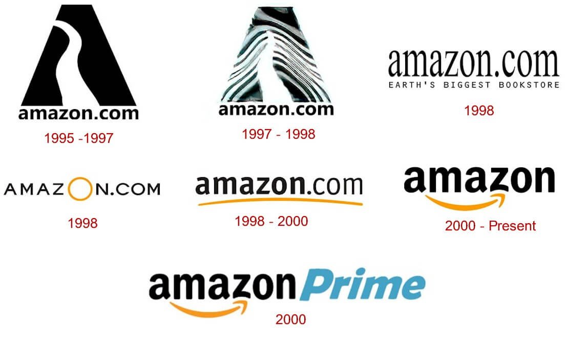
The earliest Amazon logo featured a stylized letter “A” with a river winding through it, set against a background of water ripples. It was literal and somewhat primitive, reflecting the design aesthetic of the mid-90s. As the company expanded beyond books, the brand needed a more modern and versatile mark.
In 2000, the company introduced its now-iconic “Smile” logo, designed by Turner Duckworth. This design was a masterstroke of brand marketing. The logo features the word “amazon” in a clean, bold typeface, with a curved yellow arrow underneath. This arrow serves a dual purpose:
-
The Smile: The curve of the arrow resembles a satisfied smile, conveying the company’s obsession with customer satisfaction and a positive shopping experience.
-
The A to Z: The arrow starts at the letter ‘a’ and points directly to the letter ‘z’. This subtly communicates that the company carries everything from A to Z, reinforcing the “Everything Store” brand promise.
This transition from a literal river to a symbolic smile marked Amazon’s shift from being a destination for books to being a service-oriented infrastructure. The logo is now one of the most recognized brand marks in the world, proving that effective design can distill complex corporate strategies into a single, intuitive image.

Core Branding Lessons from Amazon’s Identity Transformation
The evolution from Cadabra to Amazon provides several enduring lessons for modern brand strategists and entrepreneurs. First and foremost is the lesson of Auditory Clarity. In an age of voice search and global communication, how a brand name sounds is just as important as how it looks. If a name can be easily misheard or carries negative connotations in different contexts, it is a liability.
Secondly, Amazon’s story emphasizes the power of Scalability. A brand name should not be a cage. By avoiding names that were specific to books or the internet (like Bookmall.com), Bezos allowed his company to pivot and expand without the friction of a rebrand. The name “Amazon” is as relevant to a cloud computing platform (AWS) or a streaming service (Prime Video) as it is to a delivery service. It represents an ecosystem rather than a product.
Thirdly, the shift from Relentless to Amazon illustrates the importance of Empathy in Branding. A brand must resonate with the customer’s needs and emotions, not just the founder’s ego. While “Relentless” described Bezos’s work ethic, “Amazon” described a world of discovery and abundance for the customer.
Finally, the longevity of the Amazon brand is a testament to Consistency and Evolution. While the name has remained the same for nearly three decades, the visual identity and brand messaging have evolved to stay modern. The brand has moved from being “Earth’s Largest Bookstore” to “Earth’s Most Customer-Centric Company.” The name provided the foundation, but the strategy provided the growth.
In conclusion, the history of what Amazon was originally called is more than a piece of corporate trivia. It is a narrative of strategic correction and visionary thinking. By narrowly avoiding the “Cadaver” pitfall and leveraging the alphabetical and metaphorical advantages of the name “Amazon,” Jeff Bezos laid the groundwork for a brand that would eventually redefine global commerce. The transition from Cadabra to Amazon remains one of the most successful identity pivots in business history, serving as a blueprint for how to build a brand that is truly built to last.
aViewFromTheCave is a participant in the Amazon Services LLC Associates Program, an affiliate advertising program designed to provide a means for sites to earn advertising fees by advertising and linking to Amazon.com. Amazon, the Amazon logo, AmazonSupply, and the AmazonSupply logo are trademarks of Amazon.com, Inc. or its affiliates. As an Amazon Associate we earn affiliate commissions from qualifying purchases.