
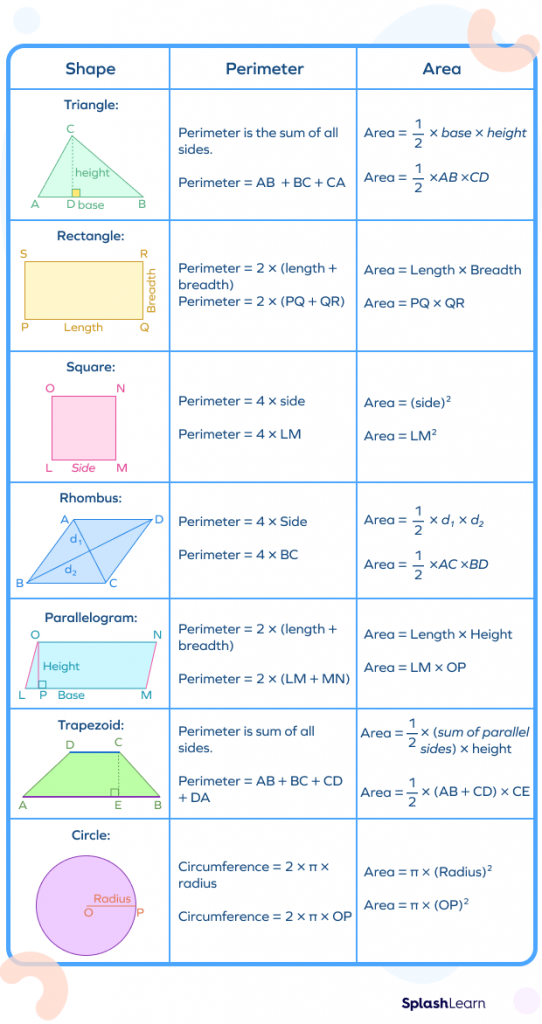
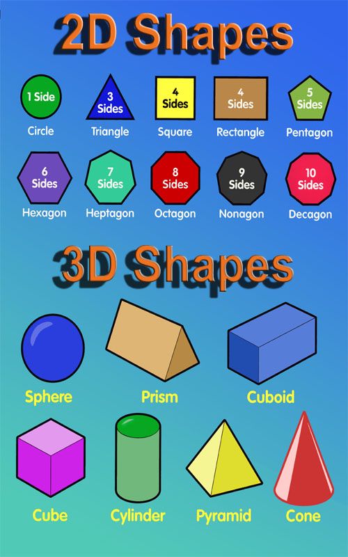
In the realm of design, brand architecture, and visual communication, understanding spatial dimensions is not merely a geometric exercise—it is the bedrock of effective visual storytelling. A two-dimensional (2D) figure is a flat shape that exists only in two directions: length and width. It possesses area but lacks depth or thickness. For brand strategists, graphic designers, and identity architects, the 2D plane is the canvas upon which the visual essence of a company is constructed. Mastering the nuances of these figures allows creators to manipulate perception, guide the viewer’s eye, and build iconic identities that resonate across diverse digital and print landscapes.
The Geometric Foundation of Branding
At the core of every successful logo and brand asset lies the fundamental geometry of 2D figures. These shapes are the building blocks of visual language, each carrying psychological weight and communicative power.
The Power of Basic Polygons
Triangles, squares, and circles form the primary alphabet of graphic design. A triangle, with its sharp angles and directional orientation, suggests movement, energy, and hierarchy. It is frequently employed in technology branding to denote progress and cutting-edge innovation. In contrast, the square represents stability, balance, and reliability. This is why financial institutions and legacy corporations often gravitate toward square-based geometric grids—they communicate trust and structural integrity.
The circle, possessing no corners, represents unity, community, and infinity. Because it lacks a beginning or an end, it is often utilized to foster a sense of inclusivity and global reach. When designers synthesize these 2D figures, they are not just drawing shapes; they are crafting a brand’s personality. A shift from a rigid, square-based typeface to a rounded, circular aesthetic can fundamentally alter how a brand is perceived by its target demographic, shifting the narrative from “authoritative” to “approachable.”
The Significance of Area and Negative Space
In two-dimensional design, the relationship between the figure and the ground—or “positive” and “negative” space—is critical. The “figure” refers to the primary shape or symbol, while the “ground” is the surrounding area. Mastery of 2D space allows designers to utilize negative space to create dual-meaning logos, such as the hidden arrow in the FedEx logo. By understanding the boundaries of a 2D plane, designers can pack layers of information into a confined space without creating visual clutter, ensuring the brand message remains clear and immediate.
Translating 2D Figures into Digital Strategy
In the modern digital economy, the majority of brand interaction occurs on flat screens. From smartphone interfaces to browser-based web portals, the user experience is almost entirely defined by the manipulation of 2D surfaces. Understanding the limitations and opportunities of 2D figures is essential for effective UI/UX design.
Flat Design vs. Skeuomorphism
The evolution of digital interface design has moved from skeuomorphism—the attempt to make digital 2D objects look like 3D, tactile reality—toward a “Flat Design” philosophy. This shift recognizes that digital screens are inherently 2D and that embracing this dimension leads to faster load times, cleaner aesthetics, and better responsiveness across multiple device sizes.
By utilizing clean, 2D shapes, color blocks, and minimalist icons, brands can create interfaces that feel modern and intuitive. A flat, 2D icon of a magnifying glass conveys “search” instantly, regardless of the screen size. The lack of artificial shadows or gradients reduces cognitive load, allowing the user to navigate a platform with greater ease. Brands that fail to acknowledge the 2D nature of digital interaction often create interfaces that feel heavy, dated, and cumbersome.
Vector Graphics and Scalability
The technical application of 2D figures in branding relies heavily on vector mathematics. Unlike raster images, which are composed of pixels, vector graphics are defined by points, lines, and curves (all 2D constructs). This allows a brand identity to be scaled infinitely—from a business card to a billboard—without a loss of fidelity.
The integrity of a brand depends on its consistency, and the use of 2D vector shapes ensures that a logo retains its exact proportions and aesthetic impact across all touchpoints. When a company adopts a vector-based design language, they are investing in long-term scalability, ensuring that their visual identity remains crisp and professional whether it is displayed on a high-definition monitor or a low-resolution printed flyer.
Visual Hierarchy and the 2D Composition
Composition is the strategic arrangement of 2D elements to communicate a specific objective. Whether in an advertisement, an email newsletter, or a landing page, the goal of the designer is to guide the viewer’s eye through a logical narrative flow using the principles of 2D layout.
The Rule of Thirds and Grid Systems
Grid systems are the invisible skeletons that support 2D layouts. By dividing the flat plane into a grid, designers can establish a rhythm and order that makes information digestible. The Rule of Thirds, a technique derived from ancient composition theories, suggests that the most compelling visual impact occurs at the intersections of a 3D-grid overlay.
By placing key brand elements—such as a call-to-action button or a hero image—within these focal points, companies can significantly increase engagement. The 2D plane is inherently limited, so the efficiency of placement is paramount. A cluttered 2D composition leads to “decision paralysis,” whereas a balanced, grid-based layout directs the user exactly where the brand needs them to look, thereby increasing conversion rates.
Visual Weight and Balance
Every 2D figure carries a perceived “weight” based on its size, color, and complexity. A large, dark circle will carry more visual weight than a small, light-colored square. Effective brand design involves balancing these weights across the composition to create a sense of harmony.
If a 2D layout is too “heavy” on one side, it creates anxiety in the viewer. Conversely, a perfectly symmetrical design can sometimes feel static or boring. Designers often employ asymmetrical balance, using smaller, high-contrast figures to balance larger, low-contrast ones. This nuanced dance of visual weight is what elevates a standard advertisement into an engaging brand experience. It transforms the flat surface from a simple carrier of text into a dynamic communicator of brand values.
The Psychology of 2D Shapes in Consumer Perception
The human brain is hard-wired to interpret 2D shapes rapidly, often before it has finished processing text or colors. This creates a unique opportunity for brands to leverage subconscious associations.
Edge Sensitivity and Emotional Response
Psychological studies suggest that humans respond differently to angular figures compared to curved ones. Sharp-edged 2D figures, like triangles and hexagons, are often associated with precision, aggressiveness, and logic. They are effective for brands looking to disrupt a market or highlight a technological advantage.
Curved, soft-edged 2D figures, like ovals and circles, trigger associations with nature, comfort, and safety. This is why medical and wellness brands often utilize soft, circular motifs in their identity design. By selecting the right “shape language,” a brand can communicate its core values without saying a single word. A brand that promises efficiency but uses soft, rounded shapes will suffer from a “branding dissonance,” where the consumer feels that something is fundamentally “off” about the company’s messaging.

The Future of 2D Branding
As we move into an era of augmented reality (AR) and virtual reality (VR), one might assume that 2D design is becoming obsolete. However, the opposite is true. Even in 3D immersive environments, users interact with 2D “heads-up displays” (HUDs), menus, and icons. The 2D figure remains the primary interface for human-computer interaction.
As brands transition into these newer mediums, the principles of 2D design—clarity, scale, hierarchy, and geometric psychology—will remain the essential tools for ensuring that user experiences stay grounded and legible. The two-dimensional figure is not just a relic of geometry; it is the fundamental language of human-centered design. By mastering these shapes, businesses can create identities that transcend trends, ensuring that their visual communication remains as sharp, scalable, and effective in the digital future as it has been throughout history.
aViewFromTheCave is a participant in the Amazon Services LLC Associates Program, an affiliate advertising program designed to provide a means for sites to earn advertising fees by advertising and linking to Amazon.com. Amazon, the Amazon logo, AmazonSupply, and the AmazonSupply logo are trademarks of Amazon.com, Inc. or its affiliates. As an Amazon Associate we earn affiliate commissions from qualifying purchases.