
In the intricate tapestry of brand identity, color is far more than mere aesthetics; it’s a potent psychological tool, a silent ambassador, and a fundamental building block of perception. Among the vast spectrum of hues, green and blue stand out as two of the most pervasive and impactful colors in branding. Individually, they evoke powerful, distinct associations. But what happens when these two formidable colors converge? What brand narrative, emotional resonance, and strategic advantage do green and blue make when brought together? This article delves into the profound psychological, strategic, and design implications of leveraging these colors to forge compelling, trustworthy, and resonant brand identities in today’s conscious marketplace.

The Psychological Powerhouse: Decoding Green and Blue
Understanding the inherent psychological triggers associated with green and blue is the first step in harnessing their combined power. Each color carries a legacy of human association, shaping our perceptions and informing our decisions, often subconsciously.
Green’s Resonance: Growth, Nature, and Ethical Consciousness
Green is universally linked to nature, health, and vitality. Its verdant imagery conjures forests, growth, and the refreshing purity of the outdoors. In a branding context, these associations translate into powerful messages:
-
Growth and Prosperity: Green symbolizes renewal, ambition, and financial prosperity (think “greenbacks”). Brands seeking to convey innovation, progress, or economic upward mobility often lean into green.
-
Health and Wellness: From organic foods to healthcare providers, green is a natural fit for brands promoting well-being, sustainability, and natural ingredients. It suggests freshness, purity, and a holistic approach.
-
Sustainability and Environmental Responsibility: With a growing global emphasis on ecological stewardship, green has become the undisputed color of eco-friendliness. Brands committed to sustainability, renewable energy, or ethical sourcing frequently integrate green into their core identity, signaling their values and commitment to the planet.
For a brand, embracing green means tapping into a desire for progress, health, and responsible action, connecting with audiences who prioritize these values.
Blue’s Foundation: Trust, Stability, and Professional Authority
Blue, in contrast, evokes the vastness of the sky and the depth of the ocean, lending itself to feelings of calm, stability, and infinitude. In the branding realm, blue is the quintessential color of trust and reliability.
-
Trust and Reliability: Blue is the most widely favored color globally, often associated with honesty, loyalty, and integrity. Financial institutions, technology companies, and healthcare providers frequently use blue to project dependability and secure service.
-
Professionalism and Authority: Darker shades of blue, in particular, convey seriousness, corporate strength, and expertise. It’s the color of uniforms, corporate logos, and governmental organizations, establishing a sense of authority and competence.
-
Calm and Serenity: Lighter blues offer a soothing presence, reducing stress and promoting a sense of peace. This makes them ideal for brands in hospitality, wellness, or any sector aiming to create a reassuring and comfortable experience.
A brand leveraging blue aims to build strong, lasting relationships with its audience, anchored in a foundation of confidence, security, and proven competence.
The Synergy of Green and Blue: Crafting Holistic Brand Identity
When green and blue intertwine, they don’t simply coexist; they synthesize, creating a nuanced and powerful brand narrative that leverages the best of both worlds. This combination is particularly potent in today’s market, where consumers increasingly demand both responsibility and reliability.
Building a Balanced Brand Narrative: Conscience Meets Competence
The most profound outcome of combining green and blue is the creation of a brand identity that communicates both ethical consciousness and professional competence. A brand that successfully merges these colors can present itself as:
-
Innovatively Responsible: A company that is forward-thinking (green’s growth) and also deeply committed to sustainable practices.
-
Trustworthily Sustainable: An eco-friendly brand that is not just well-intentioned but also established, reliable, and capable of delivering on its promises (blue’s stability).
-
Healthy and Dependable: A wellness brand that offers natural solutions backed by credible science and consistent quality.
This synergy allows brands to appeal to a broader demographic, satisfying the emotional desire for a better future (green) alongside the rational need for dependable solutions (blue). It moves beyond a single attribute, painting a picture of a well-rounded, responsible, and high-performing entity.
Strategic Applications: Industries Where Green-Blue Shines
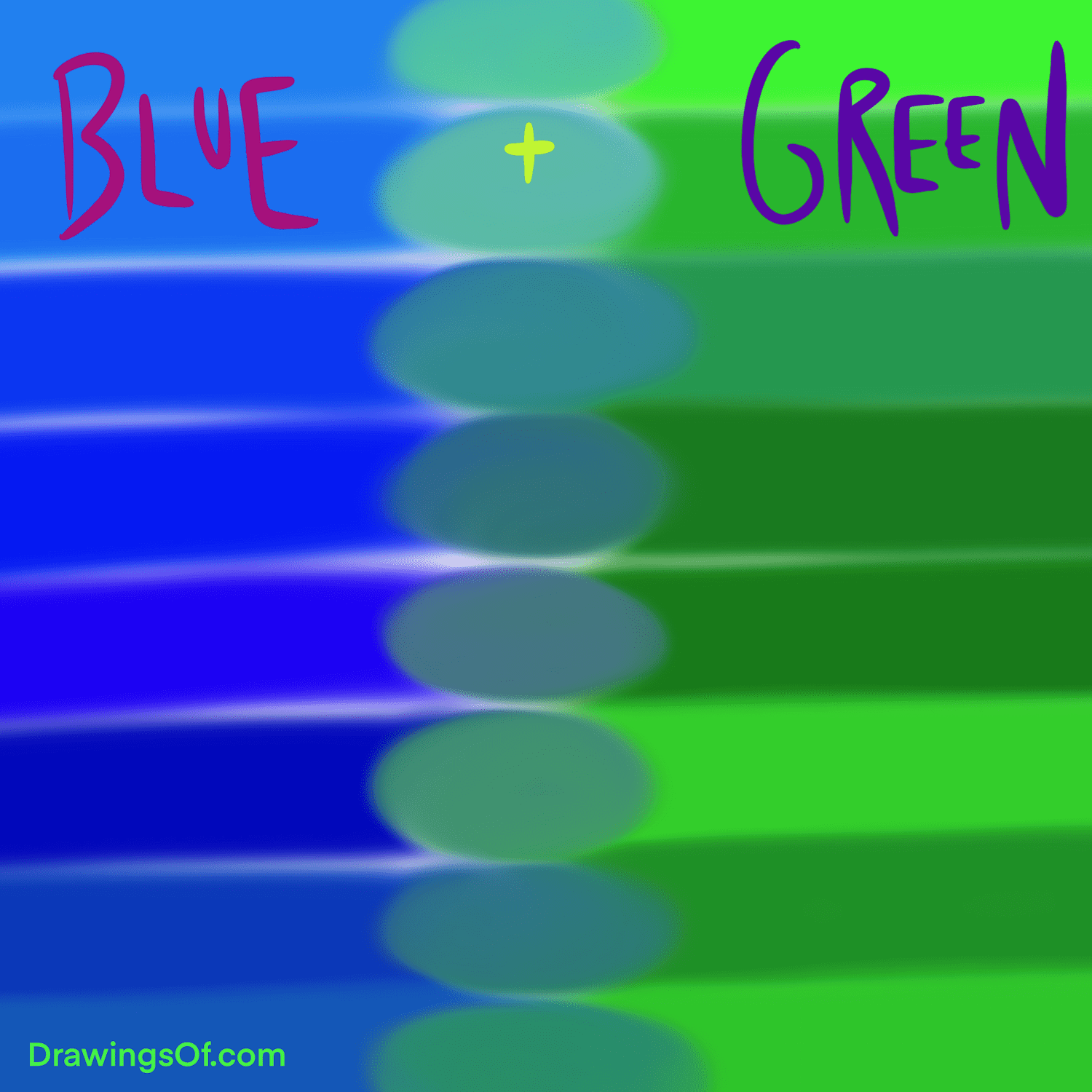
Certain industries naturally benefit from the green-blue combination, using it to differentiate and solidify their market position.
-
Sustainable Technology: Tech companies focused on environmental solutions, smart energy, or eco-friendly innovations find this palette perfect for signaling their dual commitment to progress and the planet.
-
Eco-Tourism and Hospitality: Brands offering nature-based experiences or promoting sustainable travel can use green-blue to evoke both the beauty of the natural world and the reliable, high-quality service they provide.
-
Health and Wellness: From natural health products to medical practices emphasizing holistic care, the blend reinforces both the natural aspect of treatment and the trusted expertise of practitioners.
-
Financial Services (ESG Focus): Banks or investment firms offering environmentally, socially, and governance (ESG) focused funds can use this combination to signal their commitment to both sound financial management and ethical investment.
In these sectors, green and blue aren’t just colors; they’re strategic assets that communicate core values and competitive advantages.
Design Principles: Harmonizing Green and Blue in Practice
The effective application of green and blue in branding requires careful consideration of design principles, ensuring harmony, clarity, and visual impact across all touchpoints.
Achieving Visual Balance and Impact
The key to successful green-blue branding lies in the balance. Too much of one color can skew the message, while an unconsidered combination can feel chaotic or dilute the impact.
-
Dominant vs. Accent: Often, one color will take a dominant role, with the other serving as an accent. A deep corporate blue might be softened or modernized with a vibrant green accent, or a refreshing green primary could be grounded by a trustworthy blue.
-
Shade and Saturation: The specific shades of green and blue chosen are crucial. A pale aqua might suggest lightness and calm, while a rich forest green combined with a navy blue evokes depth and gravitas. Experimenting with different saturations (from muted pastels to vibrant primaries) can dramatically alter the brand’s personality.
-
Gradient and Blending: Modern design often utilizes gradients to seamlessly merge colors, symbolizing integration and fluidity. A gradient transitioning from green to blue can beautifully represent the journey from nature to technology or sustainability to stability.
The goal is to create a visual language that feels intentional, coherent, and reflective of the brand’s desired positioning.
Application Across Brand Assets
The green-blue palette must translate effectively across all brand assets, from the smallest icon to the largest billboard.
-
Logos and Brand Marks: The logo is often the first and most lasting impression. A well-designed green-blue logo can instantly communicate the brand’s essence, whether through abstract shapes, natural motifs, or corporate symbols. Think of how many tech companies use blue, and how a subtle green element could signify their environmental efforts.
-
Website and Digital Presence: On a website, green and blue can define the user experience. Blue might provide the primary navigational framework, conveying reliability, while green highlights calls to action, sustainability features, or engaging content, inviting interaction and growth.
-
Marketing Materials: Brochures, advertisements, and social media campaigns use the palette to reinforce the brand message. A print ad for an eco-friendly product might feature lush green imagery contrasted with blue text to convey trust in the brand’s claims.
-
Product Packaging: For consumer goods, green-blue packaging can signal both the natural origins or sustainable aspects of the product and the brand’s commitment to quality and safety.
Consistency in the application of the green-blue palette across all touchpoints builds strong brand recognition and reinforces the desired psychological associations.
The Future of Green and Blue: Evolving Brand Narratives
As global priorities shift towards sustainability, ethical business practices, and authentic communication, the combination of green and blue will only grow in significance. It’s a palette perfectly poised to represent the brands of the future.
Sustainability as a Core Brand Pillar
The green element will become less of an optional add-on and more of a foundational expectation. Consumers are increasingly scrutinizing brands’ environmental and social impact. Brands that can authentically weave their green commitments into their core identity, supported by the trust and stability of blue, will gain a significant competitive edge. This means moving beyond “greenwashing” to genuine, verifiable sustainable practices.
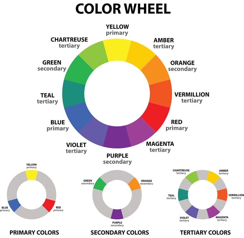
Digital Adaptations and Accessibility
In the digital realm, the harmonious use of green and blue will also address accessibility. Choosing appropriate color contrasts ensures that brand messages are legible and inclusive for all users. The versatility of these colors allows for adaptations across various screen types and lighting conditions, maintaining brand integrity in a perpetually online world.
Ultimately, what green and blue make is a powerful testament to thoughtful branding: an identity that is simultaneously vibrant and stable, innovative and trustworthy, forward-looking and deeply responsible. It’s a palette that speaks to our collective aspirations for a better, more reliable future, proving that in branding, the sum of colors can be far greater than its parts. By mastering the interplay of green and blue, brands can build not just recognition, but lasting resonance and genuine connection with their audience.
aViewFromTheCave is a participant in the Amazon Services LLC Associates Program, an affiliate advertising program designed to provide a means for sites to earn advertising fees by advertising and linking to Amazon.com. Amazon, the Amazon logo, AmazonSupply, and the AmazonSupply logo are trademarks of Amazon.com, Inc. or its affiliates. As an Amazon Associate we earn affiliate commissions from qualifying purchases.