
The POW/MIA flag, with its stark black and white imagery, is more than just a piece of fabric; it is a profound testament to the power of visual communication and a masterclass in cause branding. In the realm of corporate identity and strategic marketing, few symbols manage to encapsulate such a potent blend of history, emotion, and ongoing mission. This flag serves as the enduring brand identity for a critical cause: remembering and accounting for American service members who were prisoners of war (POW) or missing in action (MIA). Its continued prominence and deep resonance offer invaluable insights into how a carefully conceived visual brand can foster collective memory, drive awareness, and sustain a national commitment over decades.

The POW/MIA Flag as a Potent Brand Identity
At its core, the POW/MIA flag functions as an exceptionally successful brand. It possesses all the hallmarks of effective branding: immediate recognition, a clear and consistent message, strong emotional appeal, and a pervasive presence that reinforces its purpose. Its visual identity transcends linguistic and cultural barriers, communicating a powerful narrative that resonates deeply with the American public and military communities worldwide.
Origins and the Genesis of a Powerful Symbol
The genesis of the POW/MIA flag is a compelling case study in responsive branding. As the Vietnam War intensified and reports of American service members being captured or unaccounted for mounted, the need for a unified symbol to represent their plight became undeniable. In 1971, the National League of Families of American Prisoners and Missing in Southeast Asia, recognizing this void, commissioned a design for a flag that would serve as a constant reminder of these forgotten individuals.
Mary Helen Hoff, the wife of a missing airman, initially conceived the idea, envisioning a symbol that would speak for those who could not speak for themselves. The graphic designer, Newt Heisley, a former World War II pilot, brought this vision to life. Heisley’s personal connection to the cause—having served alongside those who might have faced similar fates—infused the design process with authentic empathy, a crucial element in creating a brand that genuinely connects with its audience. The resulting design was not merely decorative; it was strategically crafted to evoke emotion and communicate urgency, laying the foundation for a resilient brand identity.
Visual Semiotics: Decoding the Flag’s Design Elements
The POW/MIA flag’s brilliance lies in its minimalist yet deeply symbolic design. Every element is a deliberate choice, contributing to a cohesive visual language that telegraphs its brand message with remarkable efficiency.
-
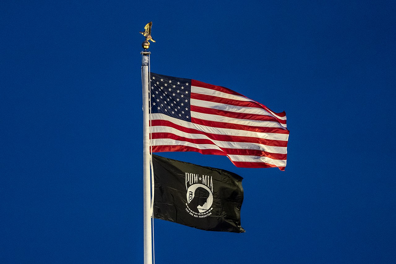
The Silhouette: The central image of a gaunt, bowed head against a guard tower and barbed wire is instantly recognizable. This silhouette is not a specific individual but a universal representation of the prisoner. It embodies anonymity and suffering, making it relatable to anyone who understands the plight of captivity. This visual icon functions as the brand’s logo, immediately communicating the core subject matter.
-
The Guard Tower and Barbed Wire: These elements are potent symbols of confinement and deprivation. They remove any ambiguity about the context of the silhouette, reinforcing the theme of imprisonment. In branding terms, these are crucial supporting graphics that add depth and context to the primary logo, solidifying the narrative.
-
The Colors (Black and White): The stark contrast of black and white is a powerful design choice. Black often signifies absence, death, and despair, while white can represent hope, purity, or the starkness of truth. The absence of color lends a serious, somber, and timeless quality to the flag, preventing it from being diluted by more vibrant, potentially distracting hues. This monochromatic palette ensures the brand’s message is delivered with solemnity and impact, standing out in a world often saturated with color.
-
The Motto (“You Are Not Forgotten”): This phrase, strategically placed below the silhouette, is the brand’s explicit promise and tagline. It transforms the visual elements from mere depiction into a vow. This tagline is a direct address to the missing, a reassurance to their families, and a pledge by the nation. It encapsulates the core value proposition of the POW/MIA brand: unwavering remembrance and a commitment to resolution.
Together, these elements form a cohesive visual identity that is instantly recognizable and emotionally resonant. This thoughtful design strategy ensures the flag’s brand message is unambiguous and universally understood.
The Core Message: Unwavering Commitment and Remembrance
The overriding brand message of the POW/MIA flag is a powerful declaration of enduring national commitment. It serves as a constant reminder that the lives and sacrifices of those who remain unaccounted for are not, and will never be, forgotten. This message is critical for several stakeholders:
-
For the Families: It offers a tangible symbol of national solidarity and shared grief, assuring them that their loved ones’ sacrifices are honored.
-
For Military Personnel: It reinforces the ethos that no one is left behind, instilling confidence and morale.
-
For the Nation: It serves as a moral compass, reminding citizens and leaders of their ongoing responsibility to seek accountability and bring closure.
This consistent, powerful messaging is the bedrock of the flag’s success as a brand for a cause.
Crafting a Brand for a Cause: Strategy and Purpose
The creation and widespread adoption of the POW/MIA flag illustrate strategic principles applicable to any organization seeking to establish a compelling brand for a social cause. It demonstrates how a clear purpose, consistent messaging, and impactful design can mobilize public sentiment and drive long-term engagement.
Bridging the Gap: From Personal Grief to National Symbol
Initially, the plight of POWs and MIAs was a deeply personal grief for thousands of families. The strategic challenge was to elevate this personal anguish to a national consciousness, transforming it into a collective responsibility. The flag achieved this by acting as a powerful visual bridge. It generalized individual stories of loss into a universal symbol of national sacrifice and unresolved questions. This transition from personal to public identity is a hallmark of successful cause branding, where an issue transcends niche interest to become a shared societal concern. The flag provided a focal point for advocacy efforts, making it easier for disparate groups to rally around a common emblem and message.
Consistent Messaging: The Enduring Promise of “You Are Not Forgotten”
One of the most remarkable aspects of the POW/MIA flag’s branding success is the absolute consistency of its message. From its inception, the promise “You Are Not Forgotten” has remained immutable. This unwavering message is vital for brand integrity and public trust. In an era saturated with information and fleeting attention spans, a brand that consistently delivers its core promise builds deep credibility and lasting resonance. The flag doesn’t change its campaign; it steadfastly reiterates its foundational commitment, ensuring that its audience never forgets its purpose. This long-term messaging strategy is a testament to the power of focus and persistence in cause-driven branding.

Design Simplicity and Emotional Resonance
The flag’s design is a masterclass in simplicity, directly contributing to its emotional resonance and memorability. Complex designs can dilute a message, but the starkness of the POW/MIA flag ensures its impact. It evokes a primal emotional response—sympathy, sorrow, and a sense of duty. This immediate emotional connection is a powerful tool in branding, fostering a bond between the symbol and its audience. The design avoids specific imagery that might limit its scope (e.g., a specific uniform or battle scene), instead opting for universal symbols of captivity that resonate broadly. This strategic universality allows the flag to remain relevant across different conflicts and generations, ensuring its brand longevity.
The Flag’s Role in National Branding and Public Engagement
Beyond representing a specific cause, the POW/MIA flag has become an integral part of America’s national branding, symbolizing specific values and commitments. Its widespread display at government buildings, public spaces, and private residences speaks volumes about its success in embedding itself into the national consciousness.
Fostering Collective Memory and Public Awareness
The flag actively functions as a tool for collective memory. Its consistent presence acts as a silent public relations campaign, continually refreshing the public’s awareness of the unresolved issue of missing service members. Unlike traditional advertising, which often has a limited run, the flag’s persistent visibility ensures that the cause remains salient. It prompts questions, initiates conversations, and educates new generations about the sacrifices made by military personnel. This sustained public awareness is crucial for maintaining political will and public support for efforts to resolve outstanding cases. In essence, the flag is a living, breathing billboard for remembrance.
A Call to Action: Sustaining the Mission
While the flag’s primary message is remembrance, it also functions as a subtle call to action. Its presence implicitly supports ongoing governmental and private sector efforts to locate, identify, and return the remains of missing personnel. The flag acts as a constant reminder to policymakers, military leaders, and citizens that the mission is not complete. This sustained visual pressure helps to ensure resources are allocated, diplomatic channels are pursued, and research continues. It solidifies the nation’s “corporate social responsibility” towards its veterans and their families, ensuring that the brand promise of “not forgotten” is continually pursued with tangible actions.
Symbol of Unity and Shared Values
The POW/MIA flag has transcended its specific origins to become a broader symbol of unity and shared national values, particularly those related to sacrifice, duty, and honor. When displayed alongside the American flag, it reinforces the idea that the nation stands united in its commitment to those who serve. This dual display strengthens the national identity, suggesting that patriotism includes a deep respect for and unwavering commitment to all service members, especially those whose fates remain unknown. It becomes a unifying emblem, transcending political divides and bringing together diverse groups under a common banner of remembrance and responsibility.
Sustaining the Brand: Legislation, Visibility, and Legacy
The enduring success of the POW/MIA flag as a brand is not accidental; it is a result of deliberate efforts, including legislative support and consistent strategic visibility. These elements have cemented its place in American culture and ensured its legacy.
Legislative Mandates: Ensuring Ubiquitous Presence
A significant factor in the flag’s ubiquitous presence and enduring brand recognition is legislative action. Public Law 101-355, passed in 1990, mandates that the POW/MIA flag be flown on specified federal holidays and at certain federal buildings, including the White House, the Capitol, and all national cemeteries. This legal requirement elevates the flag’s status, ensuring its visibility and cementing its role as a national symbol. In branding terms, this legislation represents an unparalleled level of “market penetration” and “brand visibility” that few commercial or cause brands ever achieve. It transforms the flag from an optional display into a mandatory one, reinforcing its authority and importance in the national consciousness. This strategic placement ensures consistent exposure to diverse audiences, continually reinforcing its message and maintaining its brand equity.
Enduring Relevance in a Changing World
Despite the passage of decades and the evolution of global conflicts, the POW/MIA flag maintains profound relevance. This longevity is a testament to its foundational brand strategy: a universal message rooted in timeless values of loyalty, sacrifice, and accountability. While the initial focus was on the Vietnam War, the flag has seamlessly expanded its embrace to include service members from all conflicts whose fates remain unresolved. This adaptability, without altering the core brand identity, demonstrates the power of a well-defined and broad mission. The flag’s simple, powerful design ensures it remains legible and impactful regardless of the historical context, proving that a strong visual brand can transcend specific eras and maintain its emotional grip.
The Legacy of a Symbol
The legacy of the POW/MIA flag is not just about its visual presence; it is about the ongoing impact it has on public policy, family advocacy, and national remembrance. It has fostered a culture of accountability within the military and government regarding missing personnel, setting a standard for future conflicts. The flag ensures that the search for answers for families continues, providing solace and a shared identity for those grappling with unresolved loss. As a brand, its legacy is one of successful advocacy, enduring commitment, and the profound influence a single, well-designed symbol can have on a nation’s conscience.
Conclusion: A Masterclass in Cause Branding
The POW/MIA flag stands as an exemplary model of effective cause branding. From its strategic genesis by the National League of Families to its current ubiquitous presence, every aspect of its existence reflects astute understanding of identity, messaging, and public engagement. Its stark, simple design powerfully communicates a universal message of remembrance and unwavering commitment. The flag’s ability to transcend its origins, maintain consistent messaging, and secure legislative backing demonstrates how a potent visual identity can foster collective memory, drive awareness, and sustain a national mission over generations. It reminds us that at the heart of every successful brand, particularly one dedicated to a cause, lies a clear purpose, a profound emotional connection, and an unyielding promise to its audience. The POW/MIA flag is not just a symbol; it is a perpetually flying beacon of national promise—a brand that truly means “You Are Not Forgotten.”
aViewFromTheCave is a participant in the Amazon Services LLC Associates Program, an affiliate advertising program designed to provide a means for sites to earn advertising fees by advertising and linking to Amazon.com. Amazon, the Amazon logo, AmazonSupply, and the AmazonSupply logo are trademarks of Amazon.com, Inc. or its affiliates. As an Amazon Associate we earn affiliate commissions from qualifying purchases.