
The Starbucks logo, featuring its enigmatic, dual-tailed siren, is one of the most recognizable corporate symbols globally. Far more than a mere identifier, it encapsulates a rich tapestry of brand strategy, historical evolution, and symbolic meaning that has profoundly shaped Starbucks’ identity and meteoric rise from a Seattle coffee bean retailer to an international cultural phenomenon. Understanding the logo isn’t just about decoding an image; it’s about uncovering the deep-seated branding principles that have propelled Starbucks to unprecedented success, demonstrating the power of corporate identity in fostering connection, recognition, and loyalty.
The Siren’s Enigmatic Origins: A Deep Dive into Symbolism
To truly appreciate the Starbucks logo, one must journey back to its initial conception in 1971, where its creators drew inspiration from an unexpected wellspring: maritime history and mythology. The choice of a siren, a figure steeped in lore, was neither accidental nor arbitrary; it was a deliberate foundational stroke in painting Starbucks’ brand narrative.
From Norse Mythology to Coffee Cup
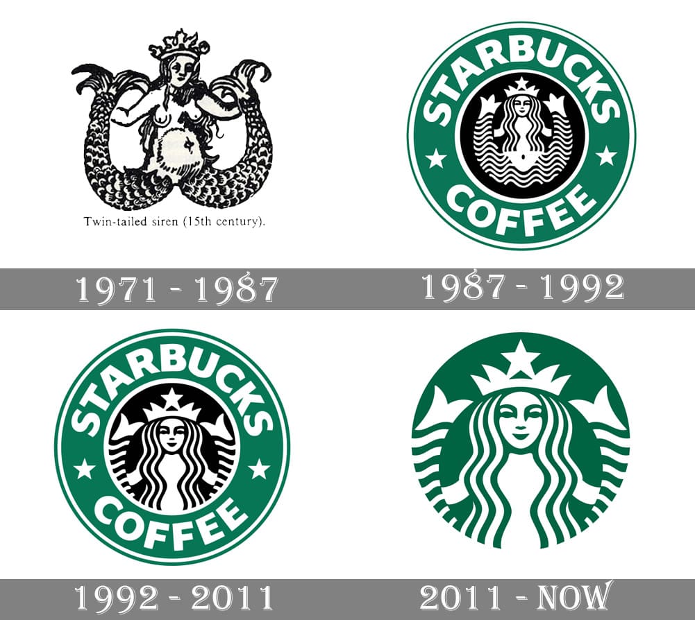
The original inspiration for the Starbucks siren came from a 15th-century Norse woodcut depicting a two-tailed mermaid. This mythical creature, often associated with danger and allure, was chosen for its captivating power and connection to the sea. The founders – Jerry Baldwin, Zev Siegl, and Gordon Bowker – were avid fans of nautical themes, particularly Herman Melville’s classic novel Moby Dick, from which the “Starbucks” name itself was derived (Starbuck was Captain Ahab’s first mate). Seattle, a prominent port city, further cemented this maritime connection. The siren, therefore, was meant to evoke the allure of the high seas, an exotic siren call promising a new and exciting commodity: premium coffee beans brought from far-off lands. It was a promise of escape, discovery, and a slightly intoxicating experience, much like the mythological sirens themselves lured sailors to their shores. The dual tails, while visually distinct, also add to the ancient, almost magical quality of the symbol, hinting at something beyond the ordinary.
The Original 1971 Logo: Raw, Provocative, and Nautical
The very first Starbucks logo, unveiled in 1971, was a bold and unfiltered rendition of the siren. Rendered in a stark brown, reminiscent of coffee beans and earth, it featured a rather explicit, full-bodied depiction of the siren with her chest exposed and navel clearly visible. Her two fishtails were prominently splayed, framing her. Around her, a ring contained the words “Starbucks Coffee, Tea, and Spice” – an indicator of the company’s initial broader offering.
This original logo was not subtle. It was raw, almost provocative, and deeply rooted in its maritime inspiration. It reflected a nascent brand that was still finding its voice, unconcerned with broad public appeal as it targeted a niche market of coffee connoisseurs in Seattle. This initial identity was about authenticity and an almost rebellious embrace of its historical and mythological roots, unvarnished and unapologetic. It spoke to a niche audience of adventurers and connoisseurs, inviting them to discover something exotic and powerful, much like the siren herself.
Evolution of an Icon: Adapting for a Global Brand
Logos are not static; they are living elements of a brand’s identity, evolving in response to market changes, strategic shifts, and the brand’s own maturity. The Starbucks siren has undergone several significant transformations, each marking a new chapter in the company’s journey from a local roaster to a global coffeehouse giant. These changes weren’t merely cosmetic; they were strategic decisions aimed at broadening appeal, simplifying messaging, and future-proofing the brand.
The 1987 Transformation: Refinement and Broad Appeal
The first major redesign of the Starbucks logo came in 1987, coinciding with Howard Schultz’s acquisition of the company and his ambitious vision to transform it into an Italian-style espresso bar chain. This shift from selling whole beans to offering brewed coffee and cafe experiences necessitated a more refined and broadly appealing visual identity. The original brown palette was replaced with a vibrant green, symbolizing freshness, growth, and prosperity – qualities Schultz envisioned for the burgeoning cafe culture.
Crucially, the siren herself was softened and made more palatable for a wider audience. Her hair now flowed over her breasts, covering the previously explicit features, and her navel was removed. She was presented in a more stylized manner, framed by a green circle with the words “Starbucks Coffee” and two stars on either side. This version marked a deliberate move away from the siren’s more provocative mythological origins towards a more inviting, accessible, and sophisticated image. It was about creating an atmosphere where people could gather and enjoy coffee, not just buy beans. The green, in particular, became synonymous with the Starbucks experience, evoking feelings of nature, sustainability, and comfort.
The 1992 Iteration: A Closer Crop and Simplified Messaging
Just five years later, in 1992, the logo underwent another subtle but significant tweak. As Starbucks continued its rapid expansion and gained greater public recognition, the need for further simplification and focus became apparent. The siren was cropped more closely, bringing her face into sharper focus and further obscuring her full body. This iteration emphasized her enigmatic gaze and flowing hair, making her even more mysterious and less literal.
The outer circle remained green, bearing the “Starbucks Coffee” text and stars. The primary goal of this change was to refine the existing brand identity, making it cleaner and more impactful as the brand’s footprint expanded across the United States. It was a step towards elevating the siren from a mere illustration to a powerful, recognizable icon, demonstrating that as a brand matures, its visual identity often streamlines to communicate its essence more directly and universally. This simplification allowed the brand to retain its unique character while becoming more digestible for a rapidly growing and diverse customer base.
The 2011 Rebrand: Unleashing the Siren and Future-Proofing

The most radical and strategic transformation occurred in 2011, marking Starbucks’ 40th anniversary. This rebrand saw the complete removal of the “Starbucks Coffee” text from the logo, leaving the green siren as the sole, standalone icon. The decision was met with both praise and apprehension but was a bold move reflecting Starbucks’ global ambitions and evolving business model.
The rationale behind this move was multifaceted. Firstly, Starbucks had grown far beyond merely selling coffee; it offered teas, pastries, merchandise, and an entire lifestyle experience. The word “Coffee” in the logo was becoming restrictive. Secondly, as a truly global brand, Starbucks sought a visual identity that could transcend language barriers and be instantly recognized across diverse cultures without relying on text. The standalone siren, by this point, had achieved such iconic status that she no longer needed linguistic context. This move aligned with a broader trend in modern branding, where mature, globally recognized companies like Apple, Nike, and Shell rely solely on their distinctive symbols. Unleashing the siren conveyed confidence, maturity, and a readiness for future innovation, signaling Starbucks’ intent to be more than just a coffee company. It allowed the brand to expand its product lines and ventures without being confined by its name.
The Strategic Impact of the Siren: More Than Just an Image
The Starbucks logo is a masterclass in effective corporate identity. Its deep symbolic roots and strategic evolution have enabled it to transcend its function as a mere company emblem, transforming it into a powerful asset that drives brand recognition, evokes emotional connections, and supports global ambition.
Building Brand Recognition and Differentiation
In a fiercely competitive market, differentiation is key. The Starbucks siren provides an instantly recognizable and unique identifier that sets the brand apart from its countless competitors. Unlike many coffee brands that rely on generic coffee cups or bean imagery, Starbucks chose a mythological figure, investing it with a distinct personality. This makes the brand memorable and visually distinct, carving out a unique niche in the minds of consumers. The siren doesn’t just represent Starbucks; she is Starbucks, an iconic symbol that immediately conjures up the entire Starbucks experience globally, regardless of whether a customer can read the brand name. This strong visual anchor is invaluable for rapid recall and market penetration.
Evoking Mystery, Allure, and Connection
The mythological nature of the siren lends an air of mystery and allure to the Starbucks brand. She represents an escape from the mundane, an invitation to something special and enchanting. Her enigmatic gaze and flowing form evoke feelings of comfort, fantasy, and connection. This emotional resonance is critical for a brand like Starbucks, which sells not just a beverage but an experience – a “third place” between home and work. The siren subtly communicates this promise of an engaging and rewarding experience, inviting customers into a world that is familiar yet slightly extraordinary. She fosters a sense of belonging and aspirational lifestyle, allowing customers to feel part of something larger and more enchanting than a simple coffee transaction.
A Symbol of Global Ambition and Adaptability
The siren’s journey from an explicit, localized figure to a stylized, text-free icon mirrors Starbucks’ own transformation from a small Seattle roaster to a global powerhouse. The logo’s ability to shed its textual constraints and thrive as a standalone symbol demonstrates its adaptability and universal appeal. It speaks a visual language that transcends cultural and linguistic barriers, making it an ideal ambassador for a brand with global ambition. This universal recognition allows Starbucks to maintain a consistent brand identity across diverse markets while still allowing for local interpretation and connection. The siren is a testament to Starbucks’ strategic foresight, preparing its brand identity for expansion into countless countries and product categories without losing its core essence.
Lessons from the Siren: Branding Principles in Action
The Starbucks logo offers invaluable insights into the enduring principles of effective branding, demonstrating how a well-crafted corporate identity can become a cornerstone of business success.
The Power of Storytelling in Branding
The Starbucks siren is a prime example of the power of storytelling in branding. By drawing on rich mythological and maritime narratives, the logo imbues the brand with depth, intrigue, and a sense of history. It’s not just a coffee shop; it’s a journey, an escape, a discovery. This narrative richness creates an emotional connection with consumers, making the brand more engaging and memorable. Brands that tell compelling stories, whether through their origin, their mission, or their visual identity, forge stronger bonds with their audience, transcending mere transactional relationships. The siren’s story is the brand’s story.
Strategic Evolution, Not Revolution
Starbucks’ approach to logo design has been one of careful, strategic evolution rather than radical revolution. Each redesign built upon the previous one, retaining core elements while refining and adapting them for new contexts. This incremental approach ensures brand continuity and avoids alienating loyal customers, while still allowing the brand to remain fresh and relevant. It demonstrates that effective branding involves a delicate balance between preserving heritage and embracing progress, ensuring that the brand identity grows organically with the company. The siren always remained, but her presentation changed to meet the times.

Beyond the Product: Creating an Experience
Ultimately, the Starbucks logo, and its underlying meaning, points to a fundamental branding truth: successful brands sell experiences, not just products. The siren doesn’t just promise good coffee; she promises the “Starbucks experience” – a comforting ritual, a community hub, a moment of personal indulgence. The logo is a visual shorthand for this broader promise, fostering a sense of aspiration and belonging. It reminds us that corporate identity is not just about what a company makes, but about what it stands for, how it makes people feel, and the world it invites them to be a part of. The siren is the gatekeeper to that immersive world.
In conclusion, the Starbucks logo is far more than a simple drawing; it is a meticulously crafted piece of corporate identity that tells a story, evokes emotion, and strategically supports a global business. From its mythological origins to its modern, text-free iteration, the siren has navigated the complex waters of branding with grace and foresight, becoming an enduring symbol of ambition, allure, and the transformative power of a truly resonant brand.
aViewFromTheCave is a participant in the Amazon Services LLC Associates Program, an affiliate advertising program designed to provide a means for sites to earn advertising fees by advertising and linking to Amazon.com. Amazon, the Amazon logo, AmazonSupply, and the AmazonSupply logo are trademarks of Amazon.com, Inc. or its affiliates. As an Amazon Associate we earn affiliate commissions from qualifying purchases.