
In the intricate tapestry of visual communication, few elements possess the subtle power and profound impact of “shade.” Often conflated with its cousins, tint and tone, shade holds a distinct position in the lexicon of art and design, referring specifically to a pure hue to which black has been added. This seemingly simple alteration transforms a color, imbuing it with depth, weight, and a new psychological resonance. For artists, understanding shade is fundamental to creating realism, mood, and visual interest. For brands, however, the mastery of shade transcends mere aesthetics; it becomes a strategic imperative, a silent language that communicates identity, values, and emotional appeal with every visual touchpoint.
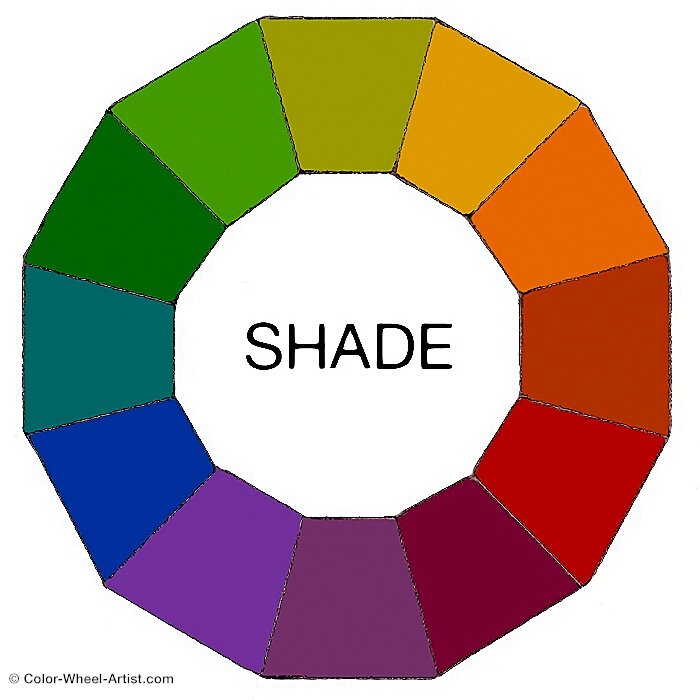
A brand’s visual identity is its first handshake with the world, and every color choice, every gradient, every subtle shift from light to dark, contributes to that critical first impression. From the iconic logos that adorn our screens to the sophisticated packaging that lines our shelves, the thoughtful application of shade is what transforms flat designs into three-dimensional experiences, mere colors into compelling narratives. In an increasingly saturated marketplace, where visual noise competes relentlessly for attention, brands that wield shade with precision and purpose possess a distinct advantage, capable of evoking specific emotions, establishing clear hierarchies, and forging deeper connections with their target audience. This article will delve into the essence of shade in art and illuminate why its strategic integration is indispensable for crafting a memorable, impactful, and enduring brand identity in the modern landscape.
The Fundamental Concept of Shade in Art
To leverage shade effectively in branding, one must first grasp its foundational definition within the broader context of art and color theory. Shade is not merely a darker version of a color; it’s a specific manipulation that carries distinct visual and psychological weight.
Defining Shade: From Pure Color to Depth
At its core, a shade is created by adding black to a pure hue. Imagine a vibrant red. Add a touch of black, and it deepens into a rich, maroon-like shade. Add more black, and it progresses towards a deeper burgundy, eventually approaching black itself. This process doesn’t just darken the color; it also decreases its saturation and often makes it appear more subdued, sophisticated, or even ominous, depending on the hue.
The purpose of shade in traditional art is manifold: to create depth and dimension, to indicate areas of less light, to model form, and to convey mood. Without shade, objects would appear flat and two-dimensional, lacking the visual cues that tell our eyes about their volume and placement in space. In a painting, a sphere appears round because artists meticulously render the interplay of light and shadow, using shades to depict the side turned away from the light source. This fundamental principle of creating visual dimensionality translates directly into the digital and print realms of branding.
Shade vs. Tint vs. Tone: A Crucial Distinction
While often used interchangeably in casual conversation, “shade,” “tint,” and “tone” are distinct terms in color theory, each referring to a specific modification of a pure hue. Understanding these differences is paramount for precise color communication in branding.
-
Shade: As established, a shade is created by adding black to a pure hue. It darkens the color and often reduces its perceived vibrancy, making it feel more weighty, serious, or grounded. (e.g., Deep Navy Blue is a shade of Blue).
-
Tint: A tint is created by adding white to a pure hue. This lightens the color, often making it appear softer, airier, or more delicate. Tints are frequently associated with pastels. (e.g., Sky Blue is a tint of Blue).
-
Tone (or Saturation): A tone is created by adding grey (a mix of black and white) to a pure hue. Adding grey desaturates the color, making it less vivid or muted. Tones can range from dark (if more black is in the grey) to light (if more white is in the grey) but always involve a reduction in the color’s intensity. (e.g., Dusty Blue is a tone of Blue).
For a brand, knowing when to use a shade versus a tint or a tone is a strategic decision that impacts the emotional message and visual impact. A tech company might use vibrant tints for their UI to convey innovation and lightness, while a luxury brand might opt for deep shades to communicate exclusivity and sophistication.
Emotional and Psychological Impact of Shade
Beyond its technical definition, shade carries a significant psychological weight. Darker colors, particularly shades, often evoke feelings of gravitas, stability, luxury, power, or mystery. Consider the deep greens and blues often used by financial institutions, conveying trustworthiness and security. Or the rich, dark palettes favored by high-end fashion brands, symbolizing elegance and exclusivity.
The human brain is wired to interpret darker values differently than lighter ones. Shades can suggest permanence and authority, making them powerful tools for establishing a brand’s credibility. They can also create a sense of intrigue, drawing the viewer in to explore further. Conversely, an overuse of shades without strategic balance can lead to a brand identity that feels heavy, somber, or unapproachable. The judicious application of shade is thus a nuanced art, requiring an understanding of both color science and human psychology.
Shade as a Cornerstone of Visual Brand Identity
A brand’s visual identity is its unique fingerprint in the marketplace. Every element, from its logo to its typeface and color palette, contributes to how it is perceived. Shade plays a crucial, often underestimated, role in forging a distinctive and memorable identity.
Crafting Brand Palettes with Intentional Shading
A well-designed brand color palette goes beyond selecting a few primary hues. It involves understanding the interplay of shades, tints, and tones to create a versatile system that can adapt across various applications while maintaining consistency. By incorporating specific shades of their primary colors, brands can expand their visual language without introducing entirely new colors.
For instance, a brand whose primary color is a bright orange might incorporate a deep, burnt orange shade for emphasis, a sophisticated background, or to denote a premium tier of service. This approach maintains a familial connection to the core brand color while offering greater flexibility and depth. Intentional shading allows for:
-
Hierarchy: Darker shades can be used for primary calls-to-action or critical information, guiding the user’s eye.
-
Mood variation: The same base color can express different moods—playful with tints, serious with shades.
-
Brand distinction: A unique set of shades derived from a common color can make a brand’s palette truly its own, setting it apart from competitors using similar base hues.
Designers meticulously select these shades, considering the brand’s personality, target audience, and the desired emotional response. It’s a strategic decision that defines the brand’s visual signature.
Leveraging Shade for Logo Design and Typography
The most concentrated expression of a brand’s identity is often its logo. Here, shade isn’t just an option; it’s a vital tool for imbuing the mark with dimension, recognition, and meaning. A logo rendered in varying shades of a single color can achieve visual depth and complexity that a flat, single-color version cannot. Think of gradients within a logo, where the transition from a lighter to a darker shade creates a sense of movement or three-dimensionality, making the logo pop off the page or screen.
Similarly, in typography, shade can enhance readability and establish a brand’s voice. Darker shades of text against a lighter background provide optimal contrast, crucial for accessibility and ease of reading. But beyond legibility, the choice of a specific shade for brand headlines or body copy can subtly influence perception. A deep charcoal grey might feel more approachable than stark black, while still conveying authority. Utilizing different shades within a textual hierarchy can draw attention to key messages and organize information effectively, guiding the reader through the brand’s narrative.
The Role of Shade in Brand Consistency Across Platforms
Maintaining brand consistency across diverse platforms—from a glossy print advertisement to a mobile app interface, a social media post, or product packaging—is one of the biggest challenges for modern brands. Color, and specifically shade, is a critical component in achieving this uniformity.
A brand’s defined shade palette acts as a guiding principle, ensuring that no matter the medium, the brand’s visual presence remains cohesive and instantly recognizable. Without a clear understanding and documentation of specific color values (e.g., HEX codes, RGB, CMYK for different shades), variations can creep in, leading to a fragmented and unprofessional brand image. For example, a shade of blue that looks perfect on a printed brochure might appear washed out or overly dark on a backlit screen if not correctly adapted.
Strategic shading ensures that a brand’s visual elements evoke the same emotions and communicate the same values, whether viewed on a high-resolution display or a limited-color billboard. This consistency builds trust, reinforces brand recognition, and strengthens the overall brand equity. It’s a painstaking process but one that pays dividends in brand recall and loyalty.
Communicating Brand Messages Through Shading Techniques
Shade is not merely a static element; it’s a dynamic tool that can be manipulated to tell stories, evoke feelings, and direct attention. Its strategic application can dramatically influence how a brand’s message is received and interpreted.
Evoking Moods and Feelings with Light and Dark
The interplay of light and dark, largely managed through the application of shades, is a powerful driver of mood. Brands can deliberately choose their shade ratios to align with the emotions they wish to evoke. A product associated with serenity or luxury might employ a palette rich in deep, muted shades, creating a tranquil and sophisticated atmosphere. Think of a spa brand using earthy browns and deep forest greens, or a high-end watch brand utilizing charcoal greys and sapphire blues. These shades communicate refinement, calm, and exclusivity.
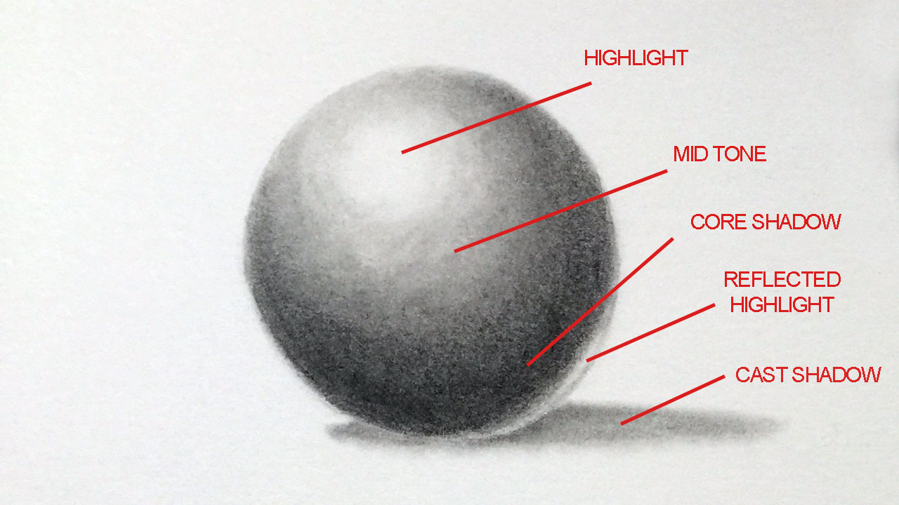
Conversely, a brand aiming for energy or innovation might balance vibrant hues with judiciously placed darker shades to ground the design without losing its dynamism. Consider tech brands that use bright, energetic colors for their primary brand elements but use dark mode interfaces with deep shades to provide a sleek, focused user experience. The contrast between light and shade can create drama, tension, or comfort, depending on the designer’s intent and the brand’s messaging goals.
Creating Depth and Realism in Brand Imagery
In branding, imagery is king. Whether photographs, illustrations, or 3D renders, the realistic portrayal of products and scenarios is crucial for engagement. Shade is the primary tool for creating depth, form, and realism in visual assets. Without it, images would appear flat and unconvincing.
For product photography, the careful control of shadows and highlights—which are essentially variations in shade and tint—makes objects appear three-dimensional, allowing consumers to perceive texture, volume, and material quality. A fashion brand relies on the subtle shading of fabric folds to convey its quality and drape. An automotive brand uses the play of light and shadow on a car’s body to highlight its sleek lines and powerful form. Even in abstract brand illustrations, the use of gradients (gradual shifts in shade) can add a sense of dimension and sophistication, transforming simple shapes into compelling visual elements that align with the brand’s aesthetic.
Guiding the User’s Eye: Hierarchy and Focus with Shade
One of the most practical applications of shade in branding is its ability to establish visual hierarchy and guide the user’s attention. In any visual layout—be it a website, an advertisement, or a packaging design—elements with higher contrast and deeper shades naturally draw the eye first.
Designers strategically use shades to:
-
Highlight key information: Important headlines, calls-to-action (CTAs), or essential product features can be rendered in a deeper shade, making them stand out against lighter backgrounds or secondary information.
-
Organize content: Different sections of a webpage or a brochure can be visually separated and prioritized using varying degrees of shade, helping users quickly navigate and understand the content structure.
-
Create visual pathways: A sequence of shades can lead the eye along a predetermined path, guiding the user through a brand’s message or a user flow on a digital platform. For instance, a lighter shade for introductory text moving to a deeper shade for the core message, then to an even deeper shade for the CTA button.
This strategic deployment of shade ensures that consumers engage with the most critical brand messages and actions, improving conversion rates and user experience. It’s about designing a visual conversation where shade speaks volumes about what matters most.
Practical Applications: Shade in Marketing and Design
The theoretical understanding of shade finds its most potent expression in its practical application across various marketing and design disciplines. Here, shade isn’t just an artistic choice; it’s a functional element that drives user engagement and brand perception.
Website and UI/UX Design: Enhancing User Experience
In the digital realm, shade is indispensable for creating intuitive and aesthetically pleasing user interfaces (UI) and enhancing user experience (UX). Shadows and varying shades are used to:
-
Indicate interactability: Subtle drop shadows beneath buttons or interactive elements signal to the user that they can be clicked or tapped, mimicking real-world depth and interaction.
-
Establish hierarchy: Deeper shades for primary navigation or active states draw attention, while lighter shades might be used for less critical information or inactive elements.
-
Provide visual feedback: When a button is hovered over or clicked, a change in its shade (darkening or lightening) provides immediate visual feedback, confirming user action.
-
Improve readability and contrast: Thoughtful application of shades ensures text is legible against backgrounds, and different sections of content are easily distinguishable, reducing eye strain and improving content consumption.
-
Create a sense of depth and realism: Modern UI design often employs subtle gradients and shadows to give elements a ‘lift’ from the background, making the interface feel more tangible and less flat. This can be seen in popular design trends like ‘Neumorphism,’ which heavily relies on shades and shadows to create soft, extruded elements.
For brands, a well-shaded UI/UX contributes to a smooth, engaging, and professional digital presence, which directly reflects on brand credibility and user satisfaction.
Print Media and Packaging: Standing Out on the Shelf
In the tactile world of print and packaging, shade plays a critical role in attracting attention, conveying quality, and communicating product information effectively. Packaging design, in particular, leverages shade to create a strong shelf presence.
-
Visual impact: Deep, rich shades can make a product appear luxurious and high-quality, instantly communicating a premium positioning. Think of the matte black boxes used for high-end electronics or spirits.
-
Brand differentiation: Unique shade combinations in packaging can help a brand stand out from competitors on a crowded shelf. A specific gradient or an unexpected use of a dark shade can become a signature element.
-
Textural perception: Even on a flat surface, the clever use of shades can suggest texture—be it the smoothness of silk, the rough grain of wood, or the shimmer of metal—enhancing the consumer’s perception of the product inside.
-
Information hierarchy: Similar to digital design, shades are used to highlight key product features, brand names, or nutritional information, ensuring that critical details are easily visible and digestible for the consumer.
The physical nature of print also allows for more sophisticated shading techniques, such as foil stamping on dark shades or spot UV coating to create subtle textural shifts that enhance the visual experience.
Digital Campaigns and Social Media: Visual Storytelling
In the fast-paced world of digital campaigns and social media, where brands have mere seconds to capture attention, the strategic use of shade is vital for impactful visual storytelling.
-
Emotional resonance: Shades can instantly set the mood for a social media post or an ad banner. A campaign for a comforting product might use warm, deep shades, while a campaign for a thrilling experience might use dramatic contrasts between light and dark shades.
-
Focus and attention: In busy feeds, a strong use of shade can help an image or video pop, drawing the eye directly to the brand’s message or product. This often involves creating strong focal points through contrasts of light and deep shade.
-
Brand consistency: Ensuring that the specific shades of brand colors are consistently applied across all digital assets reinforces brand identity and makes campaigns instantly recognizable, even within the fleeting nature of social media content.
-
Storytelling through composition: The deliberate arrangement of light and shade in photography and video can guide the viewer’s gaze through a narrative, highlighting characters, products, or key moments that convey the brand’s story. A darker background might emphasize a brightly lit product, making it the hero of the frame.
In the realm of digital marketing, where visuals dominate, a nuanced understanding and application of shade can be the difference between a fleeting glance and meaningful engagement.
Mastering Shade: A Strategic Advantage for Modern Brands
In the hyper-competitive landscape of modern commerce, every detail of a brand’s presentation contributes to its success. The sophisticated use of shade is not merely a design flourish; it is a strategic asset that differentiates, communicates, and ultimately, converts.
Professional Design Teams and the Art of Shade
The effective deployment of shade requires more than just an intuitive eye; it demands expertise in color theory, psychology, and practical application across diverse media. This is why professional design teams are invaluable for modern brands. Graphic designers, UI/UX specialists, photographers, and branding strategists possess the nuanced understanding required to:
-
Develop comprehensive brand guidelines: Documenting precise shade values (HEX, RGB, CMYK, Pantone) for all brand colors, ensuring consistent application across internal and external teams.
-
Conduct color psychology research: Understanding how specific shades resonate with the target audience and align with brand values.
-
Execute sophisticated visual compositions: Using shade to create depth, emphasis, and emotional appeal in all brand assets, from website mock-ups to print advertisements and video content.
-
Adapt shades for different platforms: Ensuring that colors and shades render accurately and effectively across various digital screens, print processes, and material types.
Investing in a design team that understands the art and science of shade ensures that a brand’s visual identity is not only beautiful but also strategically sound and highly effective in achieving its business objectives.

Staying Relevant: Adapting Shading Trends While Maintaining Core Identity
The world of design is dynamic, with trends in color and shading continually evolving. For brands, the challenge is to stay fresh and relevant without sacrificing their core identity. This involves a delicate balance of adapting new aesthetic sensibilities while maintaining the established visual language built through consistent use of specific shades.
-
Subtle Evolution: Instead of radical overhauls, brands often make subtle shifts in their color palettes, introducing new shades or adjusting the prominence of existing ones to align with contemporary tastes. For example, a shift from very flat, bright colors to more muted, sophisticated shades or vice-versa.
-
Contextual Adaptation: Brands might experiment with trending shades in their temporary marketing campaigns (e.g., seasonal social media content) while preserving their core logo and primary brand assets in their established shade palette.
-
Brand DNA as an Anchor: The fundamental understanding of what specific shades communicate about a brand’s DNA (e.g., luxury, innovation, approachability) acts as an anchor. Even as aesthetic trends shift, brands can adapt their visuals by incorporating new shading techniques or popular shade ranges that still resonate with their core values.
Mastering shade is an ongoing journey of artistic understanding, strategic planning, and continuous adaptation. For brands, it’s about wielding a powerful tool that not only beautifies their presence but also fundamentally strengthens their ability to connect, communicate, and thrive in an ever-evolving visual world. Understanding “what is a shade in art” is, therefore, not just an academic exercise but a critical component of building an enduring and impactful brand legacy.
aViewFromTheCave is a participant in the Amazon Services LLC Associates Program, an affiliate advertising program designed to provide a means for sites to earn advertising fees by advertising and linking to Amazon.com. Amazon, the Amazon logo, AmazonSupply, and the AmazonSupply logo are trademarks of Amazon.com, Inc. or its affiliates. As an Amazon Associate we earn affiliate commissions from qualifying purchases.