
The conversation surrounding breast size often suffers from a lack of standardization, leading to widespread misconceptions about what specific cup sizes actually look like. In the realms of brand strategy, fashion marketing, and corporate retail identity, understanding the physical reality of these proportions is essential for product positioning and inclusive consumer messaging. When a brand designs clothing or intimate apparel, the “C cup” is frequently cited as the industry average, yet its visual representation remains a source of confusion due to the complex relationship between band size and breast volume.
The Mathematical Reality of Cup Sizing
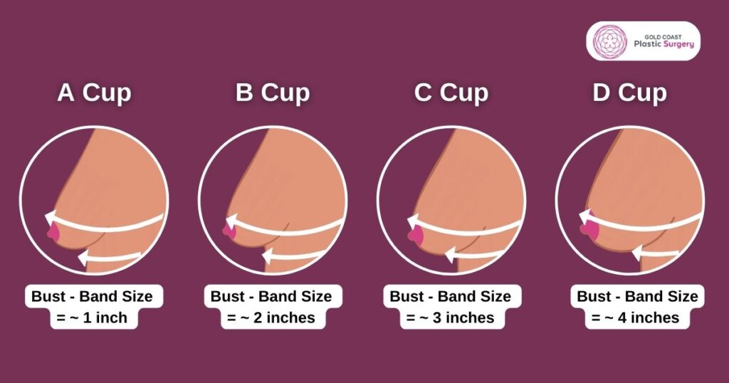
To understand what a C cup looks like, one must first dismantle the myth that a cup size is an absolute measurement. In retail and manufacturing, a cup size is merely the delta—the mathematical difference—between the measurement of the rib cage (the band) and the measurement around the fullest part of the bust.
The Role of Band Size
The most critical factor often overlooked in consumer marketing is that a C cup on a 30-band looks vastly different from a C cup on a 40-band. Because the cup size is relative, the volume of tissue required to create a “C” cup increases as the rib cage widens. This is known as “sister sizing.” A 30C, 34C, and 38C are not identical in volume; the latter is significantly larger in terms of total tissue mass.
Volume vs. Projection
From a design and branding perspective, “look” is defined by projection and distribution. A C cup is generally characterized by a moderate projection relative to the individual’s torso. It is often described in retail fit-guides as providing a balanced silhouette. However, the visual appearance is dictated by tissue density, breast shape (round, teardrop, or conical), and skin elasticity. Brands that fail to communicate these nuances often see higher return rates, as the consumer’s visual expectation—shaped by edited media—rarely aligns with the functional reality of their own anatomy.
Brand Representation and Consumer Expectations
For businesses operating in the fashion and intimate apparel sectors, the “C cup” has become a strategic benchmark. It represents the “middle ground” of the market, which is why so many brands focus their initial product development on this sizing category.
The Problem with Visual Standardization
Marketing campaigns often use models who may fit a specific cup size but possess different root widths and breast shapes. When a brand portrays a “standard” C cup, they are often inadvertently setting an unrealistic benchmark for the average consumer. From a branding standpoint, the challenge lies in moving away from a single, static image of what a C cup looks like and toward a more inclusive visual strategy. By showcasing diverse body types that all fall under the C cup category, brands can build trust and improve the customer experience by acknowledging the reality of physiological variety.

Designing for the “Average” Consumer
In product design, the C cup serves as the baseline for pattern making. Most off-the-rack clothing is draped on a fit model who typically falls within a specific size range, often targeting the B or C cup volume. When a brand understands that a C cup is not a singular “look” but a range of volume distributions, they can optimize their garment construction—specifically in areas like armhole depth, strap placement, and bust dart positioning—to ensure a better fit for a wider demographic.
Aesthetic Nuance: Tissue Density and Shape
Beyond the math and the retail strategy, the visual perception of a C cup is heavily influenced by biological factors. A brand that ignores these factors when crafting its narrative risks alienating its audience.
The Impact of Tissue Distribution
How breast tissue is distributed across the chest wall changes the visual profile significantly. A C cup with a wide root (tissue spread over a broader area of the chest) will appear flatter and wider, whereas a C cup with a narrow root will appear more projected and circular. Fashion marketing campaigns that ignore these variations in root width struggle to resonate with consumers whose bodies do not conform to the “idealized” circular shape often depicted in catalogs.
The Influence of Age and Gravity
Corporate identity in the lingerie space is shifting toward authenticity. Visualizing a C cup requires acknowledging that gravity and skin elasticity play major roles in how the breast sits on the frame. A professional brand strategy now emphasizes natural movement over the “lift and separate” aesthetics that dominated the late 20th century. By shifting the visual language toward natural contours, brands can align with modern consumer values that prioritize comfort and honest representation over artificial enhancement.
The Future of Retail and Size Inclusivity
As data analytics becomes more integrated into retail, the industry is moving away from the “one-size-fits-all” approach to cup sizing. Digital tools and AI-driven fit technology are allowing companies to better predict what a C cup looks like for their specific customer base.
Data-Driven Fit Solutions
Companies are increasingly using virtual fitting rooms and augmented reality to help customers visualize how a specific bra or garment will look on their unique frame. This technological shift is reducing the reliance on static, potentially misleading images of models. By providing personalized visual feedback, brands are successfully bridging the gap between the abstract concept of a “C cup” and the concrete reality of the consumer’s body.
Shaping the Narrative
The future of brand messaging regarding cup size lies in education. Rather than selling a fantasy, successful brands are now selling fit and functionality. By clearly articulating that a C cup is a variable volume that changes depending on the wearer’s frame, brands can empower consumers to make informed purchasing decisions. This transition from curated imagery to educational transparency is essential for building long-term brand equity in an era where consumers are increasingly skeptical of airbrushed advertising.
In conclusion, the question of what a C cup looks like cannot be answered with a photograph. It is a complex interplay of mathematical ratios, biological distribution, and, most importantly, the strategic decisions made by brands to either obscure or illuminate these realities. As the retail landscape evolves, the most successful companies will be those that embrace the nuance of the human form, moving beyond the superficial “average” to celebrate the diverse reality of their customer base. A C cup is not a static visual destination; it is a fluid, multi-dimensional category that requires a sophisticated, honest, and data-backed approach to representation.
aViewFromTheCave is a participant in the Amazon Services LLC Associates Program, an affiliate advertising program designed to provide a means for sites to earn advertising fees by advertising and linking to Amazon.com. Amazon, the Amazon logo, AmazonSupply, and the AmazonSupply logo are trademarks of Amazon.com, Inc. or its affiliates. As an Amazon Associate we earn affiliate commissions from qualifying purchases.