
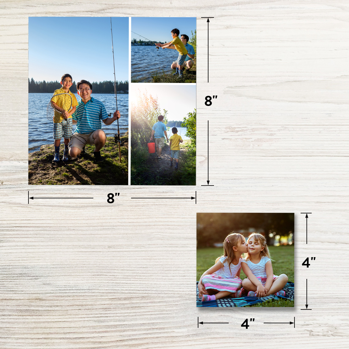
In the vast landscape of digital imagery, the term “4×4 picture” often sparks curiosity, primarily due to its seemingly simple yet profound implications for how we perceive and interact with visual content online. At its core, a 4×4 picture refers to an image with an equal width and height, resulting in a perfectly square aspect ratio. While it could literally mean an image measuring 4 inches by 4 inches when printed, in the digital realm, it most commonly denotes a square image, irrespective of its specific pixel dimensions (e.g., 400×400 pixels, 1080×1080 pixels, or even 4000×4000 pixels). This square format has become a cornerstone of digital aesthetics and functionality, driven by technological advancements and user experience demands across various platforms. Understanding what a 4×4 picture looks like, therefore, is not just about its dimensions, but about its role, utility, and visual impact in the tech-driven world.
This article delves into the technical aspects, practical applications, and future trends surrounding the ubiquitous 4×4 picture. From its foundational principles in image resolution and aspect ratio to its dominance in social media and e-commerce, we will explore why this seemingly restrictive format has become an indispensable tool for designers, marketers, and everyday users alike. We will uncover how modern software and AI tools facilitate its creation and optimization, ensuring that these compact squares deliver maximum visual punch and technical efficiency.
Understanding the “4×4” Dimension: Pixels vs. Physical Inches
The concept of a “4×4 picture” bridges the gap between traditional print media and the dynamic world of digital screens. While a physical 4×4 print implies specific imperial measurements, its digital counterpart is far more flexible and complex, primarily defined by pixel dimensions and aspect ratios. Grasping this distinction is crucial for anyone working with digital imagery.
Aspect Ratios and Their Significance
An aspect ratio describes the proportional relationship between an image’s width and its height. A 4×4 picture, by definition, has an aspect ratio of 1:1, meaning its width and height are identical. This square format stands in contrast to common rectangular aspect ratios like 3:2 (standard for DSLRs), 4:3 (traditional TV screens and older monitors), 16:9 (widescreen TVs, modern monitors, and video), or 9:16 (vertical video for mobile devices). The 1:1 aspect ratio inherently brings a sense of balance and symmetry, which is highly valued in many design contexts.
The significance of a 1:1 aspect ratio lies in its predictability across various display environments. Unlike rectangular images that might be cropped awkwardly or letterboxed (with black bars) on different screen orientations or platform requirements, a square image maintains its complete composition regardless of whether it’s viewed on a portrait-oriented phone, a landscape monitor, or embedded within a square content feed. This consistency is a major factor in its widespread adoption in digital tech.
Pixel Dimensions and Resolution
While the 1:1 aspect ratio defines the shape of a 4×4 picture, its quality and size are determined by its pixel dimensions. For instance, a 4×4 picture could be 100×100 pixels, 1080×1080 pixels, or even 4000×4000 pixels. The higher the pixel dimensions, the greater the resolution, allowing for more detail and clarity, especially when viewed on high-density displays (e.g., Retina screens).
Resolution, often measured in pixels per inch (PPI) for digital displays or dots per inch (DPI) for print, dictates how sharp an image appears. A 4×4 picture intended for a small social media thumbnail might only need 100×100 pixels at 72 PPI. However, a high-quality product image for an e-commerce website or a profile picture designed for versatility across platforms might require 1080×1080 pixels at 300 PPI to ensure crispness and allow for minor scaling without significant quality loss. Understanding the target display environment is paramount when deciding on the appropriate pixel dimensions for your 4×4 image, balancing visual fidelity with file size for optimal loading times.
File Size Implications
The pixel dimensions of a 4×4 image directly impact its file size. A 4000×4000 pixel image will naturally have a significantly larger file size than a 400×400 pixel image, especially if it’s uncompressed or saved in a less efficient format like uncompressed TIFF. Larger file sizes can lead to slower loading times on websites and apps, consuming more bandwidth and potentially detracting from the user experience.
Therefore, optimizing the file size of a 4×4 picture without compromising too much on visual quality is a critical technical consideration. This often involves choosing appropriate file formats (e.g., JPEG for photos, PNG for images with transparency or sharp lines, WebP for modern web delivery), adjusting compression levels, and ensuring the pixel dimensions are suitable for the image’s intended use, avoiding unnecessary oversized files.
Why a Square (4×4) Format Matters in Digital Media
The ascendancy of the square format in digital media is no accident. It’s a calculated design choice influenced by technical constraints, user behavior, and aesthetic preferences. The 1:1 aspect ratio offers distinct advantages that have cemented its place across diverse digital platforms.
Dominance in Social Media Feeds
Perhaps the most prominent example of the 4×4 picture’s influence is its ubiquitous presence on social media platforms like Instagram, Facebook, and LinkedIn. Instagram famously started with an exclusive square format, forcing users to crop their images into 1:1. While it has since relaxed this rule, the square remains a fundamental component of its grid layout and overall aesthetic. This choice was driven by a desire for visual consistency and a cleaner, more organized feed that prioritizes single-image focus.
For content creators and brands, understanding this square preference is vital. A 4×4 image consumes a uniform amount of screen real estate in a grid, making it easier to scan and digest content. It also encourages a particular style of photography and composition, where subjects are centered and details are confined within a symmetrical frame, creating visually appealing and scroll-stopping content.
Website Layouts and Responsive Design
Beyond social media, 4×4 pictures play a crucial role in modern website design, particularly in responsive layouts that adapt to various screen sizes and devices. Square images fit seamlessly into grid-based designs often used for product galleries, portfolios, and blog post thumbnails. Their consistent dimensions simplify the development process, as designers don’t have to worry as much about how different aspect ratios will distort or misalign within a fluid grid system.
When a website is accessed on a mobile phone, tablet, or desktop, square images maintain their integrity and proportion, contributing to a cohesive user experience. This adaptability is key in an era where users access content from a multitude of devices, and designers strive to deliver a consistent, high-quality visual experience across all touchpoints.
Visual Balance and Aesthetics
From an aesthetic standpoint, the square format is inherently balanced and timeless. Unlike rectangular images which can draw the eye horizontally or vertically, a square encourages the viewer’s gaze to settle within its frame, often leading to a more focused and contemplative viewing experience. This makes 4×4 images excellent for highlighting specific subjects, objects, or faces without the distraction of peripheral elements.
Designers often leverage the square’s natural symmetry to create visually pleasing compositions. It provides a strong, stable anchor point in a layout, contributing to a sense of order and professionalism. This aesthetic appeal translates into higher engagement and a more polished brand image, particularly for businesses that rely heavily on visual storytelling.
Practical Applications: Where You’ll Find 4×4 Pictures
The theoretical advantages of the 4×4 picture translate into numerous practical applications across various tech domains. From personal branding to e-commerce, the square format proves its versatility and effectiveness.
Profile Pictures and Avatars
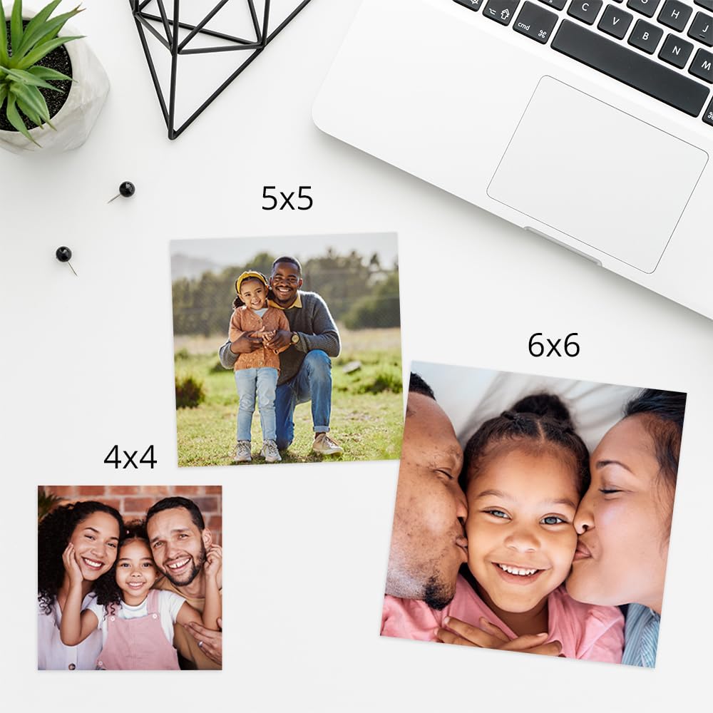
One of the most common places to encounter a 4×4 picture is as a profile picture or avatar across virtually every digital platform. Social media sites, messaging apps, professional networking platforms, and even gaming services predominantly use a square format for user profiles. This standardization simplifies platform design and ensures a consistent look for user identities.
A well-composed 4×4 profile picture is crucial for personal branding and online presence. It needs to be clear, recognizable, and often tightly cropped to focus on the individual’s face, conveying professionalism or personality within a small, symmetrical frame.
Product Photography for E-commerce
For online retailers, 4×4 pictures are indispensable, especially for product listings. E-commerce platforms like Shopify, Amazon, and Etsy often recommend or require square images for product photos. This standardization creates a clean, uniform look across product galleries, making it easier for shoppers to browse and compare items.
Square product photos ensure that every item is presented consistently, regardless of its actual shape. It helps maintain visual harmony in category pages and search results, enhancing the overall shopping experience. Moreover, these images often serve as thumbnails that link to larger product pages, making their clarity and appeal paramount.
App Icons and Digital Art
The compact, symmetrical nature of the 4×4 format makes it ideal for app icons. Whether on iOS, Android, or desktop operating systems, app icons are typically square (though often displayed with rounded corners). These tiny squares must convey an app’s function and brand identity instantly and effectively, a challenge met by the focused composition that the 1:1 aspect ratio encourages.
Furthermore, the 4×4 format has found a niche in digital art and Non-Fungible Tokens (NFTs). Many digital artists embrace the square canvas for its unique compositional challenges and its aesthetic resonance with digital display grids. The consistent frame provides a universal standard for showcasing digital creations, whether in galleries or marketplaces.
Creating and Optimizing Your 4×4 Images
Generating high-quality 4×4 pictures that meet technical requirements and aesthetic standards involves utilizing the right tools and adhering to best practices. In the age of digital content, this process has become streamlined with various software and online solutions.
Tools for Resizing and Cropping
Numerous tools are available for transforming existing images into the 4×4 format or for creating them from scratch:
-
Professional Photo Editors: Software like Adobe Photoshop, GIMP, and Affinity Photo offer precise control over cropping, resizing, and aspect ratio adjustments. Users can manually set specific pixel dimensions (e.g., 1080×1080) and fine-tune compositions.
-
Online Image Editors: Websites such as Canva, Pixlr, Fotor, and Kapwing provide user-friendly interfaces for quick cropping and resizing. Many offer pre-set aspect ratios (including 1:1) and templates, making it easy for non-designers to create professional-looking square images.
-
Mobile Apps: Most smartphone cameras and photo editing apps (e.g., Snapseed, VSCO, Instagram’s built-in editor) include square crop options, allowing for on-the-go optimization.
-
Batch Processors: For managing large volumes of images, tools that allow batch resizing and cropping (e.g., Adobe Lightroom, XnConvert) are invaluable for maintaining consistency across multiple 4×4 assets.
Best Practices for Quality and Composition
When creating 4×4 pictures, several best practices ensure optimal quality and visual appeal:
-
High-Resolution Source: Always start with the highest resolution image available to prevent pixelation when cropping or resizing.
-
Center of Attention: For a 1:1 aspect ratio, it’s often effective to place the main subject in the center or use the rule of thirds within the square frame to create balance.
-
Mind the Edges: Be mindful of what gets cut off when cropping. Ensure no critical elements are lost around the perimeter.
-
Aspect Ratio First: Crop to the 1:1 aspect ratio before making significant edits, as the new dimensions might change the overall composition.
-
Preview on Target Platform: Always preview how the 4×4 image will appear on its intended platform (e.g., social media feed, e-commerce product page) to catch any unforeseen cropping or display issues.
Compression Techniques and File Formats
After creating or resizing a 4×4 image, optimizing its file size without sacrificing too much quality is crucial for web performance.
-
JPEG for Photos: Ideal for photographs with many colors and gradients, JPEG offers excellent compression, but it is a “lossy” format, meaning some data is discarded during compression. Fine-tune the compression level to balance quality and file size.
-
PNG for Graphics/Transparency: Best for images with sharp lines, text, or transparent backgrounds (e.g., logos, icons). PNG is “lossless,” preserving all original data but resulting in larger file sizes than JPEGs for complex photos.
-
WebP for Modern Web: A newer image format developed by Google, WebP offers superior lossless and lossy compression for web images, resulting in smaller file sizes than JPEGs or PNGs while maintaining comparable quality. It’s increasingly supported by modern browsers.
-
Image Optimization Tools: Dedicated tools and plugins (e.g., TinyPNG, ImageOptim, Compressor.io) can further reduce file sizes of JPEGs and PNGs without noticeable quality degradation, making your 4×4 pictures load faster.
The Future of Square Images: AI and Adaptive Design
The 4×4 picture, while rooted in simple geometry, continues to evolve with technological advancements. The rise of artificial intelligence and the increasing demand for adaptive design are shaping how square images are created, optimized, and consumed.
AI-Driven Cropping and Composition
AI is increasingly being integrated into image editing software and content management systems to automate and enhance the creation of 4×4 images. AI-powered cropping tools can intelligently identify the main subject of an image and automatically generate optimal 1:1 crops, ensuring the most important elements are preserved and framed effectively. This capability saves significant time for content creators, especially when dealing with large volumes of diverse imagery.
Furthermore, AI can assist in compositional analysis, suggesting improvements for visual balance within a square frame or even generating multiple square variations from a single wider shot, tailored for different platforms or aesthetic preferences. This automation will further democratize high-quality image creation, making professional-grade 4×4 content more accessible.
Adaptive Layouts and Responsive Grids
The future of digital display will continue to emphasize adaptive layouts and responsive grids, where content seamlessly adjusts to any screen size or orientation. Square images are inherently well-suited for this paradigm. As display technologies become more sophisticated, the 4×4 format will remain a stable and predictable element within dynamic interfaces.
We can expect more advanced content delivery networks to serve optimized 4×4 images on the fly, tailoring resolution and file format to the user’s device, network speed, and display capabilities. This level of automation ensures that the “4×4 picture” experience is always visually crisp and technically efficient, regardless of the viewing context.

Immersive Experiences and Dynamic Content
While square images might seem static, their role in immersive experiences like augmented reality (AR) and virtual reality (VR) is also growing. A 4×4 image can serve as a texture on a 3D object, a thumbnail within a VR gallery, or a UI element in an AR application. Their consistent aspect ratio simplifies their integration into complex 3D environments, providing predictable visual anchors.
As content becomes more dynamic and interactive, the 4×4 picture will likely evolve beyond a static image. Imagine square frames that incorporate subtle animations, micro-videos, or interactive elements, all within the familiar and trusted 1:1 aspect ratio. This blend of static consistency with dynamic content will push the boundaries of what a “4×4 picture” can look like and achieve.
In conclusion, the 4×4 picture, defined by its perfect square aspect ratio, is far more than a simple dimension; it’s a fundamental building block of modern digital media. Its technical simplicity, combined with its aesthetic balance and practical versatility, has made it a cornerstone of social media, e-commerce, and various user interfaces. As technology continues to advance, driving innovation in AI and adaptive design, the square image will undoubtedly remain a crucial and evolving element in how we create, consume, and interact with visual content in the digital age.
aViewFromTheCave is a participant in the Amazon Services LLC Associates Program, an affiliate advertising program designed to provide a means for sites to earn advertising fees by advertising and linking to Amazon.com. Amazon, the Amazon logo, AmazonSupply, and the AmazonSupply logo are trademarks of Amazon.com, Inc. or its affiliates. As an Amazon Associate we earn affiliate commissions from qualifying purchases.