
In the competitive landscape of modern marketing and corporate identity, visual communication is the primary language through which a business speaks to its audience. Before a customer reads a single word of your copy, they have already formed an opinion based on the graphic features present in your design. These features serve as the building blocks of visual storytelling, ensuring that a brand’s message is not only seen but felt, understood, and remembered.
Understanding graphic features is essential for anyone tasked with crafting a brand strategy. Whether you are designing a logo, structuring a social media campaign, or developing a comprehensive brand identity system, these elements dictate the psychological impact of your work. By mastering these components, designers and strategists can guide consumer perception and solidify their position in the marketplace.
The Core Components of Visual Identity
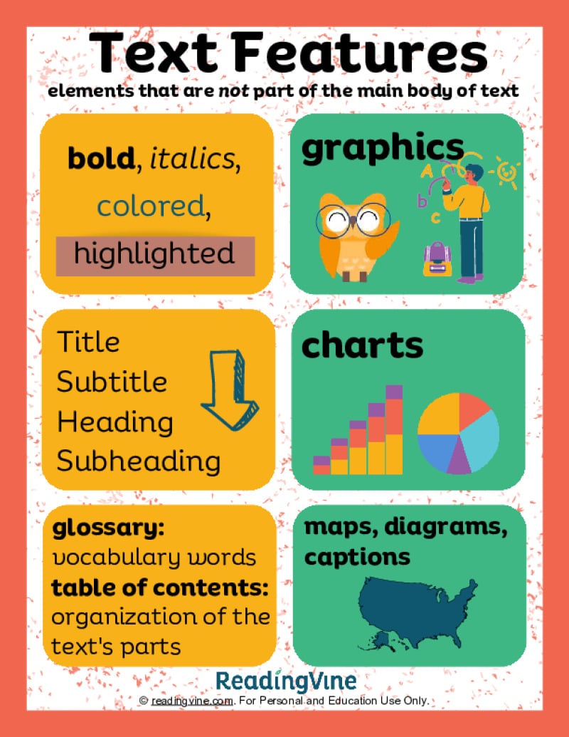
Graphic features are the specific, repeatable elements used within design layouts to create consistency and visual hierarchy. They are the tactical tools of the brand designer, used to organize information and evoke emotion. When these features are applied consistently, they transform a collection of assets into a unified brand identity.
Typography and Type Hierarchies
Typography is perhaps the most powerful graphic feature in any design system. It is not merely about choosing a font that “looks nice”; it is about selecting a typeface that conveys the brand’s voice—whether that is authoritative, playful, minimalist, or disruptive.
A well-defined graphic feature set includes a clear type hierarchy. This dictates how users consume information. By manipulating font weight, scale, tracking, and leading, designers create a roadmap for the reader’s eye. This structure prevents cognitive overload and ensures that the most critical brand messages—the “hero” statements—are processed first.
Color Palettes and Psychological Priming
Color is a universal graphic feature that bypasses logic and speaks directly to the subconscious. A brand’s color palette is a strategic asset. While blue may evoke trust and security—making it a staple in the finance and tech sectors—vibrant oranges and yellows suggest energy and accessibility.
Effective graphic systems do not just pick a few colors; they define their application. This means specifying which colors are for backgrounds, which are for call-to-action buttons, and which are for typography. This consistency is what allows a brand to become recognizable at a glance, even when the logo is removed.
Shape Language and Composition
The shapes used within your designs—geometric versus organic—communicate a specific brand philosophy. Sharp, angular lines convey precision, efficiency, and modernity. Conversely, rounded, soft shapes suggest warmth, approachability, and human-centric service.
Composition as a graphic feature refers to the arrangement of these elements within a given space. The use of negative space (or “white space”) is a critical graphic feature in luxury branding. It signals quality and confidence, implying that the brand does not need to fill every corner of the page to be noticed. Understanding the interplay between positive and negative space allows brands to curate an atmosphere of sophistication.
Enhancing Brand Recognition Through Consistency
The ultimate goal of implementing a robust set of graphic features is to achieve brand recognition. In an era of digital saturation, consumers are bombarded with thousands of visual stimuli every day. Only brands that maintain a high level of visual discipline manage to cut through the noise.
The Role of Design Systems
A design system is the codified collection of your graphic features. It acts as the “source of truth” for everyone working on the brand, from social media managers to web developers. Without a formal design system, graphic features tend to drift. One campaign might use high-contrast photography while another uses flat illustrations, leading to a fragmented brand identity that confuses the customer.
By documenting your graphic features—including sizing rules, grid structures, and iconography styles—you ensure that every touchpoint, whether an Instagram post or a printed brochure, reinforces the same narrative. This consistency builds trust. When a user sees your brand in two different environments and the graphic features match, their brain registers “familiarity,” which is the precursor to loyalty.

Icons and Imagery Styles
Photography and iconography are graphic features that provide context to your brand story. Are your photos candid and authentic, or polished and cinematic? Are your icons thin-lined and abstract, or bold and filled?
These choices must align with the brand strategy. If your brand promises to be an industry disruptor, your imagery should likely avoid traditional, overly staged stock photography in favor of gritty, high-contrast, or experimental visual treatments. These graphic features act as visual shorthand; they tell the consumer who you are before they ever interact with your product.
Strategic Application of Graphic Features
Knowing what graphic features are is the first step; knowing how to apply them strategically is where the competitive advantage is won. An effective application requires balancing creativity with structural integrity.
Adaptability vs. Uniformity
A common mistake in branding is interpreting consistency as monotony. True brand strategy uses graphic features as a modular set. You need to provide enough uniformity for recognition, but enough flexibility for adaptation across different platforms.
For example, a graphic feature like a specific brand texture or a pattern can be scaled up to serve as a background for a billboard or shrunk down to serve as a subtle border on a business card. The pattern remains the same, but its application changes based on the medium. This adaptability keeps the brand fresh while maintaining its underlying DNA.
Designing for Accessibility and Inclusivity
Modern graphic features must also prioritize accessibility. Using high-contrast color combinations, selecting readable typefaces, and ensuring that graphic layouts work well on mobile devices are no longer optional “nice-to-haves.” They are fundamental to a professional brand strategy.
If your graphic features render your content illegible to a portion of your audience, your brand identity is failing. Accessibility is not just an ethical requirement; it is a business imperative. When a brand’s graphic features are designed with all users in mind, the reach of that brand expands significantly, reinforcing a reputation for inclusivity and quality.
The Future of Graphic Features in Branding
As AI tools and automation continue to reshape the design landscape, the role of human judgment in selecting and refining graphic features is becoming more critical. Algorithms can generate millions of variations, but they cannot yet replicate the nuance of brand strategy.
The Shift Toward Motion and Interaction
Graphic features are no longer static. In the digital age, motion is a vital feature of a brand’s identity. How an element transitions onto a screen, how a logo animates, or how a button reacts to a hover state are all extensions of graphic design.
A brand’s “motion signature” is the new frontier of identity. If your brand is high-energy, your motion graphics might be rapid and springy. If your brand is premium, your motion might be deliberate, fluid, and slow. These dynamic graphic features add a layer of sophistication that static branding cannot match, helping to create a deeper, more immersive user experience.
Maintaining Brand Integrity in a Fragmented World
The proliferation of social media platforms means that your graphic features will be viewed in diverse contexts. Your design must be robust enough to survive being viewed on a tiny smartphone screen or a massive digital display.
The successful brands of the future will be those that treat their graphic features as a living language. They will continually evolve these features to meet the changing habits of their audience without losing the core equity that makes them recognizable. By treating typography, color, shape, and imagery as a cohesive toolkit, businesses can exert control over their narrative.
Ultimately, graphic features are the silent ambassadors of your brand. They communicate your values, your promise, and your personality. By investing time into defining and refining these elements, you are not just making your brand “look good”—you are building a structured, professional, and scalable identity that can stand the test of time and market fluctuation. Whether you are a startup founder or a seasoned marketer, mastering these features is the key to creating a brand that doesn’t just participate in the conversation, but leads it.
aViewFromTheCave is a participant in the Amazon Services LLC Associates Program, an affiliate advertising program designed to provide a means for sites to earn advertising fees by advertising and linking to Amazon.com. Amazon, the Amazon logo, AmazonSupply, and the AmazonSupply logo are trademarks of Amazon.com, Inc. or its affiliates. As an Amazon Associate we earn affiliate commissions from qualifying purchases.