
In the rapidly evolving landscape of technology, data is often referred to as the “new oil.” However, raw data, much like crude oil, is of little use until it is refined and processed into a format that provides actionable insights. Among the various tools used to transform raw numbers into meaningful narratives, the line plot—or line graph—stands as one of the most fundamental and powerful instruments in the technologist’s toolkit. Whether you are a software engineer monitoring server latency, a data scientist tracking the convergence of a machine learning model, or a DevOps professional analyzing traffic spikes, understanding the line plot is essential for navigating the modern tech ecosystem.
Understanding the Line Plot in the Modern Tech Ecosystem
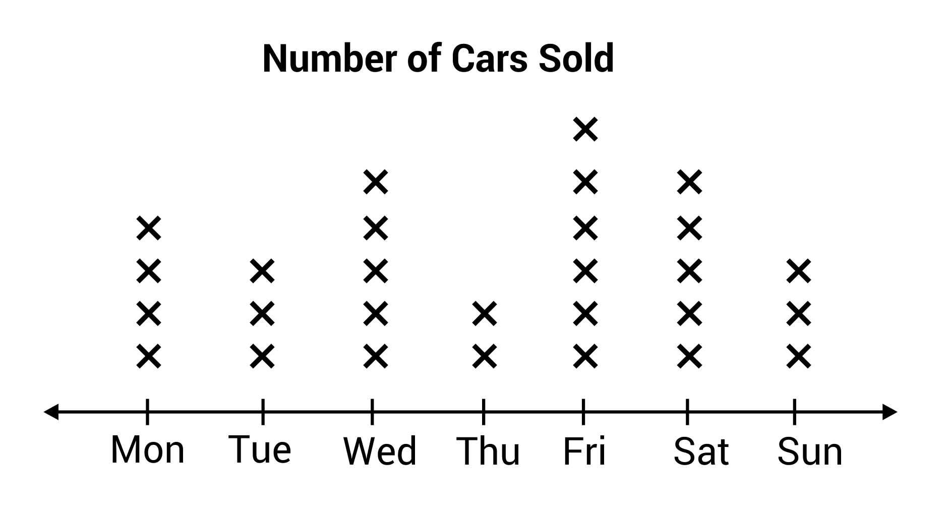
At its core, a line plot is a type of chart which displays information as a series of data points called ‘markers’ connected by straight line segments. It is the most basic yet versatile way to visualize how a specific variable changes over a continuous interval, which, in the tech world, is almost always time.
Definition and Core Components
A line plot operates on a Cartesian coordinate system. The horizontal axis (X-axis) typically represents a continuous progression, such as time (milliseconds, days, or fiscal quarters) or a sequence of steps (iterations in an algorithm). The vertical axis (Y-axis) represents the quantitative value of the metric being measured—for instance, CPU usage percentage, number of active users, or API response times.
The power of the line plot lies in its simplicity. By connecting individual data points, the plot highlights the “flow” of data, allowing the human eye to detect patterns, trends, and anomalies much faster than it could by scanning a spreadsheet or a database log. In tech, where millisecond delays can result in lost revenue, the ability to visualize “directionality” is paramount.
Why Line Plots are the Backbone of Data Analytics
In technology, we are obsessed with “trends.” Is our app getting faster or slower? Is our user base growing or plateauing? Is our security system detecting more threats this month? Line plots provide the visual bridge between raw temporal data and strategic decision-making.
Unlike bar charts, which are excellent for comparing discrete categories (e.g., “Chrome users vs. Firefox users”), line plots are optimized for continuity. They help tech teams understand “The Why” behind the “The What.” When a developer sees a sharp spike in a line plot representing memory usage, they immediately know when a memory leak might have been introduced during a deployment.
Key Use Cases for Line Plots in Software Development and AI
The application of line plots in the technology sector spans across various domains, from the low-level monitoring of hardware to the high-level analysis of artificial intelligence.
Monitoring Application Performance and Infrastructure
For DevOps and Site Reliability Engineers (SREs), the line plot is a daily necessity. Monitoring tools like Prometheus, Grafana, and Datadog rely heavily on line plots to visualize “Time-Series Data.”
Consider a scenario where a global SaaS platform experiences a slowdown. An SRE will look at a dashboard filled with line plots showing:
-
Latency: The time it takes for a request to be processed.
-
Throughput: The number of requests being handled per second.
-
Error Rates: The frequency of 500-series errors.
If the latency line plot shows a steady upward slope while the throughput line remains flat, the team can deduce that the issue is likely internal processing rather than a surge in external traffic. This visual diagnosis is significantly faster than manual log auditing.
Tracking AI and Machine Learning Training Curves
In the realm of Artificial Intelligence, the line plot is the primary way we “peek inside” the black box of a neural network. During the training phase of a Machine Learning (ML) model, data scientists use “Learning Curves.”
These are line plots that graph “Loss” (the error rate) and “Accuracy” over time (epochs). A successful model will show a line plot where the training loss steadily declines while the accuracy increases. However, if the training loss goes down but the validation loss starts to tick upward—a phenomenon clearly visible on a line plot—the engineer knows the model is “overfitting” and needs adjustment. Without these plots, AI development would be a blind exercise in trial and error.
User Engagement and Growth Metrics
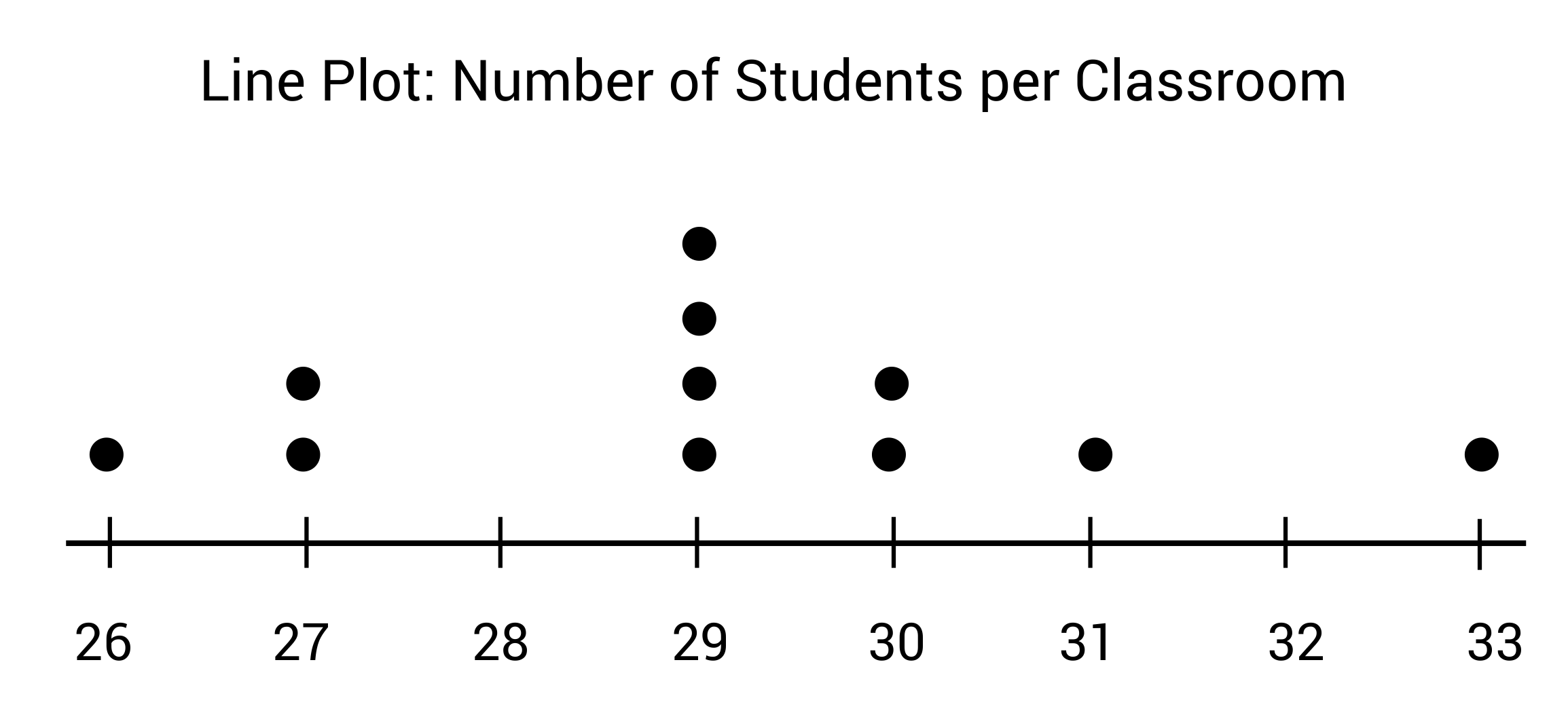
For Product Managers and Growth Hackers, line plots illustrate the health of a product. “Daily Active Users” (DAU) and “Monthly Active Users” (MAU) are almost always plotted as lines. By overlaying a line plot of “New Feature Releases” with a line plot of “User Retention,” tech companies can measure the direct impact of their software updates on user behavior.
Tools and Technologies for Creating Effective Line Plots
The tech industry provides a vast array of libraries and platforms designed to generate sophisticated line plots, ranging from simple static images to highly interactive, web-based dashboards.
Python Libraries: Matplotlib, Seaborn, and Plotly
Python is the undisputed king of data science, and its ecosystem for plotting is unparalleled.
-
Matplotlib: The foundational library. It offers granular control over every aspect of a line plot, from line thickness to font styles. It is the “industry standard” for academic and research-based tech papers.
-
Seaborn: Built on top of Matplotlib, Seaborn simplifies the creation of aesthetically pleasing plots. It is particularly adept at handling complex datasets where you might want to plot multiple lines representing different categories within the same graph.
-
Plotly: This library is a favorite for web developers. Unlike Matplotlib, Plotly generates interactive line plots. Users can hover over data points to see specific values, zoom in on specific timeframes, and toggle different data series on and off.
Business Intelligence (BI) and SaaS Dashboards
For organizations that prefer “Low-Code” or “No-Code” solutions, tools like Tableau, Power BI, and Google Looker Studio allow users to drag and drop data fields to generate line plots instantly. In the tech world, these are often integrated directly into the company’s data warehouse (like Snowflake or BigQuery) to provide real-time updates on business performance.
JavaScript Frameworks for Web-Based Visualization
When building custom dashboards inside a software application, developers often turn to D3.js or Chart.js. These JavaScript libraries allow for the creation of dynamic, responsive line plots that can live-stream data directly from an API. D3.js, in particular, is used for high-end, customized data visualizations that require animation and complex user interaction.
Best Practices for Designing High-Impact Line Plots
In tech, a poorly designed line plot can be worse than no plot at all, as it can lead to “data misinterpretation” and costly technical errors.
Avoiding “Chart Junk” and Clutter
The term “chart junk,” coined by Edward Tufte, refers to unnecessary visual elements that distract from the data. In a professional tech environment, line plots should be clean. This means:
-
Gridlines: Should be subtle and not compete with the data lines.
-
Labels: Every axis must be clearly labeled with units (e.g., “Latency (ms)”).
-
Legend: If multiple lines are present, the legend should be positioned where it doesn’t obscure the trends.
Handling Multi-Series Data and Overplotting
One common issue in tech monitoring is “Spaghetti Charts”—plots where so many lines are graphed simultaneously that they become an unreadable mess. To solve this, developers often use “Small Multiples” (several small line plots side-by-side) or interactive legends that allow the viewer to isolate a single line of interest.
Interactivity and Dynamic Updates
In the world of real-time tech, static line plots are becoming obsolete. A modern line plot should be “live.” If a server starts overheating, the line plot on the dashboard should update in real-time. Adding interactivity—such as tooltips that show the exact timestamp and value of a data point—significantly increases the utility of the plot for troubleshooting.
The Future of Line Plots: Real-Time Streaming and Predictive Analytics
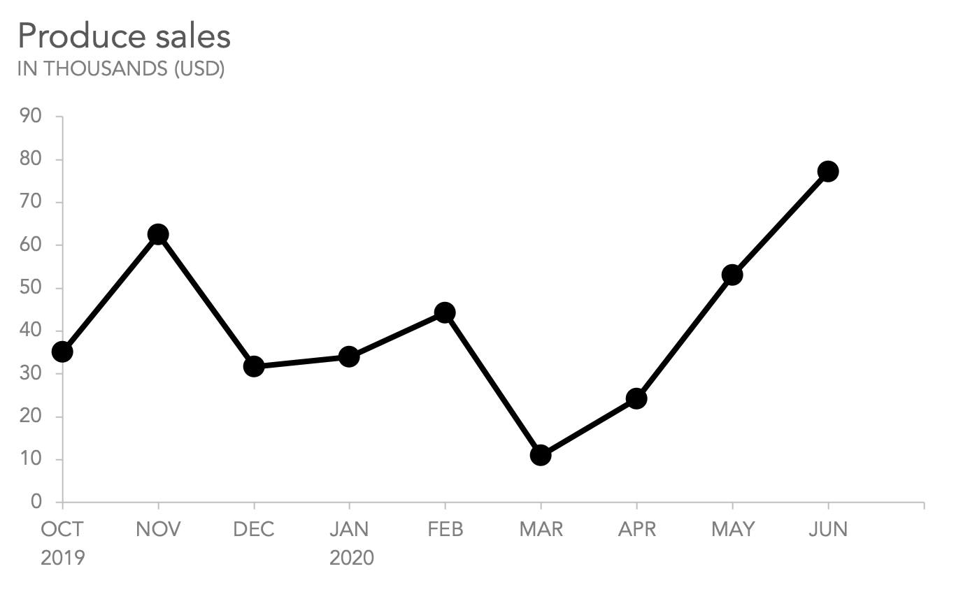
As we move further into the era of Big Data and the Internet of Things (IoT), the humble line plot is evolving. We are seeing the rise of “Predictive Line Plots,” where AI algorithms analyze historical data to extend the line into the future.
For example, a cloud infrastructure provider might use a line plot to show current disk space usage, but then use a dotted “predictive line” to show when the disk is likely to reach capacity based on current growth rates. This allows for “Proactive Scaling,” where resources are added before a failure occurs.
Furthermore, with the advent of high-frequency trading and 5G telecommunications, line plots are now handling millions of data points per second. Tech teams are developing specialized “streaming plots” that use hardware acceleration (GPU) to render data lines smoothly without lagging the browser or the monitoring application.
In conclusion, while the line plot is one of the oldest forms of data visualization, its relevance in the tech industry has never been greater. It is the primary lens through which we view the pulse of our software, the progress of our algorithms, and the growth of our digital platforms. Mastering the line plot is not just about knowing how to draw a line; it is about understanding how to interpret the digital heartbeat of modern technology.
aViewFromTheCave is a participant in the Amazon Services LLC Associates Program, an affiliate advertising program designed to provide a means for sites to earn advertising fees by advertising and linking to Amazon.com. Amazon, the Amazon logo, AmazonSupply, and the AmazonSupply logo are trademarks of Amazon.com, Inc. or its affiliates. As an Amazon Associate we earn affiliate commissions from qualifying purchases.