
In the high-stakes world of corporate identity and brand strategy, color is never just a visual preference; it is a psychological tool. When a designer or brand strategist asks, “What color is charcoal?” they aren’t looking for a simple description of a dark gray hue. They are exploring a sophisticated spectrum of meaning, authority, and versatility that sits between the absolute finality of black and the neutrality of silver.
Charcoal is a deep, matte shade of gray that mimics the appearance of burnt wood. In the context of branding, it represents a bridge between tradition and modernity. Unlike pure black, which can often feel heavy or “empty” in digital and print spaces, charcoal possesses a depth and texture that communicates stability without being overbearing. Understanding how to leverage this color is essential for any brand aiming to project a sense of premium quality, intelligence, and timelessness.

Defining Charcoal in the Language of Modern Branding
To master charcoal within a brand strategy, one must first understand its technical and sensory composition. Charcoal is not a single point on a color wheel but a range of shades that lean into various undertones, each carrying a different brand “personality.”
Beyond Black and Gray: The Nuances of Charcoal
In its purest form, charcoal is a very dark gray. However, in professional branding, charcoal is rarely just a mix of black and white. Most successful brand palettes use “off-charcoals” that contain subtle hints of blue, green, or even purple. A blue-toned charcoal feels professional and high-tech, whereas a warm, brown-toned charcoal feels organic and artisanal. Identifying these nuances allows a brand to evoke specific emotions—coolness for a software company or warmth for a luxury furniture line—while maintaining the authoritative “charcoal” base.
Technical Specifications: Hex Codes and Print Profiles
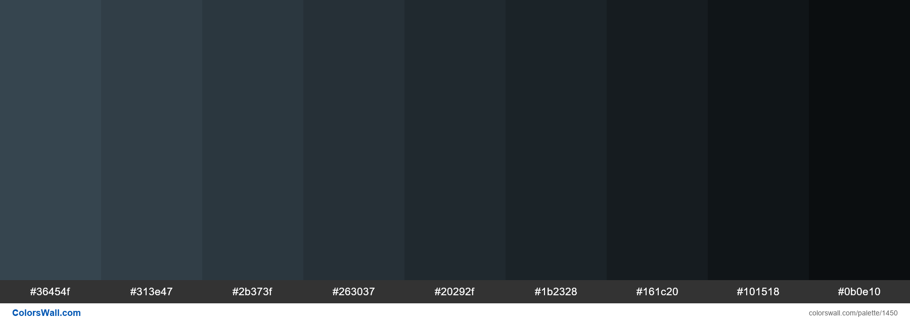
For a brand to remain consistent across all touchpoints, technical precision is non-negotiable. The most common web-safe hex code for charcoal is #36454F, though many brands opt for slightly darker variants like #2F2F2F.
In the world of print (CMYK), charcoal is often achieved through a “rich black” formula that leans heavily on black ink but adds percentages of cyan or magenta to give it body. Understanding these profiles is crucial for brand managers. If a charcoal logo looks “washed out” on a business card or “too blue” on a mobile app, the brand’s perceived reliability begins to erode. Consistency in the “charcoal” space signals meticulousness and attention to detail.
The Psychology of Charcoal: Why Leading Brands Choose It
Color psychology is the bedrock of brand strategy. Charcoal occupies a unique psychological space, offering the benefits of black—such as power and formality—while mitigating the negative associations of gloom or darkness.
Authority and Reliability
Charcoal is the color of the “power suit.” In a corporate identity, it signals that a brand is established, serious, and dependable. This is why financial institutions, law firms, and consultancy agencies frequently use charcoal as their primary anchor color. It suggests a level of maturity that lighter grays cannot match. When a client interacts with a brand draped in charcoal, there is an subconscious assumption of expertise and longevity.
Modernity and Sophistication
While black can sometimes feel “old-world” or overly Gothic, charcoal feels inherently modern. It is the color of sleek industrial design, high-end electronics, and contemporary architecture. Brands that want to appear “cutting edge” but not “trendy” gravitate toward charcoal. It provides a sophisticated backdrop that allows other brand elements—such as a vibrant accent color or a minimalist logo—to stand out without competition.
Versatility Across Industries
One of charcoal’s greatest strengths is its neutrality. It does not demand attention; instead, it commands it. This makes it an ideal choice for brands that operate in multiple sectors or have a diverse product range. Whether it is used for a luxury automotive brand or a premium skincare line, charcoal adapts to its surroundings. It acts as a “canvas” color, providing a premium feel that enhances the perceived value of whatever product it accompanies.

Integrating Charcoal into Your Visual Identity System
Building a brand identity around charcoal requires a strategic approach to hierarchy and contrast. Because it is such a dominant shade, it must be balanced correctly to avoid a visual identity that feels “heavy” or uninviting.
Complementary Color Palettes
Charcoal is perhaps the most versatile “neutral” in a strategist’s toolkit. To create a high-impact brand, charcoal should be paired with colors that either contrast its depth or enhance its sophistication:
-
Charcoal and Gold/Copper: This is the gold standard for luxury branding, conveying exclusivity and heritage.
-
Charcoal and Electric Blue/Neon: Frequently used in the “Tech” niche, this pairing suggests innovation, speed, and digital prowess.
-
Charcoal and Soft Muted Tones (Sage or Terracotta): This creates a “lifestyle” brand feel—modern, approachable, and grounded.
Typography and Readability in Charcoal
In digital design, pure black text on a white background can cause “halation,” a visual strain for the reader. Brand strategists often recommend using a deep charcoal for body text instead of true black. This improves readability and gives the interface a softer, more high-end feel. Furthermore, when charcoal is used as a background color, white or light-gray typography must be carefully weighted to ensure accessibility standards are met. A charcoal brand is only effective if it remains legible across all mediums.
Digital vs. Physical Branding Applications
The transition from a digital screen to a physical product is where many charcoal-based brands fail. On a screen, charcoal is rendered via light; on a product, it is rendered via pigment or material texture. For a brand like an electric vehicle company or a high-end appliance manufacturer, the “color” of charcoal is often tied to the material—brushed metal, matte plastic, or leather. Brand strategy must account for these tactile experiences, ensuring the “charcoal” of the website matches the “charcoal” of the physical packaging or product.
Case Studies: Iconic Brands Mastering the Charcoal Aesthetic
To truly understand “what color is charcoal” in a business context, we must look at the brands that have used it to dominate their respective markets.
Tech Giants and Minimalist Luxury
Apple is perhaps the most famous user of charcoal tones, specifically through their “Space Gray” and “Titanium” finishes. By moving away from stark blacks and whites, Apple created a middle ground that feels metallic, durable, and premium. For Apple, charcoal isn’t just a color; it’s a signifier of the hardware’s structural integrity. This strategic choice has been mirrored by other tech leaders who use charcoal to define their “Pro” or enterprise-level tiers.
High-End Fashion and the “Quiet Luxury” Trend
In the fashion world, the rise of “quiet luxury” has put charcoal at the forefront. Brands like Brunello Cucinelli and Loro Piana use charcoal to communicate wealth that doesn’t need to shout. In this niche, charcoal represents a rejection of loud logos and bright colors in favor of timelessness. For these brands, the color charcoal is a strategy of exclusion—it appeals to a sophisticated consumer who values quality over flashiness.
Best Practices for Implementing Charcoal in Personal and Corporate Branding
If you are considering incorporating charcoal into your brand identity, there are several strategic pitfalls to avoid and opportunities to embrace.
Avoiding the Pitfalls of “Muddy” Designs
The biggest risk with charcoal is that it can look “muddy” or “dirty” if the undertones are not managed. If you use a warm charcoal with a cool blue accent, the colors will clash and create a sense of visual discord. A brand strategist must ensure that the entire palette shares the same temperature. Furthermore, overusing charcoal without enough “white space” can make a brand feel oppressive or unapproachable.
Future-Proofing Your Brand with Neutral Foundations
Trends in color come and go—think of the “Millennial Pink” of the late 2010s. However, charcoal is trend-proof. By building a brand identity on a foundation of charcoal, you create a visual system that can evolve. You can change your accent colors every five years to stay modern, but the charcoal core will remain relevant for decades. This is the ultimate goal of brand strategy: creating an identity that is both of-the-moment and fundamentally timeless.
In conclusion, when we ask “what color is charcoal,” the answer lies in its ability to balance power with subtlety. It is a strategic powerhouse that provides a sense of premium quality and unwavering reliability. For any brand looking to establish a serious, modern, and sophisticated presence, charcoal is not just a choice—it is a cornerstone of professional identity.
aViewFromTheCave is a participant in the Amazon Services LLC Associates Program, an affiliate advertising program designed to provide a means for sites to earn advertising fees by advertising and linking to Amazon.com. Amazon, the Amazon logo, AmazonSupply, and the AmazonSupply logo are trademarks of Amazon.com, Inc. or its affiliates. As an Amazon Associate we earn affiliate commissions from qualifying purchases.