
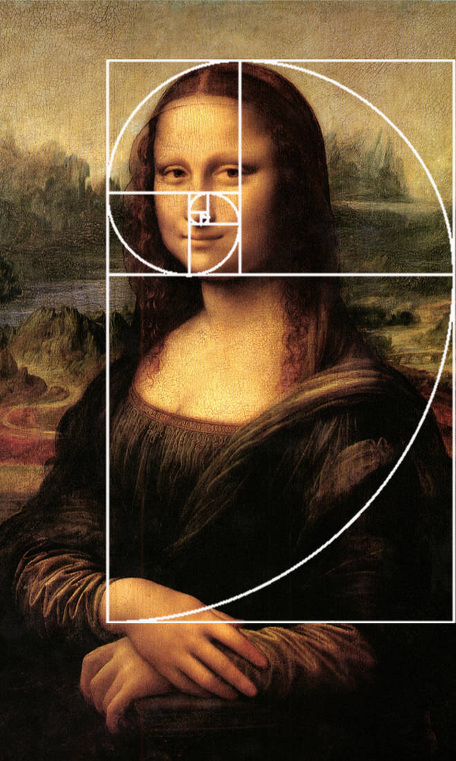
In the world of visual communication, the difference between a brand that feels “right” and one that feels “off” often comes down to a mathematical constant discovered centuries ago. The Golden Section, also known as the Golden Ratio, Phi, or 1.618, is a mathematical proportion that has governed the aesthetics of masterpieces from the Parthenon to the Mona Lisa. In the modern era, this ancient principle has transitioned from the canvas of the Renaissance painter to the toolkit of the brand strategist and graphic designer. Understanding the Golden Section in art is no longer just an academic exercise for historians; it is a fundamental pillar of corporate identity, brand strategy, and high-level design.

The Mathematics of Beauty: Understanding the Golden Section
The Golden Section is more than just a number; it is a representation of organic growth and visual harmony found throughout the natural world. It is derived from the Fibonacci sequence, where each number is the sum of the two preceding ones (1, 1, 2, 3, 5, 8, 13, and so on). When you divide a number in this sequence by its predecessor, the result edges closer to 1.618. This ratio appears in the spiral of a seashell, the arrangement of seeds in a sunflower, and even the proportions of the human face.
The Science of Visual Preference
Neuromarketing and psychological studies suggest that the human brain is hardwired to process images that adhere to the Golden Section more efficiently. Because this ratio is so prevalent in nature, our eyes find it inherently “correct.” For a brand, this is the ultimate goal: to be perceived as balanced, trustworthy, and aesthetically pleasing at a subconscious level. When a designer applies the Golden Section to a layout or a logo, they are essentially speaking the “native language” of human perception, reducing cognitive load and making the brand more memorable.
From Renaissance Art to Corporate Identity
While Renaissance artists used the Golden Section to guide the placement of subjects and the horizon line, modern brand designers use it to determine the relationship between shapes, the weight of typography, and the distribution of white space. The transition from art to branding was a natural evolution. If the goal of art is to evoke emotion and beauty, the goal of branding is to evoke those same feelings while communicating a message of professional excellence and reliability.
The Golden Ratio in Modern Brand Identity
In a marketplace saturated with visual noise, a logo must do more than just represent a company; it must command attention and instill a sense of order. The most iconic brand identities in history were not created by accident. They were engineered using geometric precision, often utilizing the Golden Spiral or Golden Circles to create a sense of movement and stability.
Logo Construction: Beyond the Surface
When we look at the Apple logo or the Twitter (now X) bird, we see simple shapes. However, beneath the surface lies a complex grid of Golden Circles. By using circles with diameters that follow the Fibonacci sequence, designers create curves that feel perfectly fluid and natural. This geometric rigor ensures that the logo remains balanced regardless of size—whether it is on a tiny app icon or a massive billboard. This “hidden geometry” is what gives world-class logos their longevity.
Iconography and Symbolism
The Golden Section also dictates the weight and proportions of brand iconography. When a brand develops a suite of icons for its digital interface, maintaining a consistent ratio ensures a cohesive brand voice. If the thickness of an icon’s stroke or the curvature of its corners follows a consistent mathematical rule, the brand feels unified. This consistency is the hallmark of a premium brand identity, signaling to the consumer that every detail of the user experience has been meticulously considered.
Designing for Impact: Applying the Ratio to Layout and Composition
While the Golden Section is most famous for its role in logo design, its application in brand strategy extends to every touchpoint of the customer journey, from print advertisements to website interfaces. A brand’s composition—the way it arranges elements on a page—determines how a customer interacts with the information.

Establishing Visual Hierarchy
The Golden Rectangle is a powerful tool for establishing visual hierarchy. By dividing a page into sections based on the ratio, a designer can guide the viewer’s eye to the most important information first. For example, in a brand’s landing page, the Golden Ratio might dictate that the primary call-to-action (CTA) occupies a space that corresponds with the “focus point” of the Golden Spiral. This ensures that the most critical brand message is positioned exactly where the eye naturally wants to land, increasing conversion rates and user engagement.
The Golden Spiral in Web Design
In digital brand strategy, user experience (UX) is king. The Golden Spiral provides a roadmap for content placement. By following the curve of the spiral, designers can place secondary information, such as navigation bars or social proof, in a way that feels unobtrusive but accessible. This creates a sense of flow that mimics how we observe a painting. Instead of a cluttered digital environment, the user experiences a curated journey that feels professional and effortless.
Case Studies: Iconic Brands That Mastered the Proportion
To truly understand the power of the Golden Section in a branding context, one must look at the companies that have built multi-billion dollar legacies on its foundation. These brands use mathematical harmony to project an image of perfection.
Apple: The Minimalism of Math
Apple is perhaps the most famous proponent of the Golden Ratio in design. From the curvature of the iPhone’s corners to the layout of their website, the Golden Section is omnipresent. The Apple logo itself is a masterclass in the application of Golden Circles. This commitment to mathematical precision is a core part of Apple’s brand strategy; it reinforces their identity as a company at the intersection of technology and liberal arts. The “perfection” of the math translates to the “perfection” of the product in the consumer’s mind.
National Geographic: Framing Reality
The National Geographic logo is a simple yellow rectangle. However, its proportions are not arbitrary; they are based on the Golden Ratio. As a brand dedicated to the exploration of the natural world, using a ratio found in nature is a stroke of branding genius. The rectangle acts as a “frame” for the world, and because that frame is mathematically harmonious, it elevates the photography and storytelling it contains. It is a testament to how a simple geometric shape, when correctly proportioned, can become a globally recognized symbol of authority.
Pepsi vs. Coca-Cola: A Study in Geometry
In its 2008 rebranding, Pepsi released a design document that leaned heavily into the Golden Ratio and other geometric principles. While the “Pepsi Globe” has evolved, the use of circular geometry was intended to create a more “dynamic” and “emotive” brand. In contrast, Coca-Cola relies on the fluid, organic lines of its Spencerian script, which inherently follows natural, rhythmic proportions. Both brands use the principles of the Golden Section to maintain a sense of classic timelessness, even as their marketing strategies evolve for the modern age.
Balancing Rigor with Creativity: When to Use the Golden Section
While the Golden Section is a powerful tool, it is not a rigid cage. The best brand designers use it as a guide rather than a rule. In the world of art and design, the human element—intuition, emotion, and subversion—is just as important as mathematical accuracy.
The Role of Design Intuition
A brand that is too mathematically “perfect” can sometimes feel cold or robotic. Skilled designers often start with the Golden Ratio to establish a foundation and then make “optical adjustments.” These are slight deviations from the math that account for how the human eye perceives light and weight. For instance, a perfectly centered object often looks slightly too low to the human eye; a designer might nudge it up to achieve “visual balance,” even if it breaks the mathematical center.
Future-Proofing the Brand
The greatest benefit of the Golden Section in brand strategy is its ability to future-proof an identity. Trends in typography and color change every few years, but the human preference for the Golden Ratio has remained constant for millennia. By anchoring a brand’s visual identity in these timeless proportions, a company can ensure that its logo and design language will look as relevant in fifty years as they do today. It is the ultimate insurance policy against the “dated” look that plagues so many modern corporations.
In conclusion, the Golden Section in art is much more than a historical curiosity. It is a strategic asset in the world of branding and design. By leveraging the same proportions that make the natural world and the great masterpieces of art so captivating, brands can create a visual language that resonates with the human subconscious. Whether it is used to craft a logo, layout a website, or define a brand’s entire visual philosophy, the Golden Section remains the gold standard for achieving balance, beauty, and lasting impact.
aViewFromTheCave is a participant in the Amazon Services LLC Associates Program, an affiliate advertising program designed to provide a means for sites to earn advertising fees by advertising and linking to Amazon.com. Amazon, the Amazon logo, AmazonSupply, and the AmazonSupply logo are trademarks of Amazon.com, Inc. or its affiliates. As an Amazon Associate we earn affiliate commissions from qualifying purchases.