
In the competitive landscape of visual identity, color is often the first element a consumer perceives. It acts as a silent ambassador, communicating values, emotions, and promises before a single word of copy is read. Among the vast spectrum of hues available to designers and brand strategists, “Goldenrod” stands out as a sophisticated, versatile, and emotionally resonant choice. Far from being a simple derivative of yellow, Goldenrod occupies a unique psychological and aesthetic space that balances the energy of gold with the grounded nature of earth tones.
For brand owners and marketing professionals, understanding what Goldenrod is—and how to leverage it—is essential for creating a corporate identity that feels both established and approachable. It is a color that signifies warmth, abundance, and wisdom, making it a powerful tool in the arsenal of modern brand strategy.

The Anatomy of Goldenrod: Defining the Visual Identity
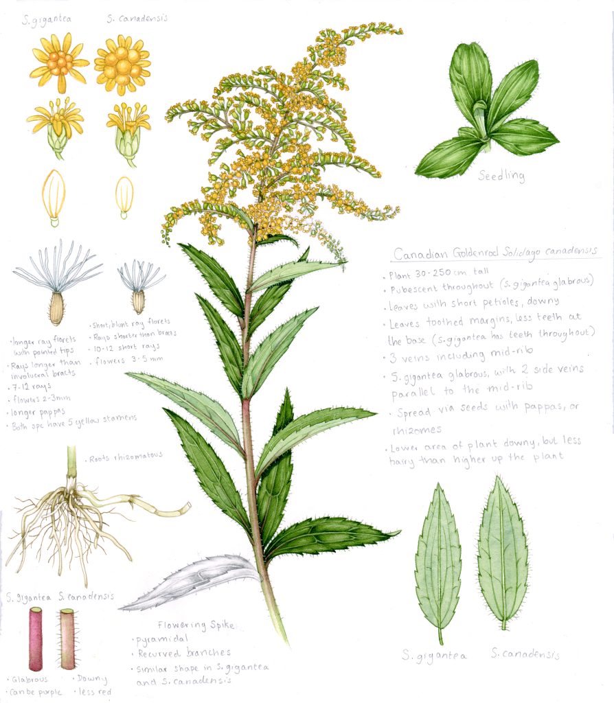
To master Goldenrod in a branding context, one must first understand its technical composition. In the world of design, Goldenrod is a deep, warm shade of yellow that leans toward the orange-brown spectrum. It takes its name from the wildflower of the same name, but in the digital and print realms, it is defined by specific mathematical coordinates that ensure consistency across all brand touchpoints.
Technical Specifications: HEX, RGB, and CMYK
In digital design, the standard “Goldenrod” color is often represented by the Hex code #DAA520. In the RGB (Red, Green, Blue) model used for screens, this translates to roughly 85% red, 65% green, and 13% blue. This high red and green content gives the color its signature glow, while the low blue value prevents it from becoming neon or overly acidic.
For print materials—such as business cards, packaging, and corporate stationery—the CMYK (Cyan, Magenta, Yellow, Key/Black) conversion is critical. Typically, a Goldenrod shade requires a heavy dose of yellow (around 80–90%) and a moderate amount of magenta (around 20–30%) to achieve that warm, honeyed depth. Understanding these specifications is the first step in ensuring brand “color constancy,” the principle that a brand must look the same whether it is viewed on an iPhone screen or a physical billboard.
The Evolution of the Shade in Visual Communication
Goldenrod has transitioned from a naturalistic hue to a staple of mid-century modern design and, more recently, to a “retro-revival” favorite in contemporary branding. In the early 20th century, shades like Goldenrod were often associated with heavy industry and agriculture due to their high visibility and connection to the harvest. Today, however, the shade has been reimagined. It is now frequently used by boutique agencies, tech startups, and premium lifestyle brands that want to move away from the sterile “tech blue” and embrace a more organic, human-centric aesthetic.
The Psychology of Goldenrod in Branding
Every color triggers a physiological and psychological response. While bright yellow is often associated with urgency or caution (think traffic signs and “sale” banners), Goldenrod operates on a different frequency. It is a “mature” yellow. It offers the cheerfulness of the sun without the frantic energy of a highlighter.
Evoking Wisdom and Reliability
From a brand psychology perspective, Goldenrod is frequently used to signal expertise and longevity. Because it sits close to “Gold” on the color wheel, it borrows some of the prestige associated with precious metals. However, because it lacks the metallic shimmer, it feels more accessible and less elitist.
Brands that utilize Goldenrod often want to be seen as “the wise mentor.” It is a color for companies that have been around for a long time or for new companies that want to project the stability of an established legacy. It suggests that the brand is rich in resources—not just financial resources, but intellectual and experiential ones as well.
The Warmth of Human Connection
In an era of digital isolation, many brands are shifting toward “human” palettes. Goldenrod is inherently warm. It mimics the “golden hour” of sunlight, which is naturally pleasing to the human eye. In marketing, this warmth translates to friendliness and inclusivity.
When a brand uses Goldenrod in its UI (User Interface) or environmental design, it creates an inviting atmosphere. It reduces the “friction” of a transaction by making the consumer feel comfortable. This is particularly effective for service-based brands—such as financial consulting or wellness apps—where building a bridge of trust is the primary marketing objective.
Strategic Implementation: Using Goldenrod in Corporate Identity
Choosing a color is only half the battle; the other half is knowing how to deploy it strategically. Goldenrod is a bold choice, and like any strong spice, it must be used with precision to avoid overwhelming the audience.
Contrast and Digital Accessibility
One of the most critical considerations in modern brand strategy is accessibility, specifically adhering to WCAG (Web Content Accessibility Guidelines). Goldenrod, being a mid-tone color, requires careful pairing to ensure that text is readable for all users, including those with visual impairments.
When using Goldenrod for buttons or calls to action (CTAs), designers must ensure high contrast. Pairing Goldenrod with white text is often a mistake, as the contrast ratio is too low for legibility. Instead, sophisticated brands pair Goldenrod with “Rich Black,” “Deep Navy,” or “Charcoal Gray.” This not only meets accessibility standards but also elevates the color, making it look more premium and intentional.
Complementary Color Palettes
Goldenrod is a versatile team player in a brand’s color palette. Its effectiveness is often determined by the colors that surround it:
- The Professional Look: Pairing Goldenrod with Navy Blue creates a classic, authoritative aesthetic. This is a staple in corporate branding for law firms and financial institutions.
- The Earthy/Organic Look: Pairing it with Forest Green or Terracotta creates a natural, sustainable vibe. This is ideal for “farm-to-table” brands or eco-conscious product lines.
- The Modern Tech Look: Pairing it with a very light “Off-White” and a hit of Electric Purple can create a vibrant, high-energy palette for a software company looking to disrupt a market.
Case Studies: Goldenrod in Action
To understand the power of this hue, we can look at how various industries have successfully integrated it into their brand narratives.
Tech and Innovation: Moving Beyond the Blue
For decades, the tech industry was dominated by “IBM Blue.” However, as tech has become more integrated into our daily lives, companies are looking for colors that feel less like a “utility” and more like a “companion.”
A notable trend in Silicon Valley has been the adoption of “warm neutrals” and “sun-baked” colors. Goldenrod has appeared in the branding of creative platforms and project management tools that want to emphasize creativity and the “joy of work.” By using Goldenrod, these companies differentiate themselves from the cold, clinical feel of their competitors, positioning their tools as catalysts for “bright ideas.”
Consumer Goods and the “New Luxury”
The “New Luxury” movement focuses on quality, craft, and story rather than just high price tags. Goldenrod fits perfectly into this narrative. We see this in the packaging of artisanal coffee roasters, boutique skincare lines, and high-end stationery.
In these cases, Goldenrod is often used on textured paper stock or with matte finishes. The lack of shine makes the color feel more “authentic” and “handcrafted.” It suggests that the product inside was made with care and tradition. This is a strategic move to appeal to the “conscious consumer” who values the process as much as the product.
Building Your Brand Palette with Goldenrod
If you are considering integrating Goldenrod into your brand, it is important to treat it as a foundational element rather than a fleeting trend.
Digital vs. Print Applications
Consistency is the hallmark of a professional brand. When implementing Goldenrod, a brand must create a comprehensive style guide. This guide should specify how the color behaves in different environments.
- On a Website: Is Goldenrod the primary background, or is it reserved for the “Sign Up” button?
- On Social Media: How does the color hold up under Instagram filters?
- In Physical Spaces: If the brand has a retail presence, how does Goldenrod look under LED lighting versus natural sunlight?
A robust brand strategy anticipates these variables. It ensures that the “warmth” of the Goldenrod brand is felt whether the customer is clicking a link or walking through a door.

Future-Proofing the Hue
While Goldenrod is currently “on-trend” due to the rise of 70s-inspired aesthetics and organic modernism, it has a timeless quality that allows it to transcend cycles. To future-proof a brand using Goldenrod, designers should avoid pairing it with other “trendy” elements that might age poorly. Instead, focus on the core attributes of the color: its stability, its warmth, and its quiet authority.
By viewing Goldenrod not just as a “color choice” but as a strategic asset, brands can create a visual identity that is both memorable and meaningful. Whether it’s used to highlight a brand’s heritage or to inject warmth into a digital platform, Goldenrod remains one of the most effective tools for building a brand that resonates on a deeply human level. It is, quite literally, the “golden touch” of modern brand strategy.
aViewFromTheCave is a participant in the Amazon Services LLC Associates Program, an affiliate advertising program designed to provide a means for sites to earn advertising fees by advertising and linking to Amazon.com. Amazon, the Amazon logo, AmazonSupply, and the AmazonSupply logo are trademarks of Amazon.com, Inc. or its affiliates. As an Amazon Associate we earn affiliate commissions from qualifying purchases.