
In the competitive landscape of visual identity, the difference between a brand that feels “industrial” and one that feels “artisanal” often lies in the smallest of margins. One of the most critical, yet frequently overlooked, decisions a brand designer makes is the selection of a primary neutral. While pure white (#FFFFFF) has been the default for decades, modern brand strategy is shifting toward more nuanced, organic tones. Enter “Egret.”
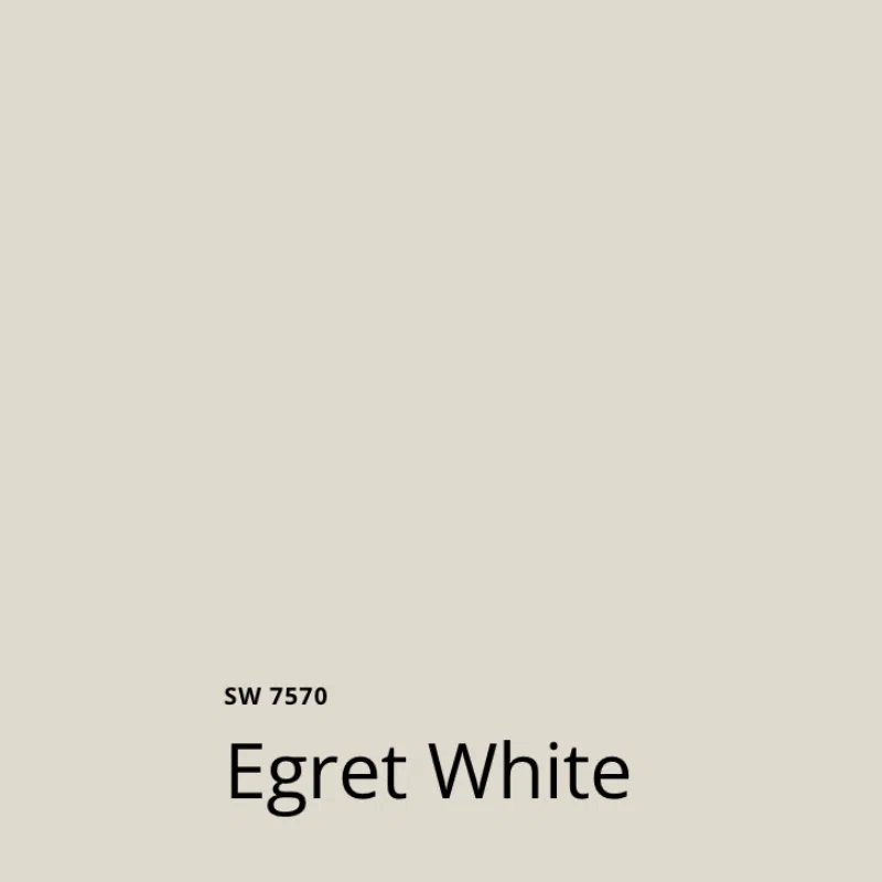
Egret is a sophisticated, warm off-white that sits at the intersection of cream, grey, and pure white. Named after the graceful bird of the same name, this colour embodies elegance, cleanliness, and a subtle organic warmth. In the context of brand strategy and corporate identity, Egret represents a departure from the sterile perfection of digital white toward a more human-centric, premium aesthetic. Understanding how to leverage this specific hue can transform a brand’s visual language from generic to high-end.
The Technical Anatomy of Egret: More Than Just “Off-White”
To effectively use Egret in a branding project, one must first understand its technical composition. Unlike a “cool” white, which may have blue or green undertones, Egret is characterized by its warmth. It typically features a very slight yellow or beige undertone, which prevents it from feeling cold or clinical.
The Hex and RGB Breakdown
In the digital design space, Egret is often represented by Hex codes such as #F3F3E8 or #E8E4E1, depending on the specific paint or fabric manufacturer being referenced (such as Pantone’s 11-0103 TPG). From an RGB perspective, it maintains high values across red, green, and blue, but with a slight leaning toward red and green to create that “creamy” warmth.
For brand designers, this distinction is vital. When viewed on a high-resolution OLED screen, pure white can often be “blinding” or create too much contrast with dark text, leading to eye fatigue. Egret provides a softer backdrop that maintains high legibility while offering a more comfortable user experience.
Egret vs. Cream and Beige
It is a common mistake to conflate Egret with cream or beige. Cream typically has a much higher saturation of yellow, making it feel traditional or perhaps even dated in a tech-forward context. Beige leans harder into brown and grey tones, which can sometimes feel “muddy.”
Egret, conversely, retains the brightness of white while shedding its harshness. It is the “perfect” neutral for brands that want to appear clean and modern without sacrificing the “soul” of their visual identity. It is the colour of high-quality unbleached paper, limestone, and premium linen—materials that naturally communicate value and intentionality.
The Psychology of Egret in Visual Branding
Color psychology is a cornerstone of brand strategy. Every hue triggers a subconscious emotional response, and neutrals are no exception. While bold colours like red or blue command immediate attention, the background neutral dictates the “mood” of the entire brand ecosystem.
Evoking Trust and Professionalism
Pure white is often associated with transparency and simplicity, but it can also feel anonymous. By shifting a brand’s primary neutral to Egret, a company signals that they are detail-oriented. It suggests a brand that doesn’t just accept “defaults” but instead chooses every element of its identity with purpose.
In sectors like boutique finance, luxury real estate, and high-end skincare, Egret evokes a sense of timelessness. It suggests that the brand is established and grounded. It moves away from the “disposable” feel of fast-fashion white and toward the “heirloom” quality of ivory and marble.
The Emotional Resonance of Soft Neutrals
Egret carries an emotional weight of calm and serenity. In a digital world characterized by high-contrast “dark modes” and neon accents, Egret acts as a visual palate cleanser. It provides a sense of space and “breathability” in design layouts.
For lifestyle brands, this is particularly effective. A brand identity built around Egret communicates that the product or service will bring peace and order to the consumer’s life. It is the colour of “Quiet Luxury”—a trend currently dominating the branding of high-end fashion houses and interior design firms. It whispers rather than shouts, inviting the consumer into a world of understated sophistication.
Strategic Implementation: Where Egret Shines
Choosing a colour is only half the battle; the second half is knowing how to apply it across various brand touchpoints. Egret is a versatile workhorse in a brand’s toolkit, performing differently depending on the medium.

Digital Interfaces and User Experience (UX)
In web and app design, the use of Egret as a background colour is a strategic move for accessibility and aesthetics. As mentioned previously, pure white on screens can be harsh. Using an Egret-toned background (#FBFBF9 or similar) creates a “paper-like” feel that makes long-form content easier to read.
Furthermore, Egret provides a more sophisticated backdrop for photography. When product images—especially those with their own subtle shadows and highlights—are placed against an Egret background, they feel more integrated into the page. Pure white backgrounds often make product photos look like they are “floating” in a void; Egret gives them a grounded, physical environment.
Physical Packaging and Tactile Luxury
Where Egret truly excels is in print and packaging. For a brand’s corporate identity, the choice of paper stock is a tactile extension of the brand promise. An Egret-coloured, heavy-weight cotton paper for business cards or letterheads immediately communicates a higher price point and a commitment to quality.
In packaging design, Egret serves as the perfect canvas for minimalist typography. When paired with foil stamping (such as gold, copper, or matte black), Egret creates a multi-dimensional look that pure white cannot achieve. It mimics the look of natural materials, appealing to the modern consumer’s desire for sustainability and “organic” origins, even if the brand is entirely digital.
Building a Brand Palette Around Egret
Egret is rarely used in isolation. Its primary strength lies in its ability to harmonize with and elevate other colours in a brand’s palette.
Pairing with Bold Primary Accents
If a brand uses a bold primary colour—such as Forest Green, Navy Blue, or Terracotta—Egret acts as the perfect stabilizer. While pure white might create a high-contrast, “sporty” look, Egret softens the relationship between the colours.
For example, a sustainable tech brand might use Egret as their primary background, with a vibrant “Digital Leaf” green for call-to-action buttons. The Egret background makes the green pop without making the overall design feel jarring. It provides a naturalistic context that reinforces the “green” brand message.
Creating Monochrome Sophistication
One of the most effective ways to use Egret in brand strategy is within a monochromatic or “tonal” palette. This involves using Egret alongside other shades of off-white, light grey, and warm taupe.
This approach is highly effective for personal branding and high-end consultancy firms. A tonal palette built on Egret communicates a high level of curation. It tells the client that the brand is not interested in fleeting trends but is focused on a cohesive, long-term vision. This “layered” neutral look is currently a hallmark of modern minimalism in the design world.
Case Studies: Brands That Leverage Off-White Identity
While many brands default to white, several industry leaders have utilized off-white and Egret-adjacent tones to define their market position.
The Tech Minimalist Approach
Consider the branding of companies like Notion or Apple in their physical environments. While their digital interfaces often use white for clarity, their physical packaging and retail spaces frequently utilize warmer neutrals to make the technology feel more approachable. By using a tone like Egret, a tech company can “warm up” its image, moving away from the “cold machine” trope toward a “lifestyle tool” identity.
Sustainable and Organic Brand Narratives
Brands in the wellness and organic food space—such as Oatly or Aesop—frequently use Egret-like tones. For these brands, pure white would feel too processed and “bleached.” Egret suggests the raw, the unrefined, and the natural. It aligns perfectly with a brand strategy centered on transparency and “clean” ingredients. By using a colour that looks like natural grain or stone, they reinforce their brand story at every visual touchpoint.

Conclusion: The Strategic Value of the Subtle
What colour is Egret? It is the colour of intentionality. In the realm of brand strategy and corporate identity, it is a tool used to signal quality, warmth, and modern sophistication. It is a bridge between the digital and the physical, the sterile and the organic.
For brand owners and designers, moving away from the default #FFFFFF to a curated neutral like Egret is a powerful way to differentiate a brand in a crowded marketplace. It demonstrates a level of craft and psychological awareness that resonates with the modern, discerning consumer. Whether it is used as the foundation of a minimalist website, the texture of a luxury box, or the primary tone of a corporate headquarters, Egret proves that sometimes, the most subtle choices make the loudest impact.
aViewFromTheCave is a participant in the Amazon Services LLC Associates Program, an affiliate advertising program designed to provide a means for sites to earn advertising fees by advertising and linking to Amazon.com. Amazon, the Amazon logo, AmazonSupply, and the AmazonSupply logo are trademarks of Amazon.com, Inc. or its affiliates. As an Amazon Associate we earn affiliate commissions from qualifying purchases.