
In the competitive landscape of modern branding, color is far more than an aesthetic choice; it is a silent ambassador for a company’s values, mission, and psychological positioning. Light green, a versatile and evocative hue, has surged in popularity across sectors ranging from sustainable technology to holistic wellness and fintech. However, the success of a light-green-based identity depends entirely on its surrounding palette. Understanding what colors go with light green is essential for brand strategists and designers aiming to evoke specific consumer emotions while maintaining visual hierarchy and legibility.

Light green—encompassing shades like mint, sage, pistachio, and pale lime—carries inherent associations with growth, renewal, health, and tranquility. Because it sits at the center of the visible spectrum, the human eye perceives it with ease, making it an ideal anchor for brands that want to appear approachable and balanced. To move beyond a “natural” stereotype, a brand must pair light green with strategic accents that either reinforce its organic roots or pivot toward a more disruptive, modern identity.
The Strategic Psychology of Light Green in Corporate Identity
Before selecting a secondary color, a brand must define the specific “flavor” of light green it intends to use. In brand strategy, the saturation and undertone of the green dictate the psychological foundation of the corporate identity.
Defining the Nuance: Mint vs. Sage vs. Lime
Mint green, with its cool blue undertones, suggests freshness, innovation, and cleanliness. It is frequently utilized in the skincare and dental industries, but it has also found a home in modern software-as-a-service (SaaS) platforms that want to emphasize a “breath of fresh air” in a cluttered market.
Sage green, a desaturated, earthy tone, conveys wisdom, stability, and premium sophistication. This is the “neutral” of the green family, often used by luxury lifestyle brands or high-end consultancies that want to signal environmental consciousness without the vibrancy of a neon palette.
Conversely, light lime or chartreuse greens are high-energy and disruptive. These shades lean into the yellow part of the spectrum, signaling movement, digital-first thinking, and youthful optimism. Understanding these distinctions is the first step in identifying which supporting colors will elevate the brand rather than diminish its impact.
Trust, Wellness, and Sustainability
Light green is the global shorthand for “eco-friendly” and “sustainable.” However, for a brand to stand out in a sea of “greenwashed” competitors, the color must be paired with unexpected tones. By combining light green with sophisticated neutrals or deep jewel tones, a brand can signal that it is not only environmentally conscious but also professional, established, and trustworthy. In the financial sector, light green is increasingly used to represent “green investing” and personal growth, moving away from the traditional, darker “money green” to suggest a more transparent and modern approach to wealth management.
Strategic Color Pairings for Brand Cohesion
Creating a brand palette requires a balance of harmony and contrast. The following pairings represent the most effective ways to utilize light green within a professional design system.
Light Green and Deep Navy: The Authority Pairing
One of the most sophisticated combinations in brand design is the pairing of light green (particularly sage or mint) with deep navy or midnight blue. This combination creates an immediate sense of professional authority. The navy provides the “weight” and corporate stability, while the light green offers a contemporary lift.
This pairing is exceptionally effective for professional services, law firms, and tech companies. It avoids the coldness of a purely blue-and-white palette while maintaining a high level of “trust signals.” When using this combination, the navy should typically serve as the primary color for typography and logos, with light green used as a high-visibility accent for call-to-action buttons, iconography, and graphic elements.
Light Green and Terracotta: The Grounded Humanist
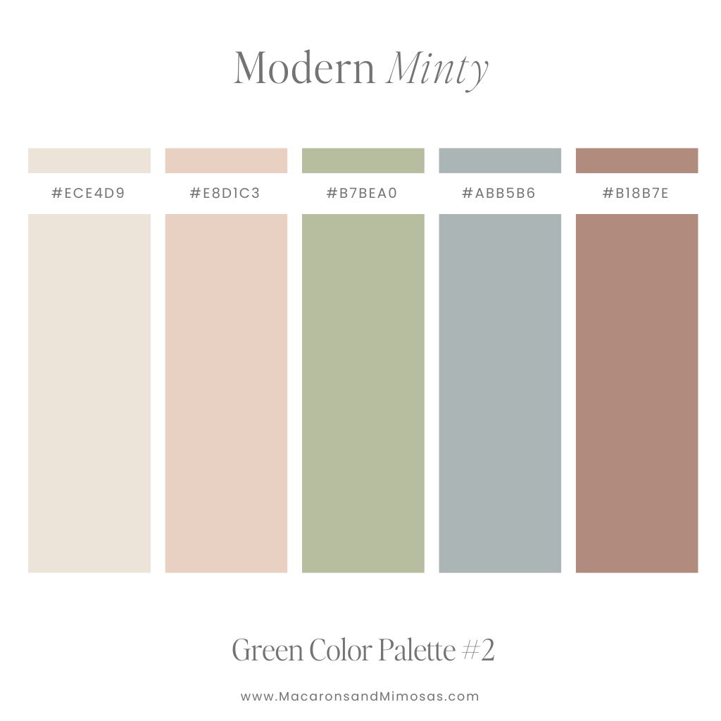
For brands that want to emphasize their human-centric nature—such as ethical consumer goods, interior design firms, or community-based platforms—pairing light green with terracotta or warm clay tones is highly effective. These are complementary-adjacent colors that evoke the natural world (earth and foliage).
This palette feels warm, tactile, and grounded. To keep this looking “brand-first” rather than “decor-first,” it is vital to incorporate plenty of white space and clean, sans-serif typography. The contrast between the cool green and the warm orange-brown creates a vibrant visual tension that feels both energetic and comforting.

Light Green and Charcoal Grey: The Modern Minimalist
When light green is paired with charcoal or slate grey, the result is a sleek, industrial, and highly modern aesthetic. This is a staple in the world of architectural branding and high-end hardware. The grey acts as a sophisticated anchor, allowing the light green to pop with a luminous quality.
This combination is particularly useful for brands that want to appear “tech-forward” but not “tech-cold.” By replacing stark black with a deep charcoal, the brand gains a level of nuance. The light green then serves as a “glow” effect, directing the user’s eye to essential information without the visual fatigue often caused by high-contrast black-and-green “hacker” aesthetics.
Light Green and Soft Mauve: The Modern Disruptor
For a brand looking to challenge industry norms—especially in beauty, fashion, or creative media—pairing mint or light green with a desaturated mauve or plum is a bold, high-fashion choice. This is a sophisticated take on the traditional complementary pairing of red and green.
By using muted, “dusty” versions of these colors, the brand achieves a “retro-modern” look that is currently very popular in Gen-Z and Millennial-focused branding. It feels artistic, intentional, and slightly rebellious.
Implementing Light Green Across Digital and Physical Touchpoints
Once the palette is established, the challenge shifts to implementation. A color that looks beautiful on a brand board may fail in a mobile app or on a matte-finished product box if not handled with technical precision.
UI/UX Design and Accessibility
In digital environments, light green can be notoriously difficult to manage regarding accessibility. One of the most common mistakes in brand strategy is using white text on a light green background. This often fails WCAG (Web Content Accessibility Guidelines) contrast requirements, making the brand inaccessible to users with visual impairments.
To ensure a light-green brand is digitally inclusive, designers should use the color for large graphic blocks, icons, or decorative elements, but rely on darker tones (like the aforementioned navy or charcoal) for body text and critical navigational elements. If light green must be used for buttons, it should be paired with dark text to ensure the “label” is legible.
Print, Packaging, and Materiality
In physical branding, light green takes on different characteristics depending on the substrate. On recycled, uncoated paper, light green can appear more “organic” and muted, reinforcing a brand’s commitment to the environment. On high-gloss packaging, it can appear more “neon” and energetic, suitable for energy drinks or tech gadgets.
Strategic brands often use “spot UV” or metallic foils to add depth to light green. For example, a sage green box with a gold-foil logo suggests a level of premium luxury that a flat print cannot achieve. When selecting colors to go with light green in print, always consider the “temperature” of the paper—a creamy, warm paper will make mint green look dull, whereas a bright white paper will help it pop.
Maintaining Brand Consistency with Light Green
The final pillar of a successful brand identity is consistency. Light green is a color that can easily “drift” toward yellow or blue depending on the monitor or printing process.
Establishing Color Standards
To maintain a cohesive corporate identity, a brand must define its light green across multiple formats:
- HEX Codes: For web and digital applications.
- CMYK: For standard four-color printing.
- Pantone (PMS): For precise color matching in logos and high-end packaging.
- RGB: For screen-based video and broadcast media.
By defining these standards, a brand ensures that its “Mint” doesn’t look like “Seafoam” when viewed on a smartphone versus a physical storefront.
The Role of White Space
In any palette involving light green, “white space” (or negative space) is a critical secondary “color.” Because light green is airy and light, it needs room to breathe. Overcrowding a light green design with too many competing colors or heavy textures can make the brand feel cluttered and “cheap.” Using generous margins and a clean, minimalist layout allows the light green to communicate its primary message: clarity, growth, and a forward-thinking perspective.
Ultimately, the colors that go with light green are those that serve the brand’s overarching narrative. Whether it is the professional weight of navy, the grounded warmth of terracotta, or the sleek modernity of charcoal, the right pairing transforms a simple color into a powerful tool for market differentiation and consumer connection.
aViewFromTheCave is a participant in the Amazon Services LLC Associates Program, an affiliate advertising program designed to provide a means for sites to earn advertising fees by advertising and linking to Amazon.com. Amazon, the Amazon logo, AmazonSupply, and the AmazonSupply logo are trademarks of Amazon.com, Inc. or its affiliates. As an Amazon Associate we earn affiliate commissions from qualifying purchases.