
Understanding the biological development of human vision is more than just a scientific curiosity; for brand strategists, product designers, and marketers, it is a foundational blueprint for capturing the attention of the world’s most influential consumer demographic: parents. When we ask, “what colors can infants see,” we are really asking how brands can optimize their visual communication to align with the physiological capabilities of their youngest end-users while simultaneously appealing to the aesthetic and emotional needs of the primary buyers.
In the competitive landscape of the $100 billion global baby care market, the application of developmental color theory is a critical differentiator. Brands that successfully bridge the gap between neonatal sensory limitations and sophisticated corporate identity are those that dominate the nursery aisle. To master this, one must understand the timeline of infant visual maturity and how each stage dictates a specific approach to brand identity and product packaging.
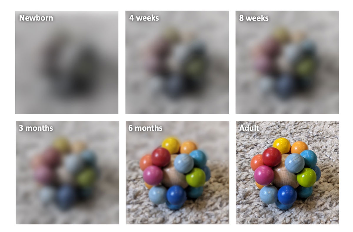
The Science of Early Visual Development: A Blueprint for Designers
At birth, an infant’s visual system is the least developed of all the senses. The retina’s cone cells, which are responsible for detecting color and fine detail, are not yet fully functional. For the first few weeks of life, a newborn perceives the world primarily in shades of gray, black, and white. This biological reality presents a unique challenge and opportunity for brand strategy. If a brand’s primary visual identity relies on subtle pastels or complex gradients, it is effectively invisible to the “user” in the first month of life.
High-Contrast and the “Grayscale” Phase
The strategic move for brands targeting the “newborn” segment (0–2 months) is the embrace of high-contrast visual identities. Research shows that infants are most attracted to bold patterns and sharp borders where black meets white. This is not merely a preference; it is a physiological necessity for visual stimulation and brain development.
From a branding perspective, companies like Lovevery and Manhattan Toy Company have built entire corporate identities around this “grayscale” phase. By utilizing high-contrast black-and-white patterns in their packaging and core product design, these brands signal “developmental expertise” to the parent. The visual language itself becomes a value proposition. When a parent sees a black-and-white geometric pattern, they don’t just see a design; they see a brand that understands their child’s needs. This builds immediate trust—a core pillar of brand equity.
The Introduction of Primary Hues: Red, Green, and Beyond
As the infant reaches two to three months, the color-detecting cones in the eye begin to mature. The first color an infant can distinguish is red. This is followed closely by green, and eventually blue and yellow. This transition marks a critical pivot point for brand design.
In this stage, “visual salience”—the ability of an object to stand out from its background—is driven by saturated primary colors. Brands that move from monochromatic palettes to bold, primary-focused designs are aligning with the infant’s expanding visual world. This is why heritage brands like Fisher-Price and LEGO have historically leaned heavily on a primary color palette. Their brand strategy is rooted in being the most “visible” option in a cluttered environment. For a marketer, understanding that a three-month-old will look at a red logo long before they notice a pale blue one is essential for shelf-placement strategy and digital ad design.
Strategic Branding: Capturing Attention in the Nursery Aisle
The “nursery aisle” is one of the most crowded retail environments in the world. To cut through the noise, brands must employ a sophisticated understanding of how color affects both the infant’s attention and the parent’s purchasing decision. This requires a dual-track branding strategy: one track for the developing eyes of the child and another for the emotional psyche of the parent.
Visual Salience vs. Aesthetic Softness
There is a fascinating tension in modern baby branding between “visual salience” (attracting the baby) and “aesthetic softness” (attracting the parent). In the early 2000s, the market was dominated by high-saturation primary colors. However, recent brand trends have shifted toward “muted” or “earthy” palettes—terracotta, sage green, and mustard yellow.
This shift represents a move toward lifestyle-centric branding. Modern parents often view their children’s gear as an extension of their own personal brand and home decor. A neon-orange plastic toy might be highly visible to an infant, but it may be perceived as “clutter” by a design-conscious parent. The most successful modern brands, such as Stokke or Liewood, have mastered the art of using muted tones for the overall product while incorporating “points of interest” in higher-contrast colors to engage the child. This creates a sophisticated corporate identity that fits into a curated lifestyle while still fulfilling its functional purpose.
Case Studies in Toy and Gear Branding
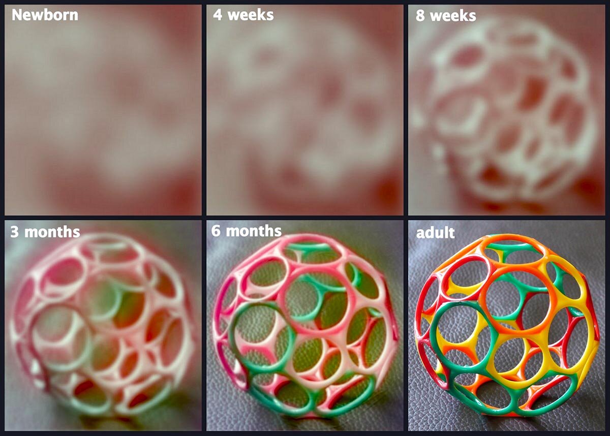
Consider the brand evolution of Lamaze (under TOMY). Their strategy explicitly uses the “Infant Development System” as a brand pillar. Each product is color-coded based on the stages of visual development. This isn’t just product design; it is a marketing masterclass. By labeling products for specific visual milestones—Stage 1 (High Contrast), Stage 2 (Primary Colors), Stage 3 (Complex Patterns)—they create a “subscription-like” logic for the consumer. The parent is incentivized to return to the brand as the child’s vision matures.
Conversely, look at the rise of “Millennial” baby brands like Mushie or Kyte Baby. Their brand strategy leans heavily into the “Money” side of design—creating an aura of premium quality through color. By avoiding the traditional “infant” primary colors and opting for a sophisticated, tonal palette, they position themselves as high-end, luxury options. They are not marketing to the infant’s eyes; they are marketing to the parent’s aspiration for a cohesive, adult-adjacent aesthetic.
Color Psychology and Parent-Consumer Behavior
While the biological facts of what infants see provide the technical constraints, the psychology of how parents perceive those colors provides the marketing opportunity. Color is a powerful driver of brand perception, evoking specific emotions and associations that can influence a buyer’s willingness to pay a premium.
Emotional Resonance with Primary Caregivers
In brand strategy, blue is often associated with trust and safety, while green evokes health and organic qualities. For baby brands, these associations are amplified. A brand that utilizes soft greens and creams is positioning itself in the “organic/natural” niche, which is one of the highest-growth sectors in personal finance and retail.
When a parent is looking for a brand that represents “purity,” they are subconsciously scanning for specific color cues. Even if an infant cannot see the nuance between “eggshell” and “ivory,” the parent perceives a brand using these tones as more premium and “cleaner” than a brand using bright, synthetic-looking plastics. The color strategy here is about mitigating risk—a primary concern for new parents—and establishing a sense of calm in what is often a chaotic life stage.
Balancing Infant Development with Interior Trends
The most significant challenge for a modern brand designer is balancing the “Developmental Brand” with the “Interior Brand.” There is a growing movement of “beige-parenting” (a term often used in social media marketing circles) where parents prioritize neutral-colored environments.
For a brand to be successful in this climate, it must innovate. This has led to the rise of “reversible” or “adaptable” visual identities. High-contrast, black-and-white elements are often placed on the “functional” side of a product (the part the baby sees), while the “aesthetic” side (the part the parent sees) features muted, trend-forward colors. This dual-sided brand strategy allows a company to claim both scientific superiority and design leadership.
Implementation: Creating a Multi-Generational Visual Identity
To execute a brand strategy that respects the science of infant vision while capturing market share, companies must follow a disciplined design process. This involves more than just picking a color palette; it involves a deep dive into the “visual ergonomics” of the nursery.
Design Principles for High-Growth Baby Brands
- Hierarchy of Contrast: Every brand touchpoint—from the logo on the box to the UI of a companion app—should have a clear hierarchy of contrast. In the early stages of a brand’s lifecycle, the “hero” images should feature high-contrast elements to ensure they are the first thing a parent notices in a social media feed or on a retail shelf.
- Saturation as a Signal: Use color saturation strategically. High saturation should be used for “calls to action” or “engagement points” for the child. Muted tones should be used for the “structural” elements of the brand to convey sophistication and stability.
- Color Consistency Across Mediums: An infant’s world is small. Consistency in color helps with brand recognition as their vision matures. If a brand’s “signature red” looks different on the packaging than it does on the physical toy, it weakens the brand’s visual authority.

Digital Design for Modern Parenting Apps
As the parenting market moves increasingly toward digital tools—sleep trackers, developmental milestones apps, and telehealth—the science of infant vision becomes even more critical for UX/UI designers. Dark mode vs. light mode, the use of high-contrast icons for “baby-facing” screen time, and the emotional impact of the color palette on a sleep-deprived parent are all vital considerations.
A digital brand strategy must account for the fact that parents are often viewing these interfaces in low-light environments (during middle-of-the-night feedings). Soft, blue-light-filtered palettes are not just a feature; they are a brand promise of “care” and “wellness.” By understanding that the parent’s eyes are as tired as the infant’s are underdeveloped, a brand can create a user experience that feels intuitive and supportive.
In conclusion, the question of “what colors can infants see” is a gateway into a sophisticated world of brand strategy and consumer psychology. By aligning visual identity with the biological reality of human development, brands can create products that are not only functional but also emotionally resonant and commercially successful. The brands that win are those that see the world exactly as their customers do—at every stage of growth.
aViewFromTheCave is a participant in the Amazon Services LLC Associates Program, an affiliate advertising program designed to provide a means for sites to earn advertising fees by advertising and linking to Amazon.com. Amazon, the Amazon logo, AmazonSupply, and the AmazonSupply logo are trademarks of Amazon.com, Inc. or its affiliates. As an Amazon Associate we earn affiliate commissions from qualifying purchases.