
In the realm of visual communication and corporate identity, color is more than a mere aesthetic choice; it is a psychological tool and a strategic asset. When designers and brand strategists ask, “What color mixture makes brown?” they are rarely looking for a simple elementary school formula. Instead, they are exploring the nuances of depth, warmth, and reliability that earth tones bring to a brand’s narrative. Brown is a complex, composite color that requires a sophisticated understanding of color theory to execute correctly in digital and physical branding.
Understanding the technical mixture of brown—and how those mixtures influence brand perception—is essential for creating a cohesive corporate identity. Whether a brand aims to project rugged durability, artisanal craftsmanship, or understated luxury, the specific “recipe” of brown used can shift the entire emotional response of the target audience.
The Technical Foundation: How to Mix the Perfect Brand Brown
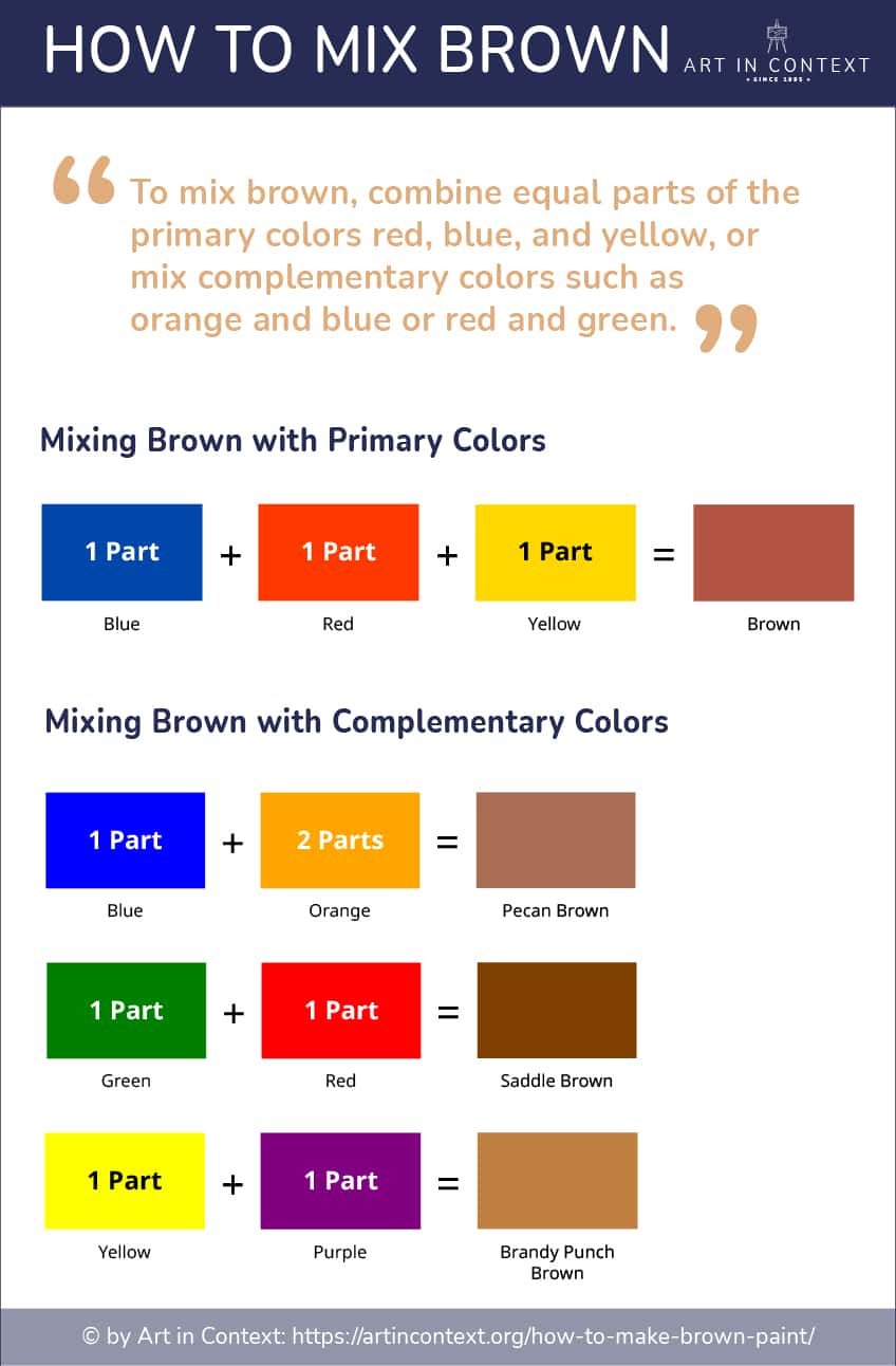
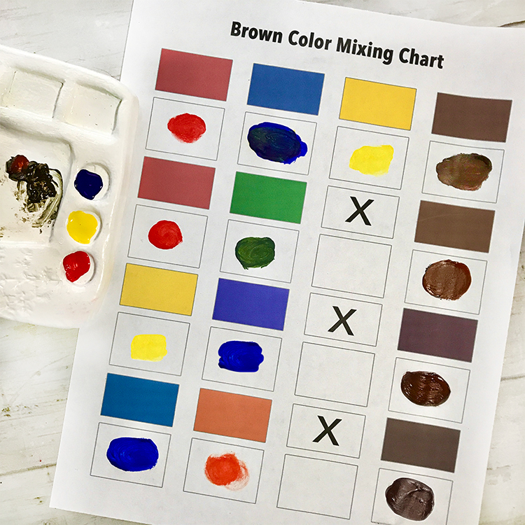
At its most basic level, brown is created by mixing the three primary colors (red, yellow, and blue) or by combining a primary color with its complementary secondary color. However, in professional brand design, the mixture must be precise to ensure consistency across various media, from digital interfaces to high-end packaging.
The Complementary Mixture Strategy
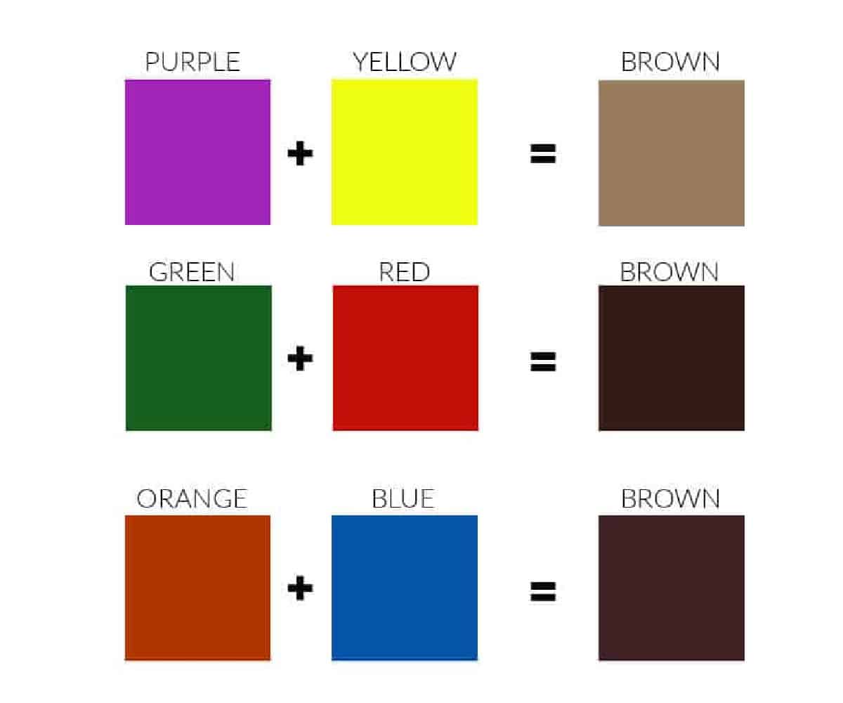
The most common way to achieve a balanced brown is by mixing complementary colors—those that sit opposite each other on the color wheel. Each pairing results in a different “flavor” of brown, which brand strategists select based on the desired brand personality:
- Blue and Orange: This mixture typically results in a deep, rich brown. Because blue is a cool tone and orange is warm, the resulting brown is often neutralized and sophisticated. This is ideal for corporate brands that want to appear grounded but modern.
- Red and Green: This combination produces a warmer, more rustic brown. It often leans toward terracotta or sienna, making it a favorite for brands in the organic food, agriculture, or outdoor industries.
- Yellow and Purple: This mixture creates a mustard-leaning or olive-toned brown. It is a more unconventional choice, often used in avant-garde fashion or boutique branding to signal uniqueness and creativity.
Digital vs. Physical Mixing: RGB and CMYK
For a brand strategist, the mixture of brown changes depending on the medium. In the digital space (RGB), brown is achieved by reducing the intensity of red and green while significantly lowering the blue. For example, a classic “Chocolate Brown” might have an RGB value of (60, 30, 0).
In print (CMYK), achieving a consistent brown is notoriously difficult. It often requires a “rich black” base or a specific Pantone Matching System (PMS) spot color to prevent the brown from appearing “muddy” or shifting toward an unintentional purple or green hue during the printing process. Understanding these technical mixtures ensures that a brand’s identity remains stable whether it is viewed on a smartphone or a corrugated cardboard shipping box.
The Psychology of Brown in Brand Strategy
Once the technical mixture is mastered, the strategic application begins. In the landscape of corporate identity, brown is often undervalued compared to the high-energy reds or the trust-inducing blues. However, brown occupies a unique psychological space that can give a brand a competitive edge by signaling stability, comfort, and authenticity.
Reliability and Dependability
Brown is the color of the earth, wood, and stone. It is inherently stable. Brands that utilize deep, chocolatey browns or slate-browns are often trying to communicate that they are “salt of the earth” and dependable. This is why brown is a staple in the logistics and construction industries. It suggests a foundation that cannot be easily shaken, providing a sense of security to the consumer.
Luxury and Understated Sophistication
While bright colors often scream for attention, brown whispers. In the world of high-end fashion and luxury goods, specific mixtures of brown—such as camel, taupe, and espresso—are used to signal timelessness. Unlike “trendy” colors that may look dated within a few seasons, a well-mixed brown suggests heritage and longevity. It moves a brand away from “fast fashion” and toward “investment pieces.”
Ruggedness and the Great Outdoors
For lifestyle and apparel brands targeting the adventurer, the mixture of brown should lean toward the umbers and ochres found in nature. This connects the brand to the physical world. When a consumer sees these earthy mixtures, their brain subconsciously associates the product with durability and the ability to withstand the elements. It frames the brand as a tool for exploration rather than just a commercial product.
Case Studies: Strategic Mastery of the Brown Palette
Examining successful global brands reveals how the “mixture” of brown is used to carve out a specific market position. These companies don’t just use brown; they own a specific shade that has become synonymous with their corporate values.
UPS: “What Can Brown Do For You?”
United Parcel Service (UPS) is perhaps the most famous example of a brand claiming a color. Their “Pullman Brown” was originally chosen because it hid dirt well on delivery vehicles, but it evolved into a powerful brand asset. By leaning into a color that most competitors avoided, UPS created a distinct visual identity that communicates efficiency, no-nonsense service, and institutional strength. Their mixture is specific, leaning toward a dark, professional sheen that distinguishes them from the “postal blue” or “courier orange” of their rivals.
Louis Vuitton: Heritage and Exclusivity
The Louis Vuitton monogram is a masterclass in using brown to denote luxury. By mixing a dark, muted brown background with lighter, golden-tan accents, the brand creates a high-contrast look that feels both antique and modern. This specific mixture evokes the high-quality leather and wood used in their original trunks, rooting the modern multi-billion dollar brand in its 19th-century craftsmanship roots.
Aesop: The Alchemist’s Aesthetic
The skincare brand Aesop uses brown through its iconic amber glass packaging. This choice is both functional (protecting the product from UV light) and strategic. The deep amber-brown mixture creates an “apothecary” feel, signaling that the brand is rooted in science, botanical expertise, and minimalism. In a crowded beauty market full of white and pastel packaging, Aesop’s brown bottles stand out as markers of intellectualism and refined taste.
Designing the Brand Identity: Implementing Earth Tones
Integrating brown into a brand’s visual identity requires more than just picking a shade; it requires a holistic approach to the brand’s color architecture.
Pairing Brown with Accent Colors
A brand that is 100% brown can feel heavy or stagnant. The mixture must be balanced with secondary colors to create visual interest.
- Brown and Gold: This is the gold standard for luxury branding, creating a sense of wealth and tradition.
- Brown and Cream: This combination is soft and approachable, often used in the food and beverage industry (coffee, chocolate, bakeries) to evoke warmth and comfort.
- Brown and Turquoise: A modern, “southwestern” or “bohemian” pairing that balances the heaviness of the earth tone with a pop of vibrant energy.
The Role of Texture and Materiality
In branding, the “mixture” of color is often influenced by the material it sits on. A brown logo printed on recycled kraft paper looks and feels very different than the same color embossed on matte-finish plastic. Brand strategists must consider how the color brown interacts with textures. For sustainable brands, the “mixture” of brown is often achieved through the substrate itself—using unbleached paper or natural wood—to reinforce the message of environmental responsibility without needing excess ink.
The Future of Earth Tones in a Digital-First World
As we move toward a more digital-centric economy, the use of brown in branding is evolving. In the early days of the internet, brown was often avoided because it didn’t render well on low-resolution screens. However, with the advent of OLED displays and high-fidelity mobile screens, the nuances of earth tones can now be fully appreciated.
We are currently seeing a “Return to Nature” trend in brand design. As consumers become fatigued by the “Tech Blue” and “Startup Pink” that dominated the 2010s, they are gravitating toward brands that feel more human and grounded. The mixture of brown provides a visual “reset.” It offers a sense of calm and tactile reality in an increasingly virtual world.
For the modern brand strategist, mastering the mixture of brown is an exercise in balance. It is about finding the sweet spot between the technical requirements of color production and the psychological needs of the consumer. By understanding how to mix and apply these tones, brands can build identities that are not just seen, but felt—creating a lasting impression of stability, quality, and timeless relevance.
aViewFromTheCave is a participant in the Amazon Services LLC Associates Program, an affiliate advertising program designed to provide a means for sites to earn advertising fees by advertising and linking to Amazon.com. Amazon, the Amazon logo, AmazonSupply, and the AmazonSupply logo are trademarks of Amazon.com, Inc. or its affiliates. As an Amazon Associate we earn affiliate commissions from qualifying purchases.