
In the sophisticated world of brand strategy, color is far more than an aesthetic choice; it is a psychological tool and a silent communicator. While many emerging brands gravitate toward the high-energy vibrancy of neon or the clinical safety of corporate blue, brown remains one of the most versatile and underutilized assets in the designer’s toolkit. Understanding what color mix makes brown—and more importantly, how to manipulate those mixes to evoke specific brand emotions—is a critical skill for creative directors and marketing strategists alike.
Brown represents stability, reliability, and heritage. It is the color of the earth, the grit of raw materials, and the warmth of artisanal craftsmanship. However, creating the “perfect” brown for a brand requires a deep dive into color theory, moving beyond simple pigments into the strategic application of visual identity.
The Fundamental Color Theory of Brown in Brand Design
To understand how to mix brown, one must first view color through the lens of relationships. Brown is technically a composite color, meaning it is created by mixing multiple hues. In the context of branding, the specific mix you choose determines whether your brand feels “luxurious and mahogany” or “organic and rustic.”
The Primary Triad Method
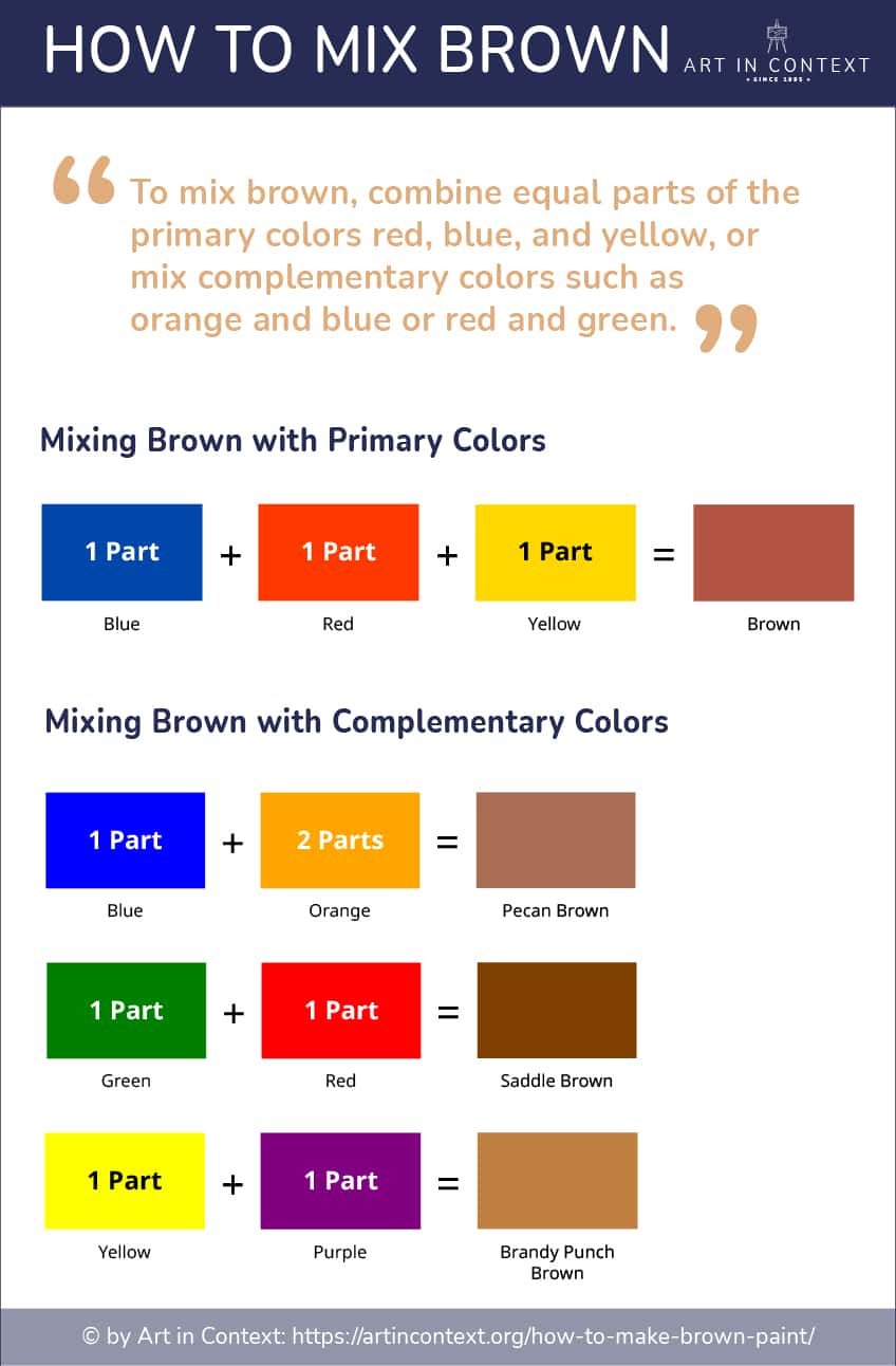
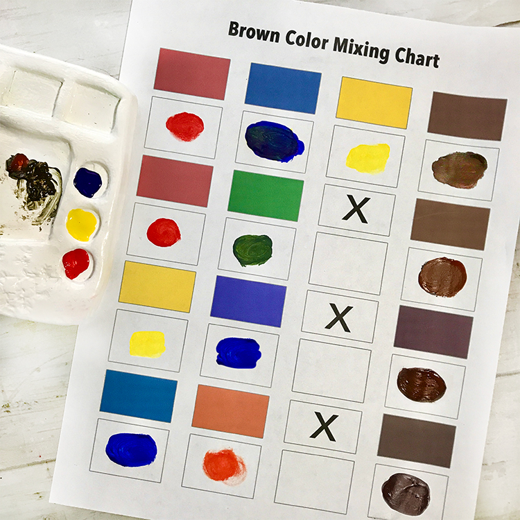
The most common answer to what color mix makes brown is the combination of all three primary colors: red, yellow, and blue. In equal parts, these colors neutralize one another to create a deep, dark brown. From a brand strategy perspective, this “triad brown” serves as a robust foundation. It is balanced and grounded. By slightly adjusting the ratio—adding more yellow for a golden ochre or more red for a burnt sienna—a brand can shift its personality from sunshine-drenched warmth to intense, passionate stability.
The Complementary Strategy
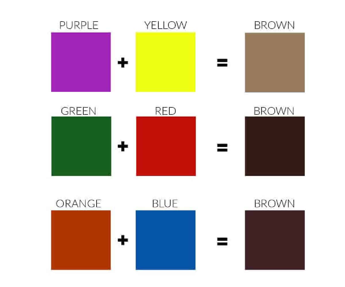
A more nuanced way to mix brown is by combining a primary color with its opposite (complementary) secondary color. This is where brand identity becomes truly customized:
- Blue and Orange: This mix creates a sophisticated, modern brown. Because blue is a “cool” color and orange is “warm,” the resulting brown is often neutral and exceptionally professional.
- Red and Green: This combination produces a deep, earthy brown reminiscent of forest floors and organic matter. It is a go-to for sustainable brands or companies emphasizing natural origins.
- Yellow and Purple: Mixing these produces a more vibrant, eccentric brown. It often carries a “vintage” or “royal” undertone, perfect for brands that want to feel established yet unique.
Tones, Tints, and Shades
A brand’s color palette is rarely just one flat brown. Strategic designers use tints (adding white), shades (adding black), and tones (adding gray) to create a comprehensive visual system. A “tinted” brown becomes tan or beige, projecting cleanliness and minimalism. A “shaded” brown becomes espresso or chocolate, projecting luxury, depth, and exclusivity.
The Psychological Impact of Brown in Brand Strategy
Every color mix carries a subconscious weight. When a brand chooses a specific brown, they are tapping into a legacy of human perception. Understanding the psychology behind the mix allows a brand to bypass traditional marketing noise and speak directly to consumer instincts.
Reliability and Longevity
Brown is the color of the earth and wood—elements that have stood the test of time. For a brand in the financial, logistics, or legal sectors, brown communicates that the company is unshakeable. It suggests that the brand is not a “flash in the pan” but a permanent fixture in the market. This is the “UPS Effect.” By owning a specific mix of Pullman Brown, the company associates its identity with the reliability of a physical asset.
The Artisan and the Premium
In the luxury sector, the color mix for brown shifts toward deeper, richer tones like mahogany, walnut, and cognac. These shades evoke leather, aged spirits, and fine woodwork. When a brand uses these mixes, it signals craftsmanship and attention to detail. It suggests that the product was not mass-produced in a factory but carefully curated by an artisan. This is why heritage fashion houses and premium automotive brands frequently utilize brown leather textures and deep brown accents in their corporate identity.
Sustainability and the “Green-Brown” Connection
As consumer demand for eco-friendly products rises, the strategic use of “earthy” brown has become a hallmark of sustainable branding. By mixing brown with subtle green undertones, brands communicate a “farm-to-table” or “raw-material” ethos. This visual shorthand tells the consumer that the product is organic, biodegradable, or sourced responsibly from nature. It strips away the artificiality of bright plastics, replacing it with the honesty of the soil.
Technical Precision: Mixing Brown Across Digital and Physical Media
While mixing paint is a physical process, brand designers must translate these “mixes” into digital environments (RGB) and print media (CMYK). Consistency is the hallmark of a professional brand, and achieving the same “brown” across a website, a business card, and a product package requires technical mastery.
The RGB Model for Digital Brand Assets
In the digital space, colors are mixed using light. To create brown in RGB (Red, Green, Blue), the values are typically skewed toward red and green with a lower blue value. For example, a classic “Saddle Brown” might have an RGB value of (139, 69, 19). For a brand strategist, selecting the right Hex code is paramount. A digital brown must be tested across OLED and LCD screens to ensure it doesn’t appear too “muddy” or “gray” on mobile devices, which could negatively impact the user experience.
The CMYK Model for Physical Collateral
When printing brand assets—packaging, brochures, and signage—the color mix shifts to Cyan, Magenta, Yellow, and Black (CMYK). Achieving a rich brown in print is notoriously difficult because “rich black” can easily overwhelm the other pigments. A strategic designer will often use a “double-hit” or a specific Pantone Matching System (PMS) color to ensure that the brown remains vibrant and does not look like a printing error. This level of precision ensures that the brand’s physical presence matches its digital promise.
Accessibility and Contrast
In modern brand strategy, inclusivity is key. Brown can be a challenging color for web accessibility (WCAG standards) if it lacks sufficient contrast with text. When mixing brown for a brand’s primary UI/UX palette, designers must ensure that the “lightness” value is high enough for dark text or low enough for white text to be legible. A “coffee” brown might look beautiful, but if it fails accessibility tests, it can alienate a significant portion of the audience.
Designing a Cohesive Brand Identity with Earthy Palettes
Knowing what color mix makes brown is only the beginning. The real magic happens when brown is paired with a secondary palette to create a cohesive brand identity. Brown acts as a “neutral anchor,” allowing other colors to pop without feeling overwhelming.
The High-Contrast Modernist Look
Pairing a deep chocolate brown with a vibrant neon cyan or a bright orange creates a look that is both grounded and futuristic. This strategy is often used by tech companies that want to feel “human” and “approachable” rather than cold and clinical. The brown provides the human element, while the bright accent provides the innovation.
The Monochromatic Sophisticate
A brand can build an entire identity using only variations of brown. By mixing different amounts of white and black into a base brown, a designer creates a “tone-on-tone” look. This is highly effective for lifestyle brands, interior design firms, and high-end spas. It creates an atmosphere of calm, serenity, and understated elegance.
The Complementary Duo
One of the most classic combinations in branding is brown and blue. Because they represent the earth and the sky/sea, they are naturally pleasing to the human eye. In a brand context, this pairing suggests a holistic, world-encompassing perspective. It is a favorite for travel brands, outdoor gear retailers, and international non-profits.
Strategic Case Studies: Leveraging Brown for Market Authority
To see the power of the brown color mix in action, we can look at global leaders who have successfully claimed this territory.
UPS: The Master of Pullman Brown
UPS is perhaps the most famous example of a brand “owning” brown. Their specific mix, known as Pullman Brown, was originally chosen because it hid dirt well on delivery vehicles. However, over decades, the strategy shifted. They leaned into the color, even adopting the slogan “What can Brown do for you?” By embracing a color many thought was “boring,” UPS built an identity centered on no-nonsense, hard-working reliability.
Louis Vuitton: Heritage through the Monogram
The Louis Vuitton monogram is a masterclass in using brown to denote luxury. The mix of a deep, muted brown base with a golden-tan logo creates a visual language of old-world travel and high-end craftsmanship. This brown isn’t just a color; it’s a symbol of status. It proves that when mixed correctly, brown can be the most expensive-looking color in a brand’s arsenal.
Aēsop: The Apothecary Aesthetic
The skincare brand Aēsop uses amber-brown glass packaging to protect its products from UV light, but this functional choice has become a core part of their brand strategy. The brown bottles, combined with minimalist black-and-white labels, evoke an “apothecary” or “scientific” feel. It suggests that the brand is focused on the integrity of the ingredients rather than the flashiness of the marketing.
In conclusion, the question of what color mix makes brown is the entry point into a vast world of strategic brand design. Whether it is the primary triad of red, yellow, and blue or the sophisticated pairing of complementary hues, the “brown” a brand chooses to present to the world is a declaration of its values. By mastering these mixes, designers and strategists can create identities that feel as permanent as the earth and as rich as the heritage they aim to represent. Brown is not just a neutral; it is a foundation for trust, luxury, and sustainable growth in a crowded marketplace.
aViewFromTheCave is a participant in the Amazon Services LLC Associates Program, an affiliate advertising program designed to provide a means for sites to earn advertising fees by advertising and linking to Amazon.com. Amazon, the Amazon logo, AmazonSupply, and the AmazonSupply logo are trademarks of Amazon.com, Inc. or its affiliates. As an Amazon Associate we earn affiliate commissions from qualifying purchases.