
When a brand designer or product strategist asks, “What color is nickel?” they are rarely looking for a simple hex code. While the literal answer is a silvery-white metal with a distinct golden or warm undertone, the strategic answer is far more complex. In the world of high-end branding, corporate identity, and product design, nickel represents a specific psychological middle ground between the sterile industrialism of chrome and the decadent tradition of gold.
Understanding the nuance of nickel is essential for brands looking to communicate reliability, “quiet luxury,” and timelessness. Unlike the cool, blue-ish tint of chrome or the stark neutrality of stainless steel, nickel possesses a subtle warmth that evokes a sense of heritage and human-centric design. This article explores how the specific aesthetic properties of nickel are leveraged across brand strategy to influence consumer perception and establish a premium market position.

Defining the Nickel Aesthetic: More Than Just Silver
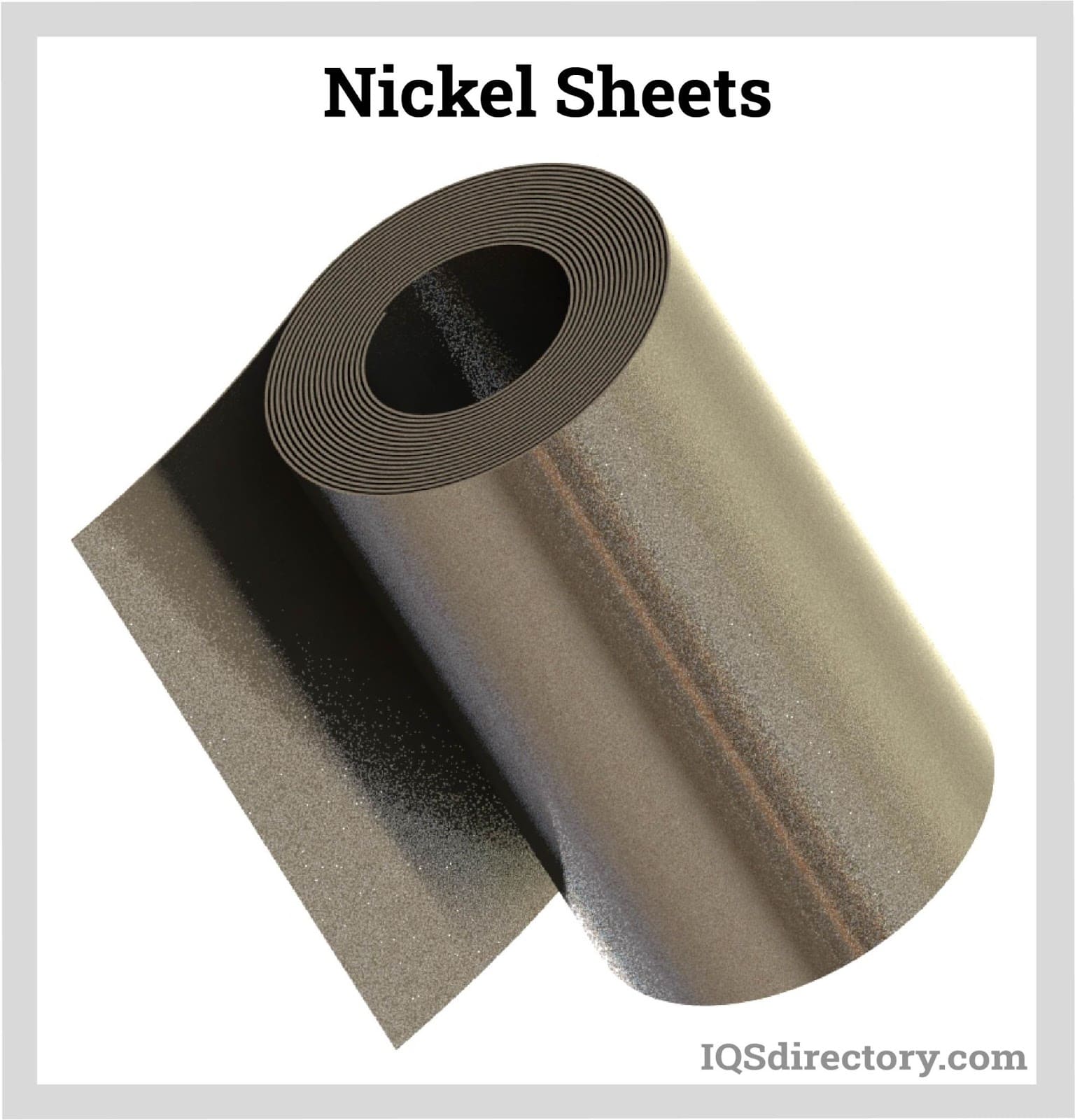
To define the color of nickel is to understand the physics of its luster. In its natural state, nickel is a lustrous, silvery-white metal. However, its most defining characteristic in a design context is its yellow or pale gold undertone. This “warmth” is what separates it from its metallic cousins and makes it a powerful tool in a brand’s visual arsenal.
The Psychology of Luster and Warmth
Color psychology suggests that bright silvers and chromes are perceived as fast, modern, and high-tech. They are the colors of the “future.” Nickel, however, leans into the psychology of the “permanent.” Because it carries a hint of warmth, it feels more organic and approachable than cold steel. For a brand, using nickel-toned finishes or color palettes signals that the company is established and trustworthy. It is the color of a brand that doesn’t need to shout to be noticed.
Nickel vs. Chrome vs. Stainless Steel
In brand strategy, the choice between different metallic finishes can completely alter the brand’s “voice.”
- Chrome: Highly reflective, blue-toned, and aggressive. It is used by brands that want to emphasize speed, cleanliness, and modernity (e.g., automotive trim, modern tech gadgets).
- Stainless Steel: Neutral, utilitarian, and industrial. It is the choice for brands emphasizing function and durability over aesthetic flair.
- Nickel: Warm, subtle, and sophisticated. It is the preferred choice for brands aiming for “transitional” design—merging the traditional with the contemporary.
When translated to digital design, “Nickel” is often represented by a complex gradient of greys with a slight increase in the red and yellow channels to mimic that signature warmth.
Nickel in Brand Identity: Communicating Reliability and Heritage
In the competitive landscape of corporate identity, the choice of a metallic palette is a foundational decision. Nickel-toned aesthetics have become synonymous with “Quiet Luxury”—a trend where brands avoid overt logos and flashy colors in favor of high-quality materials and subtle finishes.
The “Quiet Luxury” Trend in Corporate Design
For brands in the financial services, luxury real estate, or high-end lifestyle sectors, the nickel palette serves as a visual shorthand for stability. A brand that utilizes satin nickel textures in its physical office spaces or high-end embossed nickel foil on its stationary communicates a “built-to-last” philosophy. It suggests that the brand is not a “flash in the pan” but a legacy institution.
This is particularly effective in personal branding for consultants and executives. A visual identity that uses the muted, warm grey of nickel suggests a personality that is polished but not ostentatious; professional but accessible.
Case Study: The Shift Toward Soft Metals in Consumer Tech
We have seen a significant shift in the tech industry away from the stark white and silver of the early 2000s toward “Space Grey,” “Graphite,” and “Titanium”—all of which borrow heavily from the nickel color family. Apple’s transition into these warmer, darker metallics was a strategic move to reposition their devices from “cool toys” to “essential professional tools.”
By moving closer to the nickel end of the spectrum, tech brands tap into the consumer’s desire for products that feel like jewelry or high-end furniture rather than disposable electronics. This material-first branding strategy increases the perceived value of the product, allowing for higher price points and stronger brand loyalty.
Designing for the Senses: Tactile Branding and Materiality

Brand strategy is not limited to what a consumer sees; it is also about what they feel. This is where the “color” of nickel transcends the visual and enters the realm of materiality. In physical product design—from smartphones to kitchen hardware—the finish of the nickel (satin, brushed, or polished) becomes a core part of the brand’s tactile identity.
The Industrial-Chic Influence
The rise of “Industrial Chic” in hospitality and retail branding has placed nickel at the forefront. Brands like Restoration Hardware or premium boutique hotels use nickel finishes to bridge the gap between old-world craftsmanship and modern minimalism. The color of nickel fits perfectly into this niche because it complements both natural wood (warm) and concrete (cool), making it a versatile “bridge” color for brand environments.
Durability as a Brand Value
Nickel is naturally resistant to corrosion and wear, which adds a layer of functional storytelling to a brand. When a brand chooses nickel-plated components, they are making a promise of longevity. In marketing copy, “nickel-finished” or “solid nickel” are terms used to justify premium pricing. The color itself becomes a visual promise that the product will not tarnish or fade, reflecting the brand’s commitment to quality.
Digital Nickel: Translating Metallic Finishes to UI/UX
How does a brand maintain the sophisticated “nickel” look in a digital-first world? Translating the warmth and depth of nickel into web design and mobile interfaces requires a deep understanding of light, shadow, and color theory.
Mastering Gradients and Skeuomorphism
While “flat design” dominated the 2010s, we are seeing a return to “neumorphism” and subtle skeuomorphism, where digital elements mimic real-world materials. To achieve a “nickel” look in a UI (User Interface), designers must avoid pure greys.
By using hex codes like #B0A194 or #A6A69F, designers introduce that essential warmth. Strategic use of highlights (to mimic light hitting a polished edge) and soft shadows allows a digital button or icon to feel as though it was machined from solid metal. This creates a high-end “app experience” that aligns with the physical brand.
Color Theory: Pairing Nickel with Brand Palettes
Nickel is a “chameleon” color in brand strategy. Because of its neutral-yet-warm base, it pairs exceptionally well with:
- Deep Navy and Forest Green: This combination evokes a sense of traditional prestige and academic excellence.
- Matte Black: This creates a ultra-modern, “stealth luxury” look.
- Soft Creams and White: This leans into a clean, organic, and wellness-focused brand identity.
For brand strategists, the “nickel” color serves as the perfect secondary or accent color that elevates primary brand colors without competing with them for attention.
The Future of Metallic Branding: Sustainability and Innovation
As we look toward the future of brand strategy, the “color” of nickel is also becoming tied to the narrative of sustainability. Consumers are increasingly conscious of where their products come from and the environmental cost of their materials.
Ethical Sourcing and Brand Storytelling
Nickel is a key component in the batteries that power the green energy transition. Brands that use nickel—whether in their products or their visual identity—are now finding ways to link the material to a larger story of innovation and environmental responsibility. A brand that uses “recycled nickel” in its packaging or product design isn’t just choosing a color; they are choosing a stance on global sustainability.
The Longevity Mindset
The most significant trend in modern branding is the move away from “fast” everything—fast fashion, fast tech, fast furniture. The nickel aesthetic is the antithesis of the “disposable.” Its color, weight, and history suggest a product that is intended to be handed down to the next generation.
For brands looking to build a legacy in the 21st century, embracing the nickel palette is a strategic choice to align with the values of quality over quantity. Whether it is through a logo’s metallic foil, the finish on a physical product, or the sophisticated gradients of a mobile app, nickel provides a visual and emotional anchor that communicates value, warmth, and enduring style.
In conclusion, when we ask “What color is nickel?”, we are identifying a crucial element of premium branding. It is a color that captures the light of the future while remaining grounded in the warmth of the past. For the brand strategist, it is more than a metallic hue; it is a versatile tool for building a narrative of excellence.
aViewFromTheCave is a participant in the Amazon Services LLC Associates Program, an affiliate advertising program designed to provide a means for sites to earn advertising fees by advertising and linking to Amazon.com. Amazon, the Amazon logo, AmazonSupply, and the AmazonSupply logo are trademarks of Amazon.com, Inc. or its affiliates. As an Amazon Associate we earn affiliate commissions from qualifying purchases.