
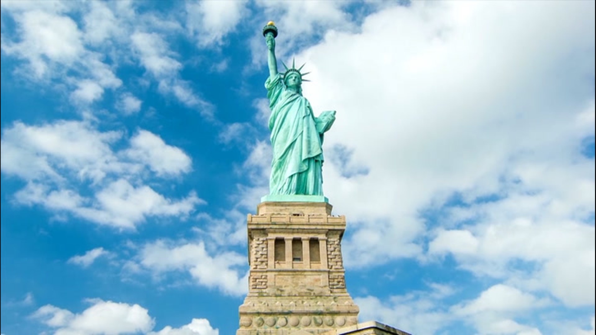
The Statue of Liberty is perhaps the most recognizable visual asset in the world. For over a century, it has served as a silent ambassador, a beacon of hope, and a cornerstone of American identity. However, from a brand strategy perspective, the statue represents a fascinating case study in organic rebranding. If you were to ask a child to color a picture of Lady Liberty, they would reach for a seafoam green or a minty teal crayon. Yet, when the monument was first unveiled in 1886, she was a brilliant, metallic copper—the color of a newly minted penny.

This transition from a fiery orange-gold to a muted, stately patina is more than just a chemical reaction known as oxidation; it is a masterclass in how visual identity evolves to match cultural values. For brand managers and designers, the question “What color is Lady Liberty?” opens a dialogue about the longevity of brand assets, the psychology of color in global marketing, and the power of allowing a brand to age with dignity.
From Copper to Patina: The Natural Rebranding of an Icon
When Frédéric Auguste Bartholdi designed the statue, he chose copper for its malleability and lightness. At its inauguration, the statue stood as a testament to industrial prowess. The bright copper was aggressive, bold, and reflected the raw energy of a young, expanding nation. However, within twenty years, the salt air of New York Harbor began its work. By 1906, the statue was covered in a thin layer of copper carbonate, turning it the distinctive blue-green hue we recognize today.
The Visual Shift as a Strategic Metaphor
In branding, a sudden shift in color palette can be catastrophic. Imagine if Coca-Cola decided to turn blue overnight. Yet, for Lady Liberty, the “rebrand” happened at a pace that allowed the public to adapt. This gradual shift mirrored the statue’s transition from an industrial achievement to an ancestral landmark. The original copper felt “new” and “temporary,” whereas the green patina feels “ancient” and “permanent.”
From a strategic standpoint, the patina acted as a protective layer, both physically and metaphorically. It shielded the underlying copper from further decay while shielding the brand from becoming dated. The green color moved the statue out of the realm of 19th-century industrialism and into the realm of timeless heritage. This teaches brand strategists an invaluable lesson: sometimes the most durable identities are those that allow for natural evolution rather than rigid adherence to a static launch-day aesthetic.
Maintaining Consistency in a Changing Palette
The challenge for modern organizations managing the “Liberty brand” is maintaining visual consistency across digital and physical mediums. Because the statue is a public domain icon, thousands of entities use its likeness. However, the specific shade of “Liberty Green” (often categorized in design circles as a variation of Verdigris) has become a standardized asset.
In corporate identity, consistency is king. When a brand’s primary color changes, the brand equity usually follows. However, in the case of the statue, the equity was not tied to the copper material, but to the silhouette and the perceived “wisdom” of the monument. The green hue actually increased the statue’s brand value by making it appear more “statuesque”—reminiscent of the weathered bronzes of Ancient Greece and Rome.
Color Psychology in Brand Longevity
Color is the most immediate form of communication. It bypasses the rational mind and triggers an emotional response. To understand the branding power of Lady Liberty, we must analyze why the specific shade of green-blue it settled into is so effective on a global scale.
Why “Liberty Green” Works for the Global Audience
In the world of marketing and design, green is traditionally associated with growth, nature, and stability. Blue, on the other hand, evokes trust, intelligence, and calm. The verdigris of the statue sits exactly at the intersection of these two psychological profiles.
As a global brand, the Statue of Liberty must communicate “Safety” and “Opportunity” to millions of people from diverse cultural backgrounds. A bright red or a harsh gold might have been seen as imperialistic or aggressive. The soft, matte green-blue suggests a mature, stable environment. It is a color that doesn’t demand attention through noise, but commands it through presence. This is a crucial distinction in high-level brand strategy: there is a difference between being “loud” and being “significant.”
Trust, Stability, and Heritage through Verdigris
Brands that want to convey a sense of history often utilize “distressed” or “weathered” colors. This is why luxury brands or law firms rarely use neon colors; they want to appear as if they have existed forever. The oxidation of Lady Liberty provided the ultimate “heritage filter” for the American brand.
This specific color palette—the teal-green—has since been adopted by numerous high-end brands to evoke similar feelings of prestige. Think of the “Tiffany Blue.” While different in saturation, it occupies a similar space in the consumer’s mind: it represents something valuable, curated, and enduring. When a brand can own a color so effectively that the color itself becomes a synonym for the brand’s values, it has reached the pinnacle of brand identity.
Protecting the Visual Assets of a Public Symbol
While the Statue of Liberty is a gift to the world and technically exists in the public domain, its “brand” is managed with surprising rigor by the National Park Service and associated heritage foundations. Protecting a brand that everyone feels they “own” requires a delicate balance of accessibility and quality control.
Managing the Commercial Use of an International Landmark
From a corporate identity perspective, the Statue of Liberty is a “Distinctive Brand Asset” (DBA). According to the Ehrenberg-Bass Institute, a DBA is something that triggers the thought of a brand without the brand name needing to be present. The torch, the crown, and specifically the color are all DBAs.
When corporations use Lady Liberty in their marketing—such as Liberty Mutual Insurance—they are leveraging the “borrowed equity” of the statue’s established brand. They utilize the color and the silhouette to instantly transfer feelings of protection and reliability to their own financial products. This is a common strategy in brand architecture: aligning a newer, less-trusted brand with a “parent” or “universal” symbol to accelerate consumer trust.
Digital Branding and Color Accuracy in the Modern Age
In the digital era, the “color” of Lady Liberty is defined by HEX codes and RGB values. For designers working on official government portals, tourism campaigns, or educational apps, the color must be rendered accurately to maintain the brand’s integrity.
- HEX: #A5D1BD (approximate)
- RGB: (165, 209, 189)
Standardizing these values ensures that whether the statue is seen on a 4K monitor in Tokyo or a printed brochure in Paris, the brand experience remains cohesive. This level of detail is what separates a world-class brand from a generic icon. It is not just “green”; it is a specific, historically-informed shade that carries the weight of the brand’s promise.
Lessons for Modern Brand Managers
The history of Lady Liberty’s color offers profound insights for today’s brand managers, marketing directors, and entrepreneurs. In a world of “fast branding” and instant pivots, there is much to be learned from a 138-year-old monument.
Embracing Organic Change
One of the most common mistakes in brand strategy is fighting the natural evolution of how a brand is perceived. Brands are not static; they are living entities that interact with their environment. Lady Liberty’s designers could have decided to polish the copper every year to keep it shiny and “on-brand” with the original vision. Instead, the decision was made to let the oxidation stay.
In modern business, this translates to listening to how your audience uses and perceives your brand. If your customers find a different value in your product than you originally intended, it might be time to “let the patina grow.” Authenticity is a core component of modern brand loyalty, and there is nothing more authentic than a brand that shows its history.
The Power of Distinctive Assets
The Statue of Liberty proves that a brand does not need a name or a tagline to be understood. It relies on a “Visual Vocabulary.” By focusing on a few key elements—the crown, the torch, and the unique verdigris color—the brand became indestructible.
For a business, this means identifying your own “color” and “silhouette.” What are the one or two things that, if stripped of your logo, would still tell people who you are? If you don’t have a distinctive color or shape, your brand is vulnerable to being replaced by any competitor with a lower price point. Lady Liberty’s “brand” is irreplaceable because its visual identity is so uniquely tied to its physical presence and historical narrative.

Conclusion: The Enduring Brand of Liberty
What color is Lady Liberty? To the scientist, she is a layer of copper carbonate over a copper skin. To the tourist, she is a majestic green figure standing in the harbor. But to the brand strategist, she is a triumph of visual identity.
She has successfully navigated the transition from a “product” (a gift of French engineering) to a “symbol” (a global beacon of freedom). Her color change was not a failure of maintenance, but an accidental stroke of branding genius that gave her the gravitas needed to endure through centuries.
In the end, the color of Lady Liberty is the color of resilience. It is a reminder that the best brands are those that can weather the storm, adapt to their environment, and emerge with a layer of protection that makes them even more beautiful—and valuable—than they were on the day they were born. For those building the brands of tomorrow, the lesson is clear: focus on the core, allow for evolution, and never underestimate the power of the right shade of green.
aViewFromTheCave is a participant in the Amazon Services LLC Associates Program, an affiliate advertising program designed to provide a means for sites to earn advertising fees by advertising and linking to Amazon.com. Amazon, the Amazon logo, AmazonSupply, and the AmazonSupply logo are trademarks of Amazon.com, Inc. or its affiliates. As an Amazon Associate we earn affiliate commissions from qualifying purchases.