
In the competitive landscape of visual identity, the selection of a core color palette is rarely a matter of mere aesthetic preference. It is a calculated strategic move designed to elicit specific psychological responses, establish market positioning, and foster brand recall. When a brand asks, “What color is cinnamon?” they are not looking for a simple HEX code. They are exploring a complex spectrum of warm, mid-tone browns and reddish-terracotta hues that signal reliability, heritage, and a sophisticated organic presence.
As modern branding pivots away from the sterile minimalism of “tech-blue” and the clinical feel of pure white, earth tones—specifically cinnamon—have emerged as a powerful tool for brands seeking to humanize their digital and physical presence. This color represents a bridge between the rustic and the refined, providing a foundation for brands that want to communicate groundedness without sacrificing elegance.

Defining the Cinnamon Spectrum: The Technical DNA of the Palette
To understand cinnamon as a brand asset, one must first define its technical boundaries. Cinnamon is not a monolithic color; it is a range of hues located at the intersection of orange, red, and brown. In the world of design and corporate identity, defining this precisely is essential for cross-platform consistency.
The Technical Profile: HEX, RGB, and CMYK
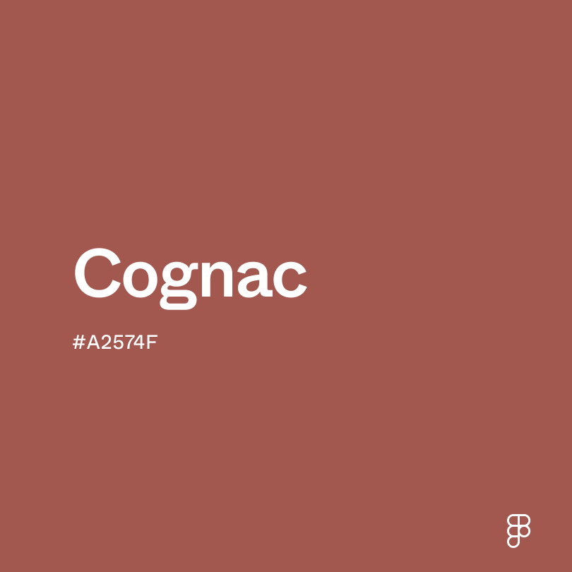
In a digital environment, cinnamon often oscillates between HEX #D2691E (a vibrant, spiced orange-brown) and #7B3F00 (a deeper, more traditional wood-tone). For high-end lifestyle brands, the “cinnamon” choice often leans toward a desaturated, matte version, such as #955251, which incorporates more muted pink and grey undertones to suggest a “terracotta” or “clay” aesthetic.
When translating these colors to print—such as packaging or high-end stationery—the CMYK profile must be meticulously managed. A typical cinnamon profile relies heavily on Magenta and Yellow, with a calculated percentage of Black to provide depth. Achieving the “warmth” of cinnamon without it veering into a muddy brown or a jarring orange is the hallmark of a sophisticated brand design team.
Organic vs. Synthetic Perception
From a brand strategy perspective, the “color” of cinnamon is defined by its perceived origin. Unlike neon colors or primary blues, cinnamon feels “found” rather than “made.” This organic perception is a massive asset for brands in the wellness, food and beverage, and sustainable luxury sectors. When a consumer sees a cinnamon-toned logo or packaging, the brain subconsciously associates the brand with natural processes, earth-derived materials, and artisanal craftsmanship.
The Psychology of Warmth and Reliability
Color psychology is the cornerstone of brand strategy. The cinnamon palette occupies a unique psychological space, offering the stability of brown with the energy of red. This combination makes it one of the most versatile tools for established corporations and disruptive startups alike.
Evoking Trust through Earth Tones
Brown, the parent category of cinnamon, is traditionally associated with the earth, wood, and stone. In a corporate context, it signals “The Provider”—a brand that is stable, dependable, and enduring. However, traditional dark brown can sometimes feel heavy or antiquated. Cinnamon solves this by infusing the stability of brown with a “glow.”
The reddish-orange undertones in cinnamon suggest a “fire-side” warmth. This triggers feelings of comfort, nostalgia, and safety. For service-based brands or high-ticket consulting firms, using cinnamon in a visual identity can lower the barrier of entry for a client by making the brand feel approachable and “human,” rather than cold and inaccessible.
The Sensory Connection in Branding
Cinnamon is one of the few colors that is intrinsically tied to a specific scent and taste. This is known in marketing as “synesthesia design.” When a brand utilizes cinnamon tones, it can actually trigger sensory memories in the consumer. This is why we see this palette dominate the specialty coffee industry, high-end bakery branding, and luxury home goods.
By choosing a color that the consumer can almost “smell” or “taste,” the brand deepens the neurological connection. This sensory shortcut bypasses traditional logical processing and goes straight to the emotional center of the brain, facilitating faster brand affinity and higher levels of customer loyalty.
Implementing Cinnamon in Brand Identity Systems
A color is only as effective as its application. Integrating cinnamon into a comprehensive brand identity system requires a deep understanding of contrast, typography, and visual hierarchy.

Typography and Contrast
One of the challenges of using cinnamon as a primary brand color is ensuring legibility across different mediums. Because cinnamon is a mid-tone, it often lacks the high contrast required for functional UI elements on its own. Strategic brands pair cinnamon with high-contrast neutrals.
For example, a luxury skincare brand might use a deep cinnamon-clay color for its secondary packaging but use a crisp, off-white (such as “parchment” or “linen”) for its typography. Alternatively, for a bold, modern look, cinnamon can be paired with a very dark charcoal or “off-black” to create a grounded, high-fashion aesthetic. Using pure black with cinnamon can often look dated; instead, designers opt for deep navy or forest green to create a sophisticated, “heritage” color story.
Complementary Palettes and Seasonal Versatility
Cinnamon is a “chameleon” color that changes its personality based on its surrounding palette. This versatility is a key reason for its popularity in brand strategy.
- The “Eco-Modernist” Palette: Cinnamon paired with sage green and cream. This communicates sustainability, growth, and natural ingredients.
- The “Urban Luxury” Palette: Cinnamon paired with slate grey and brushed gold. This communicates high-end craftsmanship, architectural precision, and exclusivity.
- The “Vibrant Heritage” Palette: Cinnamon paired with mustard yellow and deep teal. This communicates history, storytelling, and a global, eclectic perspective.
Because cinnamon feels relevant across seasons—suggesting autumn warmth or summer sun-baked earth—it prevents a brand from feeling “stuck” in a specific time of year, ensuring long-term relevance.
Digital and Physical Touchpoints: The Cinnamon Experience
The transition from a digital screen to a physical product is where many brand identities fail. The “color of cinnamon” must be managed carefully to maintain its emotional impact across all customer touchpoints.
UI/UX Considerations: The Warm Web
In digital product design (UI), earth tones like cinnamon are used to reduce “blue light fatigue.” Apps and websites that use warm neutrals are often perceived as more premium and relaxing to browse. Cinnamon is frequently used for “call to action” (CTA) buttons in boutique e-commerce settings because it draws the eye without the aggressive, “urgent” feel of a bright red or neon green.
Furthermore, cinnamon-toned photography filters (the “warm aesthetic”) have become a staple for brands on visual platforms like Instagram and Pinterest. This creates a cohesive “vibe” that extends from the website interface to the social media feed, reinforcing the brand’s identity through consistent color temperature.
Packaging and Sustainable Materials
In the physical world, the color of cinnamon is often synonymous with sustainable material choices. Kraft paper, recycled cardboard, and vegetable-dyed fabrics naturally fall within the cinnamon and tan spectrum. Brands that lean into this color can leverage the “unbleached” aesthetic to communicate their commitment to environmental responsibility.
High-end packaging often utilizes “texture-mapping,” where the color of cinnamon is paired with a tactile experience—such as a linen-embossed box or a matte-touch bottle. This multi-sensory approach solidifies the brand’s position as a premium provider that values the details of the consumer journey.
Strategic Market Positioning: Standing Out by Grinding Down
In an era where many industries—particularly FinTech and SaaS—are saturated with “corporate blue” and “startup purple,” the move toward earth tones like cinnamon is a powerful act of differentiation.
Standing Out in a Sea of Sameness
When a brand enters a market dominated by cold, high-tech aesthetics, adopting a cinnamon-based identity immediately signals that they are different. It suggests that the company is more focused on the “human” element of the business than the “algorithm” element. This is why we see a rise in “cinnamon branding” among neo-banks that want to emphasize personal relationships, or health-tech companies that want to feel like a lifestyle partner rather than a medical provider.
The Global Perspective: Cultural Associations
From a global brand strategy standpoint, cinnamon is a globally recognized symbol of value. In many cultures, the spices that share the color’s name were historically used as currency and were symbols of immense wealth and trade. By tapping into this “spice route” history, a brand can subtly evoke a sense of global exploration, heritage, and high value.
Unlike colors that may have negative connotations in certain regions (such as white for mourning in parts of Asia or red for danger in the West), cinnamon-toned browns are almost universally viewed as neutral, positive, and constructive. They represent the “common ground,” making them an ideal choice for brands with international ambitions.
In conclusion, “what color is cinnamon” is a question of strategic intent. It is a color that represents the modern evolution of brand identity—one that values warmth over coldness, heritage over fleeting trends, and the organic over the synthetic. For the brand strategist, cinnamon is not just a shade on a wheel; it is a powerful narrative tool used to build trust, evoke sensory memory, and establish a lasting, grounded presence in a rapidly changing market.
aViewFromTheCave is a participant in the Amazon Services LLC Associates Program, an affiliate advertising program designed to provide a means for sites to earn advertising fees by advertising and linking to Amazon.com. Amazon, the Amazon logo, AmazonSupply, and the AmazonSupply logo are trademarks of Amazon.com, Inc. or its affiliates. As an Amazon Associate we earn affiliate commissions from qualifying purchases.